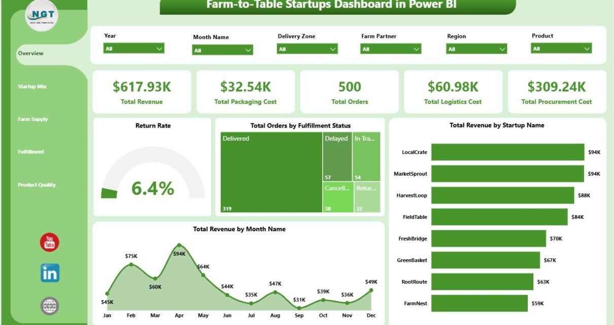
Farm-to-table startups create operational data every day: revenue, packaging cost, procurement cost, logistics cost, orders, fulfillment status, channel performance, customer type, farm partner revenue, freshness score, and product-category performance. The Farm-to-Table Startups Dashboard in Power BI turns that data into a ready reporting experience with 5 Power BI pages, 5 executive KPI cards, 16 analytical visuals, and slicer-based filtering.
This dashboard is designed for local food marketplaces, produce delivery startups, farm co-ops, subscription box operators, food incubators, founders, analysts, and fulfillment managers who want a cleaner way to review farm-to-table performance without building every Power BI page from scratch.
Click here to purchase Farm-to-Table Startups Dashboard in Power BI
Key Features of Farm-to-Table Startups Dashboard in Power BI
- 5 Power BI report pages: Overview, Startup Mix, Farm Supply, Fulfillment, and Product Quality.
- 5 KPI cards: Total Revenue, Total Packaging Cost, Total Orders, Total Logistics Cost, and Total Procurement Cost.
- Multiple slicers: Filter pages quickly by startup, channel, customer type, product category, farm partner, region, quarter, month, and fulfillment status.
- Revenue analysis: Review revenue by startup name, month name, channel, quarter, and farm partner.
- Cost analysis: Compare packaging cost, logistics cost, procurement cost, and product-category cost pressure.
- Fulfillment analysis: Track order status, freshness score by channel, and logistics cost by product category.
- Editable .pbix file: Adjust visuals, fields, measures, colors, slicers, and page layouts in Power BI Desktop.
For users new to the platform, Microsoft’s official Power BI overview explains how Power BI helps connect, model, visualize, and share business data.
Dashboard Pages Explanation
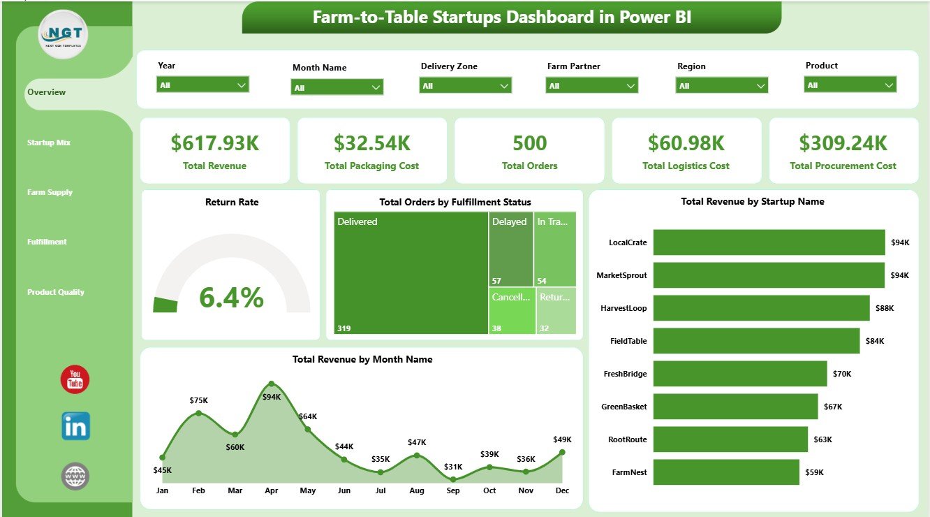
1. Overview Page
The Overview Page is the executive landing page of the report. At the top, it shows Total Revenue, Total Packaging Cost, Total Orders, Total Logistics Cost, and Total Procurement Cost. These cards help founders and operations leaders understand sales scale, order volume, sourcing pressure, delivery cost, and packaging spend before moving into deeper analysis.
Return Rate by Overall Orders: This chart compares return activity with the broader order base. It helps teams see whether customer returns are becoming a quality, delivery, or expectation-management issue.
Total Orders by Fulfillment Status: This chart shows how orders are distributed across fulfillment stages. It helps managers identify completed, pending, delayed, cancelled, or in-progress order patterns quickly.
Total Revenue by Startup Name: This visual compares revenue contribution by startup. It is useful for incubators, co-ops, multi-brand operators, and analysts who need to benchmark several farm-to-table businesses.
Total Revenue by Month Name: This trend shows how revenue changes month by month. It supports seasonal demand review, campaign analysis, and planning for farm supply and delivery capacity.
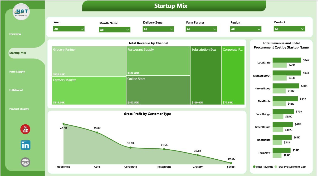
2. Startup Mix
The Startup Mix page focuses on commercial mix across channels, startups, procurement cost, and customer type. Total Revenue by Channel helps users see which sales channels are driving the strongest top-line performance. Total Revenue and Total Procurement Cost by Startup Name compares sales against sourcing cost by startup, making cost pressure easier to spot.
Gross Profit by Customer Type shows which customer groups contribute stronger margin. This is useful when a startup sells to households, restaurants, subscription customers, retailers, institutions, or wholesale buyers and needs to understand where profit is coming from.
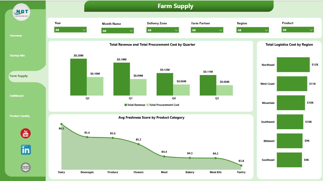
3. Farm Supply
The Farm Supply page gives a focused view of sourcing and movement. Total Revenue and Total Procurement Cost by Quarter helps teams compare sales and sourcing cost over time. This makes it easier to see whether procurement cost is rising faster than revenue across quarters.
Total Logistics Cost by Region highlights delivery and movement cost by geography. Avg Freshness Score by Product Category helps users compare product quality across produce, dairy, bakery, pantry, prepared food, or other categories used in their data.
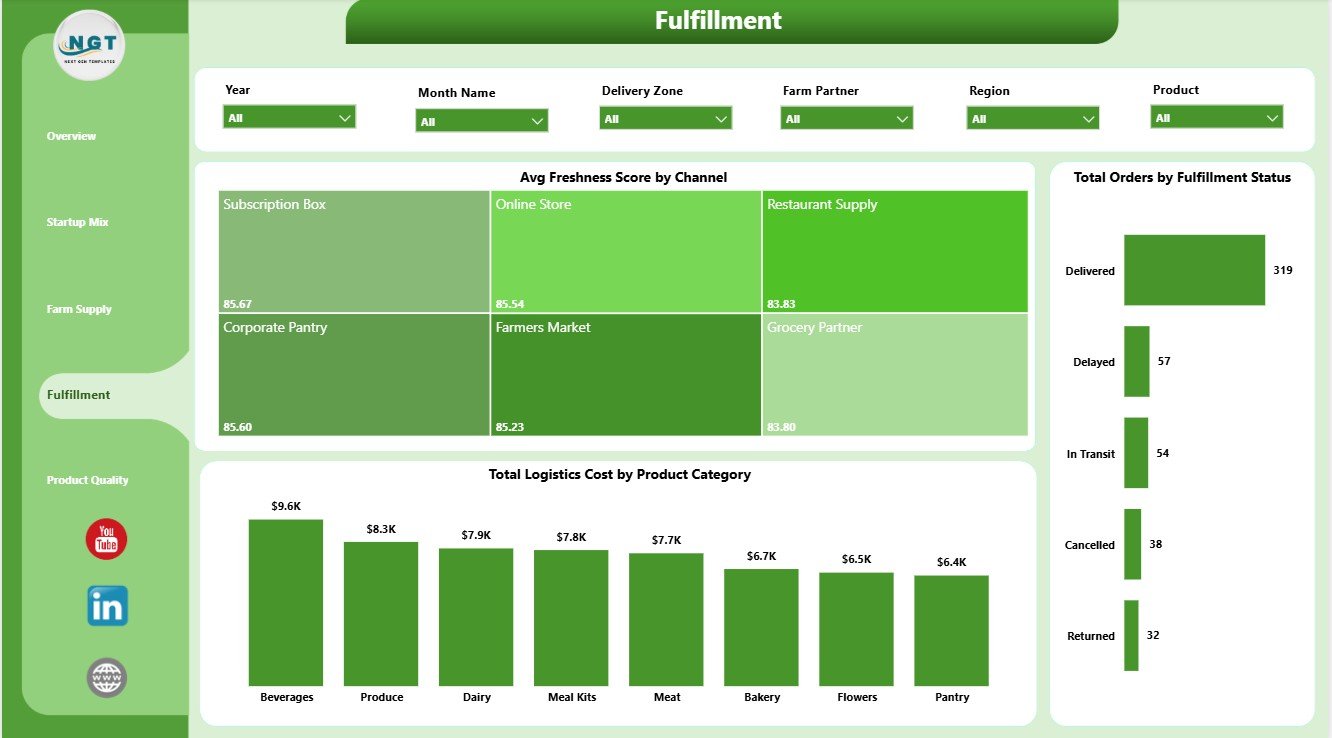
4. Fulfillment
The Fulfillment page connects freshness, orders, fulfillment status, channels, product categories, and logistics cost. Avg Freshness Score by Channel helps compare whether online, retail, subscription, wholesale, or market channels are delivering better freshness outcomes.
Total Orders by Fulfillment Status gives a clear view of order pipeline and completion behavior. Total Logistics Cost by Product Category helps identify product groups that are more expensive to move, pack, or deliver.
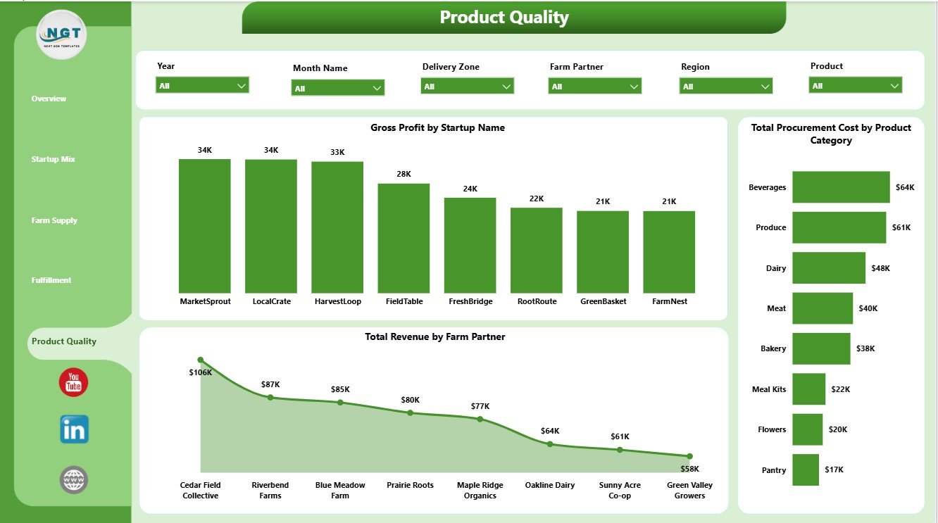
5. Product Quality
The Product Quality page is built for margin, sourcing cost, farm partner, and product-level review. Gross Profit by Startup Name compares profitability across startup brands or business units. This helps leaders see which startups are creating stronger contribution after cost.
Total Procurement Cost by Product Category shows where sourcing cost is concentrated. Total Revenue by Farm Partner helps users understand which farm partners are connected with stronger sales performance.
Farm-to-Table Startups Dashboard in Power BI vs. Tableau vs. Paid CRM/SaaS – Feature Comparison
| Feature | This Power BI Dashboard | Tableau Alternative | Paid Food Operations SaaS |
|---|---|---|---|
| Cost | $17.99 one-time | License plus dashboard build time | Monthly or annual subscription |
| Platform | Power BI Desktop and Power BI Service | Tableau Desktop or Cloud | Vendor cloud platform |
| Setup time | Open .pbix, replace data, refresh | Build or adapt workbook | Onboarding and configuration |
| Real-time team collaboration | Available through Power BI Service setup | Available through Tableau Cloud | Usually included by plan |
| Mobile access | Available after publishing | Available after publishing | Usually included |
| Customizable fields | Editable model, fields, visuals, and measures | Editable if you own the workbook | Limited by vendor settings |
| Share with link | Available through Power BI Service | Available through Tableau Cloud | Login controlled |
| Year-1 cost at 5 users | $17.99 plus any Microsoft licensing | Usually much higher | Often hundreds or thousands |
| Farm-to-table reporting | Pre-built across 5 pages | Requires custom dashboard design | Depends on reporting module |
Who Should Use This Template
This Power BI dashboard is useful for farm-to-table startups, local food marketplaces, produce delivery teams, subscription box businesses, farm co-ops, food incubators, operations analysts, founders, and consultants who report on revenue, cost, supply, fulfillment, freshness, customer type, product categories, and farm partners.
It is especially useful when the team already exports order, customer, product, farm partner, channel, and cost data from another system and needs a ready Power BI reporting layer.
Real-World Use Cases
Aarav, farm-to-table founder: Aarav opens the Overview page before monthly investor updates to explain Total Revenue, Total Packaging Cost, Total Orders, Total Logistics Cost, and Total Procurement Cost.
Meera, fulfillment manager: Meera uses the Fulfillment page to compare freshness by channel, order status, and logistics cost by product category before planning route and packing improvements.
Daniel, local food consultant: Daniel reviews Startup Mix, Farm Supply, and Product Quality to compare startups, customer types, quarters, regions, product categories, farm partners, and gross profit.
Advantages of Farm-to-Table Startups Dashboard in Power BI
- It saves build time compared with creating a report from a blank Power BI file.
- It keeps revenue, packaging, procurement, logistics, freshness, fulfillment, supply, and quality views in one report.
- It supports slicer-based analysis during weekly, monthly, or quarterly review meetings.
- It can be customized in Power BI Desktop as the reporting process grows.
- It avoids the recurring cost of a separate dashboard SaaS subscription.
Opportunities for Improvement
Teams with more advanced needs can extend the file by adding Power Query connectors, automated refresh through Power BI Service, route-level analysis, SKU-level margin measures, supplier scorecards, spoilage tracking, customer cohort analysis, row-level security, or direct connections to ecommerce and ordering systems.
Best Practices
- Keep startup, product category, farm partner, channel, region, month, quarter, and fulfillment status names consistent.
- Validate KPI cards after each refresh.
- Review revenue and procurement cost together so growth is not separated from sourcing pressure.
- Use logistics cost and freshness score together when evaluating fulfillment decisions.
- Keep a backup copy before editing model relationships, measures, and report pages.
- Use Microsoft guidance to install or update Power BI Desktop: Microsoft Learn: Get Power BI Desktop.
Explore Relevant Templates
- Farm-to-Table Startups Dashboard in Power BI
- Farm-to-Table Startups Dashboard in Excel
- Drone Farming Startups Dashboard in Power BI
- Vertical Farming Dashboard in Power BI
- Browse Power BI Dashboard Templates
Frequently Asked Questions
What is the Farm-to-Table Startups Dashboard in Power BI?
It is a Power BI dashboard template for tracking farm-to-table startup revenue, packaging cost, orders, logistics cost, procurement cost, return rate, fulfillment status, freshness, supply, and product quality.
Can I use my own farm-to-table data?
Yes. Replace or connect the sample data with your own structured records, then refresh the report in Power BI Desktop.
How many report pages are included?
The report includes five pages: Overview, Startup Mix, Farm Supply, Fulfillment, and Product Quality.
Do I need Power BI Desktop?
Yes. Power BI Desktop is used to open, refresh, edit, and customize the .pbix file. Publishing to Power BI Service may require Microsoft licensing.
Can I customize the dashboard?
Yes. You can edit visuals, fields, measures, slicers, colors, labels, and source connections in Power BI Desktop.
Does this dashboard replace food operations software?
No. It is an analytics dashboard, not an ordering system, route optimizer, POS platform, inventory barcode system, or compliance workflow.
About the Author
Built by PK – Microsoft Certified Professional with 15+ years of Excel, Google Sheets, and Power BI experience. Founder of NextGenTemplates, reaching 300K+ subscribers across YouTube channels. Every template is hand-built and tested before release.
Conclusion
The Farm-to-Table Startups Dashboard in Power BI gives food founders and operations teams a clear way to review revenue, orders, packaging cost, procurement cost, logistics cost, fulfillment, freshness, farm supply, and product quality. Instead of rebuilding reports manually, teams can use a ready Power BI structure, refresh their data, and focus on decisions that improve margins, delivery reliability, and customer experience.
For more tutorials and template walkthroughs, visit PK An Excel Expert on YouTube.