Postal Services Dashboard in Excel is built for teams that need a clear monthly view of postal revenue, mail volume, shipments, delivery speed, service quality, cost, complaints, and customer mix. Postal and courier operations handle thousands of records across regions, service types, delivery modes, customer groups, facility types, and shipment statuses. When those records stay scattered across separate files, managers lose time before they even start analysis.
This ready-to-use Excel dashboard brings the full performance story into one workbook. It includes 5 dashboard pages, 5 high-level KPI cards, 20 chart views, a structured Data sheet, and a Support sheet with pivot tables. You can replace the sample data, click Refresh All from the Excel Data tab, and review updated charts without rebuilding the dashboard from scratch.
Click here to purchase Postal Services Dashboard in Excel
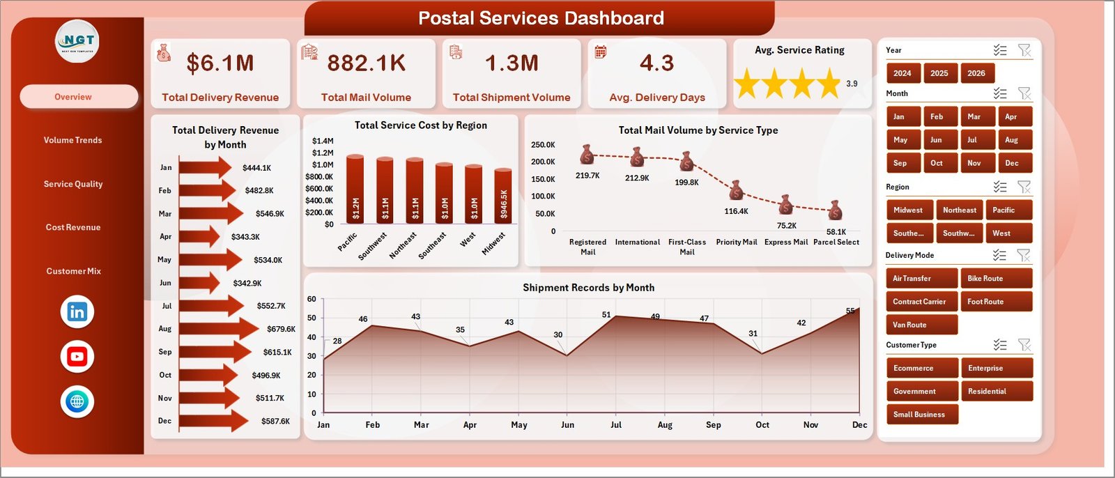
Postal Services Dashboard in Excel
Key Features of Postal Services Dashboard in Excel
- 5 analysis pages – Overview, Volume Trends, Service Quality, Cost Revenue, and Customer Mix.
- 5 headline cards – Total Delivery Revenue, Total Mail Volume, Total Shipment Volume, Avg. Delivery Days, and Avg. Service Rating.
- 20 chart views – Review revenue, cost, volume, delivery success, complaints, shipment records, and customer distribution.
- Multiple slicers – Filter the dashboard quickly and review specific segments without changing formulas.
- Data Sheet tab – Add your postal service records in the same source format.
- Support Sheet tab – Pivot tables power the dashboard dynamically and can be kept hidden.
- Excel-based workflow – No paid BI platform is required for standard analysis.
Dashboard Pages Explanation
1. Overview Page
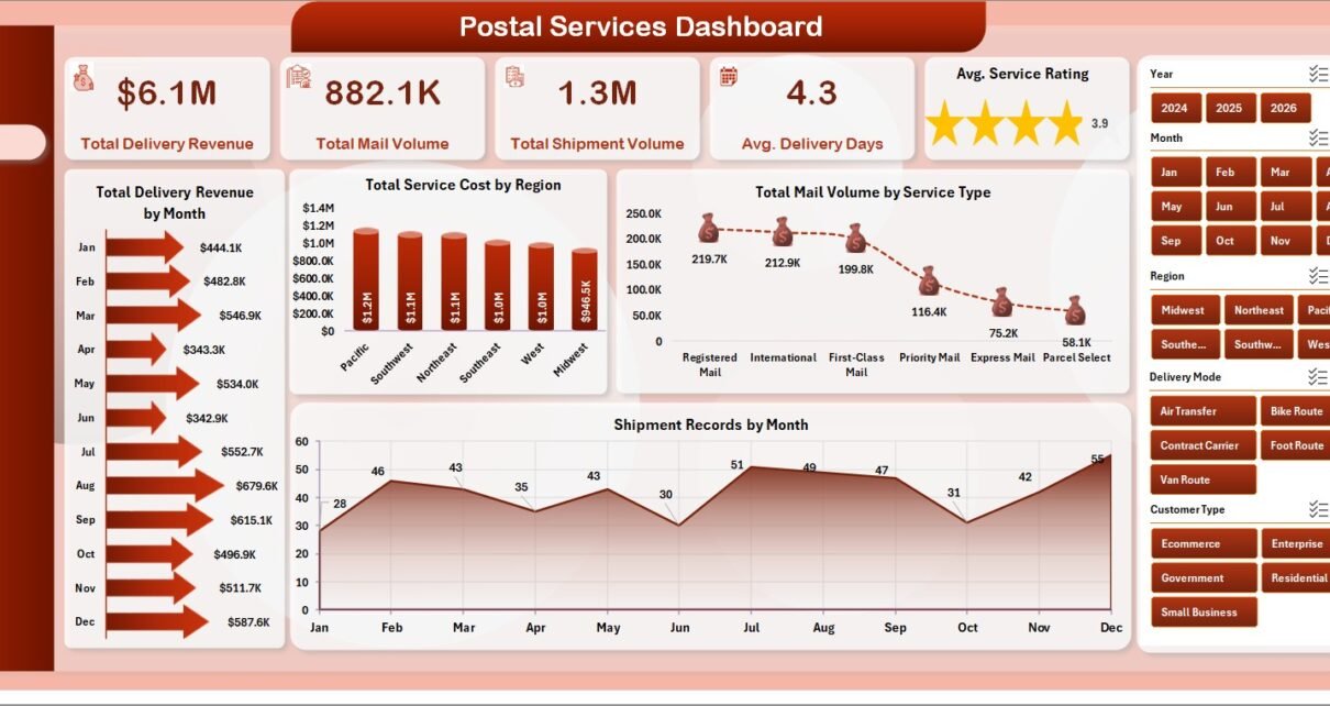
The Overview page is the executive snapshot. At the top, it shows 5 cards: Total Delivery Revenue, Total Mail Volume, Total Shipment Volume, Avg. Delivery Days, and Avg. Service Rating. These cards help managers understand overall postal performance before moving into detailed views.
The page includes Total Delivery Revenue by Month, Total Service Cost by Region, Total Mail Volume by Service Type, and Shipment Records by Month. The revenue chart highlights monthly financial movement, while the cost-by-region chart helps identify expensive areas. The service-type volume chart shows which postal services drive the most demand, and shipment records by month show operational workload trends.
2. Volume Trends
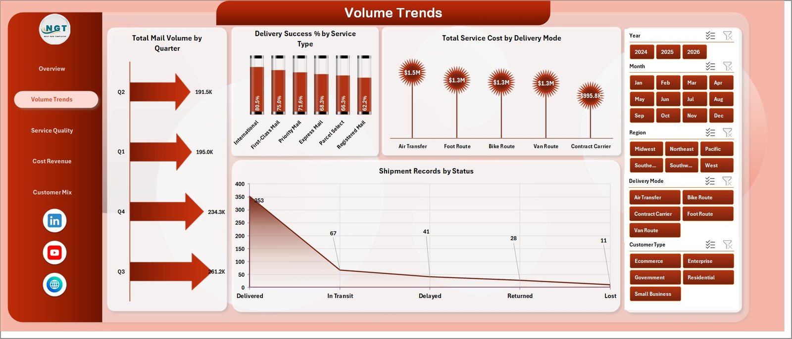
Volume Trends
The Volume Trends page focuses on mail and shipment movement over time. Total Mail Volume by Quarter helps leaders compare quarterly demand and identify seasonal changes. Delivery Success % by Service Type reveals which service categories are meeting delivery expectations and which may need attention.
Total Service Cost by Delivery Mode compares how different delivery channels affect cost. Shipment Records by Status separates completed, pending, delayed, or other status groups so branch teams can respond faster to operational bottlenecks.
3. Service Quality
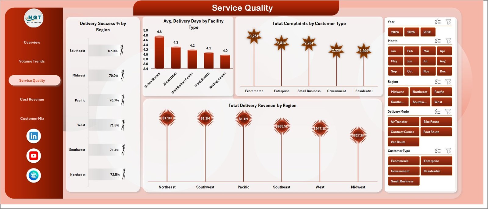
Service Quality
The Service Quality page is useful for teams that need to improve customer experience and delivery reliability. Delivery Success % by Region shows regional performance differences. Avg. Delivery Days by Facility Type helps identify whether sorting centers, hubs, branches, or other facility groups affect delivery speed.
Total Complaints by Customer Type shows which customer segments are raising the most issues. Total Delivery Revenue by Region connects service quality analysis with financial contribution, so leaders can prioritize regions that matter most to both customers and revenue.
4. Cost Revenue
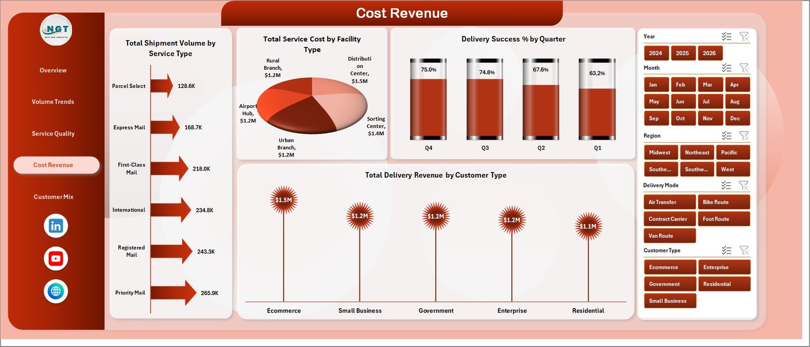
Cost Revenue
The Cost Revenue page connects shipment activity with financial impact. Total Shipment Volume by Service Type shows which services are carrying the largest workload. Total Service Cost by Facility Type helps identify cost-heavy facility categories.
Delivery Success % by Quarter tracks service reliability over time, while Total Delivery Revenue by Customer Type shows which customer groups contribute the most revenue. Together, these views support pricing, staffing, process improvement, and service planning conversations.
5. Customer Mix
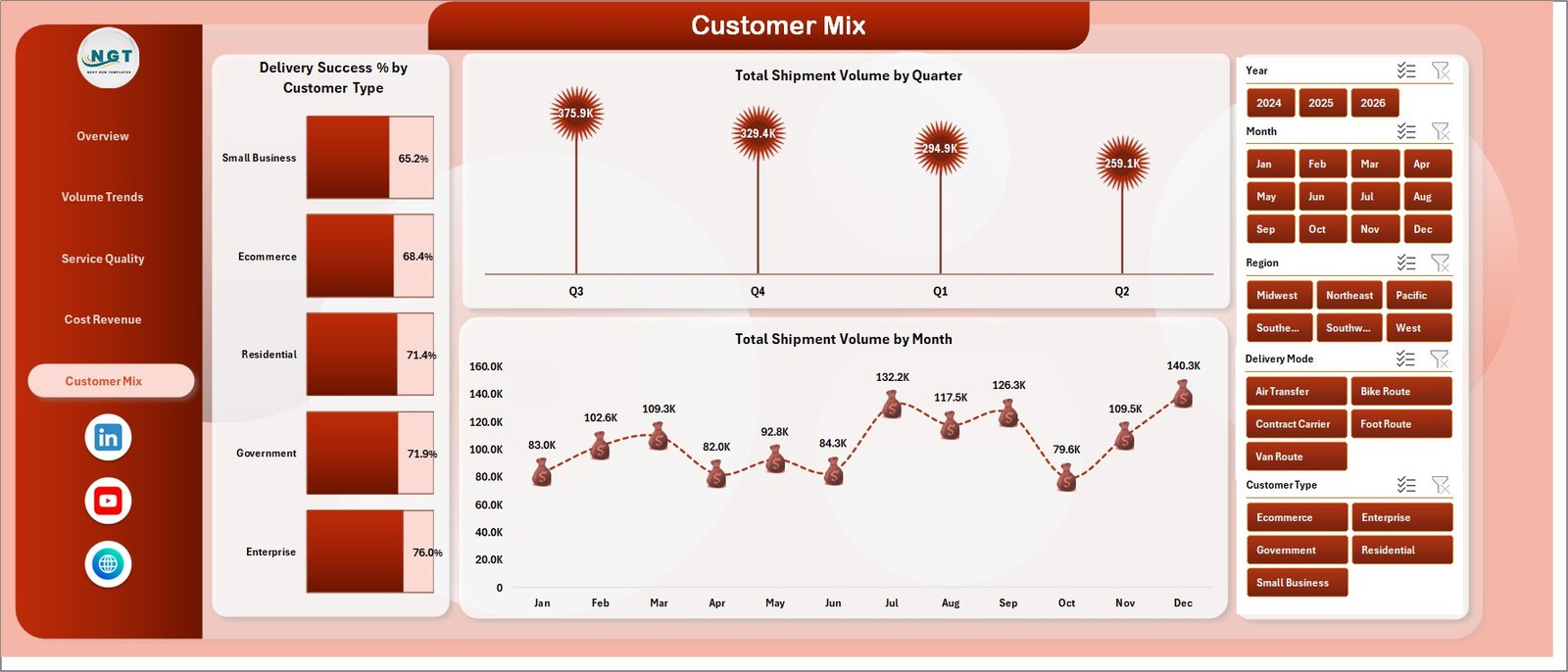
Customer Mix
The Customer Mix page explains how customer groups and time periods shape shipment performance. Delivery Success % by Customer Type shows whether service outcomes differ for retail, corporate, government, or other customer categories. Total Shipment Volume by Quarter and Total Shipment Volume by Month reveal demand movement across time.
6. Data Sheet Tab

Data Sheet tab
The Data Sheet tab is where you add or replace records. Keep the same format so the pivot tables and charts continue working correctly. This structure makes the dashboard repeatable for monthly reporting.
7. Support Sheet Tab

Support sheet tab
The Support Sheet contains multiple pivot tables used to build the full dashboard. After updating the Data sheet, go to the Excel Ribbon, open the Data tab, and click Refresh All. All pivots and related charts will refresh. You can keep this sheet hidden for regular users.
Postal Services Dashboard in Excel vs. Google Sheets vs. Paid Logistics SaaS – Feature Comparison
| Feature | Postal Services Dashboard in Excel | Google Sheets dashboard | Paid logistics SaaS |
|---|---|---|---|
| Cost | $17.99 one-time | Usually low cost, may need setup | Monthly or annual subscription |
| Best for | Excel-based branch and operations reporting | Cloud collaboration | Live operational systems |
| Setup time | Replace data and refresh pivots | Requires sharing and sheet structure | May require onboarding |
| Offline access | Yes | Limited | No |
| Dashboard pages | 5 ready pages | Must be built or copied | Depends on package |
| Live tracking | No | No, unless integrated | Often yes |
Who Should Use This Template
This dashboard is useful for postal department managers, courier branch supervisors, service quality teams, logistics analysts, regional operations heads, and finance teams that prepare recurring performance reports. It is especially helpful when the organization already works in Excel and wants an editable reporting model instead of another paid tool.
It is not the right fit for teams that need live parcel tracking, route optimization, barcode scanning, or API-based operational automation. For those needs, Microsoft guidance on Excel data models and refresh workflows can help with reporting basics, while a dedicated logistics platform may be needed for live execution. See Microsoft Excel support for workbook and refresh help.
Real-World Use Cases
Anita, a regional postal manager, uses the Overview and Service Quality pages before weekly meetings. She filters by region, compares delivery success and delivery days, and prepares a short action list for branch heads.
Rohit, a courier branch supervisor, studies shipment records by status and delivery success by service type. When delayed shipments rise, he checks whether the issue is tied to delivery mode, service category, or a particular time period.
Meena, a finance analyst, reviews service cost by region and facility type. She then compares those costs with delivery revenue by customer type to explain profitability pressure.
Advantages of Postal Services Dashboard in Excel
- It keeps revenue, cost, volume, quality, and customer analysis in one file.
- It reduces manual chart-building work for recurring reporting.
- It uses familiar Excel tools, including slicers, charts, data tables, and pivot refresh.
- It gives both high-level cards and detailed page-level analysis.
- It can be customized for different postal, courier, logistics, and delivery service models.
Opportunities for Improvement
The workbook is intentionally focused on dashboard reporting. It does not replace a live parcel tracking system, route planning engine, or customer notification tool. Teams that require real-time operational control may connect their live systems to a reporting export and then use this Excel dashboard for monthly analysis.
Best Practices
- Keep the Data sheet columns consistent.
- Refresh all pivots after every data update.
- Review filtered views before presenting final numbers.
- Keep the Support sheet hidden for normal users and visible for analysts.
- Back up the workbook before making structural changes to pivots or charts.
Explore Relevant Templates
- Postal Services KPI Dashboard in Excel
- Logistics Manager Toolkit
- Fleet Fuel Log Data Entry System in Excel
- Trucking and Logistics Dashboard in Power BI
Frequently Asked Questions
What is the Postal Services Dashboard in Excel?
It is an Excel dashboard template for postal service reporting. It tracks revenue, mail volume, shipment volume, delivery days, ratings, costs, complaints, delivery success, and customer mix.
How many dashboard pages are included?
The workbook includes 5 dashboard pages: Overview, Volume Trends, Service Quality, Cost Revenue, and Customer Mix, plus Data and Support sheets.
Can I update the dashboard with my own data?
Yes. Replace the sample data in the Data sheet using the same format, then click Refresh All in the Excel Data tab.
What is the Support sheet used for?
The Support sheet contains pivot tables that feed dashboard charts. You can keep it hidden after setup.
Does this template require Power BI?
No. It is built in Microsoft Excel and does not require Power BI or a paid dashboard platform.
Can I customize the charts?
Yes. You can edit chart titles, colors, source ranges, formulas, and pivots based on your reporting needs.
About the Author
Built by PK – Microsoft Certified Professional with 15+ years of Excel, Google Sheets, and Power BI experience. Founder of NextGenTemplates, reaching 300K+ subscribers across YouTube channels. Every template is hand-built and tested before release.
Conclusion
Postal operations need fast, clear, and repeatable reporting. The Postal Services Dashboard in Excel gives managers a practical way to review revenue, volume, delivery quality, cost, complaints, and customer mix without building a dashboard from scratch. Update the data, refresh the pivots, apply slicers, and use the 5 dashboard pages to guide better decisions.
Click here to purchase Postal Services Dashboard in Excel
Visit our YouTube channel to learn step-by-step video tutorials.