Farm-to-table startups often manage revenue, order quantity, sourcing cost, packaging cost, freshness score, delivery reliability, and customer ratings across separate exports. The Farm-to-Table Startups Dashboard in Excel gives founders and operations teams a ready Excel reporting workbook with 7 worksheet tabs, 5 KPI cards, slicers, pivot-driven charts, a Data Sheet, and a Support Sheet for refreshable dashboard reporting.
This template is designed for local food startups, produce delivery businesses, farm co-ops, subscription box operators, food marketplaces, and analysts who need a clear view of Total Revenue, Gross Profit Value, Total Order Quantity, Avg. Freshness Score, Total Packaging Cost, fulfillment status, farm partner cost, delivery zone performance, and product quality.
Click here to purchase Farm-to-Table Startups Dashboard in Excel
Key Features of Farm-to-Table Startups Dashboard in Excel
- 7 worksheet tabs: Overview, Startup Mix, Farm Supply, Fulfillment, Product Quality, Data Sheet, and Support Sheet.
- 5 KPI cards: Total Revenue, Gross Profit Value, Total Order Quantity, Avg. Freshness Score, and Total Packaging Cost.
- Multiple slicers: Filter pages quickly and review specific startups, products, regions, channels, customer types, zones, or time periods.
- Pivot-driven dashboard: The Support Sheet stores pivot tables that feed the dashboard charts and KPI views.
- Refresh All workflow: Update the Data Sheet, click Refresh All in Excel, and the connected pivots and charts refresh.
- Editable Excel file: Change chart titles, formulas, slicers, colors, fields, and layouts as your reporting process grows.
For users who want to learn more about refreshing pivots after changing source data, Microsoft provides official guidance here: Refresh PivotTable data in Microsoft Excel.
Dashboard Pages Explanation
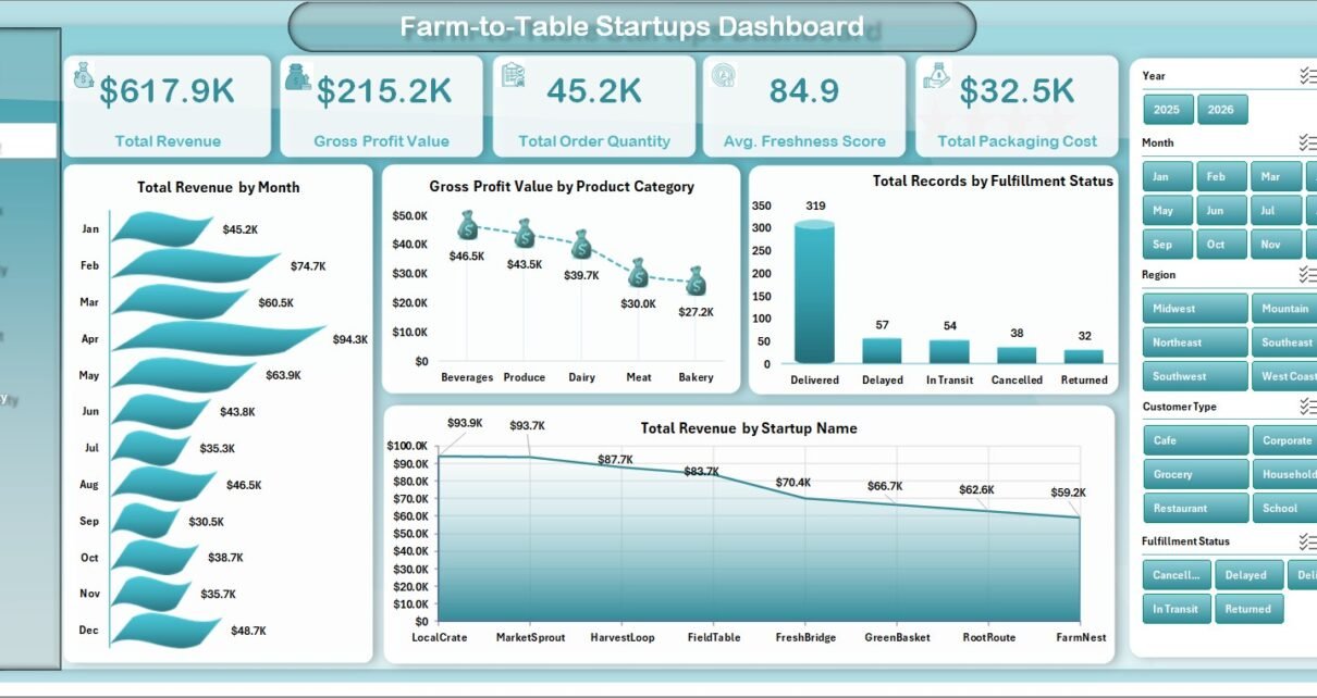
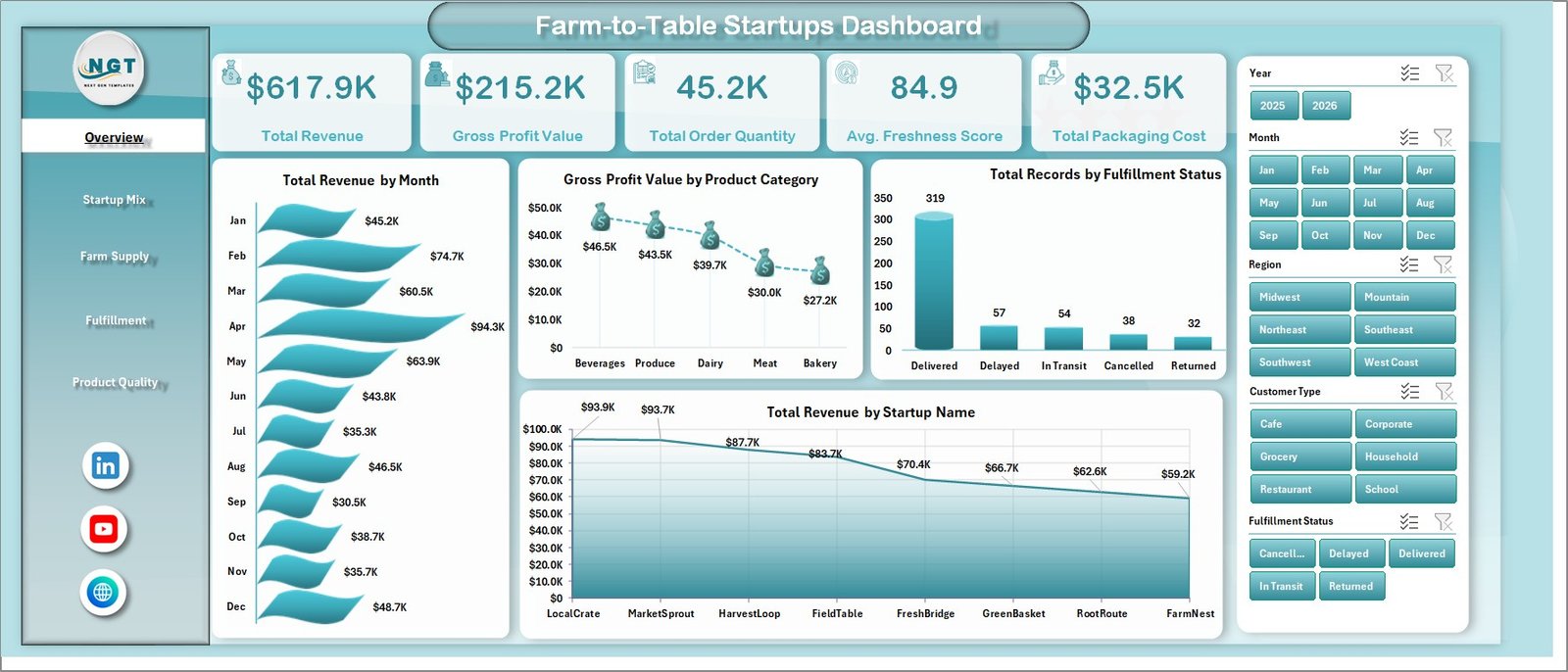
1. Overview Page
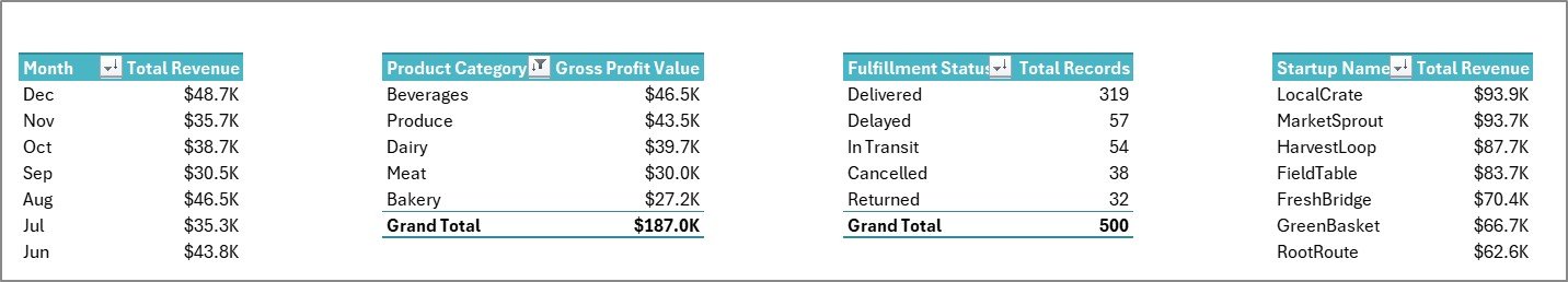
The Overview Page is the executive summary of the workbook. At the top, it includes KPI cards for Total Revenue, Gross Profit Value, Total Order Quantity, Avg. Freshness Score, and Total Packaging Cost. These cards help the user understand sales performance, margin, order volume, freshness, and packaging spend at a glance.
Total Revenue by Month: This chart shows monthly revenue movement for farm-to-table orders. It helps teams identify seasonal demand, campaign impact, and months where revenue needs closer review.
Gross Profit Value by Product Category: This chart compares gross profit across product categories. It helps founders see whether produce, dairy, bakery, pantry, prepared food, or other categories are protecting margin.
Total Records by Fulfillment Status: This chart shows how records are distributed by status. It is useful for checking completed, pending, delayed, cancelled, or in-progress orders during operations review.
Total Revenue by Startup Name: This chart compares revenue contribution by startup. It helps incubators, co-ops, and multi-brand operators understand which startup names are producing the strongest sales.
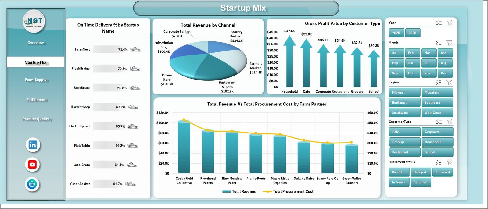
2. Startup Mix
The Startup Mix sheet focuses on startup-level delivery, channel mix, customer type, and farm partner economics. On Time Delivery % by Startup Name compares fulfillment reliability across startups, making it easier to see which teams are meeting delivery commitments.
Total Revenue by Channel shows whether online, retail, subscription, wholesale, farmers market, or partner channels drive stronger sales. Gross Profit Value by Customer Type compares profitability across customer groups. Total Revenue Vs Total Procurement Cost by Farm Partner helps users review whether specific farm partners create healthy sales relative to sourcing cost.
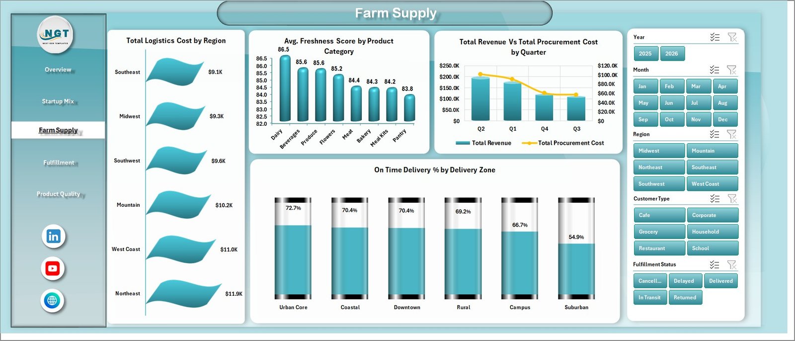
3. Farm Supply
The Farm Supply sheet reviews regional logistics, product freshness, quarterly procurement, and delivery zone reliability. Total Logistics Cost by Region shows where transportation, routing, and supply movement costs are highest.
Avg. Freshness Score by Product Category helps quality and sourcing teams compare product freshness across categories. Total Revenue Vs Total Procurement Cost by Quarter shows whether sourcing cost is moving in line with sales. On Time Delivery % by Delivery Zone highlights delivery zones where timing performance may need action.
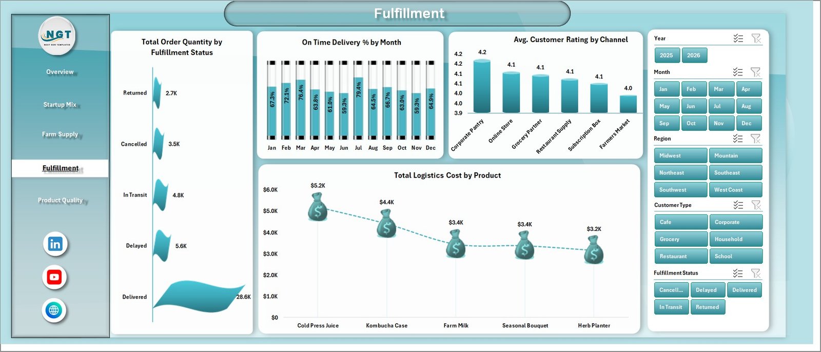
4. Fulfillment
The Fulfillment sheet is built for order movement, delivery performance, channel satisfaction, and product-level logistics cost. Total Order Quantity by Fulfillment Status shows the quantity of orders by status, helping teams see operational load and completion patterns.
On Time Delivery % by Month tracks whether delivery reliability is improving or declining over time. Avg. Customer Rating by Channel connects customer experience to sales channels. Total Logistics Cost by Product helps identify products that create higher delivery or handling cost.
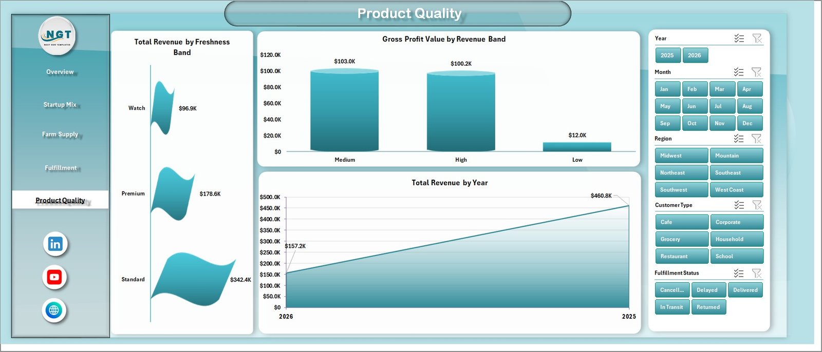
5. Product Quality
The Product Quality sheet focuses on freshness, revenue banding, gross profit, and long-term sales movement. Total Revenue by Freshness Band helps users understand whether stronger freshness levels are connected with higher revenue contribution.
Gross Profit Value by Revenue Band compares profit contribution across revenue segments. Total Revenue by Year provides a long-term sales trend for reporting to founders, advisors, or investors.
6. Data Sheet Tab
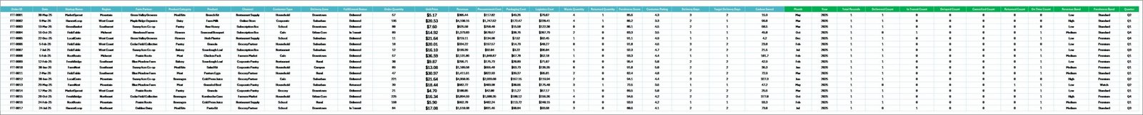
The Data Sheet tab is where users add or paste their records in the same format as the sample data. Keeping headers and field structure consistent allows the dashboard’s pivots, slicers, KPI cards, and charts to refresh correctly.
7. Support Sheet Tab
The Support Sheet contains multiple pivot tables used to create the entire dashboard dynamically. After updating the Data Sheet, go to the Data tab in the Excel Ribbon and click Refresh All. The pivot tables and charts refresh together. You can keep this sheet hidden for normal dashboard use.
Farm-to-Table Startups Dashboard in Excel vs. Google Sheets vs. Paid CRM/SaaS – Feature Comparison
| Feature | This Excel Dashboard | Google Sheets Alternative | Paid Food Operations SaaS |
|---|---|---|---|
| Cost | $17.99 one-time | Template cost or manual setup | Monthly or annual subscription |
| Platform | Microsoft Excel | Browser-based spreadsheet | Vendor cloud platform |
| Setup time | Replace data and refresh | Copy sheet and configure formulas or pivots | Onboarding and implementation |
| Real-time team collaboration | Via OneDrive or SharePoint | Native collaboration | Usually included by plan |
| Mobile access | Excel mobile app or Microsoft 365 | Google Sheets app | Vendor app |
| Customizable fields | Fully editable workbook | Editable sheet | Limited by vendor settings |
| Share with link | Available through cloud storage setup | Built in | Login controlled |
| Year-1 cost at 5 users | $17.99 plus Excel licensing already used | Template cost plus build time | Often hundreds or thousands |
| Farm-to-table analytics | Built across 5 dashboard pages | Must be built or adapted | Depends on plan and integrations |
Who Should Use This Template
This dashboard is useful for farm-to-table startups, local food marketplaces, farm co-ops, produce delivery operators, subscription box businesses, farmers market sellers, specialty grocery teams, food incubators, and operations analysts. It works especially well when the team already receives structured exports for orders, revenue, procurement, delivery, customer ratings, product categories, and fulfillment status.
It is not designed to replace live POS software, route optimization tools, food safety compliance systems, inventory barcode systems, or supplier contract management platforms. Think of it as a reporting layer that turns prepared Excel data into a clear visual dashboard.
Real-World Use Cases
Startup founder: Reviews revenue, gross profit, packaging cost, procurement cost, and product category margin before monthly investor or advisor meetings.
Fulfillment manager: Uses fulfillment status, order quantity, on-time delivery, delivery zone, and logistics cost charts to plan staffing and delivery improvements.
Farm partnership analyst: Compares farm partner procurement cost against revenue and monitors freshness score by product category to guide sourcing decisions.
Advantages of Farm-to-Table Startups Dashboard in Excel
- It saves time compared with designing a farm-to-table dashboard from scratch.
- It keeps sales, margin, procurement, fulfillment, freshness, and quality reporting in one workbook.
- It uses familiar Excel features like pivot tables, charts, slicers, and Refresh All.
- It can be customized for different product categories, delivery zones, farm partners, and startup names.
- It supports recurring reporting without requiring a full BI implementation.
Opportunities for Improvement
The dashboard is built for periodic reporting, not live operational automation. Teams still need to export, prepare, or paste their source data into the Data Sheet. Larger operators may later connect similar reporting logic to Power BI, a database, or an ERP system. The workbook does not include API connectors, route optimization, order capture, or food safety compliance workflows.
Best Practices
- Keep the Data Sheet headers and field structure consistent.
- Use standardized names for startup, farm partner, product category, channel, region, and delivery zone.
- Refresh all pivots after every data update using Data > Refresh All.
- Validate KPI cards before sharing the workbook with founders, advisors, or operations teams.
- Save a backup before changing pivot fields or adding new calculated columns.
- Hide the Support Sheet before sharing the dashboard with non-technical users.
Explore Relevant Templates
You can download the product from Farm-to-Table Startups Dashboard in Excel. Related templates include Drone Farming Startups Dashboard in Power BI, Vertical Farming Dashboard in Power BI, and Aquaculture KPI Scorecard in Excel. You can also explore more Excel Dashboard Templates.
Frequently Asked Questions
What KPI cards are included?
The Overview page includes Total Revenue, Gross Profit Value, Total Order Quantity, Avg. Freshness Score, and Total Packaging Cost.
How many worksheet tabs are included?
The workbook includes Overview, Startup Mix, Farm Supply, Fulfillment, Product Quality, Data Sheet, and Support Sheet tabs.
Can I use my own farm-to-table data?
Yes. Replace the sample rows in the Data Sheet with your own records and keep the same format so pivots and charts refresh correctly.
Do I need macros or VBA?
No. The dashboard uses Excel pivot tables, charts, slicers, and refreshable workbook logic. No macro setup is required.
Can I customize the dashboard?
Yes. You can modify charts, slicers, colors, sheet names, formulas, and pivot layouts in Excel.
Can I hide the Support Sheet?
Yes. The Support Sheet can be hidden because it mainly stores the pivot tables used to power the dashboard.
Is this a live order management system?
No. It is an Excel dashboard template for prepared data. It does not replace POS, route planning, inventory, or compliance software.
About the Author
Built by PK – Microsoft Certified Professional with 15+ years of Excel, Google Sheets, and Power BI experience. Founder of NextGenTemplates, reaching 300K+ subscribers across YouTube channels. Every template is hand-built and tested before release.
Conclusion
The Farm-to-Table Startups Dashboard in Excel is a practical way to turn revenue, gross profit, order quantity, freshness score, packaging cost, procurement, delivery, and product quality data into a clean visual report. It is ideal when you want flexible Excel analytics without the cost or complexity of a full food operations SaaS implementation.
Click here to purchase the Farm-to-Table Startups Dashboard in Excel.
Subscribe to our YouTube channel for step-by-step Excel tutorials: Youtube.com/@PK-AnExcelExpert
Last updated: June 2026