Fertilizer manufacturing teams work with tight production schedules, rising raw material costs, energy pressure, quality expectations, and shift-level execution challenges. When production, quality, costing, and operations numbers are scattered across files, managers spend too much time preparing reports and not enough time improving the process. The Fertilizer Manufacturing Dashboard in Power BI solves that problem by turning structured manufacturing data into 5 interactive report pages for faster review.
This Power BI dashboard includes 5 KPI cards, 16 analytical visuals, and slicer-based filtering. Teams can track Total Raw Material Cost, Total Energy Cost, Total Labor Cost, Avg Quality Score, Good Units, quantity produced, production status, operators, shifts, products, production lines, grades, plants, months, and quarters from one editable .pbix report.
Click here to view the Fertilizer Manufacturing Dashboard in Power BI product page.
Key Features of Fertilizer Manufacturing Dashboard in Power BI
- 5 Power BI pages for Overview, Production, Quality, Costing, and Operations.
- 5 headline KPI cards for raw material cost, energy cost, labor cost, quality score, and good units.
- Interactive slicers for quick filtering during daily, weekly, and monthly reviews.
- Production analysis across month, production status, product, shift, and line.
- Quality analysis by operator, defect rate, grade, and monthly raw material cost.
- Costing analysis for completed batches, quarterly energy cost, and product-level raw material cost.
- Operations analysis by production line, shift, and plant.
- Editable .pbix file for Power BI Desktop customization.
Microsoft provides official guidance for working with Power BI Desktop reports, publishing, and sharing through Power BI Service in its Power BI documentation. This template gives users a ready report structure that can be refreshed and customized inside that ecosystem.
Dashboard Pages Explanation
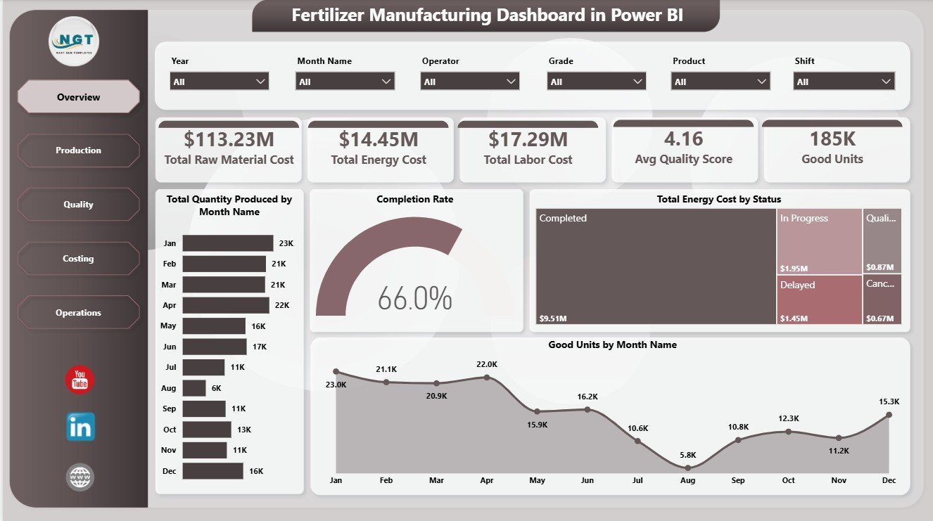
1. Overview Page
The Overview Page is the executive summary of the report. At the top, users can review Total Raw Material Cost, Total Energy Cost, Total Labor Cost, Avg Quality Score, and Good Units. These cards help managers understand whether production cost, quality, and accepted output are moving in the right direction.
Total Quantity Produced by Month Name: This chart shows monthly production volume. It helps users identify seasonality, production peaks, capacity pressure, and months where output drops below expectation.
Completion Rate by Production Status: This visual explains how production is distributed across statuses. It helps teams see whether batches are completed, delayed, pending, or still in process.
Total Energy Cost by Status: This chart connects energy cost with production status. It helps finance and operations teams review whether certain statuses are linked with higher energy consumption.
Good Units by Month Name: This chart focuses on accepted output. It helps teams compare usable production across months and separate true yield from total production volume.
2. Production Page
The Production Page helps supervisors compare product output, shift-level energy cost, and production line contribution. Good Units by Product shows which products are producing the highest accepted units. Total Energy Cost by Shift compares shift-level cost pressure. Total Quantity Produced by Production Line shows which lines are contributing the most production volume.

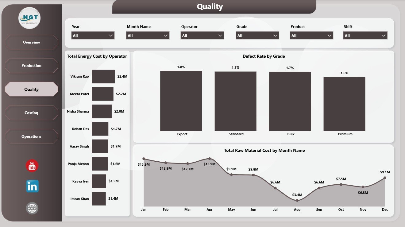
3. Quality Page
The Quality Page supports deeper review of operator cost, defect rate, grade performance, and monthly material cost. Total Energy Cost by Operator highlights operator-level cost differences. Defect Rate by Grade helps identify grades with higher defect issues. Total Raw Material Cost by Month Name shows whether material cost is increasing or decreasing over time.
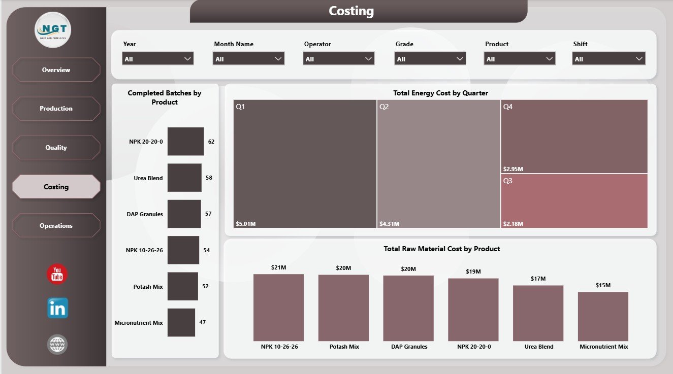
4. Costing Page
The Costing Page is useful for finance, plant leadership, and production planning. Completed Batches by Product shows product-level completion output. Total Energy Cost by Quarter supports periodic cost review. Total Raw Material Cost by Product helps identify which fertilizer products consume the highest material spend.
5. Operations Page
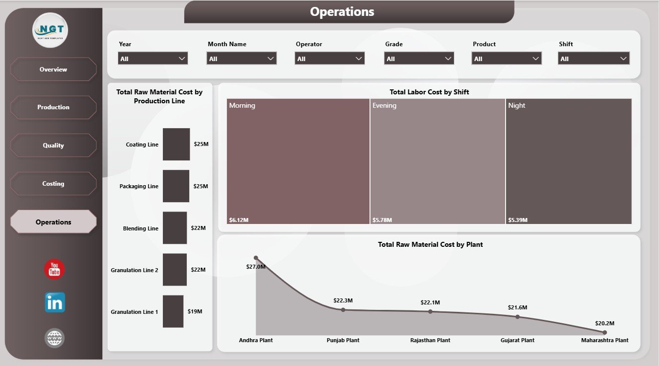
The Operations Page brings together plant, shift, and production line analysis. Total Raw Material Cost by Production Line helps users identify line-level material pressure. Total Labor Cost by Shift compares labor spend across shifts. Total Raw Material Cost by Plant shows which plants carry the highest raw material cost.
Fertilizer Manufacturing Dashboard in Power BI vs. Tableau vs. Paid CRM/SaaS – Feature Comparison
| Feature | This Power BI Dashboard | Tableau Alternative | Paid Manufacturing SaaS |
|---|---|---|---|
| Cost | $17.99 one-time | License plus build time | Monthly or annual fee |
| Platform | Power BI Desktop and Power BI Service | Tableau Desktop or Cloud | Vendor cloud platform |
| Setup time | Open .pbix, replace data, refresh | Requires dashboard build or adaptation | Requires onboarding |
| Real-time team collaboration | Available through Power BI Service setup | Available through Tableau Cloud | Usually included by plan |
| Mobile access | Available after publishing | Available after publishing | Usually included |
| Customizable fields | Editable model, fields, visuals, and measures | Editable if you own the workbook | Limited by vendor settings |
| Share with link | Available through Power BI Service | Available through Tableau Cloud | Login controlled |
| Year-1 cost at 5 users | $17.99 plus any Microsoft licensing | Usually much higher | Often hundreds or thousands |
| Manufacturing analysis | 5 prebuilt report pages | Must be designed | Depends on module |
Who Should Use This Template
This template is useful for fertilizer manufacturers, plant managers, production supervisors, quality control teams, operations analysts, cost accountants, finance managers, and Power BI users who need structured reporting for production, cost, quality, and operations data.
It is not meant to replace a live MES, ERP, MRP, inventory planning system, or shop-floor automation tool. It works best when the team already has clean manufacturing data available for refresh in Power BI Desktop.
Real-World Use Cases
Plant review meeting: A plant manager filters the Overview page by month and reviews raw material cost, energy cost, labor cost, quality score, and good units before the weekly production meeting.
Quality investigation: A quality lead checks defect rate by grade and operator-level energy cost to identify patterns that need process review.
Cost control: A finance analyst uses the Costing page to explain quarterly energy cost movement and raw material cost by product during month-end reporting.
Advantages of Fertilizer Manufacturing Dashboard in Power BI
The main advantage is speed. Instead of creating a new Power BI report from zero, users receive a ready structure with pages, cards, charts, and slicers already arranged for fertilizer manufacturing analysis.
The dashboard also improves consistency. Teams can refresh the same report each month and review performance using the same page structure. This makes comparisons easier and reduces manual reporting work.
Opportunities for Improvement
Teams can extend this dashboard by adding plant-specific KPIs, supplier data, planned vs actual production targets, machine downtime, inventory levels, safety metrics, or customer demand fields. Advanced Power BI users can also add DAX measures, drill-through pages, bookmarks, or role-level security before publishing.
Best Practices
- Keep source data clean and consistent before refreshing Power BI.
- Use standard names for plants, products, shifts, operators, and grades.
- Review KPI cards first, then drill into page-level visuals.
- Validate raw material cost, energy cost, and labor cost fields before month-end reporting.
- Publish through Power BI Service only after checking filters, slicers, and data refresh settings.
Explore Relevant Templates
- Fertilizer Manufacturing Dashboard in Power BI
- Fertilizer Manufacturing Dashboard in Excel
- Fertilizer Manufacturing KPI Dashboard in Power BI
- Power BI Dashboard Templates
Frequently Asked Questions
What is the Fertilizer Manufacturing Dashboard in Power BI?
It is an editable Power BI dashboard template for fertilizer manufacturing production, quality, costing, and operations analysis.
How many pages are included?
The report includes five pages: Overview, Production, Quality, Costing, and Operations.
What KPI cards are shown on the Overview page?
The Overview page includes Total Raw Material Cost, Total Energy Cost, Total Labor Cost, Avg Quality Score, and Good Units.
Can I customize the report?
Yes. Since it is a .pbix file, users can edit visuals, measures, labels, colors, filters, slicers, and report pages in Power BI Desktop.
Do I need Power BI Desktop?
Yes. Power BI Desktop is needed to open, refresh, and customize the report. Power BI Service is optional for online publishing and sharing.
Is this a full manufacturing software system?
No. It is a reporting and analytics dashboard, not a live production execution, inventory, scheduling, or ERP system.
About the Author
Built by PK – Microsoft Certified Professional with 15+ years of Excel, Google Sheets, and Power BI experience. Founder of NextGenTemplates, reaching 300K+ subscribers across YouTube channels. Every template is hand-built and tested before release.
Conclusion
The Fertilizer Manufacturing Dashboard in Power BI gives manufacturing teams a cleaner way to review raw material cost, energy cost, labor cost, quality score, good units, completion rate, defects, plants, shifts, operators, grades, products, and production lines. Instead of building a report from scratch, users can start with a ready structure and adapt it to their own manufacturing data.
Visit our YouTube channel to learn step-by-step Excel, Power BI, and dashboard tutorials.