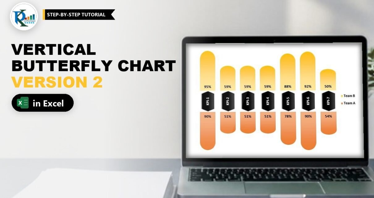
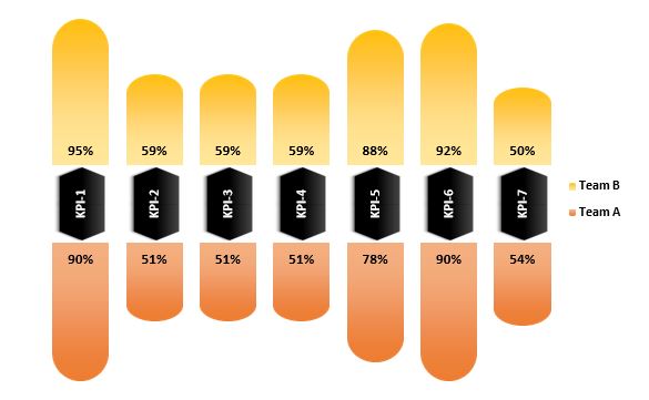
A vertical butterfly chart in Excel compares two teams KPI by KPI, with the KPIs running across the page and the team bars growing up and down from a shared centre line. This is Version 2 of my Stylish Butterfly Chart. In Stylish Butterfly Chart Version 1 the KPIs are stacked from top to bottom; here the same idea is built from columns, which fits wide dashboard spaces better. You need one stacked column chart, three helper columns and a few shapes. The free practice file is below.
⬇️ Download the Practice File
Two sheets (finished chart and practice build) · .xlsx (no macros) · Excel 2013 and later
Watch the Video Tutorial
In the video, PK adds three support columns to seven KPI scores, builds a stacked column chart, hides the blank areas and pastes rounded gradient shapes and a rotated black pentagon label into the visible series. If the player does not start here, watch it on YouTube.
What You Will Build
- A side-by-side comparison of Team A and Team B across seven KPIs, from KPI-1 on the left to KPI-7 on the right.
- Team B columns that grow upwards and Team A columns that grow downwards from the centre.
- Rounded column ends with two-colour gradients.
- A black label in the middle of each column with the KPI name written vertically.
- Percent labels next to the centre and a two-item legend on the right.
Part 1 – Prepare the Data for the Vertical Butterfly Chart in Excel
Step 1: Enter the team scores
The practice file uses seven KPIs, all stored as percentages:
A1: KPI Name   B1: Team A   C1: Team B
A2: KPI-1      B2: 90%      C2: 95%
A3: KPI-2      B3: 51%      C3: 59%
A4: KPI-3      B4: 51%      C4: 59%
A5: KPI-4      B5: 51%      C5: 59%
A6: KPI-5      B6: 78%      C6: 88%
A7: KPI-6      B7: 90%      C7: 92%
A8: KPI-7      B8: 54%      C8: 50%
Turn off the gridlines from View > Gridlines.
Step 2: Add the three support columns
D1: KPI Name Size           D2:D8: 50%
E1: Blank Area for Team A   E2: =100%-B2
F1: Blank Area for Team B   F2: =100%-C2
Fill E2 and F2 down to row 8 and format the new columns as percentages.
How the helper columns work
- KPI Name Size is the height of the middle block that holds the KPI name.
- Blank Area for Team A (
=100%-B2) is the invisible space under Team A. Because Team A plus its blank always equals 100%, every Team A column starts at the same centre line and hangs down by its own score. - Blank Area for Team B (
=100%-C2) is the invisible space above Team B, so Team B grows up from the same centre line. - Every column therefore totals 100% + 50% + 100% = 250%, which fixes the axis setting in Step 4.
Part 2 – Build the Stacked Column Chart
Step 3: Insert a 2-D stacked column chart
Select the table (A1:F8) and go to Insert > Column Chart > 2-D Stacked Column. With seven KPI rows and five value columns, Excel already uses the columns as series and the KPIs as categories, so you do not need Switch Row/Column here (Version 1 needed it).
Step 4: Gap width and axis
Right-click a column, choose Format Data Series and change Gap Width from 150% to about 30%. Then right-click the vertical axis, choose Format Axis and set Minimum to 0 and Maximum to 2.5. That is the 250% total of each column, so all columns line up top and bottom.
Step 5: Put the series in the right order
Right-click the chart, choose Select Data and use the move arrows until the list reads:
- Blank Area for Team A
- Team A
- KPI Name Size
- Team B
- Blank Area for Team B
The first series sits at the bottom of each stack and the last at the top, so this order gives you blank space, Team A, the KPI block, Team B and blank space from bottom to top.
Step 6: Hide the blanks and clean up
- Select Blank Area for Team A and set Shape Fill to No Fill. Do the same for Blank Area for Team B.
- Delete the axes, the gridlines and the chart title.
Part 3 – Make the Columns Stylish
Step 7: Draw the rounded shape
Go to Insert > Shapes > Rectangles and choose Round Same Side Corner Rectangle. Draw it, drag the yellow handle all the way so the top becomes a full half circle, and adjust the height so it looks like a column.
Step 8: Add a gradient
Right-click the shape and open Format Shape. Set Line to No line and Fill to Gradient fill. Delete the extra gradient stops so only two remain, pick your two colours, set Type to Linear and Direction to Linear Down.
Step 9: Paste one shape into each team
Copy the shape, click the Team B series (the upper columns) and paste. Then select the shape again, change its two gradient colours and go to Shape Format > Rotate > Flip Vertical so the rounded end points down. Copy it, click the Team A series and paste. In the video Team B ends up orange and Team A gold; the finished sheet in the practice file uses gold for Team B and orange for Team A. Either works, as long as the two teams have clearly different colours.
Step 10: Build the KPI label shape
Insert a Pentagon (Arrow: Pentagon from Block Arrows) and use Rotate > Rotate Right 90° so it points down. Copy it, paste a second one and use Flip Vertical on the copy so it points up. Place the two together, select both and apply the black shape style. Copy both shapes, click the KPI Name Size series and paste.
Part 4 – Add Labels and the Legend
Step 11: Team value labels
Add data labels to Team A and Team B. In Format Data Labels set Team A to Inside End and Team B to Inside Base. Both positions put the number right next to the centre. Make these labels black, bold and a little bigger.
Step 12: Vertical KPI name labels
Add data labels to KPI Name Size, tick Value From Cells, select the KPI names in A2:A8, click OK and untick Value. Then open Size & Properties > Alignment > Text direction and choose Rotate all text 270°, so each name reads from bottom to top inside the narrow black label. Make the font white and bold.
Step 13: Legend
Click the legend, then click the entries for the two blank areas and KPI Name Size one at a time and press Delete. Only Team A and Team B remain. Right-click the legend, choose Format Legend, set the position to Right, and make it black and bold. Resize the chart to suit your page.
Now change any score in B2:C8 and the matching column grows or shrinks, while the KPI labels stay perfectly lined up in the middle.
Version 1 vs Version 2
Both versions use the same three helper columns and the same 250% axis trick. Version 1 uses a stacked bar chart, so KPIs go down the page and teams spread left and right; it suits a tall, narrow space. Version 2 uses a stacked column chart, so KPIs go across and teams spread up and down; it suits a wide strip on a dashboard. PK calls Version 2 the horizontal layout because the KPIs run horizontally.
Common Errors and Fixes
- Columns do not line up in the middle. The axis maximum is on Auto. Set it to 2.5, or to 2 plus your KPI Name Size if you changed it (for example 3 for 100%).
- Team A grows up instead of down. Blank Area for Team A is not first in the series list. Fix the order in Select Data.
- The KPI names are cut off. Rotate the label text 270° or raise KPI Name Size and the axis maximum together.
- Excel asks to update links when you open the practice file. The workbook contains four leftover named ranges that point to another file. They are not used by the chart, so you can choose Don’t Update, or remove them in Formulas > Name Manager. (Observed in the file; fix is an addition, not from the video.)
Tips
- Keep scores between 0% and 100%; the blank-area formulas assume it.
- To add an eighth KPI, add a row to the table and extend each series range in Select Data.
- Use the same shape method with your company colours to match a dashboard theme.
- For a refresher on chart elements, see Microsoft’s guide to creating a chart from start to finish.
Want It Ready-Made?
For more ways to compare two teams, the Dynamic Comparison in Butterfly Chart template on NextGenTemplates.com gives you a ready-made side-by-side comparison that updates as you enter data, and you can browse more Excel charts and visualization templates. To put charts like this into complete reports, see Excel Pivot Tables and Dashboards on NextGenTemplates Academy.
Related Tutorials
- Stylish Butterfly Chart Version 1
- Dynamic Comparison in Butterfly Chart
- Team Comparison with Tornado or Butterfly Charts in Excel
- Stylish and Dynamic Comparison Chart
- Comparison Infographic in Excel
Frequently Asked Questions
What is a vertical butterfly chart?
It is a butterfly chart built from columns instead of bars. The categories run across the page, one group grows upwards and the other grows downwards from a shared centre.
Why do I need blank area columns?
Each blank area is 100% minus a team score. It fills the space so every team column starts exactly at the centre line, no matter how big or small the score is.
Why is the axis maximum 2.5?
Each column adds up to 100% for Team A and its blank, 50% for the KPI block and 100% for Team B and its blank. That is 250%, so a maximum of 2.5 keeps every column the same height.
How do I write the KPI names vertically?
Format the KPI Name Size data labels, open the Size and Properties tab and set Text direction to Rotate all text 270 degrees.
Which version should I use, 1 or 2?
Use Version 1 for a tall, narrow space and Version 2 for a wide space. The data and helper columns are the same in both.
About the Author
PK is a Microsoft Excel expert and trainer and the founder of PK: An Excel Expert and NextGenTemplates.com. He has been teaching Excel, VBA, Power Query and Power BI since 2016 on his YouTube channel.
Conclusion
A vertical butterfly chart in Excel uses the same recipe as Version 1, turned on its side: blank-area helper columns, a stacked column chart with the series in the right order and a 250% axis, rounded gradient shapes pasted into the team series, and rotated Value From Cells labels for the KPI names. Download the practice file, rebuild it on the second sheet, and then drop it into any wide dashboard where you need a quick two-team comparison.