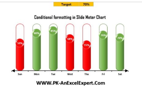
We have created an attractive visualization to display multiple KPI performance in Excel. We have used Excel auto shapes to create this visualization. RAG (Red, Amber, and Green) color changes dynamically to display the KPI performance. This is a ready to use template for Multiple KPIs Visualization in Excel
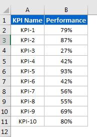
This visualization can be used for any type of KPI data type like – Numbers, percentages or decimals etc.
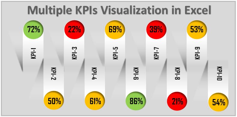
Multiple KPIs Visualization in Excel
We have displayed below given sample KPIs on the visualization –
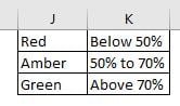
We have used color code as per below given conditions.
Below is the snapshot of below given visualization –
Click to buy Multiple KPIs Visualization in Excel
Visit our YouTube channel to learn step-by-step video tutorials
Watch the step by step video tutorial:
Click to buy Multiple KPIs Visualization in Excel