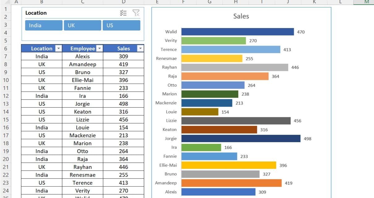
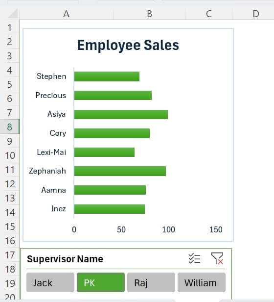
PKComments Off on Quick Dynamic Sales by Employees chart with Slicer in Excel
Excel is a powerful tool which can be used for a wide range of business applications, for analyzing data, creating charts and graphs etc. One useful feature in Excel is
PKComments Off on 3D Chart for Weekly Sale in Excel
Data visualization is a robust strategy for presenting and analyzing vast amounts of data, uncovering trends, patterns, and relationships that may have been previously concealed. 3D charts are a
PKComments Off on Annual Sales Calendar for Sales Dashboard in Excel
In this article, we have created an Annual Sales Calendar for Sales Dashboard in Excel. You can use this Sales Calendar in your sales dashboard. We have used the Combo
PKComments Off on Dynamic Comparison in Butterfly Chart
Dynamic Comparison in Butterfly Chart is useful when you want to compare the Sales or any other parameter for two employees or two Teams for multiple dates. We have used
PKComments Off on Dynamic Sales Funnel Chart with Slicers
In this article you will learn how to create dynamic Sales Funnel Chart with Slicers. This Chart can be used in your business dashboard or presentations. Below are the data
Fish Chart is my lasted innovation. I have used it to display sales data points. The new thing is that fishes are getting changed randomly whenever worksheet is recalculated. I
Today I have come with a beautiful Filling Stacked Column Chart. In this chart I have showcased day wise Sales Conversion. There are 5 circles for 100% each for 20%.
Using the info-graphics in the charts is very nice idea. It will increase the visual appeal and audience attention of your report or dashboard. We have created 4 different charts
Line charts, as an efficient means of tracking and showcasing data trends over time, have become a go-to solution for visualizing metrics such as sales, revenue, and others. However, conventional