Data visualization is a robust strategy for presenting and analyzing vast amounts of data, uncovering trends, patterns, and relationships that may have been previously concealed.
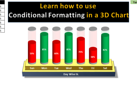
3D charts are a distinctive and engrossing form of data visualization that presents information in a three-dimensional format. These charts offer a dynamic approach to presenting data, making them ideal for creating captivating presentations and reports.
In this blog, we delve into the intricacies of creating a 3D Chart for weekly sales in Excel. With step-by-step guidance, we’ll explore the process of setting up the data, creating the chart, customizing it, and interpreting the results. By the conclusion of this guide, readers will possess a thorough understanding of how to create and utilize 3D charts for weekly sales to effectively analyze and present data.
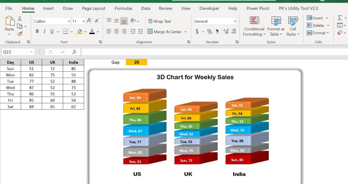
We have displayed a dynamic gap between each stack in the chart. You can use it in your Sales Dashboard.
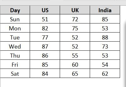
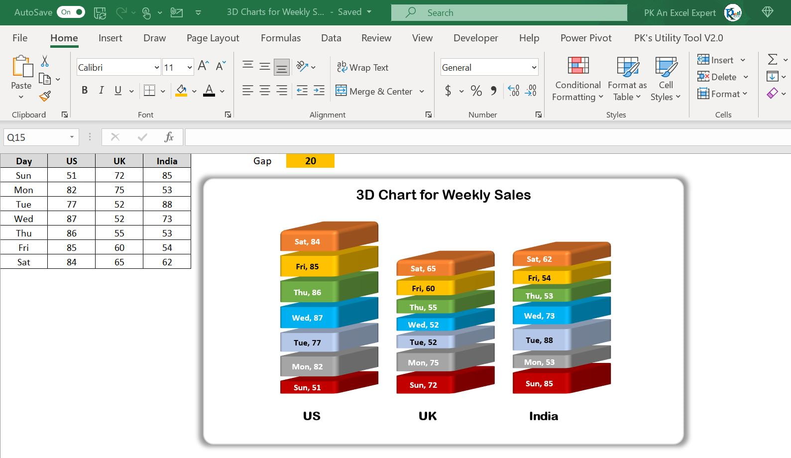
Data Points: Below are the data points for chart:
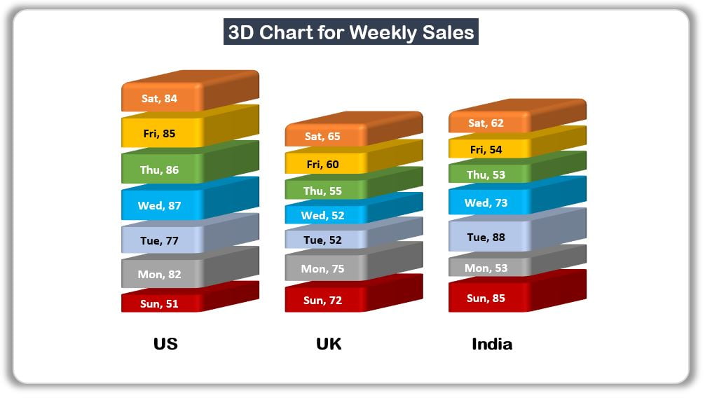
3D Chart for Weekly Sale
Below is the 3D chart using above data points:
Click to buy 3D Chart for Weekly Sale in Excel
Gap: You can change the gap number highlighted in yellow cell
Click to buy 3D Chart for Weekly Sale in Excel
Visit our YouTube channel to learn step-by-step video tutorials
Watch the video below to learn how to make a Weekly Sales 3D chart in Excel.
Click to buy 3D Chart for Weekly Sale in Excel