Part of the free Module 9: Advanced Charts and Infographics · Lesson 2 of 8 · Full Excel course
Updated on 5 September 2026 · Works in Excel 365, 2021, 2019 and 2016 unless noted.
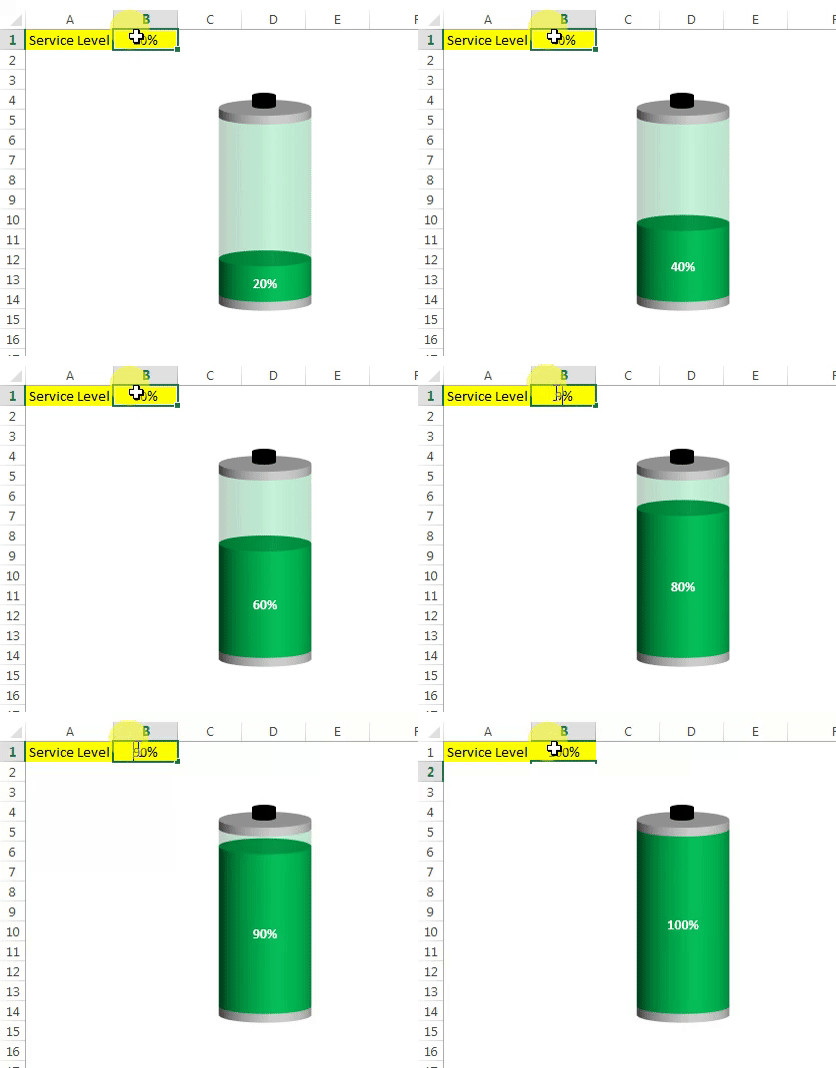
A battery chart in Excel shows a single KPI, such as service level or budget used, as the charge level of a battery: a green fill rises inside a grey-capped cylinder as the value increases. Excel has no battery chart type, so you build it from a 3-D stacked column chart and one shape. This lesson builds the chart from a blank sheet and links it to a cell so the level moves automatically.
How a battery chart works
The chart is a stacked column with four series: an upper cap, the KPI value, the blank remainder and a lower cap. Switching rows and columns stacks them in one cylinder. The caps are coloured grey, the value green, and the remainder becomes a transparent green so the battery looks partly charged. A small Magnetic Disk shape on top completes the terminal.
Battery charts suit dashboard tiles where one percentage must be read instantly and the metaphor of full or empty helps a non-technical reader. They build the same way in Excel 2013 through Microsoft 365 and need no VBA.
The support data explained
| Cell | Entry | Purpose |
|---|---|---|
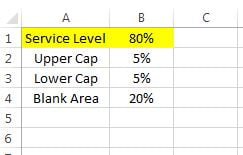
| A1 / B1 | Service Level / 80% | The KPI. Link B1 to your data or type a value |
| A2 / B2 | Upper Cap / 5% | Grey band at the top of the battery |
| A3 / B3 | Lower Cap / 5% | Grey band at the bottom |
| A4 / B4 | Blank Area / =100%-B1 |
The uncharged part; drawn as transparent green |
The KPI plus the blank area always equals 100 percent, so the body of the battery keeps the same height while the green level moves. The two caps add a fixed 10 percent on top.
Step 1: set up the data
- In A1 type the metric name (Service Level) and in B1 its value (80%).
- In A2 type Upper Cap and in B2 enter 5%; in A3 type Lower Cap and in B3 enter 5%.
- In A4 type Blank Area and in B4 enter
=100%-B1.
Step 2: insert and shape the column
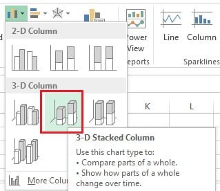
- Select A1:B4 and go to Insert > Charts > Insert Column or Bar Chart > 3-D Column > 3-D Stacked Column.
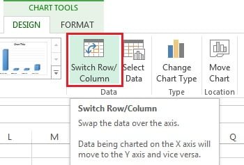
- With the chart selected, open the Chart Design tab (Design under Chart Tools in Excel 2016 and 2019) and click Switch Row/Column so all four values stack in one column.
- Click the plus sign beside the chart and untick Axes, Chart Title and Gridlines. Before you untick Axes, it is worth fixing the vertical axis maximum at 1.1 (see the tips section) so the battery height never changes.
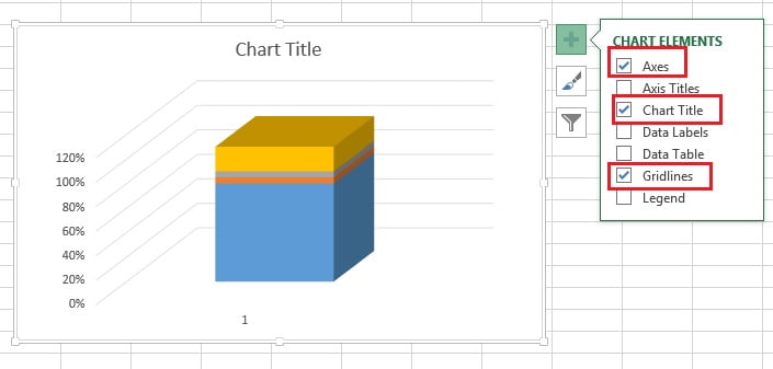
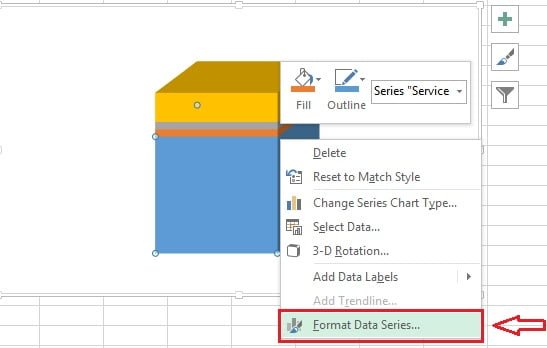
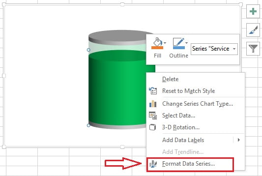
- Right-click the column and choose Format Data Series.
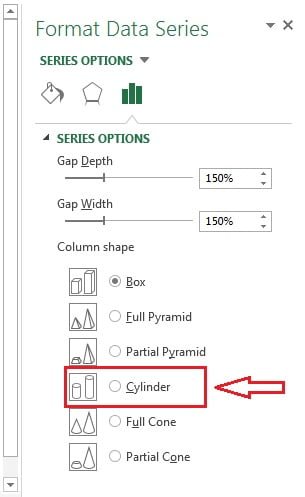
- Under Column Shape select Cylinder.
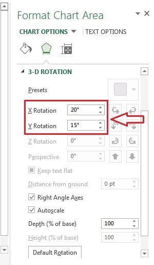
- Right-click the cylinder and choose 3-D Rotation.
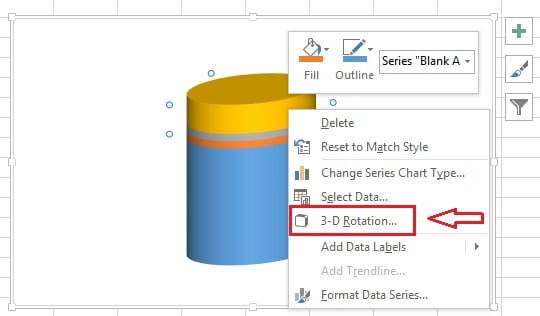
- Set X Rotation to 0 degrees (default 20) and Y Rotation to 10 degrees (default 15) so the battery stands upright.
Step 3: order and colour the series
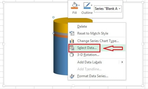
- Right-click the cylinder and choose Select Data.
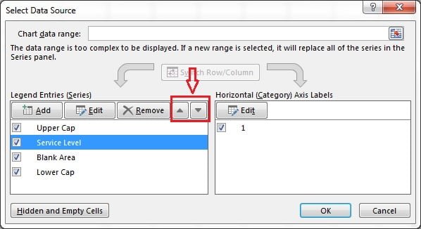
- Use Move Up and Move Down so the series list reads, from top to bottom: Upper Cap, Service Level, Blank Area, Lower Cap. Click OK.
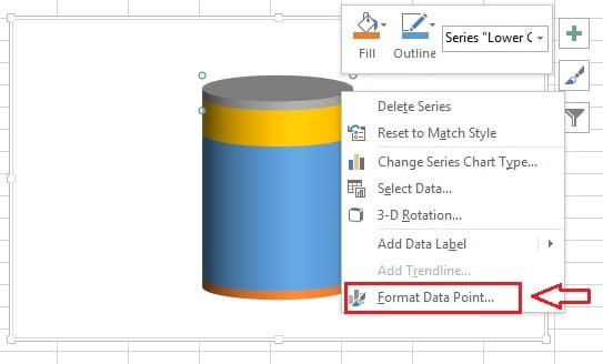
- Right-click the Upper Cap segment and choose Format Data Point.
- Click the Fill & Line icon in the pane.
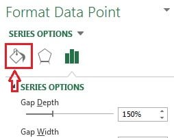
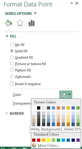
- Choose Solid fill and set the colour to grey. Repeat for the Lower Cap (grey), the Service Level segment (green) and the Blank Area (the same green).
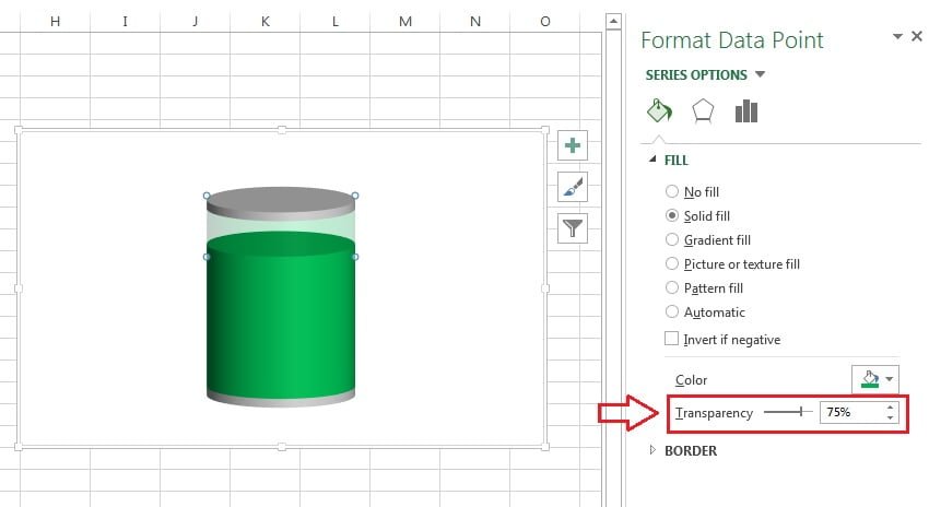
- Select the Blank Area segment and set its Transparency to 75% so it reads as the empty part of the battery.
- Right-click the battery and choose Format Data Series again.
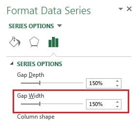
- Under Series Options set Gap Width to 300% (default 150%) to make the battery slimmer.
Step 4: add the terminal cap and the label
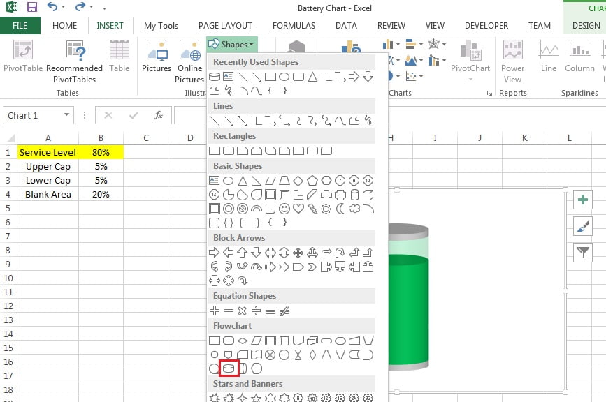
- With the chart selected, go to Insert > Shapes > Flowchart > Magnetic Disk and draw the shape.
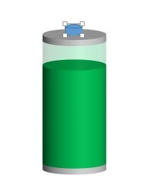
- Resize the shape to a small cap that matches the battery width and place it on top of the cylinder.
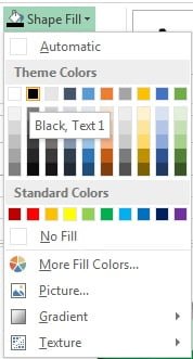
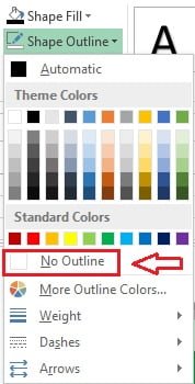
- Select the shape and choose Format > Shape Fill > Black.
- Choose Format > Shape Outline > No Outline.
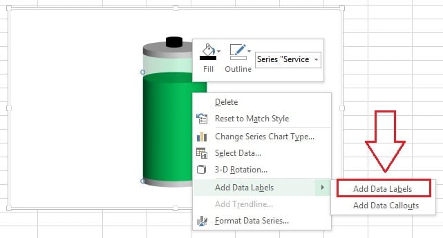
- Right-click the green Service Level segment and choose Add Data Labels. Set the label font to white, size 11, so the percentage reads clearly on the green fill.
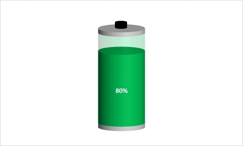
The battery chart is complete. Change the value in B1 and the green level moves.
Worked example: a battery that turns red below target
A call centre wants the battery green at or above 70 percent and red below it. Extend the support data with two conditional series.
| Cell | Label | Formula |
|---|---|---|
| B1 | Service Level | 62% |
| B5 | Green Fill | =IF(B1>=70%,B1,0) |
| B6 | Red Fill | =IF(B1<70%,B1,0) |
| B4 | Blank Area | =100%-B1 |
- Open Select Data, remove the Service Level series and add Green Fill (B5) and Red Fill (B6) in its place, ordered Upper Cap, Green Fill, Red Fill, Blank Area, Lower Cap.
- Colour Green Fill green and Red Fill red. Only one of them is non-zero at any time, so the battery shows a single colour.
- Type 62% in B1: the battery shows a red level at 62 percent. Type 85%: it switches to green at 85 percent.
Result: one chart that changes colour with the KPI, with no conditional formatting or VBA.
Download the practice file and video
Click the chart below to download the finished battery chart workbook and compare it with your own. A styled, ready-to-paste version is available at NextGenTemplates.
When to use a battery chart
- A single percentage KPI with an obvious full level: service level, budget used, capacity, course completion.
- Dashboard tiles where a familiar metaphor helps non-technical readers.
- Not for negative values, values above 100 percent, or comparing many categories; use a bar chart for those.
Tips and common mistakes
- Switch Row/Column first. If the four segments appear side by side instead of stacked, this step was skipped.
- Fix the axis before hiding it. Open Format Axis, type 0 for Minimum and 1.1 for Maximum, then remove the axis. On Auto the battery rescales whenever the KPI changes.
- Use a 3-D chart. Cylinder shape and 3-D rotation are only available on 3-D column charts, not 2-D.
- Cap the input. Wrap the KPI in
MIN(B1,100%)so an over-achieved value does not overflow the battery. - Group the parts. Select the chart and the cap shape and press Ctrl+G so they move and resize together.
- Keep the caps small. 5 percent each is enough; larger caps distort the apparent charge level.
- Clear the background. Set the chart area fill to No fill so the battery sits cleanly on a coloured dashboard.
Practice exercise
- Build the basic battery with a KPI of 80 percent, then change it to 20, 50 and 100 percent and check the caps stay in place.
- Add the red and green conditional series from the worked example with a threshold cell instead of a fixed 70 percent.
- Build a three-colour version (red below 60, amber 60 to 85, green above 85) using three IF formulas.
- Copy the finished chart twice and point the copies at two other KPIs to make a row of three batteries.
Key takeaways
- A battery chart is a 3-D stacked column with four series: cap, value, blank area, cap.
- Switch Row/Column stacks the series in one cylinder; Cylinder shape and 3-D rotation give it the rounded body.
- The blank area is the same green at 75 percent transparency, which creates the uncharged look.
- A Magnetic Disk shape forms the terminal; group it with the chart.
- Conditional colours come from extra series with IF formulas, not from conditional formatting.
Related lessons
- Advanced Charts and Infographics course hub
- Test tube chart in Excel
- Speedometer chart in Excel
- Progress circle chart in Excel
- Stacked column chart basics
- IF function for the conditional colour series
- Microsoft Support: Create a chart from start to finish
Frequently asked questions
Why is the battery chart built from a 3-D column chart?
Only 3-D column charts offer the Cylinder column shape and the 3-D rotation controls, which give the battery its rounded body and upright stance. A 2-D version is possible with a plain stacked column and rounded shapes, but it looks flat and needs more manual drawing.
How do I make the battery turn red when the KPI is low?
Replace the single value series with two series driven by IF formulas, for example =IF(B1<70%,B1,0) for red and =IF(B1>=70%,B1,0) for green. Stack both in the chart and colour each one. Because only one is non-zero at a time, the battery shows a single colour that switches at the threshold.
Can I show several batteries side by side?
Yes. The quickest way is to copy the finished chart and point each copy at a different KPI row. Alternatively, put each KPI in its own column of the support table, insert one 3-D stacked column chart and skip Switch Row/Column, then add a cap shape above each cylinder.
Why does the battery change height when I change the value?
The vertical axis is still set to Auto, so Excel rescales it to the new total. Open Format Axis, type 0 as the Minimum and 1.1 as the Maximum so the bounds switch to Reset, then hide the axis. The body will keep the same height and only the green level will move.
Does the battery chart work in Excel for the web or on a Mac?
Excel for Mac supports 3-D column charts, Cylinder shape and 3-D rotation, so the build works there. Excel for the web can display the finished chart but does not expose the Column Shape and 3-D rotation options, so build it in desktop Excel and share the file.
Want the finished version? Ready-made Excel battery charts, dashboards and KPI templates are available at NextGenTemplates.com.