Introduction
Comparative Analysis is very important for each business. Using these analysis they can see the insights how they are performing over a period of time. And, which product, service for employee is doing good or bad. Our recent project, showcased in a concise video on YouTube, delves into constructing a Comparative Analysis Dashboard in Microsoft Power BI. This dashboard doesn’t just display data, but it also tells a story. We are comparing Current Year Sales with Previous Year sales and highlighting Year-over-Year (YoY) sales growth percentage. Additionally, it provides a comprehensive view of Budgeted Sales data alongside Budget Variance%, offering a clear picture of performance versus expectations.
Click to buy Comparative Analysis Dashboard in Power BI
Understanding the Comparative Analysis Dashboard
Click to buy Comparative Analysis Dashboard in Power BI
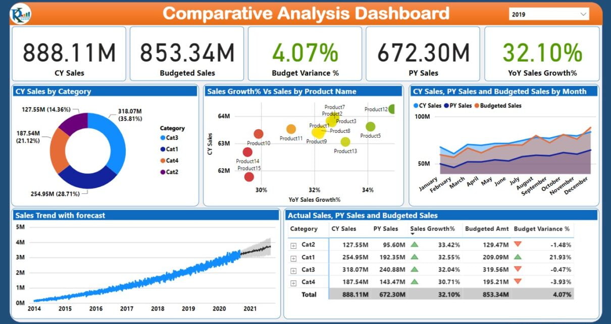
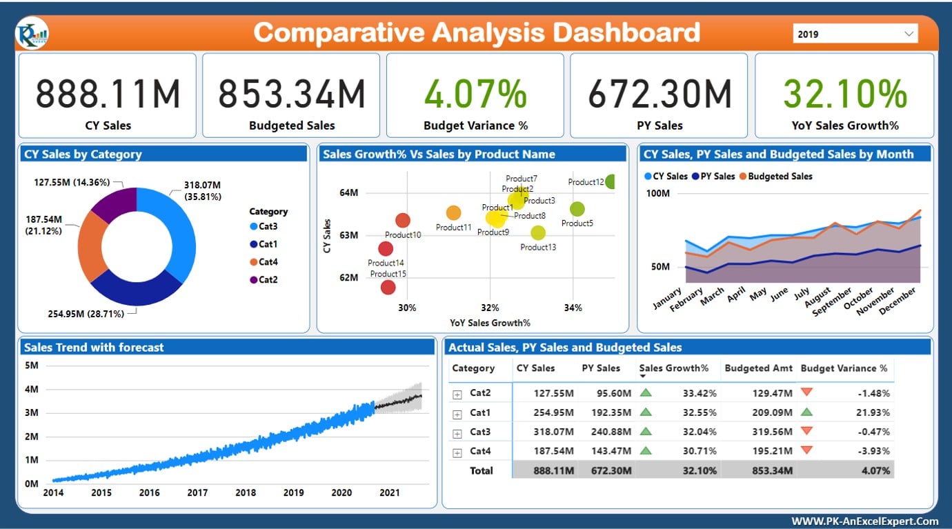
On the top card, we have displayed the cards for CY Sales, Budget Sales, Budget Variance, PY Sales and YOY Sales Growth. From the top write corner, you can select the year using slicer.
In the middle of the page, we are showing the Current Year Sales by category in a doughnut chart. Sales Growth% and Sales amount by Product on a scatter chart. The Monthly trend of the CY Sale, PY Sales and Budget Sales.
At the bottom of the dashboard, we are showing Sales Trend with the Sales Forecast. And, a Table with conditional formatting with CY Sales, Budget Sales, Budget Variance, PY Sales and YOY Sales Growth by Product and Category.
Watch the step by step video tutorial:
Click to buy Comparative Analysis Dashboard in Power BI
Below is the live dashboard.
Click to buy Comparative Analysis Dashboard in Power BI
Conclusion
In our journey to create a Comparative Analysis Dashboard in Power BI, we’ve aimed to bring your data to life in a way that’s both insightful and accessible. Our YouTube video stands as a guidepost for those eager to harness the analytical power of Power BI, offering a step-by-step blueprint for turning raw data into a compelling narrative of your business’s journey. Join us in exploring the capabilities of Power BI and unlock the stories your data is just waiting to tell.
Visit our YouTube channel to learn step-by-step video tutorials
Click to buy Comparative Analysis Dashboard in Power BI