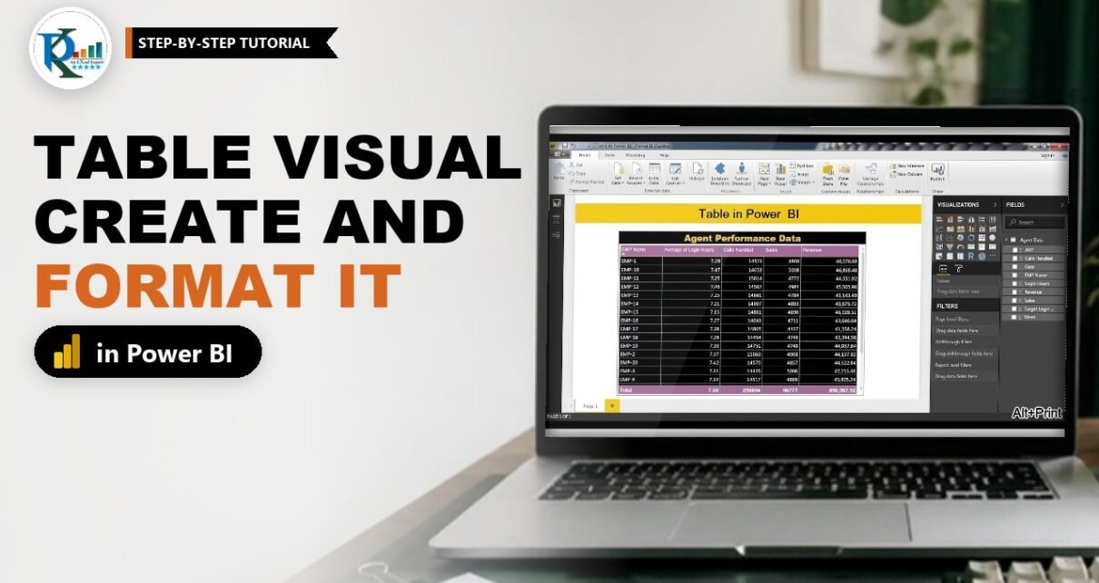
A table in Power BI is the quickest way to show exact numbers: one row per item, one column per field, and a total row at the bottom. In this tutorial you build PK’s agent performance table from a call centre data set, fix the classic “same name repeated many times” problem with the right aggregation, sort it, and then format every part of it: style, gridlines, headers, values, totals, conditional formatting and the title. Every step uses the current Power BI Desktop names, and the practice file is free to download.
⬇️ Download the Practice File
ZIP (81 KB) · Table in Power BI.pbix (the agent data is already loaded in the file)
Watch the Video Tutorial
PK imports the agent data, builds the table, fixes the aggregations and then walks through every formatting option. The video was recorded in 2017, so the Format pane looks different today; the steps below use the current names.
What You Will Build
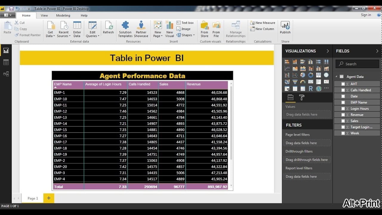
- A table visual with EMP Name, Average of Login Hours, Calls Handled, Sales and Revenue for 20 agents.
- Correct aggregations, so every employee appears on one row and the total row adds up properly.
- Sorting by clicking any column header.
- A custom look: teal vertical gridlines, a yellow border, purple column headers and totals, and white text on black rows.
- Conditional formatting on Average of Login Hours and a title that reads Agent Performance Data.
The Practice Data
PK’s Excel workbook has two sheets, Agent Data and Employee List. Only Agent Data is used. It holds daily rows for 20 agents (EMP-1 to EMP-20) with these columns: Date, Week, EMP Name, Calls Handled, Sales, AHT, Login Hours, Target Login Hours and Revenue. The download is the finished .pbix with this data already loaded.
Part 1: Create a Table in Power BI
Step 1: Load the agent data
In a new file select Home > Get data > Excel workbook and open the workbook. In the Navigator, tick Agent Data only and click Load. The columns appear under Agent Data in the Data pane (called Fields in older versions).
Step 2: Add the table visual
Click an empty part of the canvas and, in the Visualizations pane, click the Table icon. An empty table appears; drag its corners to give it room.
Step 3: Add the fields in order
Drag the fields into the Columns well (on the Build visual tab) in this order: EMP Name, Login Hours, Calls Handled, Sales and Revenue. The order in the well is the order of the columns in the table.
- To remove a column, click the X next to the field in the well.
- To move a column, drag the field up or down inside the well. PK moves Revenue above Sales to show this, then puts it back.
Step 4: Fix the aggregations so each employee appears once
At this point you see EMP-1 many times. The reason is Revenue: it is set to Don’t summarize, so Power BI shows every distinct revenue value as its own row. Fix it in the Columns well:
- Click the drop-down arrow next to Login Hours and choose Average. The header changes to Average of Login Hours, which is the meaningful number for hours per day.
- Leave Calls Handled and Sales on Sum.
- Click the arrow next to Revenue and choose Sum.
Now each employee appears once. The total row shows an average of 7.33 login hours, 293,694 calls handled, 96,777 sales and revenue of 893,987.92.
How the aggregation works
A table groups by every column that is not summarised. With Revenue on Don’t summarize, it groups by EMP Name plus Revenue. Once every number column is summarised, EMP Name is the only grouping column and you get one row per agent. The total row uses the same aggregation as its column, which is why login hours show an average and the others show a sum.
Step 5: Sort the table
Click a column header to sort by it, and click again to reverse the order. A small arrow under the header shows the active sort. PK sorts by Average of Login Hours, ascending first and then descending. You can also use More options (…) > Sort axis on the visual header.
Tip: use Focus mode (the expand icon on the visual header) to see the table full screen while you format it, then click Back to report.
Part 2: Format the Table in Power BI
Select the table and click the Format visual icon (the paintbrush) in the Visualizations pane. The Visual tab formats the table and the General tab handles size, title and border. The values are PK’s from the practice file.
Step 6: Pick a style preset
Under Visual > Style presets choose a starting style. The list includes Default, None, Minimal, Bold header, Alternating rows, Contrast alternating rows, Flashy rows, Bold header flashy rows, Sparse and Condensed. Your settings in the next steps override it.
Step 7: Set the gridlines and border
Expand Visual > Grid:
- Vertical gridlines: on, colour teal (#01B8AA), width 2.
- Horizontal gridlines: PK changes the colour and width to show the options, then turns them off in the final file.
- Borders: a yellow (#F2C80F) border of width 1. This was called Outline in the 2017 version.
- Options > Row padding: 3. Row padding works like row height in Excel.
- Options > Global font size: 12. (Text size in the video, raised from 8 to 12).
Step 8: Format the column headers
Expand Visual > Column headers and set the Background color to purple (#A66999), the Text color to white, the font to Arial Unicode MS and the size to 13. Two options are worth understanding:
- Column width: PK turns on auto-size column width in the video. In the current version this setting lives under Visual > Layout > Column width: set Auto-size behavior to Fit to content so the columns fit their contents, or to Fixed width to keep the widths you set.
- Text wrap: on, a long header such as Average of Login Hours wraps to two lines. Off, it is cut off with an ellipsis and the full name only shows on hover.
Step 9: Format the values
Expand Visual > Values. Set the Text color to white and the Background color to black. Then set the Alternate text color to white and the Alternate background color to black too, so every row looks the same. Keep Text wrap on and set the font size to 14.
The URL icon card is useful when a column holds web addresses: turn it on and Power BI shows a small link icon instead of the full URL.
Step 10: Format the total row
Expand Visual > Totals. Turning Values off hides the total row; PK keeps it on. Set the Background color to the same purple as the headers so the table has a frame top and bottom, keep the text white, and pick the same font as the header.
Step 11: Format a single column
To change one column only, expand Visual > Specific column, choose the column under Series (PK picks Calls Handled) and set its text or background colour. PK shows the effect and then reverts it.
Step 12: Add conditional formatting
Expand Visual > Cell elements and set Series to Average of Login Hours. Turn on Background color and Power BI shades each cell on a colour scale from the lowest to the highest value. In the same card you can turn on Font color, Data bars or Icons. Click the fx button next to an option to set your own colours and rules; PK covers the custom rules in his next video.
Step 13: Add the title, background and border
Switch to the General tab:
- Title: turn it on, type Agent Performance Data in Text, set the text colour to yellow, the background to black, Horizontal alignment to center, the font to Arial Black and the size to 16. In Focus mode the title is hidden, so click Back to report to see it.
- Properties: set an exact Size (height and width) and Position instead of dragging.
- Effects: add a Background colour for the empty area of the visual and a Visual border around it.
Finally, PK adds a text box at the top of the page with Table in Power BI in bold, size 44, centred, as the page heading.
Common Errors and Fixes
The same name appears on many rows
A numeric column is set to Don’t summarize. Open the drop-down next to each number field in the Columns well and pick Sum or Average.
The total is wrong or blank
A total uses the column’s aggregation. An average column totals as an average, and a column on Don’t summarize has no total. Check the aggregation, or turn Totals off if a total makes no sense for that column.
The header is cut off with dots
Turn on Text wrap under Column headers, or set Visual > Layout > Column width > Auto-size behavior to Fit to content so the column grows to fit.
The title does not show
You are in Focus mode, which hides the title. Click Back to report.
Tips
- Use a Matrix instead of a table when you want row and column groups, such as employees by week. This is an addition to the video.
- Pair the table with drillthrough or a report page tooltip to show more detail without making it wider.
- Microsoft’s guide to tables in Power BI reports covers every formatting card in the current version.
Want It Ready-Made?
If you work with call centre numbers like these, the Call Center Operations Dashboard in Power BI on NextGenTemplates.com gives you a finished, interactive report with formatted tables, KPI cards and charts that you can load with your own data. Browse all Power BI dashboard templates for more.
Related Tutorials
- Power BI Drillthrough: Filtered Detail Pages, Step by Step
- Power BI Tooltips: Format and Create Report Page Tooltips
- Dynamic Conditional Formatting in Power BI
- Power BI Dashboard Design: Make Your Report Look Like an App
Frequently Asked Questions
What is the difference between a table and a matrix in Power BI?
A table shows a flat list with one row per item and a total row. A matrix adds row and column groups with subtotals, like a pivot table in Excel.
Why does my Power BI table repeat the same name?
One of the number columns is set to Don’t summarize, so each of its values becomes its own row. Change that column to Sum or Average in the Columns well.
How do I sort a table in Power BI?
Click the column header to sort by that column and click again to reverse it. You can also use More options, Sort axis on the visual header.
How do I change the header colour of a Power BI table?
Select the table, open Format visual, Visual, Column headers and change the background color and text color.
Can I add conditional formatting to a Power BI table?
Yes. Open Format visual, Visual, Cell elements, pick the column under Series and turn on background color, font color, data bars or icons.
About the Author
PK is a Microsoft Excel and Power BI expert and trainer and the founder of PK: An Excel Expert and NextGenTemplates.com. He has been teaching Excel, VBA, Power Query and Power BI since 2016 on his YouTube channel.
Conclusion
A table in Power BI takes a minute to create, and the real work is in the details: summarise every number column so each item appears once, sort by the column that matters, and then use the Visual tab for gridlines, headers, values, totals and conditional formatting and the General tab for the title. Download the practice file, rebuild the agent performance table, and then add drillthrough or a tooltip to take it further.