In this article, you will learn how to use Weightage Analysis Template in Microsoft Excel. Weightage Analysis is used to get the Weightage Score calculation based on different parameters.
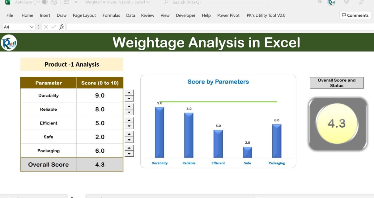
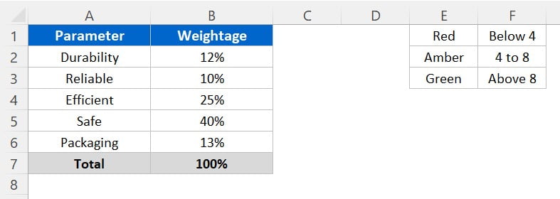
In this video, I will explain you, how to get the Overall score of a Product Performance based on various parameters. We have given the different weightages to all the parameters like – Durability, Reliable, Efficient, Safe and Packaging. Total of these weightages should be exact 100%
Weightage Analysis Template in Microsoft Excel
Click to buy Weightage Analysis Template in Microsoft Excel
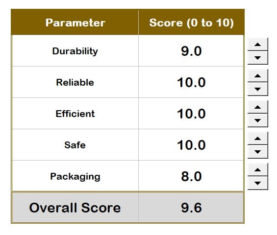
In this table, we have entered the score between 0 to 10 in front of each parameter. Based on given Weightage Analysis Template on the Weightage sheet tab, it is calculating the Overall score for that Product.
You can change the score for any product using the spin button in front of each parameter or you can type it manually in the relevant cell.
Click to buy Weightage Analysis Template in Microsoft Excel
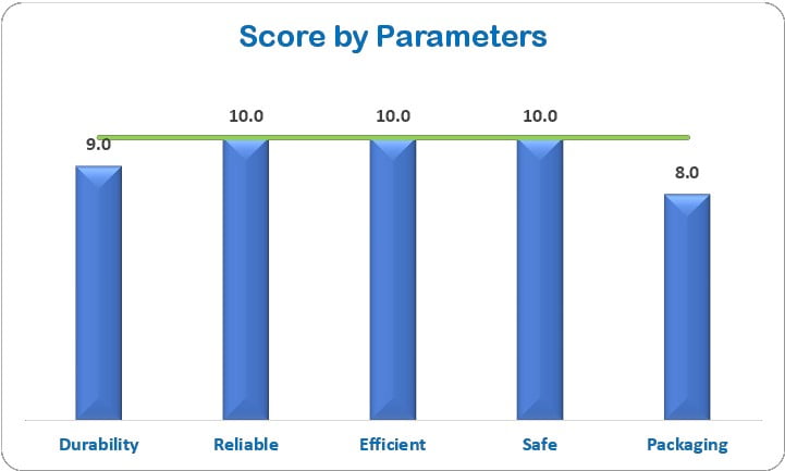
Then we have displayed a column chart for each parameter score along with the green line of 10 score.
Click to buy Weightage Analysis Template in Microsoft Excel
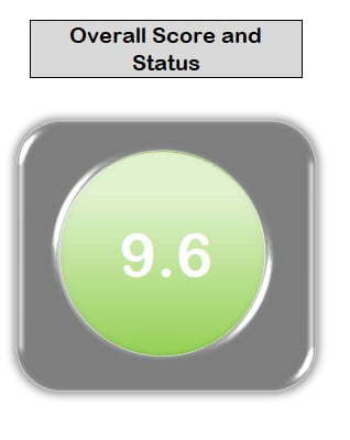
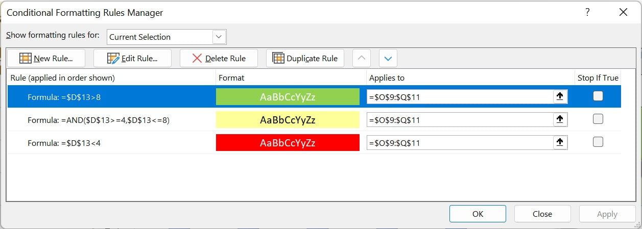
In the last visual, we have displayed the Overall Score and Status with colors. If overall score is less than 4 then, it will be in red color. If it is between 4 to 8 then it will be in yellow color. If it is greater than eight, then it will be in green color.
Click to buy Weightage Analysis Template in Microsoft Excel
Follow the below steps to learn, how we can create this in Microsoft Excel.
- Let’s copy the “Weightages” on the new workbook. Rename the worksheet as Weightages.
- Now add a new worksheet and rename it as “Score”.
- Create a table with Parameters, Weightages, Score (0 to 10), Max Line.
- Put the VLOOKUP for Weightages from previous sheet.
- Put the data validation in the Score (0 to 10) column to allow the number between 0 to 10 only.
- Put the spin button in front of first parameter from Developer tab >> Insert >> Form control >> Spin button.
- Right click on the spin button, go to format control.
- On the control tab, put the minimum value as 0 and maximum value as ten.
- Connect with relevant cell in the cell link box.
- Add the Overall score row in the end of the table.
- Put the SUMPRODUCT formula in to get the overall score.
- Put the Score
Click to buy Weightage Analysis Template in Microsoft Excel
Now create the Score by Parameters chart-
- Select the range Parameters, Score (0 to 10) and Max line.
- Go to the Insert tab >> Insert a 2D clustered column chart.
- Right click on the chart, click on Change Series Chart Type.
- In the Change chart type window, go to Combo.
- Select the Line chart for Max Line
- Click on OK
- Remove the gridlines from the chart.
- Remove the Legend from the chart.
- Change the Chart Title as “Score by Parameters”.
- Hide the Weightages and Max line column.
- Max line will be invisible from the chart.
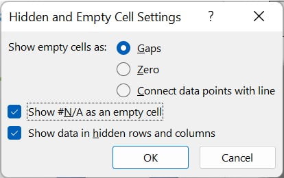
- Right click on the chart. Go to the select data.
- Click on hidden and empty cells. Click on OK.
Click to buy Weightage Analysis Template in Microsoft Excel
Now, we will add the Status visual. To add the status visual, we will take the help of Microsoft Power Point.
- Go to a blank PowerPoint slide.
- Insert a Rounded corner Rectangle shape from Insert tab >> shapes. Keep the height 3 cm and width 4 cm.
- Insert an Ovel and keep the height and width as 2.5 cm.
- Select both the shape and align them Center and Middle.
- Go the Shape format tab >> Merge Shapes and Combine.
- Now this is a single shape. Select the shape and remove the outline.
- Fill the dark grey color.
- Go to the Shape Format >> Shape Effects >> Preset >> select Preset 5
- Go to the Shape Format >> Shape Effects >> Shadow >> No Shadow (None)
- Copy the shape to the excel sheet.
- Select few cells in the excel and put the condition formatting there.
- We will use three conditional formatting to highlight read amber and green.
Click to buy Weightage Analysis Template in Microsoft Excel
Set the shape over the condition formatted cells properly.
Visit our YouTube channel to learn step-by-step video tutorials
Watch the step-by-step video tutorial:
Click to buy Weightage Analysis Template in Microsoft Excel