Excel is an essential tool in the corporate world, and its charting capabilities are among its most powerful features. Among these, the Stacked Column Chart stands out for its effectiveness in presenting comprehensive data. This type of chart allows users to compare individual elements across categories while also appreciating the overall totals. In this article, we will discuss how to create a compelling and effective Stacked Column Chart with integrated totals in Excel.
What is a Stacked Column Chart with Integrated Totals in Excel?
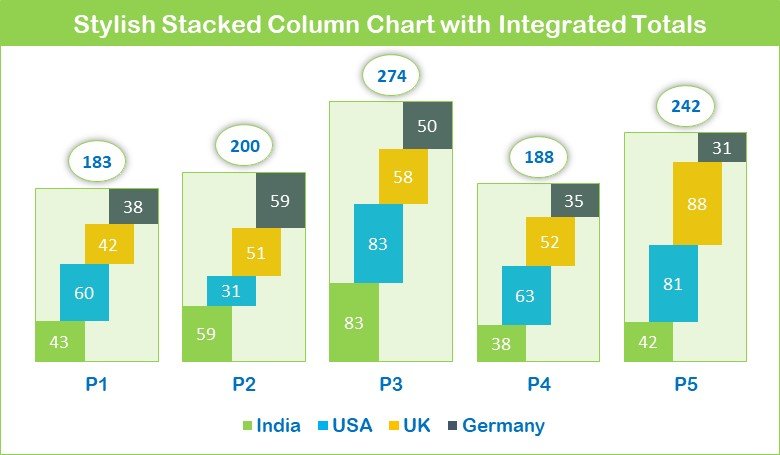
A Stacked Column Chart in Excel is a type of bar graph where multiple data series are represented as parts of individual columns, stacked upon one another. This makes it easier to view the collective totals of the series, as well as their individual components. The stacking allows for easy comparison between categories while maintaining a clear view of the overall picture.
Let’s delve into how you can create such a graph using Excel.
Understanding the Sales Data
To illustrate this process, we’ll be using the following sales data:
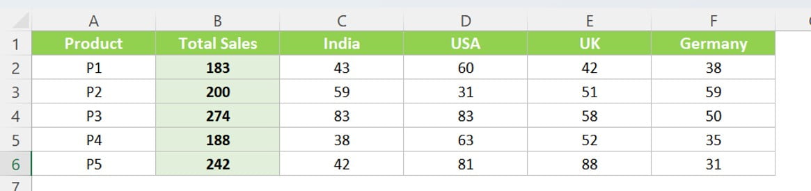
This data, ranging from A1:F6, shows the total sales of five different products (P1 to P5) and their distribution across four countries: India, USA, UK, and Germany.
Click to buy Effective Stacked Column Chart with Integrated Totals
Steps to Create the Stacked Column Chart with Integrated Totals
In this guide, we’ll walk you through the process of creating a Stacked Column Chart with Integrated Totals in Excel. This process is divided into various steps for easy understanding.
Step 1: Data Selection
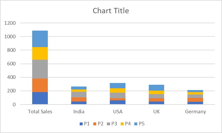
To start with, you need to select the data you want to represent in the chart. For our example, we will select the range “A1:F6”.
Step 2: Inserting the Chart
After selecting the data, navigate to the ‘Insert’ tab on Excel’s toolbar. Here, you can insert a 2D Stacked Column Chart.
Click to buy Effective Stacked Column Chart with Integrated Totals
Step 3: Adjusting Chart Design
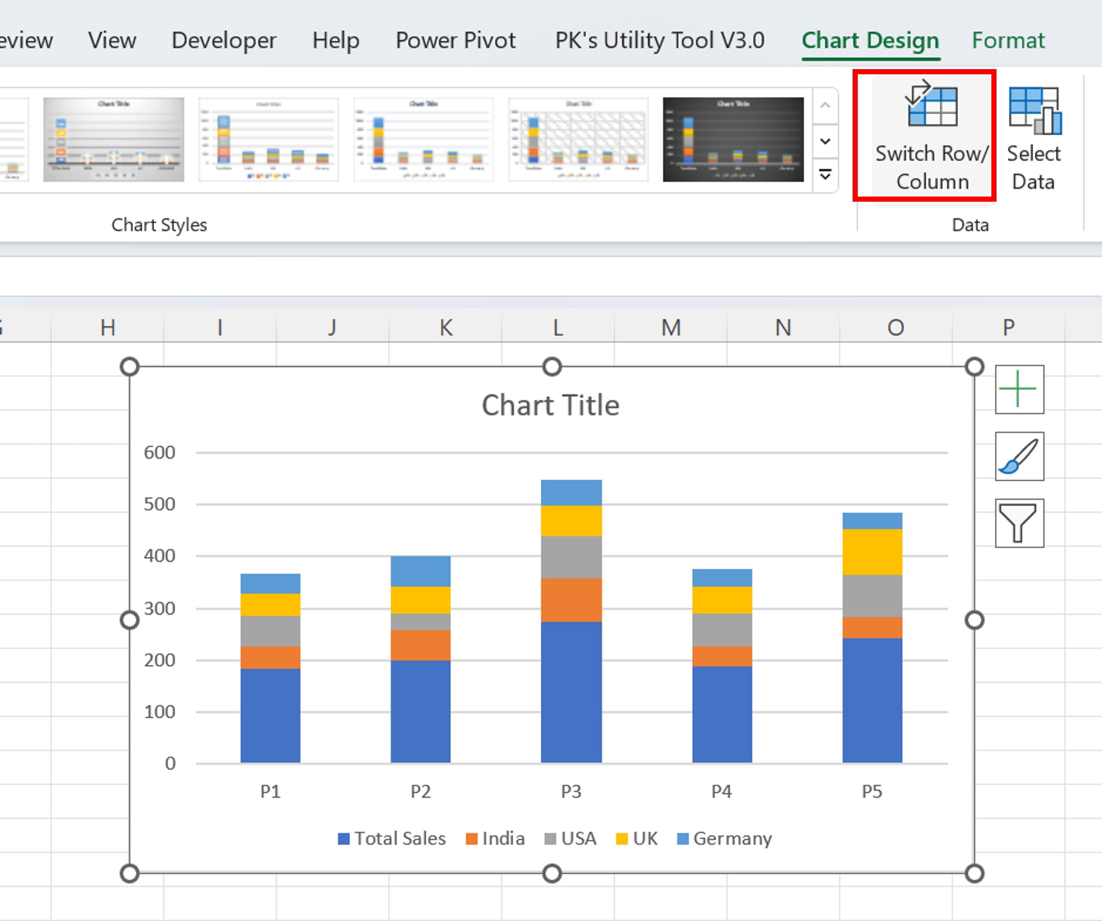
Once the chart is inserted, select it and go to the ‘Chart Design’ tab. Here, click on ‘Switch Row/Column’ to adjust your data display.
Click to buy Effective Stacked Column Chart with Integrated Totals
Step 4: Changing the Series Chart Type
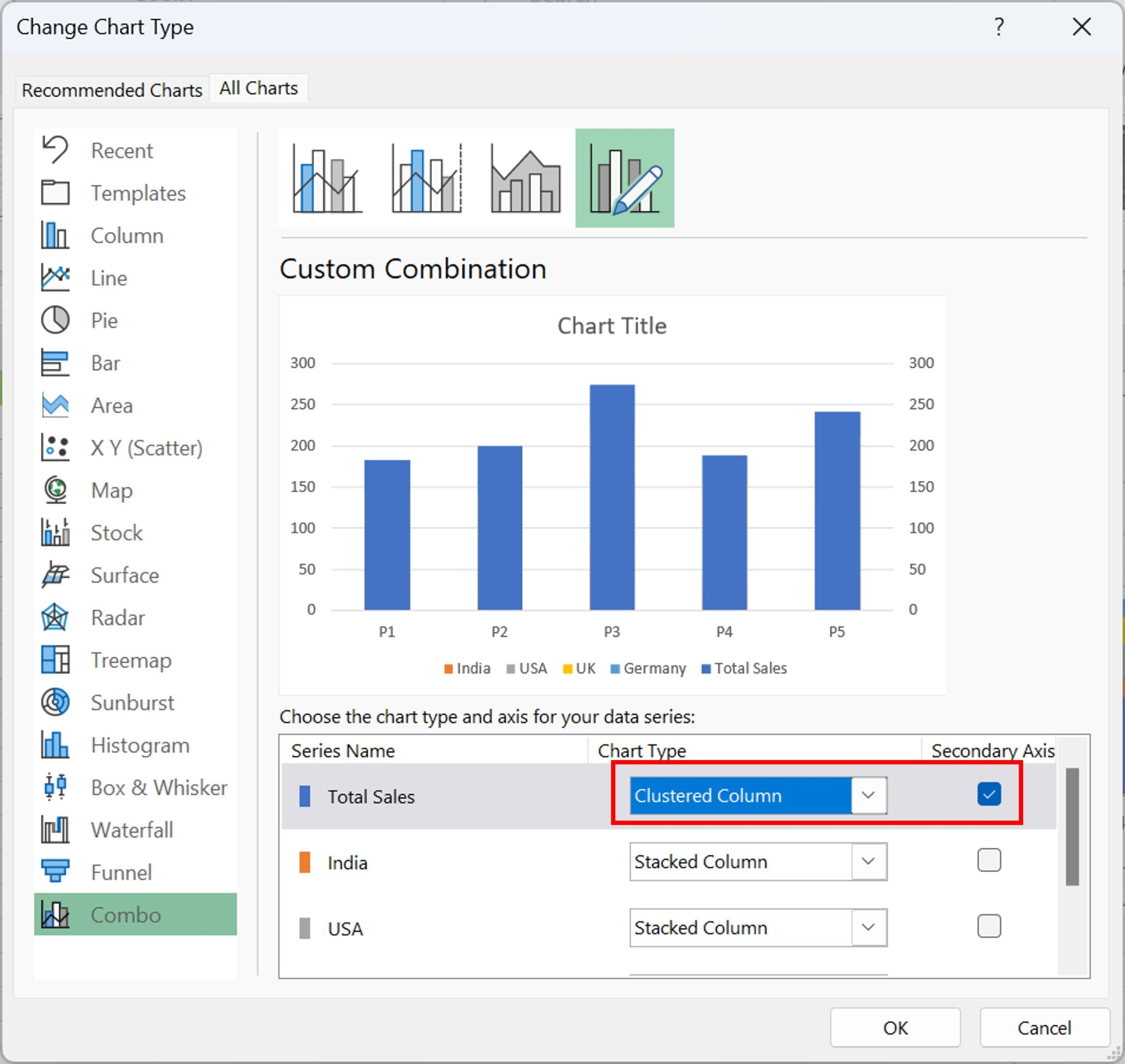
To further customize your chart, right-click on it and select ‘Change Series Chart Type’. In the ‘Change Chart Type’ window that opens, select the ‘Clustered Column’ for ‘Total Sales’ and check the ‘Secondary Axis’ option.
Click to buy Effective Stacked Column Chart with Integrated Totals
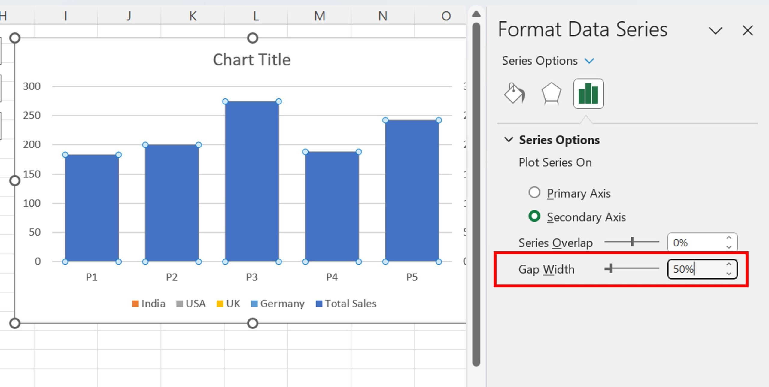
Step 5: Formatting Data Series
Next, right-click on the chart and select ‘Format Data Series’. In this section, adjust the ‘Gap Width’ to be between 20% to 50%.
Click to buy Effective Stacked Column Chart with Integrated Totals
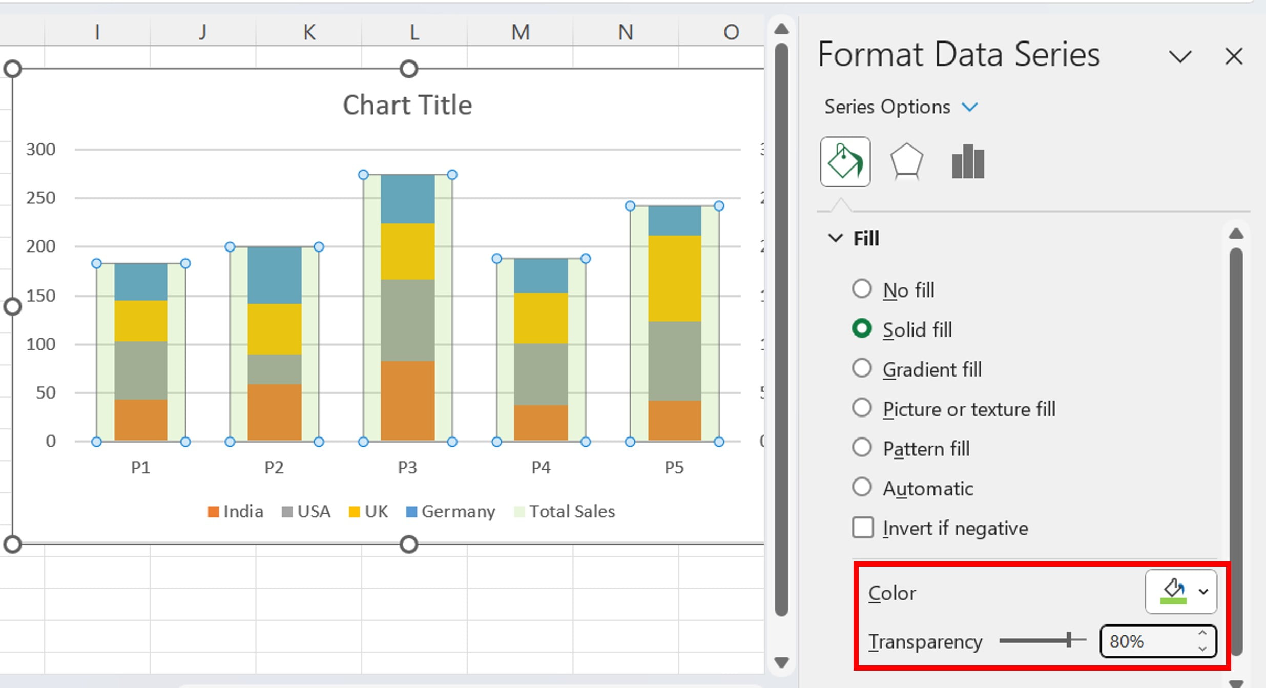
Step 6: Customizing Chart Appearance
In the ‘Format Data Series’ window, navigate to ‘Fill and Line’. Choose a light green color with 80% transparency for the ‘Total Sales’ column.
Click to buy Effective Stacked Column Chart with Integrated Totals
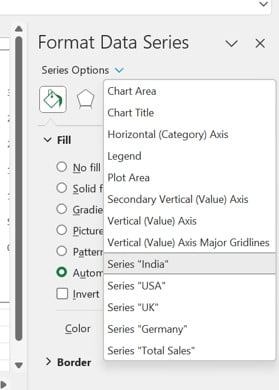
Step 7: Selecting a Data Series
From the ‘Series Options’ drop-down menu, select a specific series. For instance, you might choose the series representing ‘India’ or any other location.
Click to buy Effective Stacked Column Chart with Integrated Totals
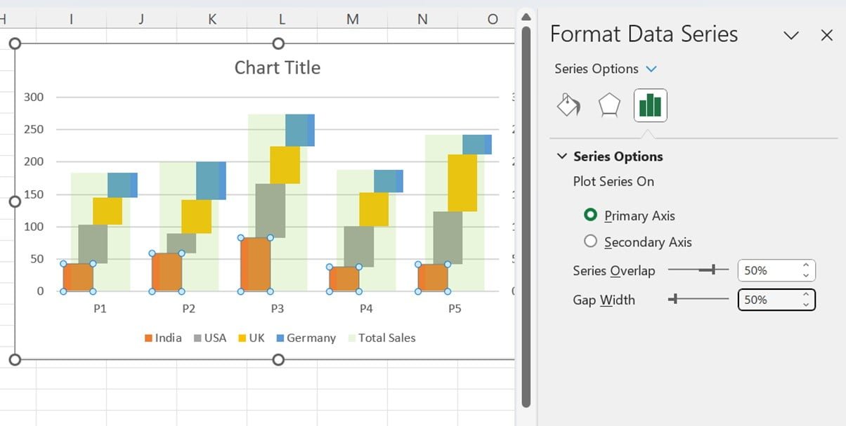
Step 8: Adjusting Series Overlap and Gap Width
For the selected series, adjust the ‘Series Overlap’ to 50% and set the ‘Gap Width’ to 50%.
Click to buy Effective Stacked Column Chart with Integrated Totals
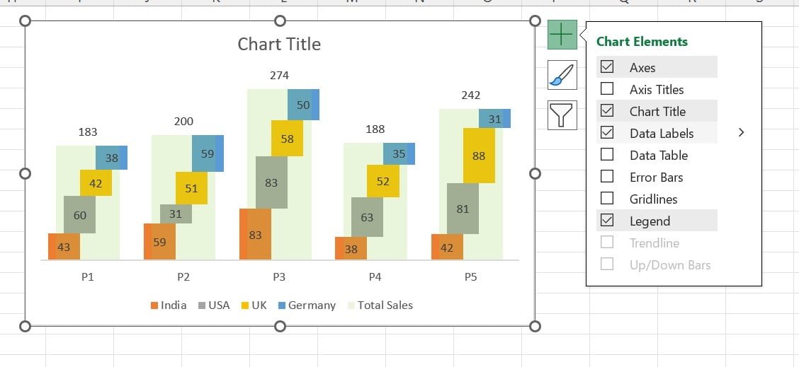
Step 8: Add the Data labels:
Now, click on the Chart Elements and Add the Data Labels. You can remove the Both Vertical Axis and Grid lines from the chat for better view.
Click to buy Effective Stacked Column Chart with Integrated Totals
By following these steps, you can create an effective and visually appealing Stacked Column Chart in Excel. Remember, proper data visualization plays a crucial role in interpreting and communicating your data effectively.
Opportunities for Improvement in Stacked Column Chart with Integrated Totals
While Stacked Column Chart with Integrated Totals are highly useful in many situations, they also have potential areas for improvement. For example, when dealing with many data series, the chart can become cluttered and difficult to interpret. In such cases, it might be beneficial to break down the data into multiple smaller charts or use a different type of chart altogether, like a line graph or a stacked area chart.
Another area for improvement is the presentation of the totals. Excel does not automatically provide an option to display the totals in Stacked Column Charts. However, by following the steps mentioned above or using a combination chart, you can display these totals, making your data easier to understand.
Best Practices for Creating Stacked Column Chart with Integrated Totals
Limit the Number of Stacks:
Too many stacks in one column can make the chart hard to read. Try to limit the number of data series for clarity.
Use Consistent Colors:
Assign a specific color to each data series and keep it consistent throughout your chart. This will make it easier to identify each series.
Arrange Data Logically:
If possible, arrange your data series in a logical order. This could be in ascending or descending order of magnitude or any other method that makes sense for your data.
Label Clearly:
Make sure your chart title, axis titles, and data labels are clear and descriptive. This will make your chart easier to understand.
Avoid 3D Charts:
While 3D charts can look attractive, they can distort data representation and make accurate interpretation difficult. Stick with 2D charts for accuracy.
Use a Chart when it’s Effective:
While Stacked Column Charts are powerful tools, they are not always the best choice. Use them when they enhance understanding of your data, not just for visual appeal.
Frequently Asked Questions
Q1. Can you explain the concept of a Stacked Column Chart with Integrated Totals in Excel?
In Excel, a Stacked Column Chart with Integrated Totals operates as a unique chart variant. It represents multiple data series as individual parts of stacked columns. Therefore, it enables the easy comparison of different categories. Moreover, it has the added advantage of displaying the collective total of all series.
Q2. What is the process to add totals to a Stacked Column Chart in Excel?
Initially, after you create a Stacked Column Chart, you need to take action on one of the columns by right-clicking on it. Following this, you should select ‘Add Data Labels’ twice consecutively. To ensure the total of each stacked column is displayed, you must click on one of the labels, right-click, and then proceed to select ‘Format Data Labels’. Subsequently, under ‘Label Options’, you have to check the option ‘Value From Cells’ and pick the range of total sales.
Q3. Can you suggest instances where a Stacked Column Chart would be the best choice?
Primarily, Stacked Column Charts come in handy when your objective is to display the cumulative total of categories that are divided into sub-categories. Specifically, they are the right fit when you’re working with a limited number of categories and sub-categories, and you’re aiming to highlight the distribution of each category along with the overall total.
Q4. Can I create a Combo Chart with a Stacked Column Chart in Excel?
Yes, you can. A Combo Chart combines two different chart types, allowing you to represent different types of data simultaneously. To create a Combo Chart, create a Stacked Column Chart first, then add a secondary axis and change the chart type for this axis.
Q5. What other chart types can be useful in Excel?
Excel offers a wide variety of chart types, each with its strengths. Some of the most commonly used ones include Line Graphs, Pie Charts, Area Charts, Scatter Plots, and Histograms. The best chart type depends on your data and what you want to communicate.
Q6. What other tools in Excel can help with data analysis?
Excel offers many powerful tools for data analysis, including PivotTables, Conditional Formatting, and various statistical functions. By mastering these tools, you can gain deeper insights from your data.
Creating effective and insightful charts is an art in itself. With the right understanding and practice, you can transform raw data into meaningful visualizations that tell compelling stories. Remember, the goal is not just to create visually appealing charts, but to communicate your data effectively. So, keep exploring, keep learning, and keep charting!
Enhancing Your Excel Skills
Excel’s charting capabilities go far beyond Stacked Column Charts and Combo Charts. There are many more chart types and features that can help you to visualize and interpret your data effectively. Some of these include Pie Charts, Area Charts, Scatter Plots, and Histograms. Each has its strengths and best use cases, so it’s beneficial to familiarize yourself with all of them.
Moreover, Excel also offers powerful tools for data analysis, like PivotTables, Conditional Formatting, and various statistical functions. By mastering these tools, you can transform your data into meaningful insights and make more informed decisions.
Conclusion
Excel is more than just a spreadsheet program. it’s a comprehensive tool for data analysis and visualization. The Stacked Column Chart is just one of many features that can help you make sense of your data and communicate your findings effectively. By understanding how to create and enhance these charts, you can take your Excel skills to the next level.
Visit our YouTube channel to learn step-by-step video tutorials
Watch the step-by-step video tutorial:
Click to buy Effective Stacked Column Chart with Integrated Totals