Keeping track of project status or Key Performance Indicators (KPIs) such as service level, productivity, or quality score is a necessity in today’s fast-paced corporate world. One efficient, visually appealing, and dynamic way to do this is by using an Animated Progress Circle Chart in Excel. This unique tool goes beyond traditional project status reporting tools, offering a dynamic and comprehensive picture of project progress or KPI status. In this guide, we will delve into the intricacies of creating an Animated Progress Circle Chart in Excel.
Understanding the Animated Progress Circle Chart
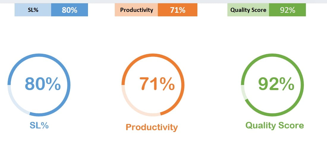
The Animated Progress Circle Chart is a visual tool created using the Doughnut Chart feature in Excel. It serves as one of the best ways to track project status or showcase KPI metrics. This innovative chart can be tailored to depict various metrics such as Service Level, Productivity, and Quality Score.
Below is an example of the Animated Progress Circle Chart.
Click to buy Animated Progress Circle Chart
Creating the Animated Progress Circle Chart
Watch the step-by-step video tutorial:
Click to buy Animated Progress Circle Chart
Creating a circle graph like this involves using Excel’s Doughnut Chart and a simple VBA code for animation.
- Designing the Doughnut Chart: The first step involves crafting the Doughnut Chart tailored for your specific KPI or project status.
- Animating the Chart: Post creating the Doughnut Chart, we implement the VBA code to bring the chart to life.
The VBA code used for animating the chart is as follows:
Private Sub Worksheet_Activate()
Dim sh As Worksheet
Set sh = ThisWorkbook.Sheets("Animated Circle Chart")

Dim i As Long

For i = 0 To sh.Range("F1").Value * 100
VBA.DoEvents
sh.Range("E2").Value = i / 100
Next i


For i = 0 To sh.Range("I1").Value * 100
VBA.DoEvents
sh.Range("H2").Value = i / 100
Next i

For i = 0 To sh.Range("L1").Value * 100
VBA.DoEvents
sh.Range("K2").Value = i / 100
Next i


End Sub

Private Sub Worksheet_Change(ByVal Target As Range)

Dim sh As Worksheet
Set sh = ThisWorkbook.Sheets("Animated Circle Chart")

Dim i As Long

If Target.Row = 1 Then

If Target.Column = 6 Then
For i = 0 To sh.Range("F1").Value * 100
VBA.DoEvents
sh.Range("E2").Value = i / 100
Next i
End If


If Target.Column = 9 Then
For i = 0 To sh.Range("I1").Value * 100
VBA.DoEvents
sh.Range("H2").Value = i / 100
Next i
End If


If Target.Column = 12 Then
For i = 0 To sh.Range("L1").Value * 100
VBA.DoEvents
sh.Range("K2").Value = i / 100
Next i
End If

End If


End Sub
Advantages of Animated Progress Circle Chart
Creating a circle graph for project tracking or KPI monitoring offers several advantages:
- Visual Appeal: The Animated Progress Circle Chart provides an eye-catching, colorful, and dynamic visual of data, making it easy for anyone to understand the status or progress.
- Dynamic Tracking: Unlike static project status tools, the Animated Chart offers real-time, dynamic tracking of project progress or KPI metrics.
- Versatility: This chart is not just restricted to project status tracking but can also be used for a variety of KPI metrics, making it one of the most versatile project status reporting tools.
Opportunities for Improvement
As with any tool or technique, there is always room for improvement. For the Animated Progress Circle Chart, potential enhancements could include:
- Interactivity: Incorporating interactive elements into the chart could further enhance its usability.
- Integration: The possibility of integrating the chart with other data sources or platforms could be explored to automate data input and update.
- Customization: Providing more customization options like color, size, and fonts could make the chart more adaptable to different project requirements or brand guidelines.
Best Practices for Using the Animated Progress Circle Chart
- Keep it Simple: While creating a circle graph, ensure that it remains simple and easy to understand. Over-complicating the chart may reduce its effectiveness.
- Regular Updates: For dynamic tracking, regular updates are crucial. Ensure the data feeding into the chart is updated regularly.
- Use Clear Labels: Make sure that the labels for your metrics are clear and easy to understand.
- Use Consistent Colors: When tracking multiple metrics, use consistent colors for the same metrics to avoid confusion.
Conclusion
The Animated Progress Circle Chart is a potent tool for project status tracking and KPI monitoring. It combines the simplicity of Excel with the power of visual data representation. By embracing this tool, businesses can take their project status tracking and KPI monitoring to the next level.
Frequently Asked Questions
1. Can I use the Animated Progress Circle Chart for tracking multiple projects or KPIs simultaneously?
Absolutely! However, while the Animated Progress Circle Chart is versatile and able to handle multiple project tracking or KPI monitoring, it’s crucial to maintain a clear and comprehensible representation of data.
2. Considering the dynamic nature of projects, how frequently should I update the data in the Animated Progress Circle Chart?
Ideally, you should strive to update your chart as regularly as the project status or KPIs change. Given that the key value of this tool is real-time tracking, consistent data updates will keep the chart current and accurate.
3. Is it a prerequisite to have VBA knowledge to effectively utilize the Animated Progress Circle Chart?
Not necessarily. While having a basic understanding of VBA could help you in customizing the animation or making modifications, you can create and use the chart without needing deep knowledge of VBA.
4. Do I have the flexibility to customize the colors, fonts, and other design elements in the Animated Progress Circle Chart?
Yes, certainly! The chart can be customized as per your project requirements or brand guidelines, including changing colors, fonts, and other design elements.
In conclusion, the Animated Progress Circle Chart is a highly adaptable tool. Not only can it be used as a project status tool or a KPI chart, but it can also be tailored to fit your specific design preferences, making it a truly versatile addition to your project management toolbox.
Visit our YouTube channel to learn step-by-step video tutorials
Click to buy Animated Progress Circle Chart