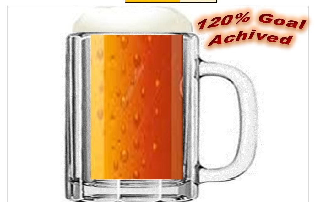
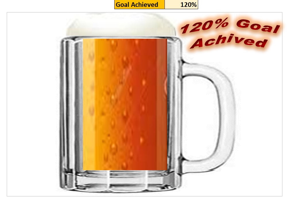
Beer mug chart is a beautiful infographic representation for KPI metrics in percentage like – Target Achieved%, Service Level%, Quality Score etc.
Beer Mug Graph in excel
Learn our other infographic charts:
- Info-graphics: Stunning Thermometer Chart in Excel
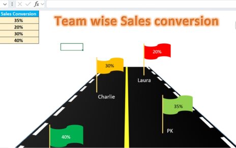
- Info-graphics: Flag Chart in Excel
- Medical Science Info-graphic Chart in Excel
- Info-graphics: Animated Hour Glass Chart in Excel
- Info-graphics with Column chart (Part-1)
- Info-graphics with Column chart (Part-2)
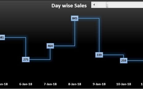
- Info-graphics with Line Chart
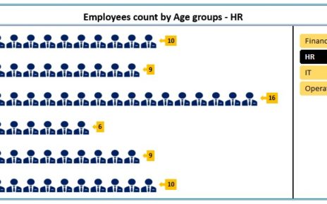
- Male and Female Info-graphics in Excel
- Comparison info-graphics in excel
Watch the step-by-step video tutorial:
Click here to download the practice file
Visit our YouTube channel to learn step-by-step video tutorials