Line charts, as an efficient means of tracking and showcasing data trends over time, have become a go-to solution for visualizing metrics such as sales, revenue, and others. In this article, we delve into the use of Info-graphics with Line Chart in Microsoft Excel.
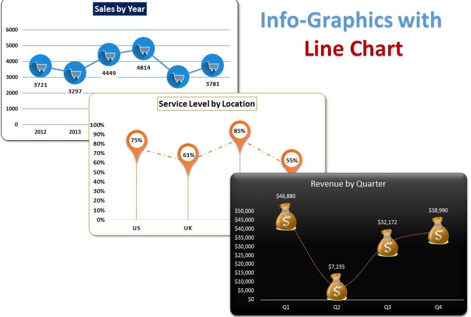
We’ll take a closer look at three distinct line charts, each exemplifying the creative use of info-graphics in visualizing data: Sales by Year, Revenue by Quarter, and Service Level by Location.
Info-graphics with Line Chart
We have created below given info-graphics chart:
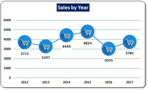
Sales by Year:
To create the Sales by Year Line Chart, we first require sales data for each year. With the data in hand, we follow these simple steps:
- Select the sales data
- Click on the Insert tab, then go to Charts and Insert the Line chart with Markers
- Right-click on the chart and select Format Data Series
- Copy the Sales Kart icon (You can take it from google and keep in the worksheet)
- Select the markers and paste the Kart icon
Click to buy Info-graphics with Line Chart
The result is a chart that showcases the sales trends from 2012 to 2017, with the Sales Kart icon adding a touch of personality to the visualization.
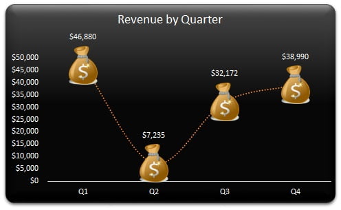
Revenue by Quarter:
Next up, we look at the Revenue by Quarter Line Chart, which displays revenue trends for each quarter. We follow a similar process as the first chart, but with a slight twist:
- Select the revenue data
- Click on the Insert tab, then go to Charts and Insert the Line chart with Markers
- Copy the Money Bundle icon (You can take it from google and keep in the worksheet)
- Select the markers and paste the Money Bundle icon
Click to buy Info-graphics with Line Chart
This chart, now adorned with the Dollar Money Bundle icon, provides a vivid and engaging representation of the revenue data, with a single glance providing a comprehensive understanding of the trends.
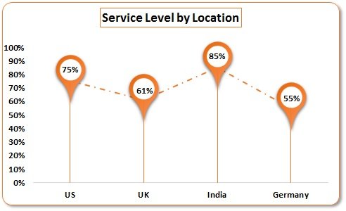
Service Level by Location:
Finally, we look at the Service Level by Location Line Chart, displaying trends in service levels across various locations. The process is the same, with a change in the marker style to the Location icon:
- Select the Service Level data
- Click on the Insert tab, then go to Charts and Insert the Line chart with Markers
- Copy the Location icon (You can take it from google and keep in the worksheet)
- Select the markers and paste the Location icon
Click to buy Info-graphics with Line Chart
With the Location icon representing the service level data, this chart provides an insightful and eye-catching representation of the service levels across the various locations.
In conclusion, info-graphics bring an element of excitement to line charts, transforming otherwise mundane visualizations into vibrant and informative graphics. By incorporating info-graphics, charts become not only aesthetically pleasing but also easier to comprehend, delivering data in a manner that is both engaging and accessible.
Click to buy Info-graphics with Line Chart
Visit our YouTube channel to learn step-by-step video tutorials
Watch the step-by-step tutorial to learn these chart in Excel:
Click to buy Info-graphics with Line Chart