Home>Blogs>Charts and Visualization>Male and Female Info-graphics in Excel
Male and Female Info-graphics in Excel
Charts and Visualization

Male and Female Info-graphics in Excel

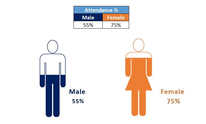
By using Male and Female Info-graphics in MS Excel, we can showcase a KPI metrics gender wise like – Attendance% for Male and Female, Productivity for Male and Female, Success Rate etc. This is very useful and beautiful chart to use in business presentation and dashboards. This is a data driven chart.

Male and Female Info-graphics in Excel

We have taken the support of Power Point Presentation here to create the transparent shape of Male and Female. To fill the shape we have used Column Chart.

Male and Female Info-graphics in Excel
Male and Female Info-graphics (Data driven chart)


Visit our YouTube channel to learn step-by-step video tutorials

Youtube.com/@PKAnExcelExpert

Watch the step by step tutorial:

PK
Meet PK, the founder of PK-AnExcelExpert.com! With over 15 years of experience in Data Visualization, Excel Automation, and dashboard creation. PK is a Microsoft Certified Professional who has a passion for all things in Excel. PK loves to explore new and innovative ways to use Excel and is always eager to share his knowledge with others. With an eye for detail and a commitment to excellence, PK has become a go-to expert in the world of Excel. Whether you're looking to create stunning visualizations or streamline your workflow with automation, PK has the skills and expertise to help you succeed. Join the many satisfied clients who have benefited from PK's services and see how he can take your Excel skills to the next level!
https://www.pk-anexcelexpert.com

Leave a Reply