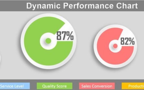
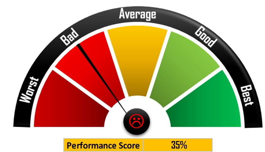
Rating Meter Chart in Excel is very innovative and informative chart to show the Process or Portfolio level health in five buckets – Worst, Bed, Average, Good and Best. This is a kind of Speedometer or Gauge Chart in Excel.
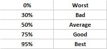
We have calculated these buckets on the base below given table.
Click to buy Rating Meter Chart in Excel
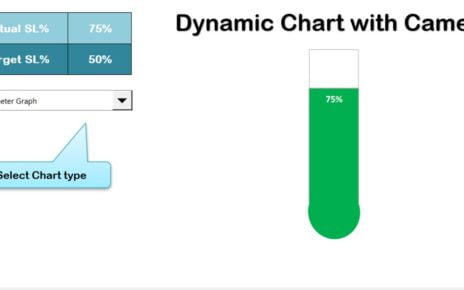
Rating Meter Chart in Excel
Below is the snapshot of Rating Meter Chart. We also have displayed a small smiley symbol in the center of rating meter. Shape and color of this smiley symbol change according to Performance Score.
Click to buy Rating Meter Chart in Excel
Visit our YouTube channel to learn step-by-step video tutorials
Watch the step by step video tutorial:
Click to buy Rating Meter Chart in Excel