I. Introduction
a. Explanation of what a dynamically highlight topper student chart is:
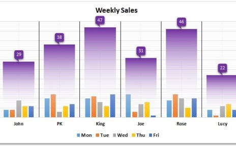
A dynamically highlight topper student chart is a type of chart that highlights the student with the highest score in each category. The chart uses conditional formatting to highlight the topper student based on the data range. This chart can be used to visualize and identify the highest-performing student in different categories such as tests, assignments, or exams.
b. Brief overview of the benefits of using this chart in educational settings:
There are several benefits to using a dynamically highlight topper student chart in educational settings. Firstly, it provides a quick and easy way to identify the highest-performing student in each category, allowing teachers to acknowledge and reward their achievements. Secondly, this chart can be used to track and monitor student progress over time, identifying areas where students may be struggling and need additional support. Thirdly, by highlighting top-performing students, it can motivate other students to work harder and strive for better results. Overall, a dynamically highlight topper student chart is a valuable tool for educators looking to improve student performance and promote a culture of excellence in their classrooms.
II. Data Preparation
Click to buy Dynamically highlight topper student chart
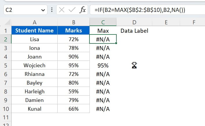
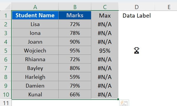
A) Explanation of the sample data used in the tutorial:
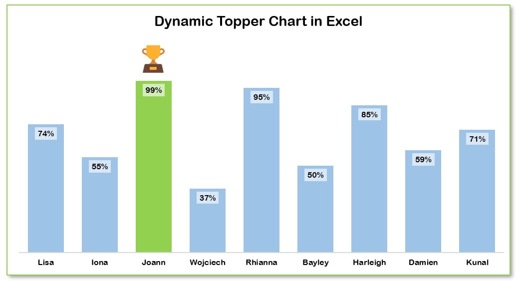
The data used in the tutorial includes a list of student names and their corresponding marks. The marks range from 0% to 100%, and the goal is to create a column chart that highlights the top-performing student in green with a trophy icon.
B) Instructions on how to prepare the data for the chart:
To create the chart, we need to add two support columns to our existing data. In cell C2, we can use the following formula:
=IF(B2=MAX($B$2:$B$10),B2,NA())
This formula checks if the student’s mark is equal to the maximum mark in the entire data range. If it is, then the student’s mark is displayed. Otherwise, the cell displays #N/A.
In cell D2, we can use the following formula:
=IF(ISERROR(C2),"","🏆")
This formula checks if there is an error in the cell in column C. If there is no error, then a trophy icon is displayed in the cell. If there is an error, then the cell is left blank.
These formulas can be dragged down to the end of the data range to apply them to all the rows in the dataset. With these support columns, we can now create the column chart and use conditional formatting to highlight the top-performing student.
Steps to create the dynamic chart:
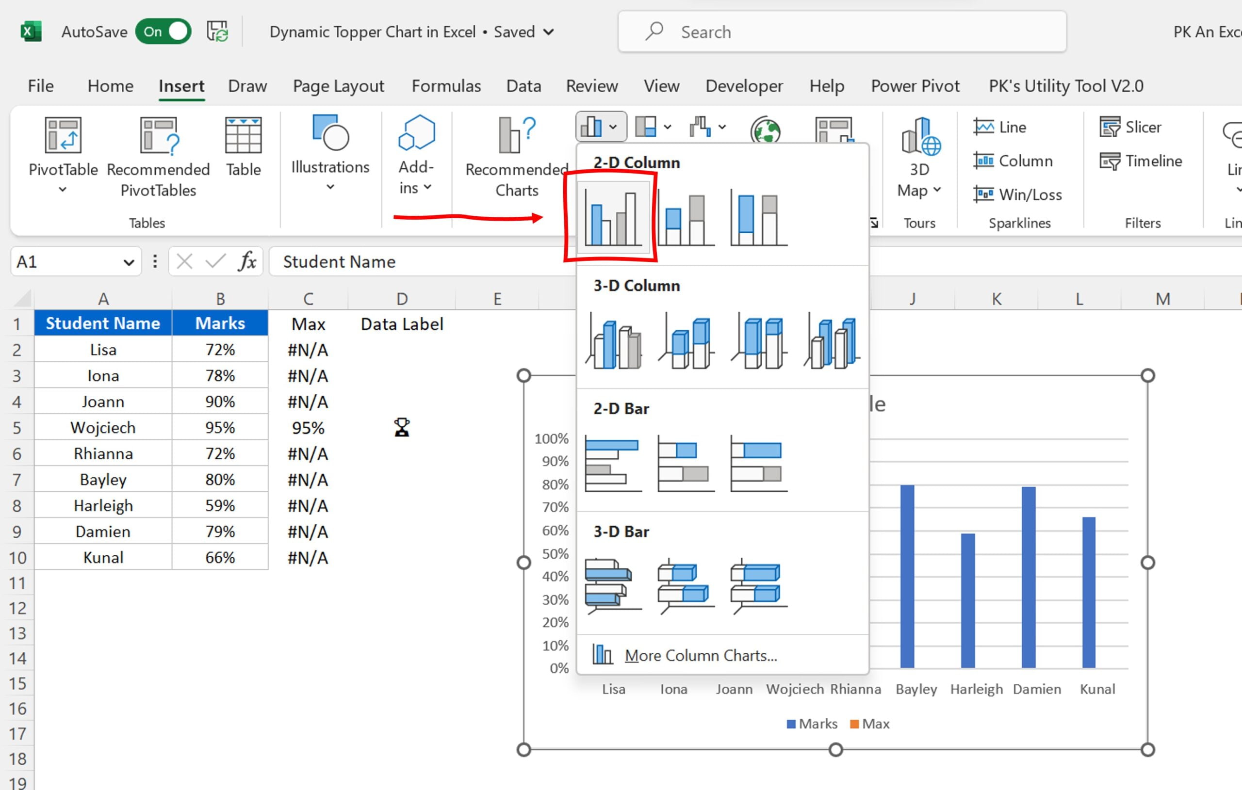
Select the data range:
Start by selecting the data range you want to use in your chart. In this case, we’ll use the range A2:C10.
Click to buy Dynamically highlight topper student chart
Create the chart:
Once you’ve selected the data range, go to the Insert tab in the ribbon and click on the Column chart button. Choose the Clustered Column chart type.
Click to buy Dynamically highlight topper student chart
Customize the chart:
Now that you have created the chart, you can customize it according to your needs. For example, you may want to remove the legends, gridlines, and vertical axis from the chart.
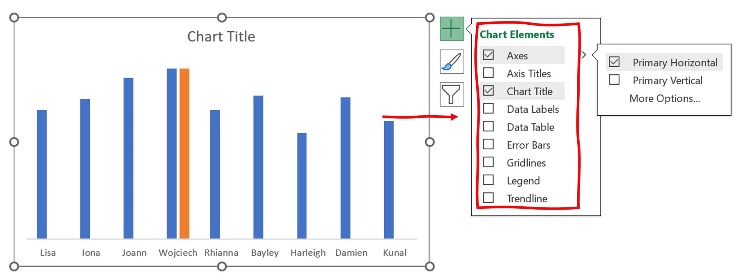
Remove legends, gridlines, and vertical axis:
To remove the legends, right-click on the chart and select “Delete” or simply press the “Delete” key on your keyboard. To remove the gridlines and vertical axis, Click on the chart to activate the Chart. Click on the chart Elements (+ icon) and uncheck the “Gridlines” and Primary Vertical from the “Axes” options.
Click to buy Dynamically highlight topper student chart
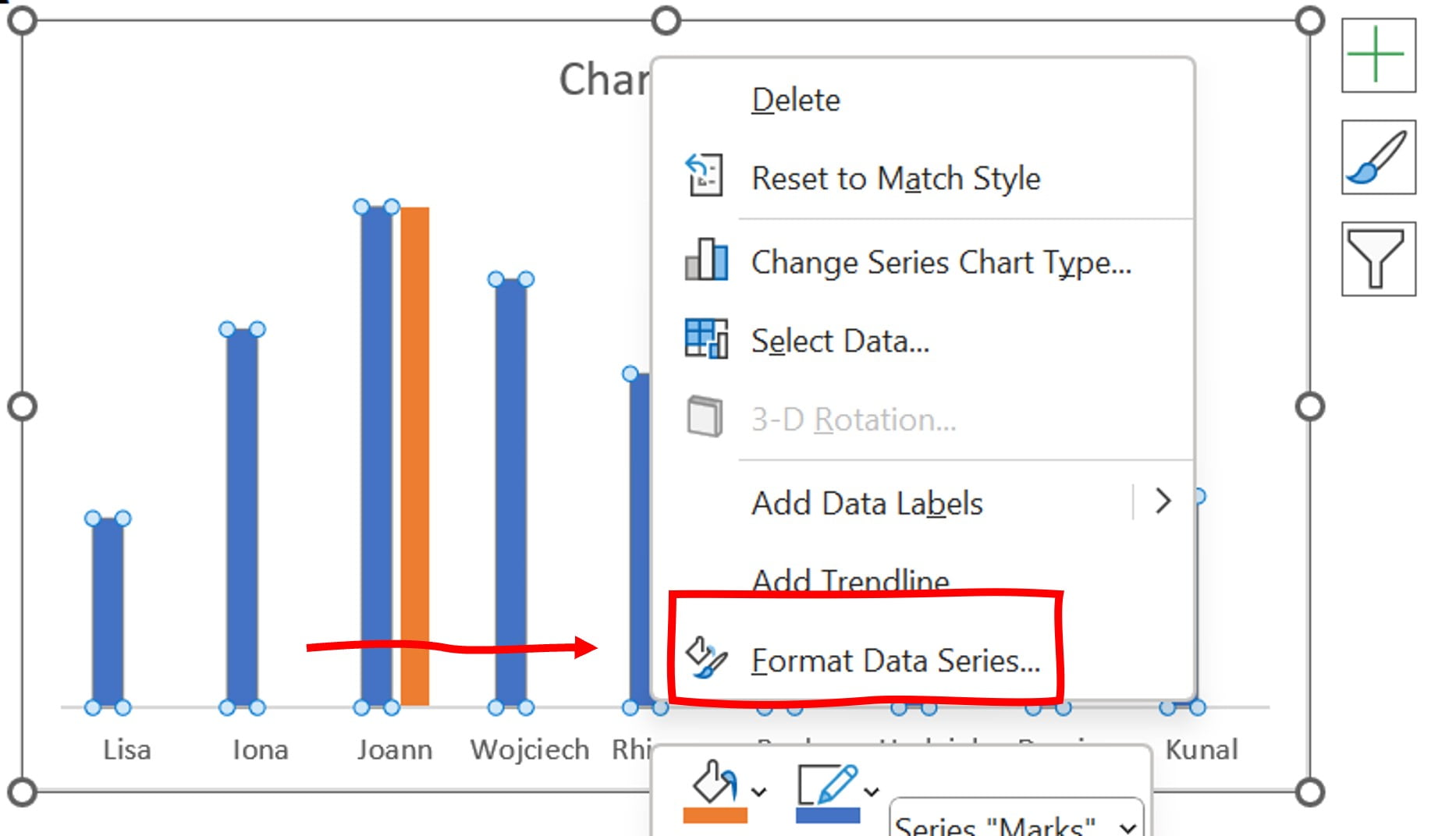
Format the data series:
To adjust the overlap and gap width between the data series in the chart, right-click on the chart and select “Format Data Series”.
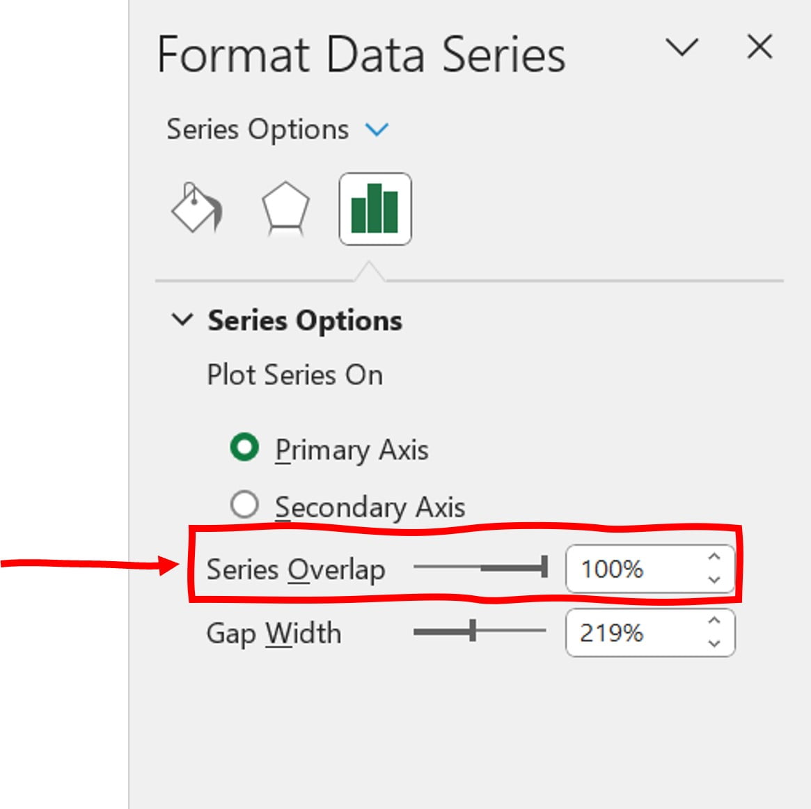
Set the series overlap:
In the Format Data Series dialog box, under the “Series Options” section, adjust the “Overlap” slider to 100%. This will ensure that each data series in the chart is fully visible and not obscured by another series.
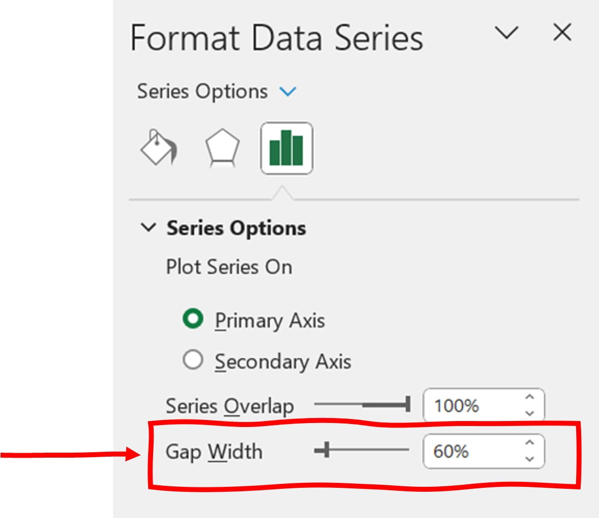
Set the gap width:
Still in the Format Data Series dialog box, adjust the “Gap Width” slider to 60%. This will create a small gap between each column in the chart.
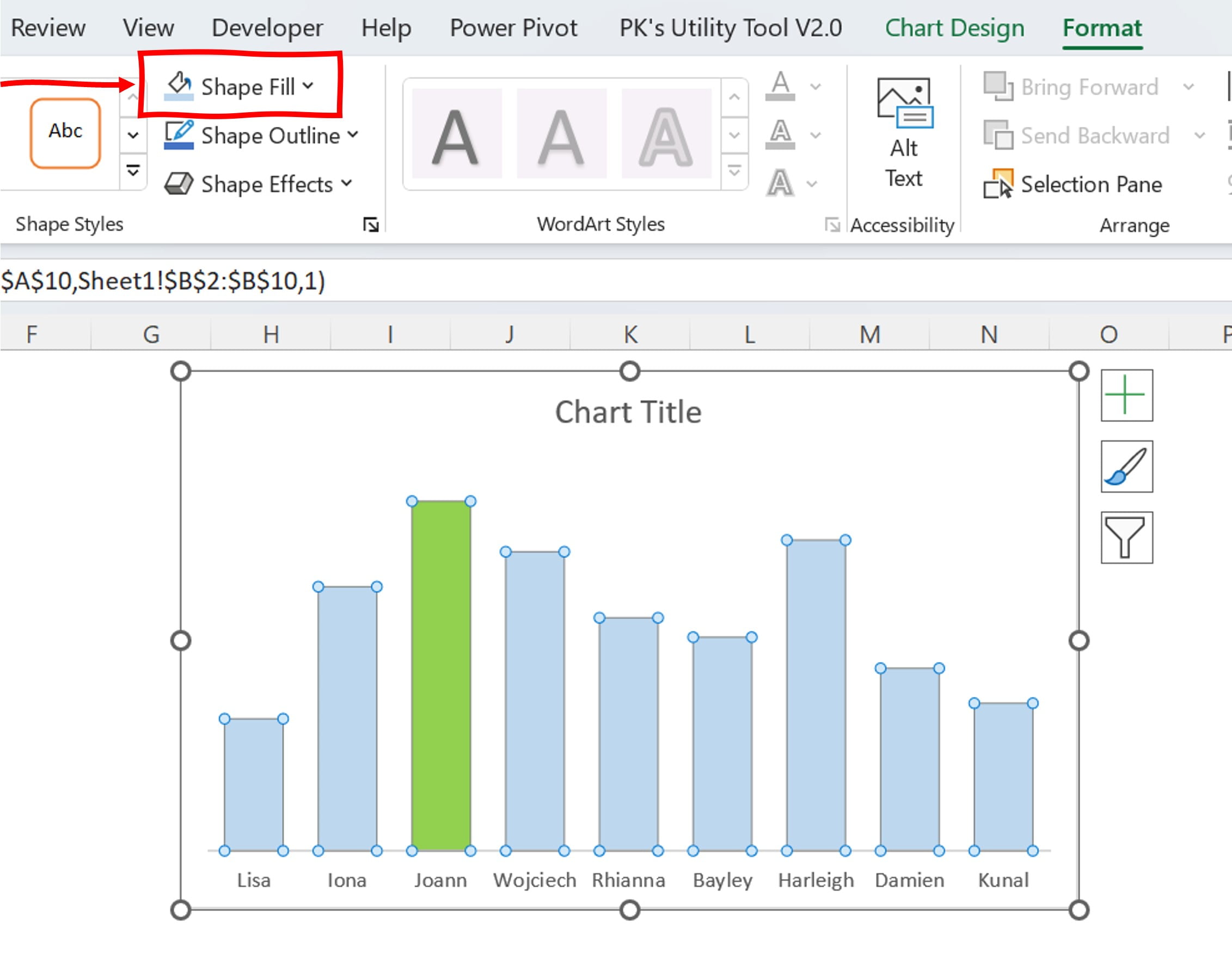
Fill colors:
To highlight the Topper column, fill it with a light green color. Select the column for the Topper and go to the “Fill” option in the ribbon. Choose a light green color from the color palette. Fill the other columns with a light blue color.
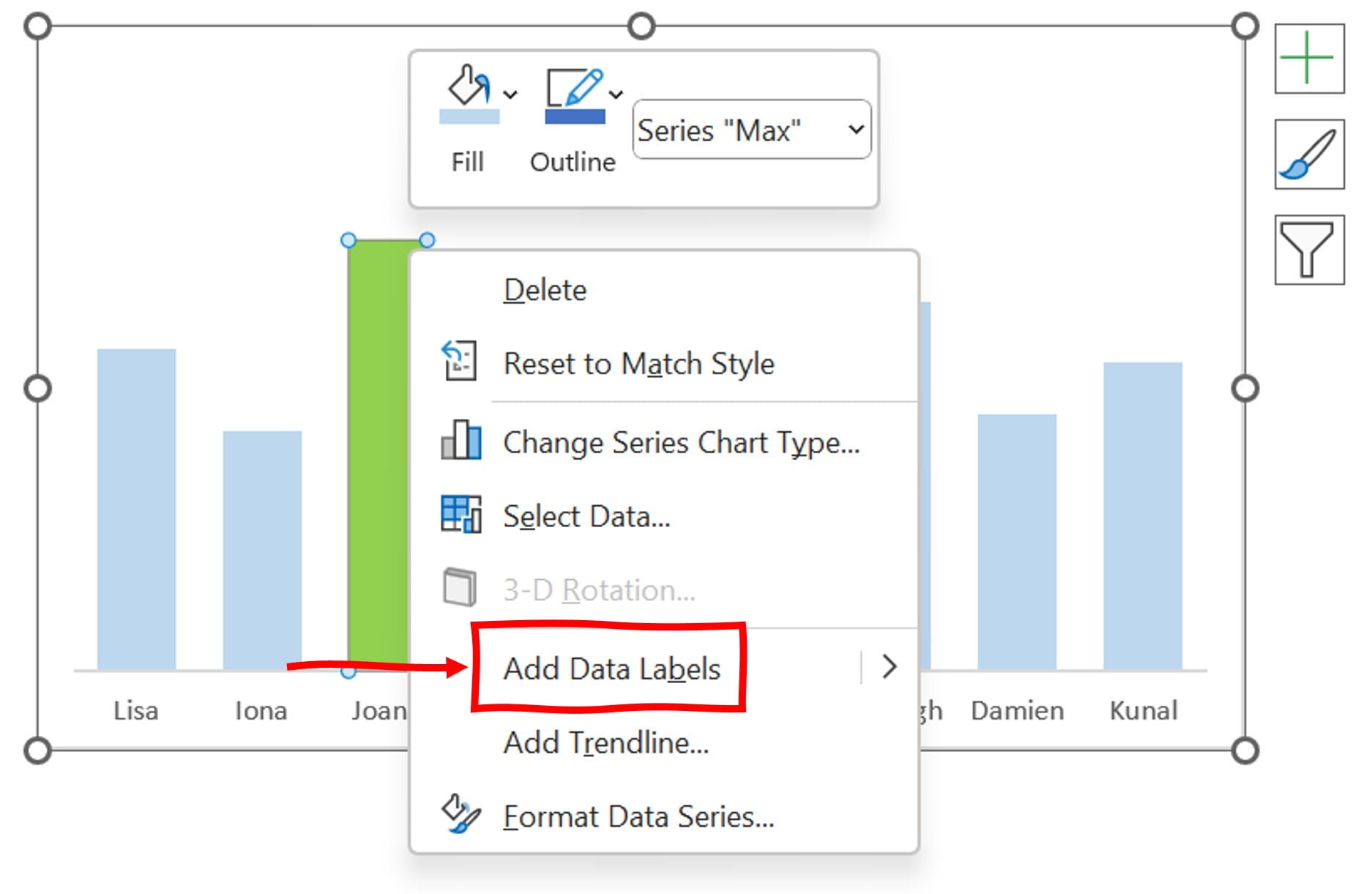
Add Data Labels for Toper Student:
Now, let’s add data labels to our chart. Start with the Topper column. Right-click on the Topper column and select “Add Data Labels”.
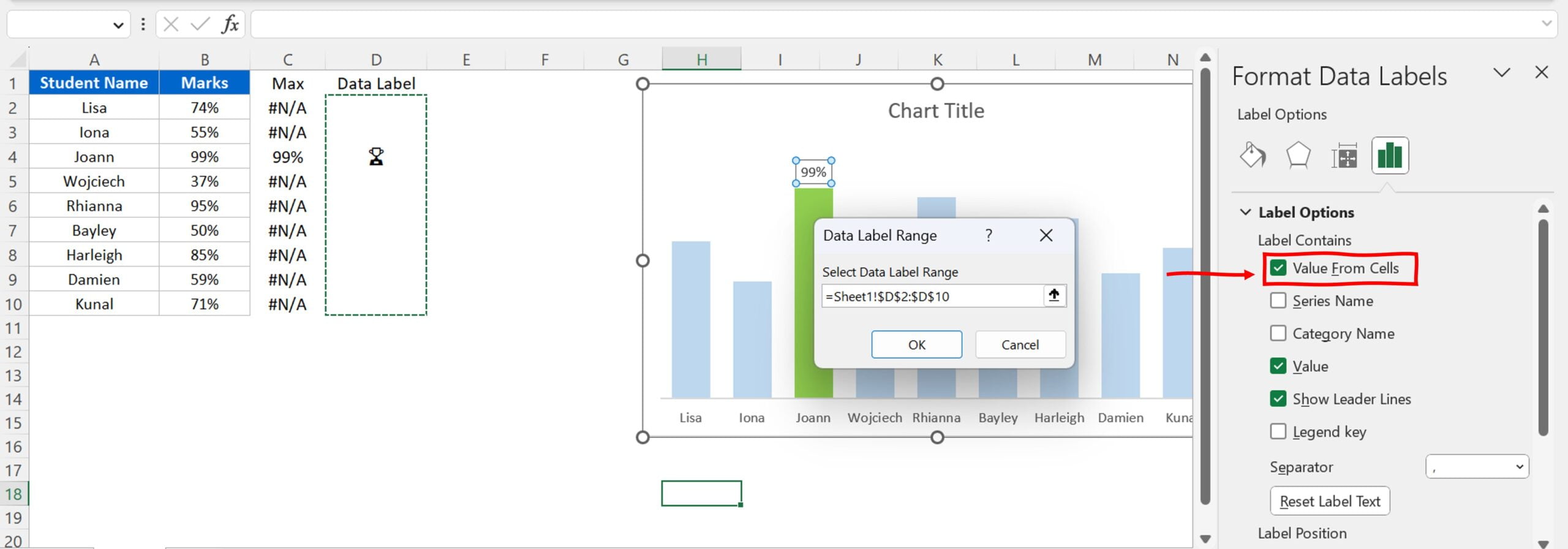
Choose Value from Cells:
After adding data labels, right-click on the labels and select “Format Data Labels”. In the “Label Options” section, choose “Value from Cells” and select the range “D2:D10”. This will show the Trophy icon over the Topper column.
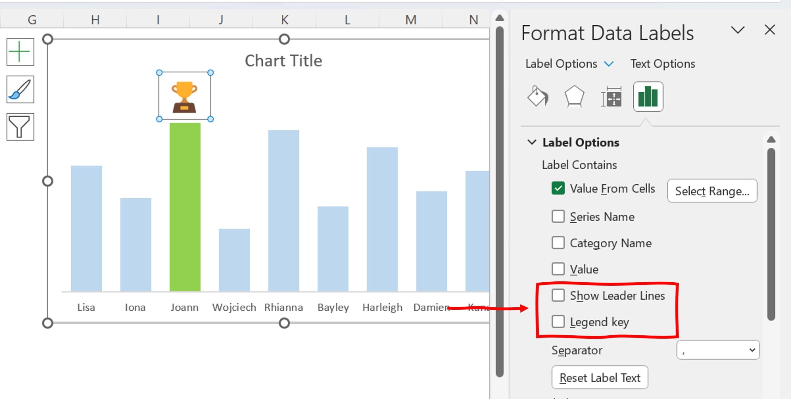
Customize the Data Labels:
To customize the data labels, uncheck “Value” and “Show Leader Lines”. Increase the font size of the data labels to increase the size of the Trophy icon.
Add Data Labels for other students:
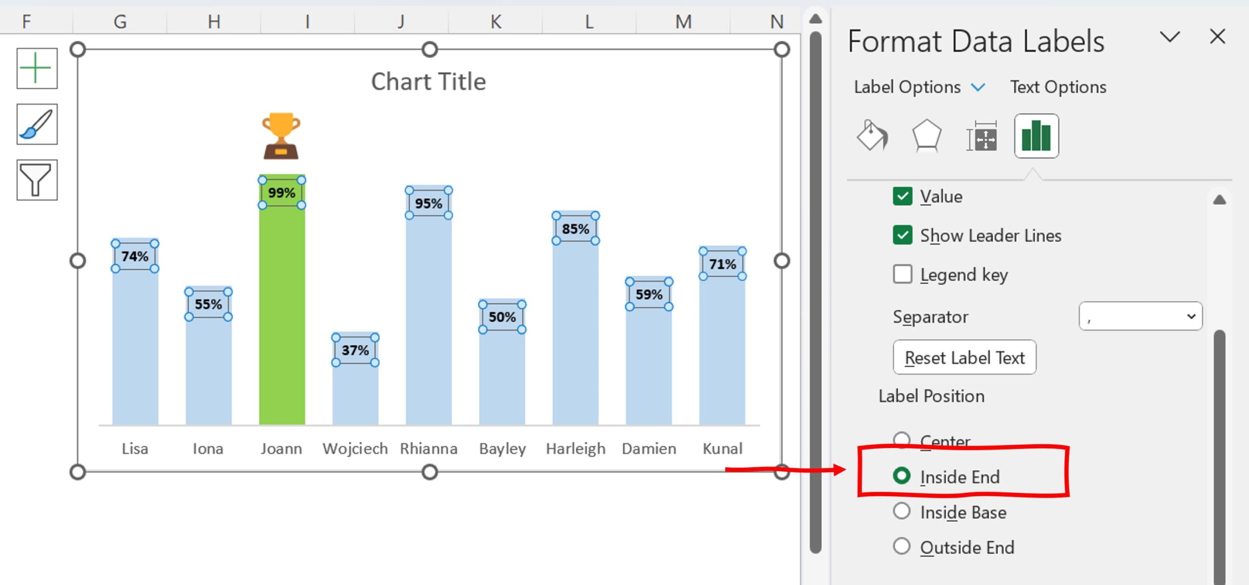
Now, add data labels for all other students. Right-click on the column chart and select “Add Data Labels”. Select the “Label Position” as “Inside End” to display the data labels inside the end of the columns.
Add Chart Title:
Finally, add a title to your chart. Click on the chart title and edit it as per your requirements.
Preview the chart:
Preview your chart to ensure that everything looks the way you want it to. If needed, you can adjust the data labels, chart colors, and other settings until you are satisfied with the final result.
Benefit of Dynamically highlight topper student on the chart
- Easily identify the top-performing student in a class
- Provides motivation and encouragement for students to perform better
- Saves time and effort for teachers by automatically updating the chart
- Helps teachers track student progress over time
- Provides a visual representation of student performance
- Promotes a positive learning environment by highlighting student achievements
- Allows for easy comparison of student performance
- Can help teachers identify areas where students may need extra support or instruction.
Conclusion
In conclusion, the dynamic highlight topper student chart in Excel is a useful tool for teachers in educational settings. It allows teachers to easily track student progress, identify high-performing students, and provide extra support where needed. Additionally, it provides motivation for students and promotes a positive learning environment. With the simple steps outlined in this tutorial, anyone can create a dynamic highlight topper chart in Excel and take advantage of its many benefits.
Visit our YouTube channel to learn step-by-step video tutorials
Watch the step-by-step video tutorial:
Click to buy Dynamically highlight topper student chart