Introduction
In today’s digital age, managing attendance in schools, colleges, or offices is a time-consuming task. This dynamic attendance sheet can help streamline this process by providing real-time attendance data that can be easily analysed and updated. Power Pivot is a powerful tool that can be used to create such a dynamic attendance sheet.
Explanation of what a dynamic attendance sheet is
A dynamic attendance sheet is an automated tool Which can be used to tracks and records attendance data for a group of people. It allows you to convert tabular view of attendance data into a proper attendance format quickly.
Brief overview of Power Pivot
Power Pivot is a data modelling tool which comes with Microsoft Excel. It enables users to create complex data models, perform advanced data analysis, and create interactive dashboards and reports. Power Pivot allows users to import and merge data from multiple sources, perform calculations using advanced formulas, and create relationships between different data sets. Users can create dynamic visualizations of data that can be easily updated as new information becomes available.
In the following sections, we will explore how to set up a dynamic attendance sheet using Power Pivot.
Setting up the Data
Click to buy Dynamic Attendance Sheet Using Power Pivot
Creating a table for the attendance data
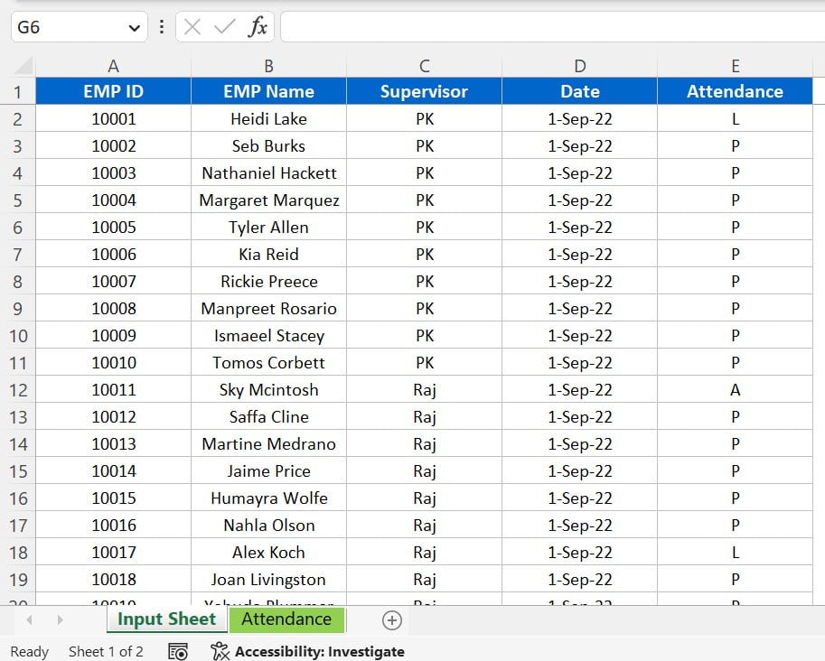
The first step in creating a dynamic attendance sheet using Power Pivot is to create a table for the attendance data. To do this, open a new Excel workbook and create a new sheet named “Input Sheet”. In this sheet, create a table with the following columns: EMP ID, EMP Name, Supervisor, Date, and Attendance. For the attendance column, we have used “P” for Present, “A” for Absent, and “L” for Leave, but you can customize these attendance types as per your requirements.
Entering sample data
After creating the table, enter some sample data to test the dynamic attendance sheet. We have entered dummy data for 40 employees with 4 supervisors, spanning from 1st September 2022 till 18th February 2023. You can replace this data with your original attendance data.
Formatting the table
Click to buy Dynamic Attendance Sheet Using Power Pivot
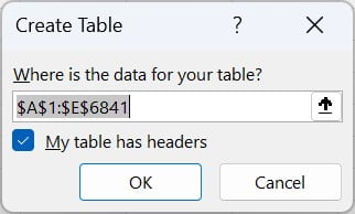
To make the attendance data table more user-friendly and easier to work with, we can format it as an Excel table. Select the range of data you have entered and press the keyboard shortcut Ctrl+L or go to the home tab and click on the “Format as Table” button. Check the “My table has headers” option and choose a table style that you prefer. This will convert the range into a table, making it easier to manage and analyse the attendance data.
By completing these steps, you have set up the necessary input sheet with formatted attendance data, ready to be imported into Power Pivot to create a dynamic attendance sheet.
Using Power Pivot to Create a Dynamic Attendance Sheet
Adding the attendance table to Power Pivot
Click to buy Dynamic Attendance Sheet Using Power Pivot
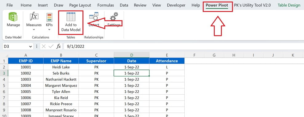
Once you have completed the data entry part, you can add this data to the Data Model. To add the data to the Data Model, click anywhere on the table and go to the Power Pivot tab. Then, click on “Add to Data Model.” This will open a new Power Pivot window where you can create relationships, add calculated columns, and create measures.
Note: If the Power Pivot tab is not available in your Excel ribbon, you can add it by following the below steps:
- For Excel 2010: Download and install the Microsoft Power Pivot for Excel add-in from the Microsoft website.
- For Excel 2013 and Excel 2016: The Power Pivot add-in is already built into Excel, but it may not be enabled. To enable the add-in, click on the “File” tab in the Excel ribbon, then click on “Options.” In the Excel Options dialog box, click on “Add-Ins.” In the Manage box, select “COM Add-ins,” and then click “Go.” Check the box next to “Microsoft Office Power Pivot for Excel,” and then click “OK.”
- For Excel 2019 and Excel 365: The Power Pivot add-in is already enabled by default.
Adding a Month calculated Column in Power Pivot
Click to buy Dynamic Attendance Sheet Using Power Pivot
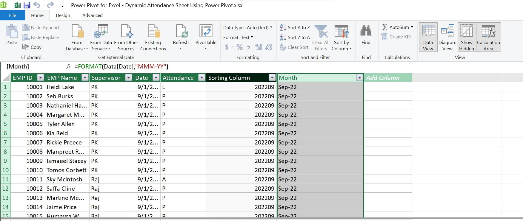
Now, you will add two calculated columns for the month as given below:
Sorting Column = FORMAT(Data[Date], "YYYYMM")

Month = FORMAT(Data[Date], "MMM-YY")
The Sorting Column is added to sort the Month column by Sorting Month because the Month column is a text, so it is not possible to sort it in the proper sequence.
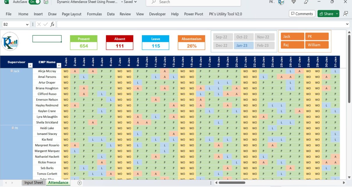
Creating a pivot table to display attendance data
After adding the calculated columns, you can load the data into a Pivot table in a new sheet tab. In the rows section, add Supervisor and EMP Name. Add Dates in the column section. In the values section, add the Attendance_Cal measure which will be explained in the next step.
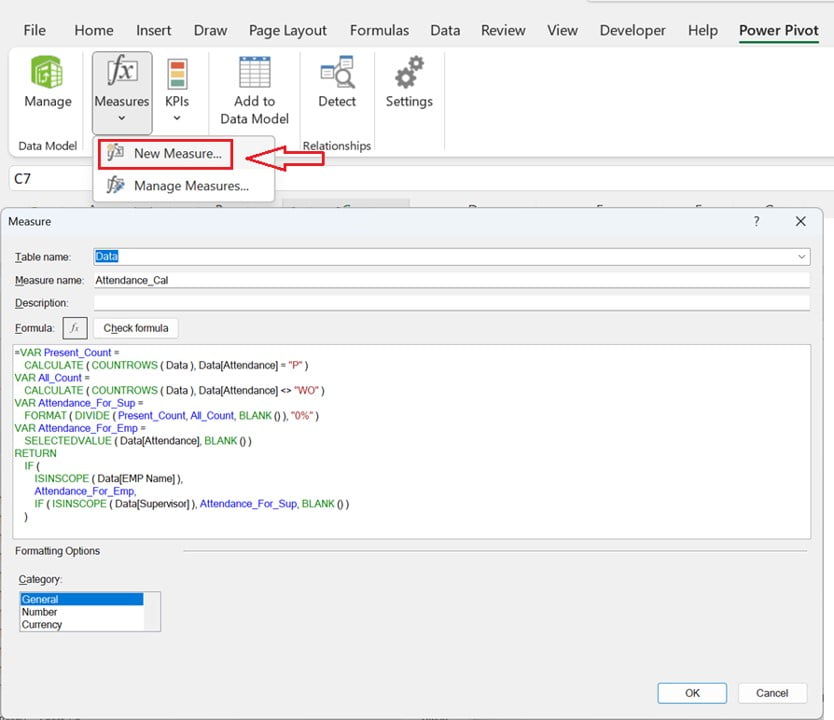
Create the “Attendance_Cal” Measure
Click to buy Dynamic Attendance Sheet Using Power Pivot
Now, you will create an Attendance_Cal measure using the following formula:
To create the measure, go to the Power Pivot Tab>> Measures >> New Measure
Attendance_Cal =
VAR Present_Count =
CALCULATE ( COUNTROWS ( Data ), Data[Attendance] = “P” )
VAR All_Count =
CALCULATE ( COUNTROWS ( Data ), Data[Attendance] <> “WO” )
VAR Attendance_For_Sup =
FORMAT ( DIVIDE ( Present_Count, All_Count, BLANK () ), “0%” )
VAR Attendance_For_Emp =
SELECTEDVALUE ( Data[Attendance], BLANK () )
RETURN
IF (
ISINSCOPE ( Data[EMP Name] ),
Attendance_For_Emp,
IF ( ISINSCOPE ( Data[Supervisor] ), Attendance_For_Sup, BLANK () )
)
This measure will show the actual Attendance type. When you expand the supervisors in the pivot table, it will show the attendance% by supervisor. When you collapse the pivot table by supervisor, it will show the attendance% by employee.
Customizing the Dynamic Attendance Sheet
Adding slicers to the pivot table

Click to buy Dynamic Attendance Sheet Using Power Pivot
To make the dynamic attendance sheet more interactive, we can add the slicers to the pivot table. We use the slicers to filter the data in the pivot table by selecting the desired value(s) from a list of options. In this case, we have added two slicers for EMP Name and Supervisor. To customize the slicers, we have taken the following steps:
- To remove the slicer headers, right-click on the slicer, go to Slicer Settings, and uncheck the Slicer Header option.
- Adjusted the width of the slicer to fit two columns for Supervisor and three columns for EMP Name.
- Changed the style of the slicers by selecting the desired option from the Slicer Styles menu.
Formatting the pivot table
We can customize the appearance of the pivot table to improve its readability and visual appeal. In this case, the following formatting options were applied:
- We can change the style of the slicers by selecting the desired option from the Slicer Styles menu.
- To improve the readability of the pivot table, we change the orientation of the Dates in the pivot columns at a 90-degree angle using the Format Cells window.
- We reduced the column width slightly to make the pivot table more compact.
- We removed the gridlines and heading from the worksheet to give the pivot table a cleaner appearance.
Adding conditional formatting to highlight certain attendance levels
Click to buy Dynamic Attendance Sheet Using Power Pivot
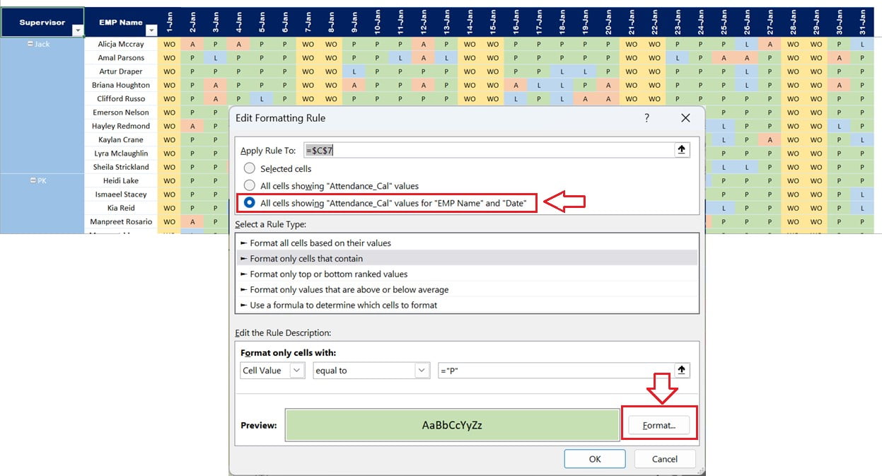
Conditional formatting is a useful tool for highlighting specific values in a pivot table. In this case, four conditional formatting rules were added to highlight the attendance levels A (Absent), P (Present), L (Leave), and WO (Weekly Off). To apply conditional formatting to a pivot table, follow these steps:
- Select the Pivot Table in which you want to apply the conditional formatting.
- Go to the Home tab and click on the Conditional Formatting option.
- Click on New Rule
- Select the All cells showing “Attendance_Cal” values for “EMP Name” and “Data”. This the third option in “Apply Rule to“
- Go to the Format only cells that contain
- Select cell Value and equal to and Put “P” in the box.
- Set the desired formatting options for the selected rule type (e.g., fill color, font color, etc.).
- Click OK to apply the rule to the Pivot table.
Similarly, you can apply the rule for other attendance type also.
Adding four formulas at the top of the Pivot table

Click to buy Dynamic Attendance Sheet Using Power Pivot
We have added four formulas to the top of the pivot table to show the count of the Preset, Absent, Leave, and Absenteeism%. Below are the details of the formulas
Preset Count:
This formula uses the COUNTIF function to count the number of cells in the pivot table which contain the value “P”. The formula used is
=COUNTIF($C$7:$XFD$1048576,"P")
Absent Count:
This formula uses the COUNTIF function to count the number of cells in the pivot table which contain the value “A”. The formula used is
=COUNTIF($C$7:$XFD$1048576,"A")
Leave Count:
This formula uses the COUNTIF function to count the number of cells in the pivot table which contain the value “L”. The formula used is
=COUNTIF($C$7:$XFD$1048576,"L")
Absenteeism%:
This formula calculates the absenteeism percentage. we are dividing the sum of the Absent and Leave counts by the sum of the Present, Absent, and Leave counts. The formula used is
=IFERROR((H3+L3)/(D3+H3+L3)
Click to buy Dynamic Attendance Sheet Using Power Pivot
Conclusion
Summary of the benefits of using a dynamic attendance sheet
Using a dynamic attendance sheet created using Power Pivot offers several benefits as given below:
Improved efficiency:
It saves time and effort in manually updating attendance records and generating reports.
Real-time analysis:
The attendance data is always up to date so that you can analyze it in real-time, enabling you quick decision-making.
Flexibility:
You can customize the attendance sheet to suit specific needs and can accommodate a large volume of data.
Visualization:
The Pivot table provides an interactive and visually appealing way to present attendance data.
Possible applications in other fields
The use of Power Pivot for creating dynamic sheets can be applied in various fields. For example, in human resources, a dynamic employee performance sheet can be created that allows managers to track and analyse employee performance in real-time. In sales, a dynamic sales dashboard can be created to monitor sales data and track progress towards sales goals.
Encouragement to explore Power Pivot further
Power Pivot is a powerful tool that can help in simplifying complex data analysis tasks. It enables the creation of dynamic data models that can handle large datasets and provide real-time insights. Exploring Power Pivot further can help individuals and organizations to leverage this tool to optimize their data analysis processes and gain a competitive advantage.
Visit our YouTube channel to learn step-by-step video tutorials
Watch the step-by-step video tutorial:
Click to buy Dynamic Attendance Sheet Using Power Pivot