In this article, we have create a RAG waffle Chart visualization with slicer to display the Red, Amber and Green percentage. We have used Conditional Formatting and linked picture feature to create this beautiful visualization.
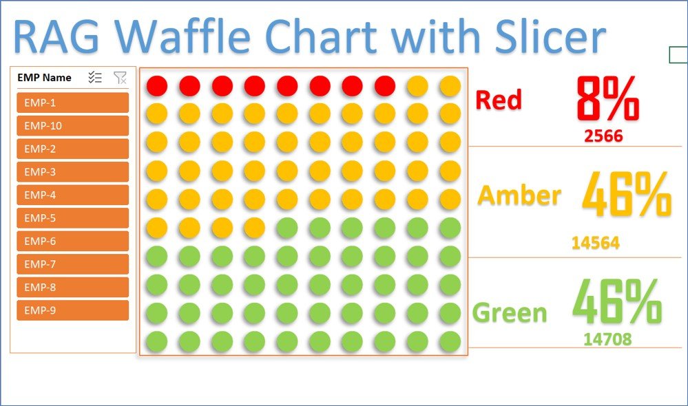
RAG waffle Chart visualization with Slicer
Below is the snapshot for the Chart. This chart shows Part of Red, Amber and Green in the Single Chart. Total of all 3 colors should be 100%. It will show the count of dot according to the%. You can use this chart in place of Pie or Tree map chart.
Click to buy RAG waffle Chart visualization with Slicer
Visit our YouTube channel to learn step-by-step video tutorials
Watch the step-by-step video tutorial:
Click to buy RAG waffle Chart visualization with Slicer