Home>Blogs>Charts and Visualization>Conditional Formatting in a Line Chart
Conditional Formatting in Line Chart
Charts and Visualization

Conditional Formatting in a Line Chart

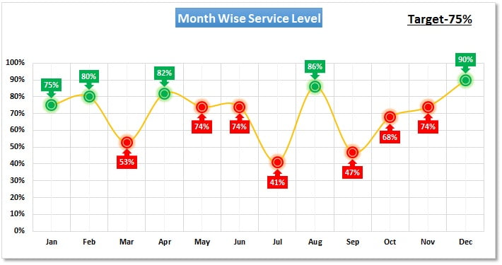
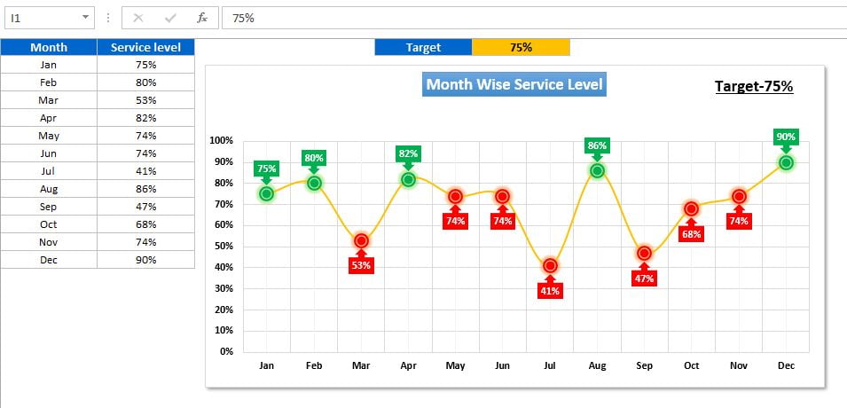
Using Conditional Formatting in a Line chart is very nice idea. This chart is very useful to show the trends of the data.

Here we have showcased the month on month Service Level and Target has been connected from and Excel cell. It can be easily analyzed that which months are not meeting the target. This is a dynamic chart, if we will change the target value then Red and Green color will be changed automatically.

Conditional Formatting in Line Chart


Click here to download this Excel workbook.


Watch the step by step video tutorial:

PK
Meet PK, the founder of PK-AnExcelExpert.com! With over 15 years of experience in Data Visualization, Excel Automation, and dashboard creation. PK is a Microsoft Certified Professional who has a passion for all things in Excel. PK loves to explore new and innovative ways to use Excel and is always eager to share his knowledge with others. With an eye for detail and a commitment to excellence, PK has become a go-to expert in the world of Excel. Whether you're looking to create stunning visualizations or streamline your workflow with automation, PK has the skills and expertise to help you succeed. Join the many satisfied clients who have benefited from PK's services and see how he can take your Excel skills to the next level!
https://www.pk-anexcelexpert.com

Leave a Reply