Home>Blogs>Charts and Visualization>Medical Science Info-graphic Chart in Excel
Medical Science Info-graphic Chart
Charts and Visualization

Medical Science Info-graphic Chart in Excel

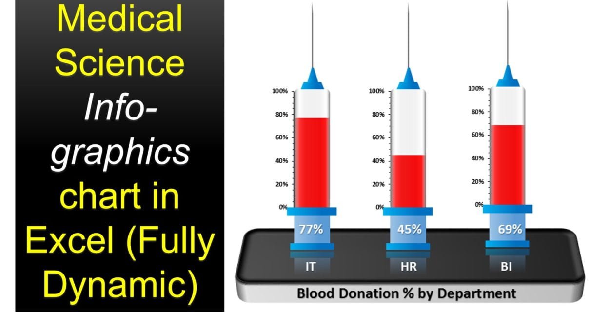
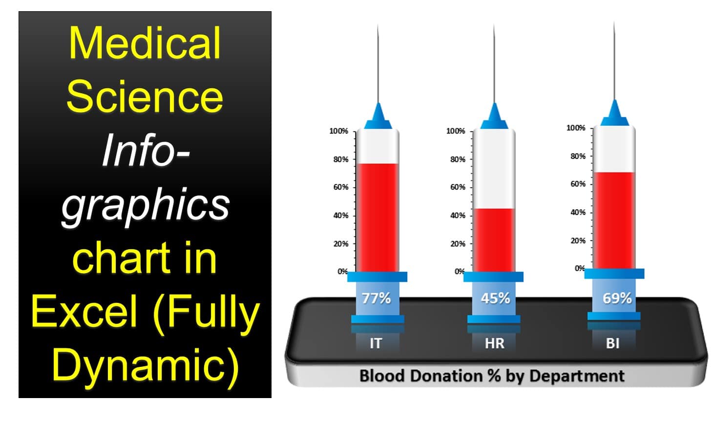
In this article, we have created a beautiful Medical Science info-graphics chart in Excel. We have displayed department wise blood donation% using this info-graphic in excel only. We have not used any external image. Chart is fully dynamic and connected with the excel data points.

Medical Science Info-graphic Chart

Watch the step by step video tutorial:

Click here to download this practice file.

PK
Meet PK, the founder of PK-AnExcelExpert.com! With over 15 years of experience in Data Visualization, Excel Automation, and dashboard creation. PK is a Microsoft Certified Professional who has a passion for all things in Excel. PK loves to explore new and innovative ways to use Excel and is always eager to share his knowledge with others. With an eye for detail and a commitment to excellence, PK has become a go-to expert in the world of Excel. Whether you're looking to create stunning visualizations or streamline your workflow with automation, PK has the skills and expertise to help you succeed. Join the many satisfied clients who have benefited from PK's services and see how he can take your Excel skills to the next level!
https://www.pk-anexcelexpert.com