In this article you will learn how to create an Employee Wise Deficit and Surplus Sales Chart. This chart will give 2 types of analysis.
- This will give an employee level sales comparison.
- Sales deficit and surplus for each employee against the sale target.
This is a good-looking chart and can be used for business dashboard or presentation.
Below are the steps to create Employee Wise Deficit and Surplus Sales Chart-
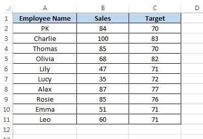
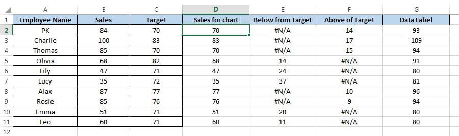
Let’s say we have employee wise sales and target data as given in below image.
- Before creating the chart, we need to take below support columns-
- Take a support column “Sales for chart” on column D.
- Put formula “=MIN(B2:C2)” on cell D2.
- Take a support column “Below from Target” on column E.
- Put formula “=IF(C2>B2,C2-B2,NA())” on cell E2.
- Take a support column “Above of Target” on column F.
- Put formula “=IF(B2>C2,B2-C2,NA())” on cell F2.
- Take a support column “Data Label” on column G.
- Put formula “=MAX(B2:C2)+9” on cell G2.
- Fill down the formula “D2:G11“
- Now select the range “A1:A11” and “C1:G11” by pressing Ctrl key.
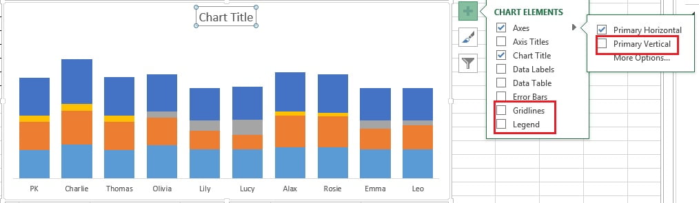
- Go to the Insert tab>>Charts>> Insert a 2D Stacked Column Chart
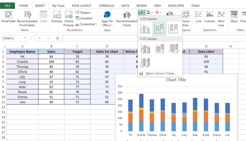
Insert a 2D Stacked Column Chart
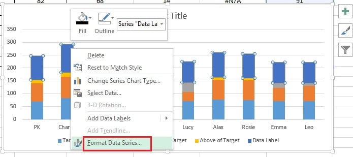
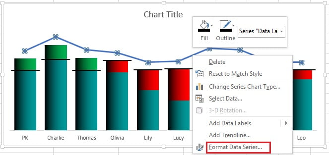
- Right click on the chart and click on “Format Data Series”
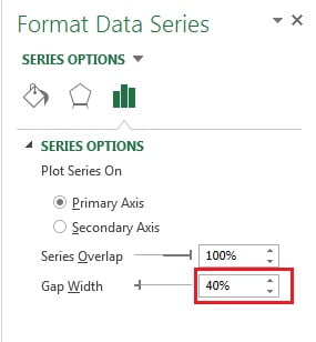
- Change the Gap Width as 40% in Format Data Series.
- Remove the Gridlines, Legend and Vertical Axis from the chart.
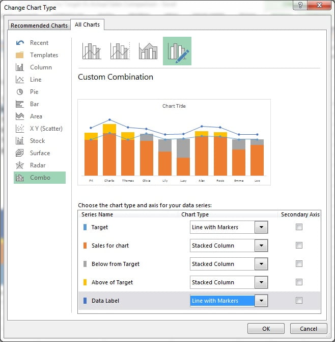
- Right click on the column of chart and click on Change Series Chart Type.
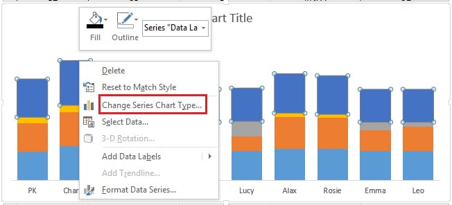
- Change Chart Type window will be opened.
- Change the Chart type for “Target” and “Data Label” series as “Line with Markers“.
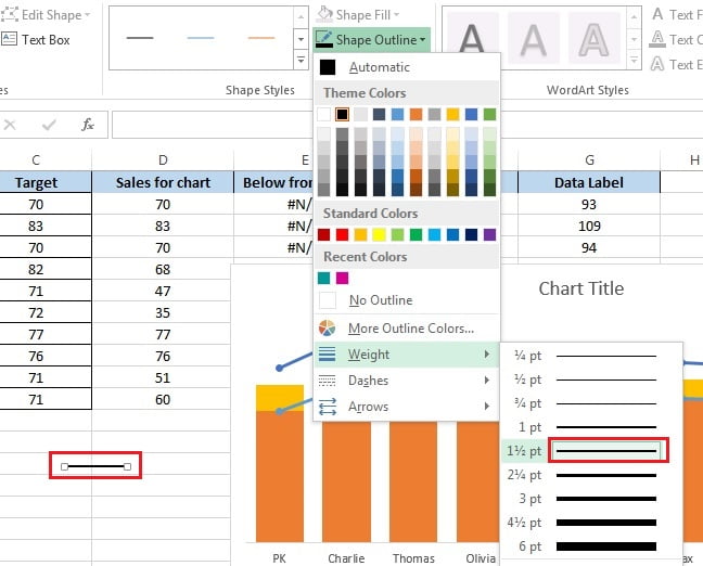
- Go to the Insert>>Shapes>>Insert a lines.
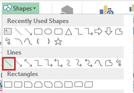
- Drag a small line on the worksheet.
- Select the line and go to Format tab>>Shape Outline.
- Choose line color as Black.
- Choose the weight of line as 1½ pt.
- Copy the line (shape) and paste on the Target line chart.
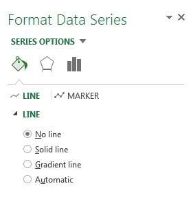
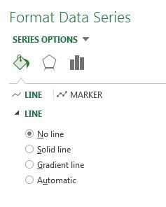
- Right click on the Target line chart and click on Format Data Series.
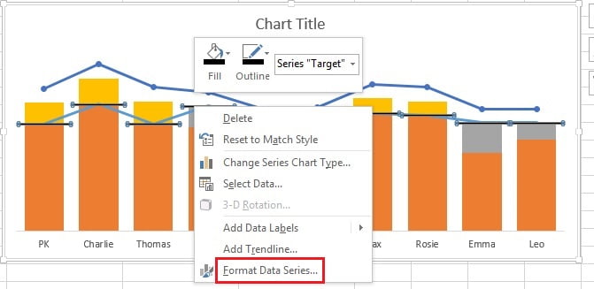
- Select No line under Line option in Format Data Series Window.
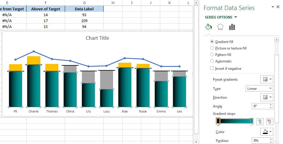
- Right click on “Sale for Chart” series and click on Format Data Series.
- Go to the Fill & Line option and choose the Gradient fill.
- Choose the Type as Linear.
- Choose the Angle as o°.
- Take two Gradient Stops and fill Black and Teal color as given in below image.
Gradient fill for Sale for Chart Series.
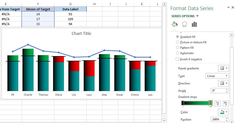
- Right click on “Below From Target” series and click on Format Data Series.
- Go to the Fill & Line option and choose the Gradient fill.
- Choose the Type as Linear.
- Choose the Angle as o°.
- Take two Gradient Stops and fill Black and Red color as given in below image.
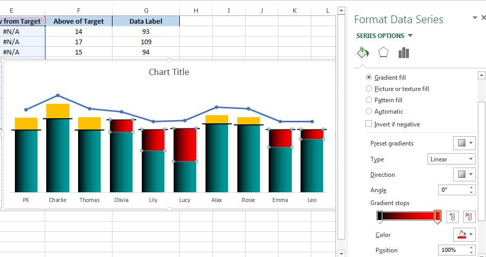
- Right click on “Above of Target” series and click on Format Data Series.
- Go to the Fill & Line option and choose the Gradient fill.
- Choose the Type as Linear.
- Choose the Angle as o°.
- Take two Gradient Stops and fill Black and Green color as given in below image.
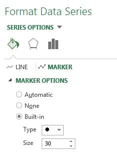
- Now Right click on the “Data Label” Series line chart and click on Format Data Series.
- Select the No line in the Line option.
- Select the Marker.
- Choose Built-in under Marker Options.
- Choose Type as circular marker.
- Choose Size as 30.
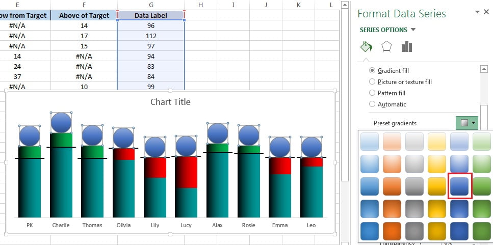
- Now go to the Fill of Marker Options and fill the Gradient color from preset gradients as given in below image.
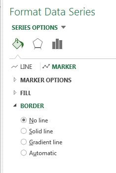
- Choose the No line the Border.
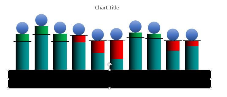
- Now go to Insert tab>>Shapes>>Insert a Rectangle.
- Drag the rectangle over the chart as given in below image.
- Fill the black color in the rectangle.
- Choose No outline in Outline.
- Right click on the rectangle and click on Format Shape.
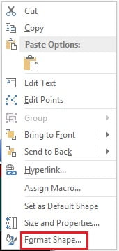
- Go to the Effects option.
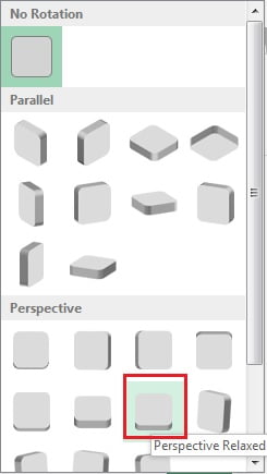
- Go to 3D Rotation.
- Go to Preset and select Perspective Relaxed
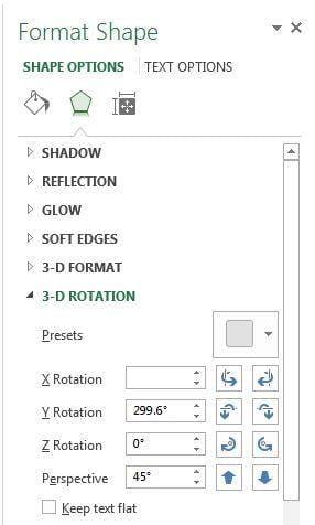
- Change Y Rotation as 299.6°
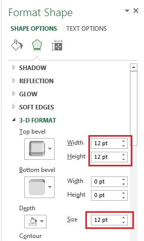
- Now go to 3-D Format.
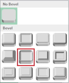
- Choose the Top Bevel as given in below image.
- Choose the Top bevel Width and Height as 12pt.
- Choose the Depth as 12pt.
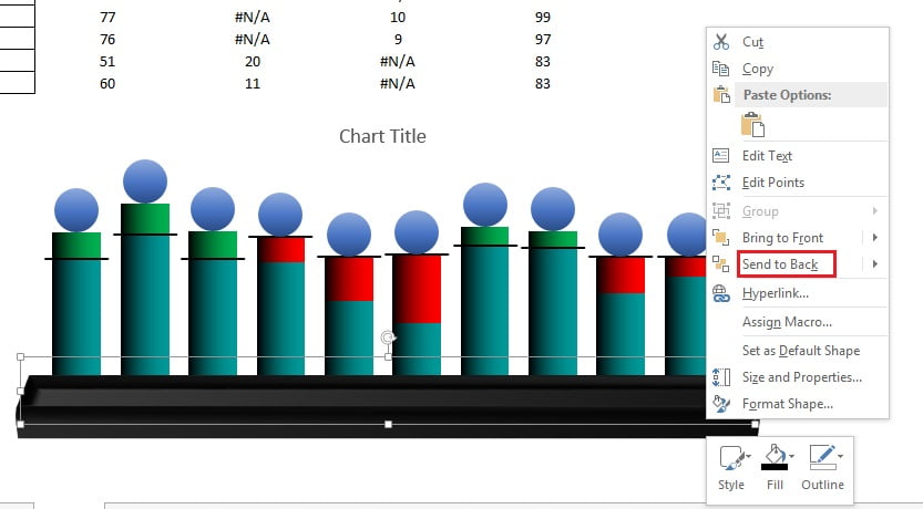
- Right click on the chart and click on Send to Back.
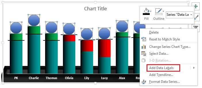
- Now we will add the data labels.
- Right click on the Markers and click on Add Data Labels.
Click to buy Employee Wise Deficit and Surplus Sales Chart
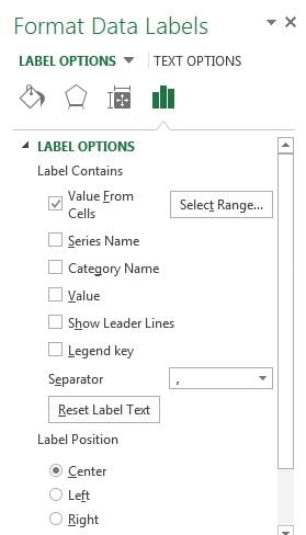
- After adding the data label, right click on the data label and click on Format Data label.
- Click on Value From Cells.
- Select the range from “B2:B11“.
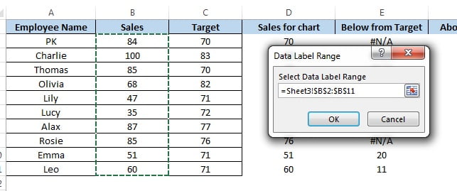
- Click on Center available below Label Position.
- Right click on the “Above of Target” series (Green Series) and click on Add data label.
- Right click on the “Below from Target” series (Red Series) and click on Add data label.
- Format the Data Label as White font color and font as Bold.
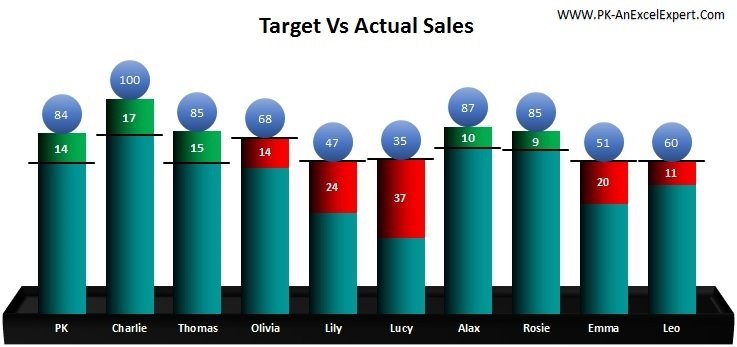
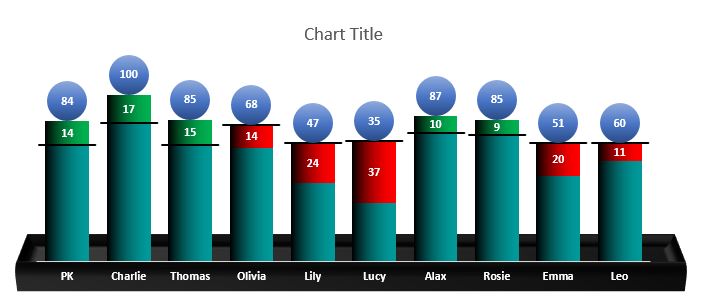
Below is the final Employee Wise Deficit and Surplus Sales Chart
Visit our YouTube channel to learn step-by-step video tutorials
Click to buy Employee Wise Deficit and Surplus Sales Chart
Watch the step-by-step video tutorial for Employee Wise Deficit and Surplus Sales Chart:
Click to buy Employee Wise Deficit and Surplus Sales Chart