In today’s digital age, data visualization and management play crucial roles in the education sector. We have created a Project Management Student Dashboard in Power BI. If you are running an institute or any education centre then This is will be very useful to you. This article explores the features, advantages, best practices, and opportunities for improvement in using this dashboard. We’ll also address frequently asked questions to provide a complete understanding of this powerful tool.
Introduction
A well-designed dashboard can transform how educational institutes manage and visualize student data. The Project Management Student Dashboard in Power BI offers a robust solution, blending functionality with an intuitive interface. This ready-to-use template is perfect for institutes aiming to enhance their data management capabilities.
Key Features of the Project Management Student Dashboard
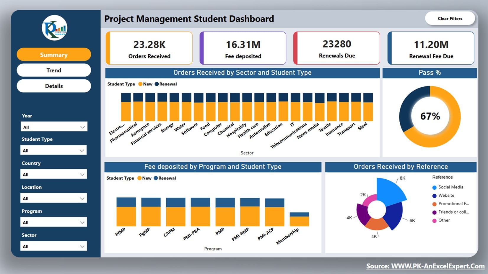
The Project Management Student Dashboard in Power BI is structured into three main pages, each offering unique insights and functionalities:
Summary Page
Click to buy Project Management Student Dashboard in Power BI
The Summary Page provides a high-level overview of critical metrics, including:
- Order Received: Tracks the total number of student enrollments.
- Fee Deposited: Monitors the total amount of fees collected.
- Renewals Due: Shows the number of students due for renewal.
- Renewal Fee Due: Displays the outstanding renewal fees.
- Pass Percentage: Presented in a pie chart, indicating the pass rate.
- Sector, Program, and Reference Analysis: Offers insights into different segments, showing sector-wise, program-wise, and reference-wise performance.
- New Students vs. Renewals: Differentiates between new student enrollments and renewals.
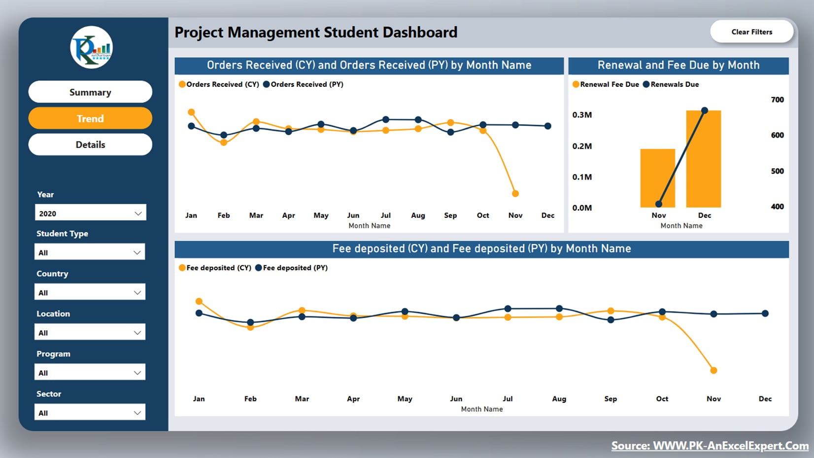
Trend Page
Click to buy Project Management Student Dashboard in Power BI
The Trend Page focuses on monthly trends, comparing current and previous years’ data:
- Order Received: Visualizes the monthly order received for the current year versus the previous year.
- Renewals Due and Renewal Fee Due: Tracks monthly renewals and associated fees.
- Fee Deposit: Compares the monthly fee deposits of the current year with the previous year.
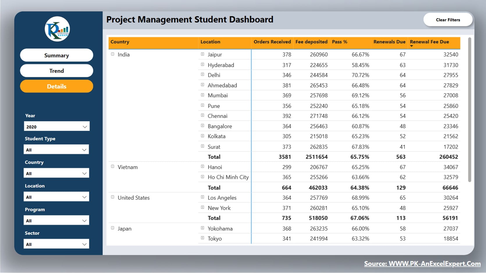
Details Page
Click to buy Project Management Student Dashboard in Power BI
The Details Page provides a detailed matrix or table visual, showcasing:
Country, Location, Reference, Sector, Program, and Category: Breaks down the data by these dimensions, showing order received, fee deposit, pass percentage, renewals due, and renewal fee due.
Other Features
Clear All Filter Button
Located at the top right corner of the dashboard, this button allows users to clear all filters from the page, ensuring they can start fresh with their data exploration.
Slicers
On the left side of the dashboard, we have given multiple slicer to filter the data in the dashboard.
Page Navigation Button
These buttons facilitate easy navigation across different pages of the dashboard, enhancing user experience and accessibility.
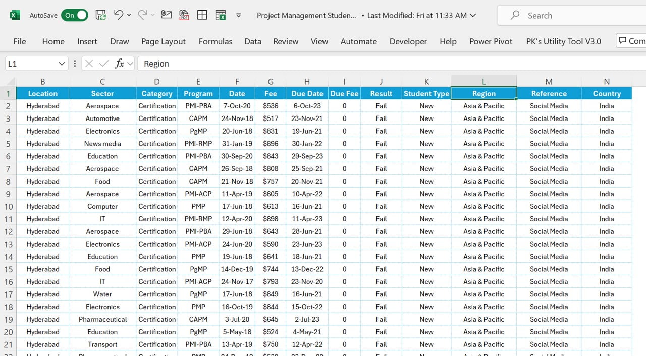
Dataset of Dashboard:
We are using the Excel based Data. Below is the format of the data. You can simply replace this data with your own data in the same format.
Click to buy Project Management Student Dashboard in Power BI
Advantages of the Project Management Student Dashboard
The Project Management Student Dashboard in Power BI offers numerous benefits:
- Enhanced Data Visualization: The dashboard provides clear and intuitive visualizations, making it easier to understand complex data.
- Improved Decision-Making: With real-time data and comprehensive insights, educational institutes can make informed decisions quickly.
- User-Friendly Interface: The dashboard’s design ensures ease of use, even for those with limited technical expertise.
- Customizable: Institutes can tailor the dashboard to meet their specific needs, adding or modifying features as required.
Opportunity for Improvement in the Project Management Student Dashboard
While the Project Management Student Dashboard is robust, there are always opportunities for enhancement:
- Integration with Other Systems: Integrating the dashboard with other management systems can provide a more seamless data flow and reduce manual data entry.
- Enhanced User Training: Providing additional training resources can help users maximize the dashboard’s potential and utilize all its features effectively.
- More Advanced Analytics: Incorporating advanced analytics and predictive modeling can further enhance the insights provided by the dashboard, allowing for even better decision-making.
Best Practices for Using the Project Management Student Dashboard
To get the most out of the Project Management Student Dashboard, follow these best practices:
- Regular Data Updates: Ensure that data is updated regularly to maintain the accuracy and relevance of the information displayed.
- Utilize Filters Effectively: Make use of the slicers and filters to drill down into specific data points and gain deeper insights.
- Customize Visualizations: Tailor the visualizations to meet your specific needs, ensuring that the most important metrics are highlighted.
- Train Users: Provide comprehensive training to all users, ensuring they understand how to navigate and use the dashboard effectively.
- Monitor Performance: Regularly monitor the performance of the dashboard to ensure it is functioning correctly and providing accurate data.
Conclusion
The Project Management Student Dashboard in Power BI is a powerful dashboard for educational institutes. It is offering comprehensive data visualization and management capabilities. By understanding its features, advantages, and best practices, institutes can enhance their data management processes and make informed decisions.
Frequently Asked Questions (FAQs)
Q. What is the Project Management Student Dashboard in Power BI?
The Project Management Student Dashboard is a data visualization dashboard. We have designed it to help educational institutes manage and analyze student data effectively. It offers comprehensive insights into enrollments, fee deposits, renewals, and more.
Q. How can the dashboard benefit my institute?
The dashboard enhances data visualization, improves decision-making, and offers a user-friendly interface. It helps institutes track critical metrics and make informed decisions quickly.
Q. Can I customize the dashboard?
Yes, the dashboard is highly customizable. Institutes can tailor it to meet their specific needs, adding or modifying features as required.
Q. How often should I update the data?
To maintain accuracy, it’s essential to update the data regularly. This ensures that the information displayed is current and relevant.
Q. Is training required to use the dashboard?
While the dashboard is user-friendly, providing training to users can help them maximize its potential and utilize all its features effectively.
See the below live dashboard
Click to buy Project Management Student Dashboard in Power BI
Visit our YouTube channel to learn step-by-step video tutorials
Watch the step-by-step video tutorial:
Click to buy Project Management Student Dashboard in Power BI