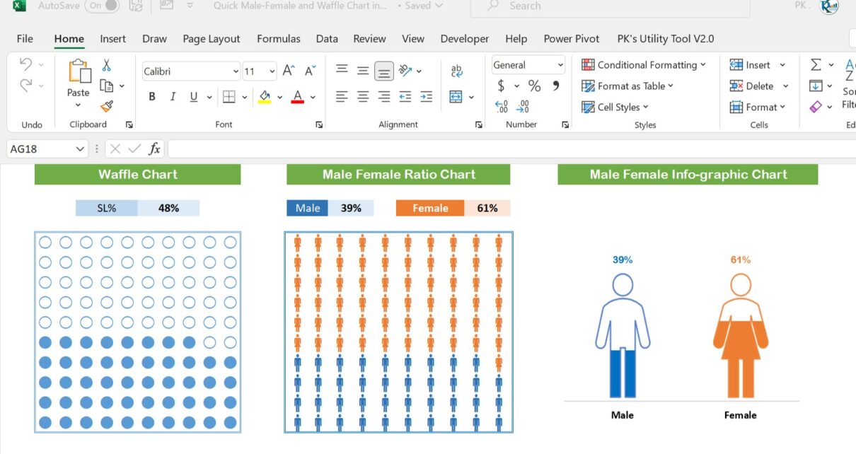
In this article, we have created two Waffle charts and a Male/Female infographic chart. To create the waffle charts, we used the SEQUENCE function. You can use these chart in you business dashboard. These are ready to use charts in Excel.
See our other related charts:
- RAG waffle Chart visualization with Slicer
- Waffle Charts in Excel Without Macro
- Quick Dashboard in Excel
- Male and Female Info-graphics in Excel
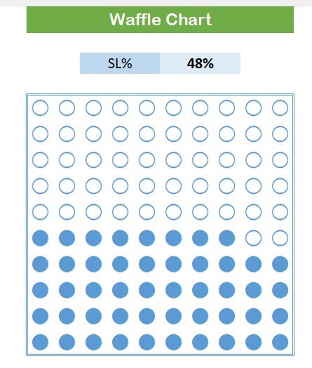
Waffle chart in Excel:
You can use this chart to show the KPI metric like – Service Level, Quality Score, etc. You can simply enter your data to create the chart.
Click to buy Quick Male-Female and Waffle Chart in Excel
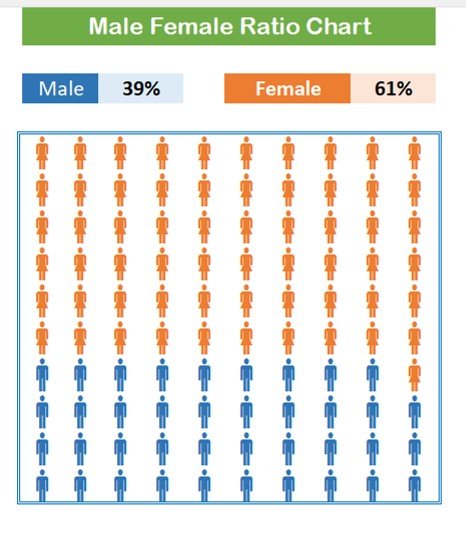
Male/Female Ratio Chart:
In this chart, you can show the Attendance%, and Headcount% by Male and Female.
Click to buy Quick Male-Female and Waffle Chart in Excel
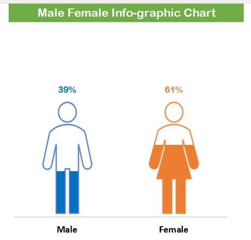
Male Female Info-graphic Chart:
This chart also can be used to show the Attendance%, and Headcount% by Male and Female.
Click to buy Quick Male-Female and Waffle Chart in Excel
Visit our YouTube channel to learn step-by-step video tutorials
Watch the step-by-step video tutorial:
Click to buy Quick Male-Female and Waffle Chart in Excel