Recycling plays a crucial role in building a sustainable and environmentally responsible future. Cities, municipalities, and waste management organizations continuously work to improve recycling efficiency, reduce landfill waste, and optimize resource recovery. However, managing recycling operations without proper performance tracking becomes extremely challenging.
Organizations often collect large volumes of recycling data from different facilities, plants, and collection points. Unfortunately, when teams store this data in scattered spreadsheets or disconnected reports, managers struggle to monitor recycling performance effectively.
Therefore, organizations need a centralized analytical solution that converts raw recycling data into clear insights. This is exactly where the Recycling Infrastructure KPI Dashboard in Power BI becomes extremely valuable.
Click to Purchases Recycling Infrastructure KPI Dashboard in Power BI
The Recycling Infrastructure KPI Dashboard in Power BI is a ready-to-use analytical tool that helps organizations monitor recycling performance indicators, evaluate operational efficiency, compare targets with actual performance, and identify improvement opportunities.
Because Power BI provides powerful visualization, filtering, and data modeling capabilities, managers can easily transform raw recycling data into interactive dashboards that support better decision-making.
In this comprehensive guide, you will learn everything about the Recycling Infrastructure KPI Dashboard in Power BI, including its structure, features, advantages, best practices, and practical implementation strategies.
What is a Recycling Infrastructure KPI Dashboard in Power BI?
A Recycling Infrastructure KPI Dashboard in Power BI is an interactive analytics tool that tracks key performance indicators related to recycling operations and infrastructure performance.
Instead of reviewing multiple reports manually, organizations can analyze recycling performance through visual dashboards that display trends, comparisons, and performance indicators.
This dashboard helps organizations monitor:
-
Recycling collection efficiency
-
Waste processing capacity
-
Recycling rate performance
-
Operational targets vs actual performance
-
Year-over-year recycling trends
Moreover, decision-makers gain real-time visibility into recycling operations, which helps them identify operational gaps and improve waste management strategies.
As a result, organizations can make faster, data-driven decisions that support sustainability goals.
Why Do Organizations Need a Recycling Infrastructure KPI Dashboard?
Recycling infrastructure generates large volumes of operational data every day. Collection centers, sorting plants, recycling facilities, and logistics teams all contribute to the overall recycling ecosystem.
However, when organizations rely on manual reporting methods, they often face several challenges.
Common Problems Without a Recycling Dashboard
-
Difficulty monitoring recycling performance across multiple locations
-
Lack of visibility into operational targets
-
Time-consuming manual reporting processes
-
Inconsistent data analysis across departments
-
Limited insights into recycling trends
Therefore, organizations require a structured analytical system that provides a centralized view of recycling operations.
A Power BI KPI dashboard solves this problem by consolidating all recycling data into a single visual interface.
Consequently, managers can instantly evaluate performance, compare targets, and identify improvement areas.
Key Features of the Recycling Infrastructure KPI Dashboard in Power BI
The Recycling Infrastructure KPI Dashboard in Power BI contains three main analytical pages that provide a comprehensive view of recycling performance.
Each page focuses on a different level of analysis.
1. Summary Page – The Main Performance Overview

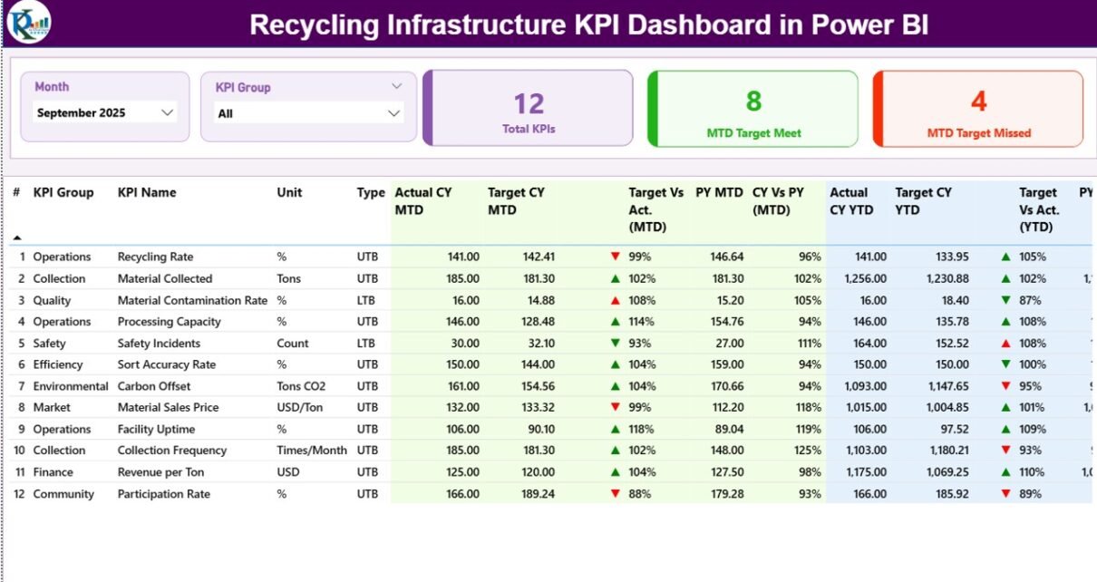
The Summary Page acts as the central monitoring hub of the dashboard. It provides a quick overview of recycling KPIs and helps decision-makers evaluate performance instantly.
At the top of the dashboard, users can select filters that control the analysis.
Slicers Available
-
Month slicer to analyze performance by time period
-
KPI Group slicer to filter KPIs by category
These filters allow users to dynamically update the entire dashboard with just a few clicks.
KPI Performance Cards
The dashboard displays three important KPI cards:
-
Total KPIs Count – Total number of KPIs tracked in the dashboard
-
MTD Target Meet Count – Number of KPIs that achieved their monthly targets
-
MTD Target Missed Count – Number of KPIs that failed to meet targets
These KPI cards immediately highlight the overall performance of recycling operations.
Detailed KPI Performance Table
Below the KPI cards, the dashboard displays a detailed KPI performance table that contains important analytical fields.
Click to Purchases Recycling Infrastructure KPI Dashboard in Power BI
The table includes the following columns:
-
KPI Number – Sequential number assigned to each KPI
-
KPI Group – Category of the KPI (Operations, Sustainability, Cost, etc.)
-
KPI Name – Name of the performance indicator
-
Unit – Measurement unit of the KPI
KPI Type Classification
Each KPI also includes a performance classification:
-
LTB (Lower the Better)
-
UTB (Upper the Better)
This classification helps the dashboard determine whether higher values indicate improvement or decline.
Monthly Performance Indicators
The dashboard also includes Monthly-to-Date (MTD) performance metrics, such as:
-
Actual CY MTD – Current year monthly performance
-
Target CY MTD – Monthly target value
-
MTD Status Icon – ▲ or ▼ indicator showing KPI status
Green arrows represent strong performance, while red arrows indicate performance gaps.
Target vs Actual Performance (MTD)
The dashboard calculates performance percentages using the formula:
Actual MTD / Target MTD
This metric helps managers understand whether recycling operations meet expected targets.
Previous Year Comparison (MTD)
The dashboard also compares performance with historical data.
-
PY MTD – Previous year monthly value
-
CY vs PY (MTD) – Comparison between current year and previous year
Therefore, organizations can easily evaluate whether recycling performance improves year after year.
Year-To-Date (YTD) Analysis
In addition to monthly metrics, the dashboard includes Year-To-Date performance indicators.
These metrics include:
-
Actual CY YTD
-
Target CY YTD
-
YTD Status Icon
-
Target vs Actual (YTD)
-
PY YTD
-
CY vs PY (YTD)
As a result, managers can evaluate long-term recycling trends and progress toward annual sustainability targets.
Click to Purchases Recycling Infrastructure KPI Dashboard in Power BI
2. KPI Trend Page – Visual Performance Analysis

The KPI Trend Page provides a visual analysis of recycling performance over time.
Instead of reviewing numbers in tables, users can analyze trends using dynamic charts.
Charts Available on the KPI Trend Page
This page contains two combo charts that display:
-
Current Year Actual Performance
-
Previous Year Performance
-
Target Values
These charts show both Monthly-to-Date (MTD) and Year-To-Date (YTD) performance trends.
KPI Selection Slicer
A slicer located on the left side of the dashboard allows users to select a specific KPI.
Once the user selects a KPI, the charts automatically update to display detailed trends.
Therefore, users can quickly analyze performance patterns and identify seasonal changes in recycling operations.
3. KPI Definition Page – Detailed KPI Information

The KPI Definition Page provides detailed information about each KPI.
This page acts as a drill-through page, which means users can access it from the Summary page.
The KPI Definition page includes the following information:
-
KPI Number
-
KPI Group
-
KPI Name
-
Unit
-
KPI Formula
-
KPI Definition
-
KPI Type (LTB or UTB)
This page helps users understand the exact meaning of each KPI.
Additionally, the page contains a Back Button located at the top-left corner so users can return to the main dashboard.
Excel Data Source Used in the Dashboard
The Recycling Infrastructure KPI Dashboard in Power BI uses an Excel file as the data source.
This approach makes the dashboard flexible and easy to maintain.
Users only need to update the Excel file, and the dashboard refreshes automatically.
The Excel file contains three worksheets.
1. Input_Actual Worksheet
This worksheet stores the actual performance data of each KPI.
Users must enter the following fields:
-
KPI Name
-
Month (First date of the month)
-
MTD Value
-
YTD Value
After users update this sheet, the dashboard reflects the latest recycling performance.
2. Input_Target Worksheet
This worksheet stores the target values for each KPI.
Users must fill the following fields:
-
KPI Name
-
Month
-
Target MTD Value
-
Target YTD Value
These targets allow the dashboard to calculate performance comparisons.
3. KPI Definition Worksheet
This worksheet contains the metadata of each KPI.
The fields include:
-
KPI Number
-
KPI Group
-
KPI Name
-
Unit
-
Formula
-
Definition
-
KPI Type (LTB or UTB)
Because the dashboard reads this information directly from Excel, organizations can easily modify KPI definitions without editing Power BI models.
Advantages of Recycling Infrastructure KPI Dashboard in Power BI
Click to Purchases Recycling Infrastructure KPI Dashboard in Power BI
Organizations gain several benefits when they implement a recycling KPI dashboard.
1. Centralized Performance Monitoring
The dashboard consolidates all recycling performance indicators into one platform.
As a result, decision-makers can analyze operational performance quickly.
2. Real-Time Data Insights
Power BI dashboards update automatically when data refreshes.
Therefore, organizations can monitor recycling performance continuously.
3. Faster Decision-Making
Managers can immediately identify operational issues and take corrective actions.
Consequently, organizations improve recycling efficiency.
4. Improved Sustainability Tracking
The dashboard allows organizations to measure progress toward environmental goals.
Thus, companies can support sustainability initiatives effectively.
5. Clear Data Visualization
Interactive charts and KPI indicators simplify complex data.
Therefore, users can understand recycling performance without technical expertise.
Best Practices for the Recycling Infrastructure KPI Dashboard
Organizations should follow several best practices when implementing a recycling KPI dashboard.
Define Clear KPIs
Select performance indicators that align with sustainability and operational goals.
Maintain Accurate Data
Ensure that data entered into Excel remains accurate and consistent.
Update Data Regularly
Update the data source frequently to maintain real-time insights.
Use Standard KPI Definitions
Maintain consistent KPI definitions across departments.
Train Users
Provide training so users understand how to interpret dashboard insights.
How Organizations Can Use This Dashboard Effectively
Organizations can use the Recycling Infrastructure KPI Dashboard in Power BI in multiple ways.
Waste Management Companies
Waste management organizations can monitor recycling plant performance and collection efficiency.
Municipal Governments
Cities can track recycling programs and evaluate environmental policies.
Recycling Processing Facilities
Processing plants can monitor operational throughput and recovery rates.
Environmental Agencies
Government agencies can analyze recycling performance across regions.
Future of Recycling Analytics and Smart Waste Management
Technology continues to transform the recycling industry.
Advanced analytics tools like Power BI help organizations analyze environmental data more effectively.
In the future, recycling analytics will integrate with:
-
Smart waste sensors
-
IoT-enabled recycling bins
-
AI-based waste sorting systems
-
Real-time sustainability monitoring
Therefore, organizations that adopt data-driven recycling management today will lead the sustainable cities of tomorrow.
Conclusion
Recycling infrastructure plays a vital role in achieving environmental sustainability and efficient waste management. However, organizations cannot improve recycling performance without proper data monitoring and analytics.
The Recycling Infrastructure KPI Dashboard in Power BI provides a powerful solution for tracking recycling KPIs, comparing targets, and analyzing operational trends.
Because the dashboard combines Excel data sources with interactive Power BI visualizations, organizations gain a flexible and scalable analytical platform.
As a result, managers can monitor recycling performance in real time, identify operational gaps, and implement strategies that support sustainable waste management.
Therefore, organizations that adopt recycling KPI dashboards can significantly improve recycling efficiency, operational transparency, and environmental impact.
Frequently Asked Questions (FAQs)
What is a Recycling Infrastructure KPI Dashboard?
A Recycling Infrastructure KPI Dashboard is an analytical tool that tracks recycling performance indicators such as recycling rate, processing capacity, and operational efficiency.
Why should organizations use Power BI for recycling dashboards?
Power BI provides powerful visualization, filtering, and data modeling capabilities. Therefore, organizations can easily convert recycling data into interactive insights.
What data sources are used in this dashboard?
Click to Purchases Recycling Infrastructure KPI Dashboard in Power BI
The dashboard uses an Excel file containing three worksheets:
-
Actual KPI Data
-
Target KPI Data
-
KPI Definitions
What does LTB and UTB mean in KPIs?
-
LTB (Lower the Better) means lower values represent better performance.
-
UTB (Upper the Better) means higher values represent better performance.
Can organizations customize this dashboard?
Yes. Organizations can modify KPI definitions, targets, and actual values by updating the Excel data source.
Visit our YouTube channel to learn step-by-step video tutorials