Managing a clinic today requires more than medical expertise. Clinics must monitor patient satisfaction, billing, doctor performance, treatment costs, and monthly trends—all at the same time. However, when data stays scattered across multiple Excel files and reports, decision-making becomes slow and reactive. Therefore, clinics increasingly rely on a Clinic Dashboard in Excel to gain clarity, control, and confidence.
In this detailed and SEO-optimized guide, you will learn what a Clinic Dashboard in Excel is, why it matters, how it works, what each dashboard page shows, its advantages, best practices, and answers to common questions. Moreover, this article explains everything in simple language so anyone can understand and apply it easily.
Click to Purchases Clinic Dashboard in Excel
What Is a Clinic Dashboard in Excel?
A Clinic Dashboard in Excel is a ready-to-use analytical tool built using Microsoft Excel that helps clinics track, analyze, and visualize clinical, operational, and financial performance in one place.
Instead of reviewing long data tables daily, clinic managers and doctors view summarized insights through charts, KPI cards, and slicers. As a result, they understand performance at a glance and take faster action.
Because Excel supports pivot tables, slicers, and charts, this dashboard remains flexible, cost-effective, and easy to maintain without advanced software.
Why Do Clinics Need a Dashboard in Excel?
Clinics deal with increasing patient volumes, rising operational costs, and higher expectations for service quality. Therefore, relying on manual reports no longer works.
A Clinic Dashboard in Excel helps because:
-
It centralizes clinic data into one file
-
It reduces reporting time significantly
-
It improves visibility into patient and revenue trends
-
It supports faster and smarter decisions
-
It works without expensive BI tools
As clinics grow, structured dashboards become essential rather than optional.
How Does a Clinic Dashboard in Excel Work?
A Clinic Dashboard in Excel works by connecting raw clinic data with pivot tables and charts. Then, slicers filter the data dynamically.
Typical Flow of the Dashboard
-
Data gets stored in a structured Data Sheet
-
Pivot tables summarize key metrics
-
Charts visualize trends and comparisons
-
Slicers allow filtering by month, doctor, department, or location
-
Users navigate pages using a Page Navigator
Because everything updates automatically, the dashboard always reflects the latest data.
Key Features of the Clinic Dashboard in Excel
This ready-to-use Clinic Dashboard in Excel includes multiple features designed for clarity and ease of use.
Page Navigator for Easy Navigation
The Page Navigator, located on the left side, allows users to move quickly between dashboard pages. Therefore, users never waste time searching for reports.
Right-Side Slicers for Dynamic Analysis
Each page includes right-side slicers that help filter data instantly by relevant dimensions such as department, location, doctor, or month.
Interactive Charts and KPI Cards
Instead of static visuals, the dashboard uses interactive pivot charts and KPI cards. As a result, users can explore data deeply without changing formulas.
What Are the Pages Included in the Clinic Dashboard in Excel?
This Clinic Dashboard in Excel contains five powerful analytical pages, each designed for a specific type of analysis.
Overview Page: What Is Happening in the Clinic at a Glance?
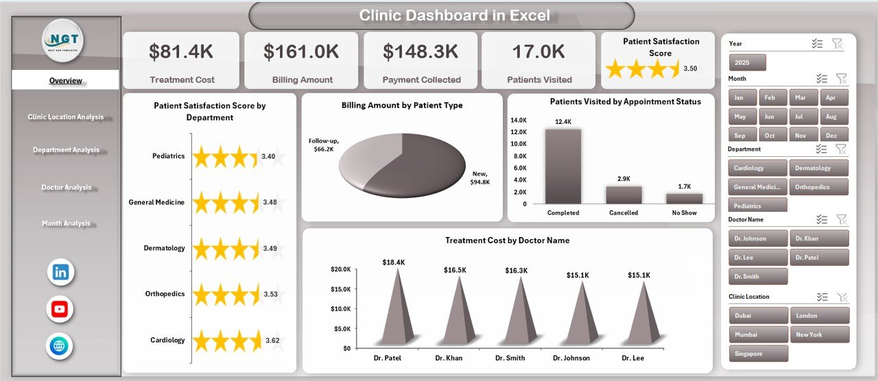
The Overview Page serves as the main dashboard. It provides a high-level snapshot of clinic performance.
Key Elements of the Overview Page
-
Right-side slicer for quick filtering
-
Four KPI cards for instant insights
-
Four summary charts
Charts on the Overview Page
-
Patient Satisfaction Score by Department
This chart helps identify which departments deliver better patient experiences. -
Billing Amount by Patient Type
This chart shows revenue distribution across different patient categories. -
Patient Visits by Appointment Status
This chart highlights completed, cancelled, and pending appointments. -
Treatment Cost by Doctor Name
This chart helps compare treatment expenses across doctors.
Because all critical KPIs appear on one page, leadership understands performance instantly.
Clinic Location Analysis: How Do Different Locations Perform?
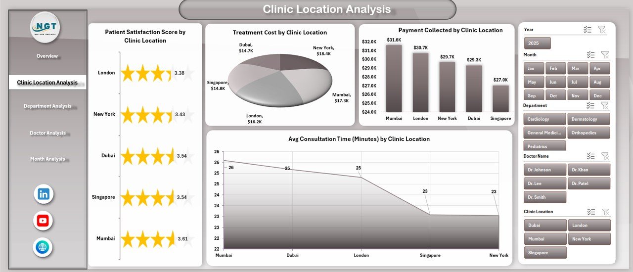
The Clinic Location Analysis page focuses on comparing performance across multiple clinic locations.
Why Location Analysis Matters
Different locations often show different cost structures, patient satisfaction levels, and efficiency. Therefore, location-wise insights support better resource planning.
Charts on the Clinic Location Analysis Page
-
Patient Satisfaction Score by Clinic Location
This chart highlights locations with high or low patient satisfaction. -
Treatment Cost by Clinic Location
This chart compares treatment expenses across locations. -
Payment Collection by Clinic Location
This chart shows which locations generate more collections. -
Average Consultation Time by Clinic Location
This chart reveals efficiency differences across clinics.
With these insights, management can standardize best practices across locations.
Click to Purchases Clinic Dashboard in Excel
Department Analysis: Which Departments Drive Performance?
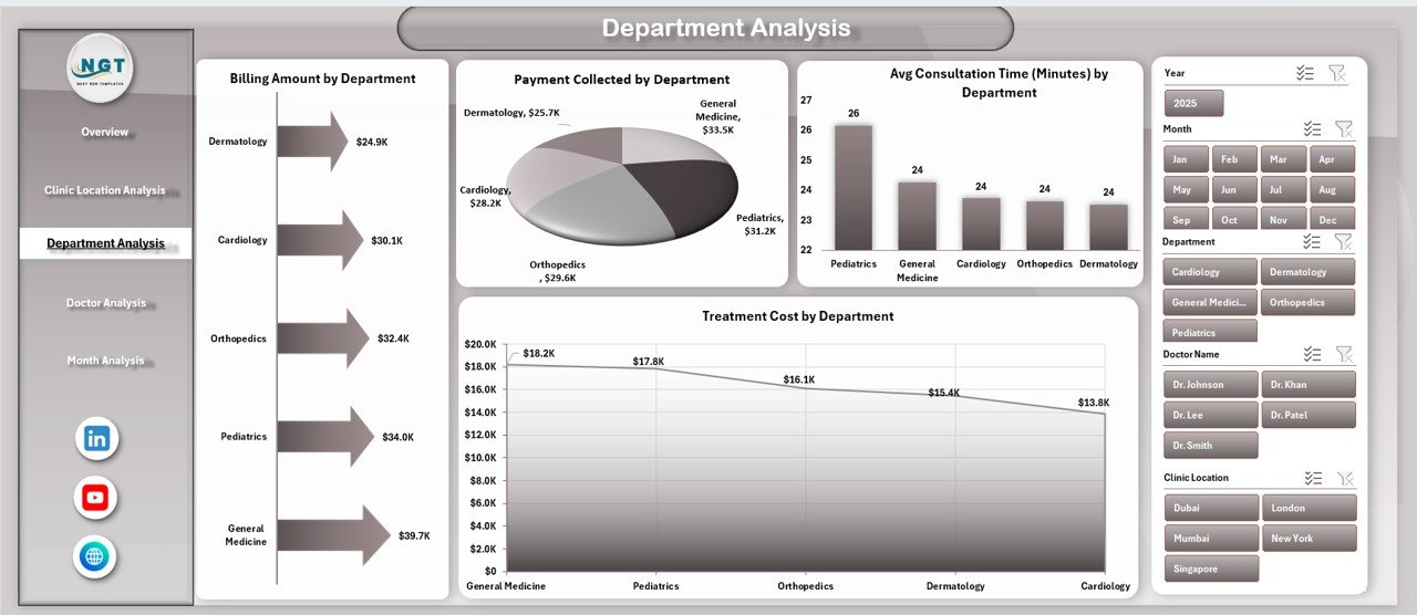
The Department Analysis page helps clinics evaluate department-wise financial and operational performance.
Why Department Analysis Is Important
Departments differ in patient load, treatment costs, and revenue generation. Therefore, analyzing them separately improves control.
Charts on the Department Analysis Page
-
Billing Amount by Department
This chart identifies top-revenue departments. -
Payment Collection by Department
This chart shows collection efficiency by department. -
Treatment Cost by Department
This chart highlights departments with higher expenses. -
Average Consultation Time by Department
This chart measures operational efficiency.
As a result, clinics allocate budgets and staff more effectively.
Doctor Analysis: How Do Individual Doctors Perform?
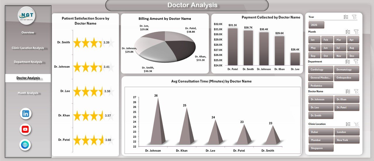
The Doctor Analysis page focuses on individual doctor performance.
Why Doctor-Wise Analysis Matters
Doctors influence patient satisfaction, treatment quality, and revenue. Therefore, measuring doctor performance supports fairness and improvement.
Charts on the Doctor Analysis Page
-
Patient Satisfaction Score by Doctor Name
This chart shows how patients rate each doctor. -
Payment Collection by Doctor Name
This chart compares collections generated by doctors. -
Average Consultation Time by Doctor Name
This chart highlights consultation efficiency. -
Billing Amount by Doctor Name
This chart shows doctor-wise revenue contribution.
Because performance becomes transparent, clinics encourage accountability and improvement.
Month Analysis: How Does Performance Change Over Time?
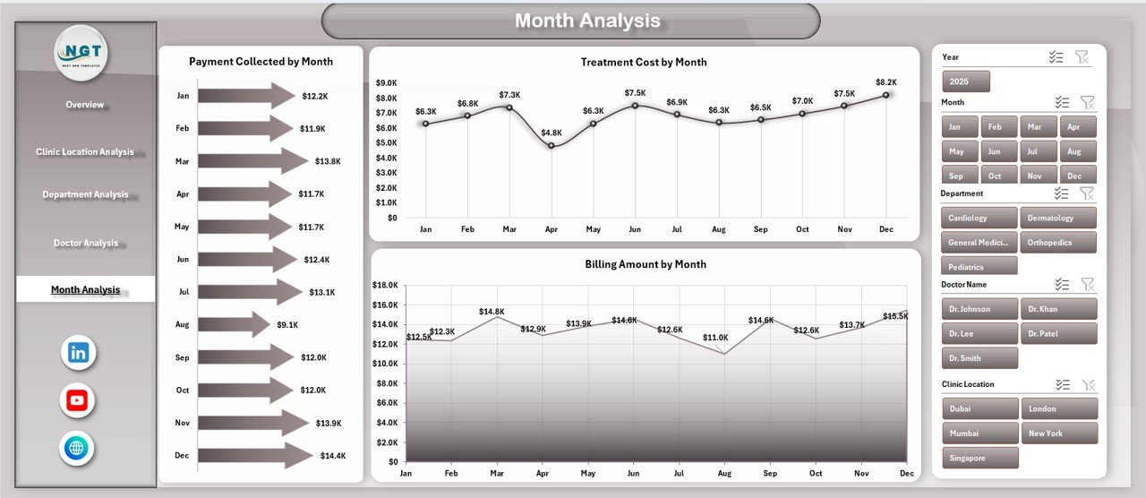
The Month Analysis page tracks monthly trends across key financial metrics.
Why Monthly Analysis Is Critical
Trends help clinics plan budgets, staffing, and marketing. Therefore, monthly analysis supports proactive decisions.
Charts on the Month Analysis Page
-
Payment Collection by Month
This chart shows monthly collection trends. -
Treatment Cost by Month
This chart highlights seasonal cost variations. -
Billing Amount by Month
This chart tracks revenue growth or decline.
As a result, clinics forecast performance accurately.
Click to Purchases Clinic Dashboard in Excel
What Are the Support Sheets in the Clinic Dashboard?
Behind the visuals, the dashboard includes essential support sheets.
Data Sheet
The Data Sheet stores raw clinic data such as patient visits, billing, doctor details, department, location, and dates. Because data stays structured, pivot tables update smoothly.
Support Sheet
The Support Sheet contains helper tables, mappings, and calculated fields that power slicers and charts. Therefore, the dashboard remains clean and user-friendly.
Advantages of a Clinic Dashboard in Excel
Using a Clinic Dashboard in Excel offers multiple advantages.
Centralized Performance Tracking
All clinic KPIs stay in one dashboard. Therefore, teams avoid confusion and duplication.
Faster Decision-Making
Because insights appear visually, leaders act quickly and confidently.
Cost-Effective Solution
Excel dashboards eliminate the need for expensive BI tools.
Easy Customization
Users can modify charts, KPIs, and layouts easily.
Improved Accountability
Doctor-wise and department-wise views promote transparency.
Best Practices for the Clinic Dashboard in Excel
To get the best results, clinics should follow proven best practices.
Maintain Clean and Structured Data
Always keep raw data accurate and consistent. Clean data ensures reliable insights.
Use Standard KPIs
Define patient satisfaction, billing, and cost KPIs clearly to avoid confusion.
Update Data Regularly
Refresh the data weekly or monthly so insights stay relevant.
Limit Charts per Page
Avoid clutter. Focus only on the most important charts.
Train Users Properly
Ensure staff understands slicers, filters, and navigation.
Who Can Benefit from a Clinic Dashboard in Excel?
This dashboard suits many roles.
-
Clinic Owners
-
Hospital Administrators
-
Finance Teams
-
Operations Managers
-
Medical Directors
Because Excel is familiar, adoption remains easy across teams.
Conclusion: Why Should Clinics Use a Dashboard in Excel?
Click to Purchases Clinic Dashboard in Excel
A Clinic Dashboard in Excel transforms raw clinic data into clear, actionable insights. It simplifies reporting, improves visibility, and supports smarter decisions. Moreover, it helps clinics improve patient satisfaction, control costs, and grow revenue.
Instead of spending hours on manual reports, clinics gain one centralized view of performance. Therefore, adopting a Clinic Dashboard in Excel becomes a strategic advantage rather than just a reporting tool.
Frequently Asked Questions (FAQs)
What is a Clinic Dashboard in Excel used for?
A Clinic Dashboard in Excel tracks patient satisfaction, billing, doctor performance, costs, and monthly trends in one interactive report.
Can small clinics use this dashboard?
Yes. Small and mid-sized clinics benefit the most because Excel remains affordable and easy to use.
Does this dashboard require advanced Excel skills?
No. Basic Excel knowledge is enough to operate and update the dashboard.
Can I customize the dashboard?
Yes. You can add KPIs, charts, and filters based on clinic needs.
How often should data be updated?
Clinics should update data weekly or monthly for accurate insights.
Is Excel secure for clinic data?
Yes, when protected properly using passwords and access controls.
Visit our YouTube channel to learn step-by-step video tutorials