Container shipping plays a critical role in global trade. Every day, shipping companies manage thousands of containers, multiple ports, rising fuel costs, customer commitments, and strict delivery timelines. Therefore, tracking performance accurately becomes essential. However, many shipping teams still rely on scattered Excel files, manual reports, and delayed summaries. As a result, decisions often come too late.
That is exactly where a Container Shipping Dashboard in Power BI delivers powerful value.
In this detailed, SEO-friendly, and easy-to-understand article, you will learn what a Container Shipping Dashboard in Power BI is, why it matters, how it works, its page-wise structure, advantages, best practices, and frequently asked questions. Moreover, this article expands your provided information with practical insights so you can confidently use this dashboard in real-world shipping operations.
Click to Purchases Container Shipping Dashboard in Power BI
What Is a Container Shipping Dashboard in Power BI?
A Container Shipping Dashboard in Power BI is a centralized, interactive reporting solution designed to monitor key performance indicators related to container shipping operations.
Instead of analyzing cost, revenue, fuel, and bookings across multiple reports, this dashboard brings everything into one visual Power BI report. Consequently, shipping managers, finance teams, and operations leaders gain real-time clarity on performance.
Because Power BI connects seamlessly with Excel data sources, implementation stays simple. At the same time, interactive slicers and visuals ensure deep analysis without complexity.
Why Do Shipping Companies Need a Container Shipping Dashboard?
Container shipping involves high operational costs and thin profit margins. Therefore, even small inefficiencies can impact profitability significantly. A Power BI dashboard helps shipping companies stay proactive rather than reactive.
Here is why this dashboard becomes essential:
-
It centralizes operational and financial data
-
It tracks cost, revenue, profit, and fuel expenses clearly
-
It highlights delay reasons and inefficiencies
-
It improves customer segment profitability analysis
-
It supports faster, data-driven decisions
Moreover, dashboards replace static reports with dynamic insights. As a result, leadership teams gain confidence in every decision.
How Does the Container Shipping Dashboard in Power BI Work?
The dashboard follows a structured and scalable approach.
First, users capture shipping data in an Excel file. This data includes cost, revenue, fuel expenses, bookings, customer segments, shipping lines, ports, service types, and months.
Next, Power BI imports this data and transforms it into interactive visuals. Because the dashboard uses slicers on every page, users can filter data instantly. Consequently, analysis becomes faster, deeper, and more accurate.
Click to Purchases Container Shipping Dashboard in Power BI
Key Features of the Container Shipping Dashboard in Power BI
This dashboard includes carefully designed features that simplify logistics analytics.
Interactive Slicers for Dynamic Analysis
Each page includes slicers that allow users to filter data by customer segment, shipping line, destination port, service type, and month. Therefore, users can focus on specific business scenarios instantly.
KPI Cards for Quick Performance Snapshot
High-level KPIs appear as cards on the overview page. As a result, executives understand performance at a glance without drilling into details.
Visual Storytelling with Charts
The dashboard uses clear charts to explain trends, comparisons, and cost drivers. Consequently, insights remain easy to interpret even for non-technical users.
What Pages Are Included in the Container Shipping Dashboard in Power BI?
The dashboard consists of five analytical pages, each designed to answer specific business questions.
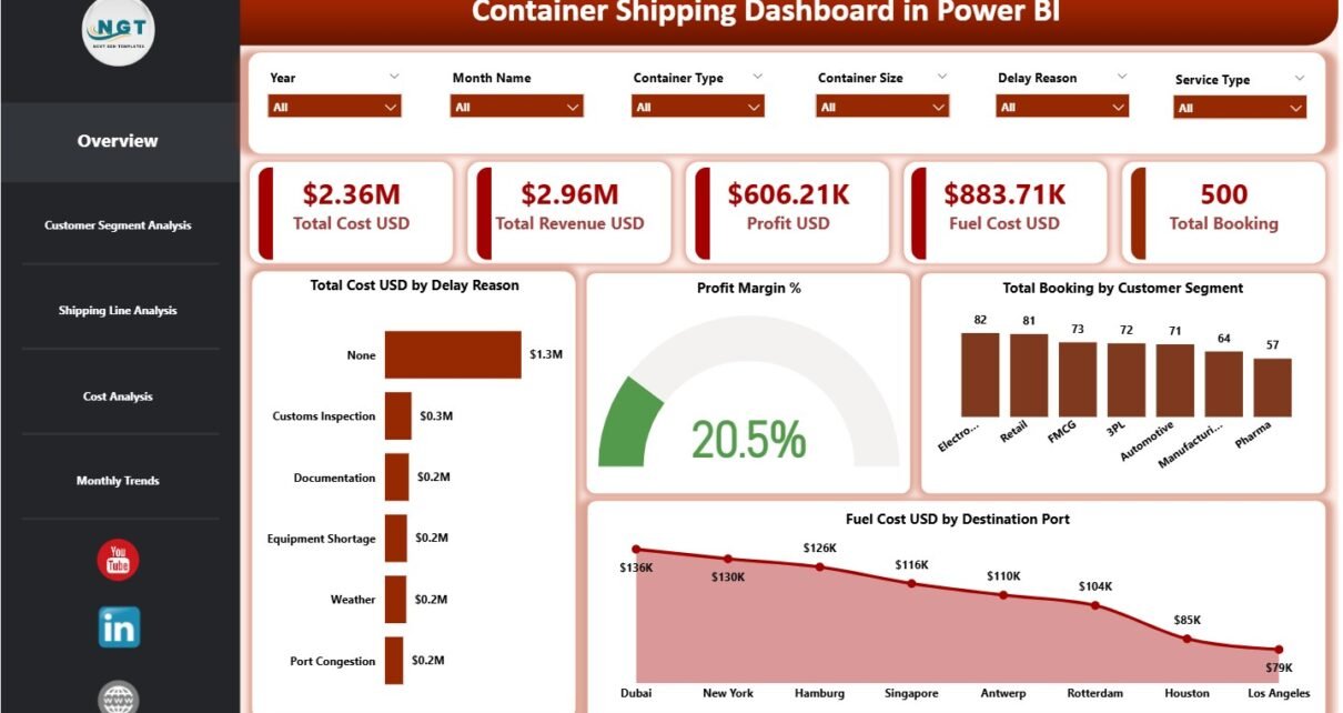
1. Overview Page: What Is the Overall Shipping Performance?
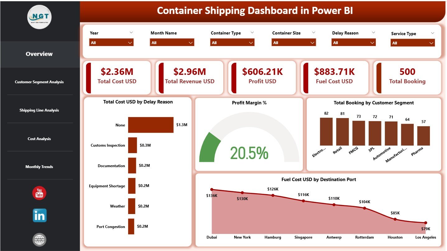
The Overview Page acts as the command center of the dashboard. It summarizes overall performance across costs, revenue, fuel, profit, and bookings.
KPI Cards on the Overview Page
This page includes five KPI cards:
-
Total Cost USD – Shows overall operational and shipping costs
-
Total Revenue USD – Displays total revenue generated
-
Profit USD – Calculates revenue minus total cost
-
Fuel Cost USD – Highlights fuel expenditure
-
Total Booking – Shows total container bookings
Because these KPIs appear instantly, decision-makers gain immediate clarity.
Charts on the Overview Page
The Overview Page includes four charts:
-
Total Cost USD by Delay Reason – Identifies major delay-related cost drivers
-
Profit Margin % – Shows overall profitability performance
-
Total Booking by Customer Segment – Highlights booking distribution
-
Fuel Cost USD by Destination Port – Reveals fuel-heavy routes
Together, these visuals provide a complete snapshot of shipping operations.
Click to Purchases Container Shipping Dashboard in Power BI
2. Customer Segment Analysis: Which Customers Are Most Profitable?
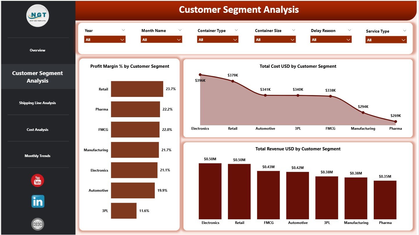
Different customer segments behave differently. Therefore, understanding segment-wise performance becomes crucial.
Charts Included in Customer Segment Analysis
This page includes three charts:
-
Profit Margin % by Customer Segment
-
Total Cost USD by Customer Segment
-
Total Revenue USD by Customer Segment
As a result, shipping companies can identify high-value customers, optimize pricing, and renegotiate contracts effectively.
3. Shipping Line Analysis: Which Shipping Lines Drive Better Performance?
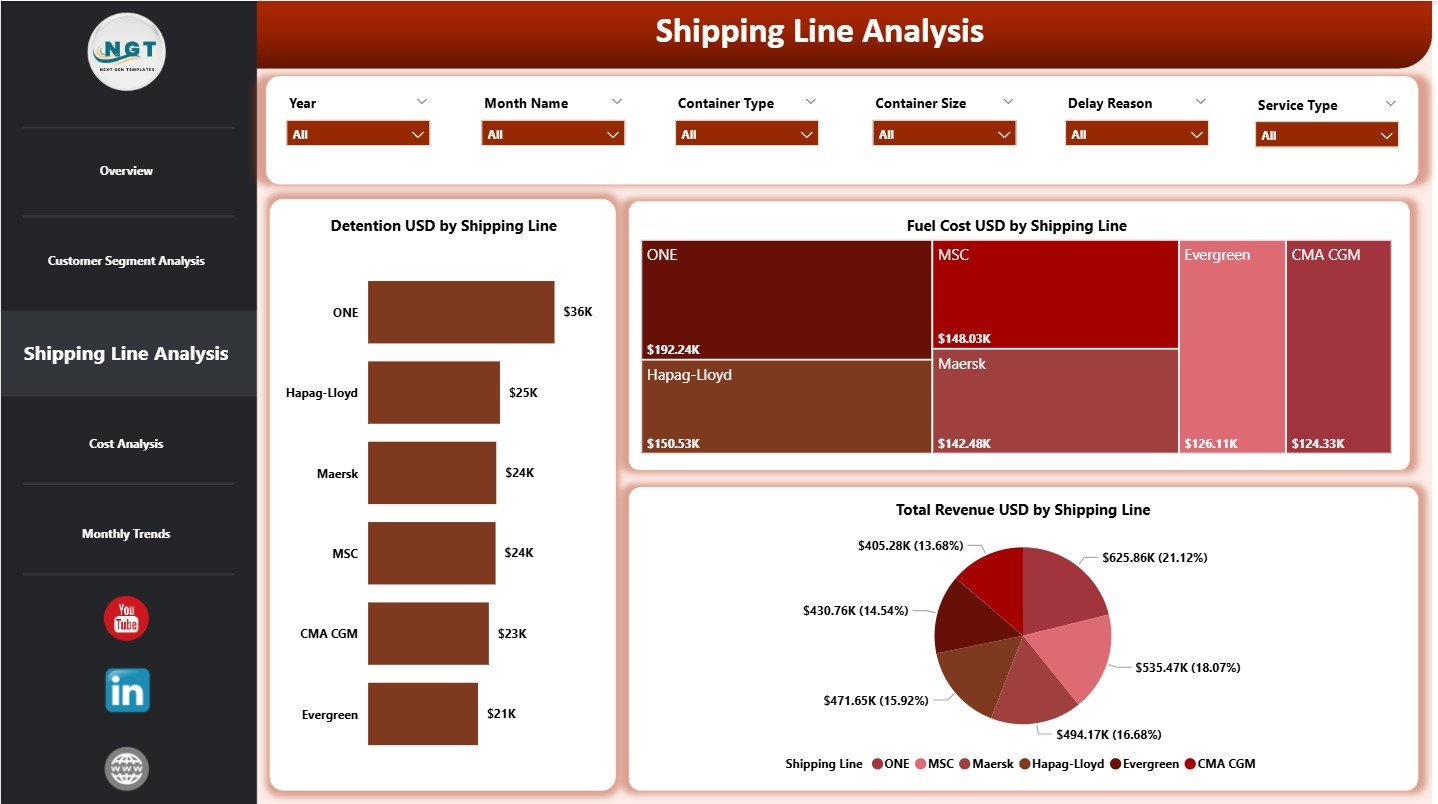
Shipping lines influence cost, fuel usage, and revenue. Hence, this page focuses on shipping-line-level analysis.
Charts Included in Shipping Line Analysis
This page includes three charts:
-
Detention USD by Shipping Line
-
Fuel Cost USD by Shipping Line
-
Total Revenue USD by Shipping Line
Because these visuals appear together, managers can compare efficiency, cost behavior, and revenue contribution across shipping lines.
4. Cost Analysis: Where Do Costs and Revenue Originate?
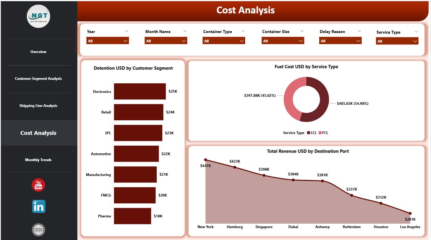
Understanding cost drivers remains critical for margin improvement. Therefore, the Cost Analysis page breaks down expenses and revenue in detail.
Charts Included in Cost Analysis
This page includes three charts:
-
Detention USD by Customer Segment
-
Fuel Cost USD by Service Type
-
Total Revenue USD by Destination Port
As a result, companies can control detention charges, optimize service types, and focus on high-revenue ports.
5. Monthly Trends: How Does Shipping Performance Change Over Time?
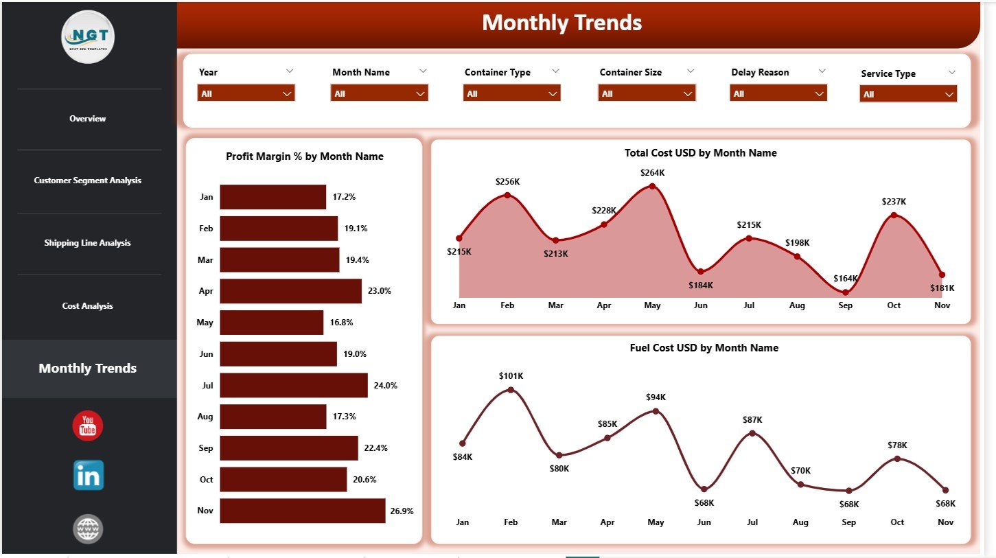
Trends reveal patterns that static numbers cannot show. Hence, the Monthly Trends page focuses on time-based analysis.
Charts Included in Monthly Trends
This page includes three charts:
-
Profit Margin % by Month
-
Total Cost USD by Month
-
Fuel Cost USD by Month
These visuals help teams identify seasonality, rising costs, and margin pressure early.
What Data Supports the Container Shipping Dashboard in Power BI?
The dashboard runs on a structured Excel-based data model.
Core Data Fields
Typical fields include:
-
Booking date and month
-
Customer segment
-
Shipping line
-
Destination port
-
Service type
-
Delay reason
-
Total cost USD
-
Fuel cost USD
-
Detention USD
-
Total revenue USD
Once users update this data, Power BI refreshes all visuals automatically.
Click to Purchases Container Shipping Dashboard in Power BI
Advantages of Container Shipping Dashboard in Power BI
Improved Cost Control
-
Tracks fuel, detention, and delay-related costs
-
Identifies cost-heavy routes and services
-
Supports proactive expense management
Better Revenue and Profit Visibility
-
Shows profit margins clearly
-
Highlights high-performing customer segments
-
Improves pricing and contract decisions
Faster Decision-Making
-
Replaces static reports with live dashboards
-
Enables instant filtering and drill-downs
-
Reduces reporting turnaround time
Scalability and Flexibility
-
Works for small operators and large fleets
-
Integrates easily with Excel data
-
Supports future expansion
Opportunities for Improvement in Container Shipping Dashboards
Although powerful, dashboards can evolve further:
-
Adding real-time vessel tracking
-
Including carbon emission analysis
-
Integrating predictive fuel cost models
-
Automating data refresh from ERP systems
These enhancements can deliver even greater strategic value.
Best Practices for the Container Shipping Dashboard in Power BI
Maintain Accurate and Clean Data
Always standardize ports, service types, and customer names. Clean data ensures reliable insights.
Update Data Regularly
Refresh data weekly or monthly. Regular updates keep trends meaningful.
Monitor Trends, Not Just Totals
Analyze month-wise trends to detect early warning signs.
Use Slicers Strategically
Focus on one dimension at a time. Avoid excessive filtering that hides insights.
Review KPIs with Stakeholders
Discuss dashboard insights with operations, finance, and sales teams regularly.
Click to Purchases Container Shipping Dashboard in Power BI
Who Can Benefit from a Container Shipping Dashboard in Power BI?
This dashboard benefits multiple stakeholders:
-
Container shipping companies
-
Freight forwarders
-
Logistics service providers
-
Port operations teams
-
Finance and cost-control teams
-
Supply chain analysts
Because the dashboard adapts easily, it fits both operational and strategic needs.
How Does Power BI Add Value Over Traditional Reports?
Power BI dashboards offer:
-
Interactive visuals instead of static tables
-
Faster insights through slicers
-
Better storytelling with data
-
Scalable reporting for growing operations
Therefore, Power BI becomes a natural choice for modern shipping analytics.
Conclusion: Why Should You Use a Container Shipping Dashboard in Power BI?
A Container Shipping Dashboard in Power BI transforms complex shipping data into clear, actionable insights. It helps organizations control costs, optimize fuel usage, improve customer profitability, and monitor performance trends effectively.
Because shipping margins remain tight and competition continues to grow, data-driven decision-making becomes essential. This dashboard empowers teams to act faster, plan smarter, and operate more profitably.
Click to Purchases Container Shipping Dashboard in Power BI
Frequently Asked Questions (FAQs)
What is a Container Shipping Dashboard in Power BI used for?
It tracks shipping costs, revenue, fuel expenses, profit margins, bookings, and trends in one interactive report.
Do I need advanced Power BI skills to use this dashboard?
No. Basic Power BI navigation and slicer usage are sufficient.
Can this dashboard work with Excel data?
Yes. The dashboard uses Excel as its primary data source.
Can I analyze multiple customer segments and shipping lines?
Yes. Slicers allow multi-dimensional analysis instantly.
Is this dashboard suitable for small shipping companies?
Yes. It works well for both small and large operations.
How often should I refresh the data?
Monthly or weekly refreshes work best for operational tracking.
Can I customize KPIs and visuals?
Yes. Power BI allows full customization based on business needs.
Does the dashboard support trend analysis?
Yes. The Monthly Trends page focuses on time-based performance.
Click to Purchases Container Shipping Dashboard in Power BI
Visit our YouTube channel to learn step-by-step video tutorials