The Crisis Response KPI Dashboard in Power BI tracks unlimited crisis KPIs across 3 interactive Power BI pages, with Month and KPI Group slicers plus 3 status cards showing Total KPIs, MTD Target Met, and MTD Target Missed counts. Setup takes under 10 minutes — fill 3 Excel sheets (Input_Actual, Input_Target, KPI Definition), point the .pbix file at the data source, click Refresh, and every card, table, and chart recalculates automatically. No DAX rebuilds, no SaaS subscriptions, no per-user fees.
🌍 Used by 8,400+ teams across 40+ countries, this Power BI Dashboard replaces $39–$199-per-user-per-month SaaS tools like Resolver, Everbridge, and D4H with a one-time $11.99 download that runs locally on Microsoft’s free Power BI Desktop application.
✅ Instant download · One-time payment · No subscription · No per-user fees · Lifetime access
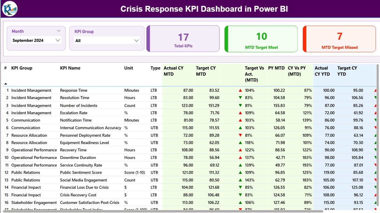
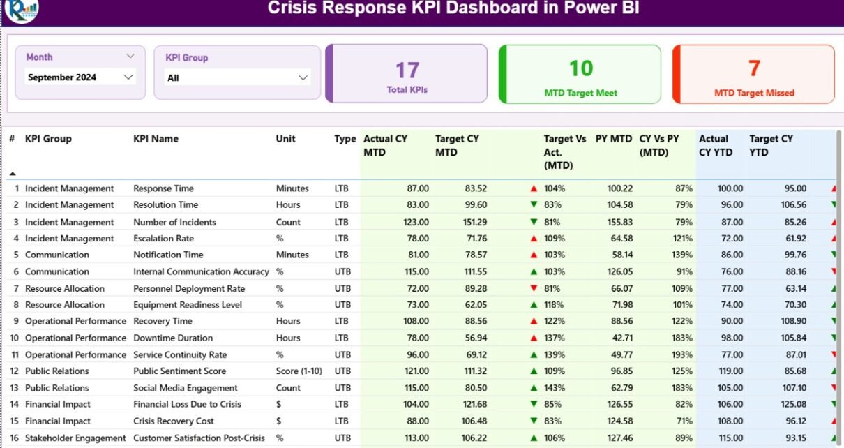
Crisis Response KPI Dashboard in Power BI – Summary Page
Introduction to the Crisis Response KPI Dashboard in Power BI
Crisis response is one of those operational disciplines where reporting frequency matters as much as reporting depth. Boards want quarterly numbers; chiefs want monthly trend lines; duty managers want yesterday’s mean-time-to-acknowledge before the next shift starts. The Crisis Response KPI Dashboard in Power BI consolidates all three audiences into a single .pbix file with three pages — a Summary view, a KPI Trend view, and a hidden drill-through KPI Definition page — fed by a simple Excel data source that any team member can update.
The dashboard follows the same MTD/YTD reporting pattern used by ISO 22301 business continuity programs, with red/green ▲▼ icons that automatically interpret LTB (Lower the Better) and UTB (Upper the Better) KPI types. That logic alone removes the most common error in scorecard reporting — a green light next to a missed target because someone forgot to invert the conditional formatting rule for response-time KPIs.
Key Features of the Crisis Response KPI Dashboard in Power BI
3 Pre-Built Power BI Pages. The dashboard ships with a Summary Page, a KPI Trend Page, and a hidden KPI Definition drill-through page. Both visible pages have Month and KPI Group slicers at the top, so a crisis lead can isolate any month or any group (Response, Communication, Recovery, Training, etc.) in two clicks.
3 KPI Status Cards. Total KPIs, MTD Target Met, and MTD Target Missed sit prominently on the Summary page. These three numbers answer the morning standup’s first question — “how are we trending against target?” — without scrolling.
16-Column KPI Detail Table. Every row carries the full picture: KPI Number, KPI Group, KPI Name, Unit, Type (LTB/UTB), Actual CY MTD, Target CY MTD, MTD Status Icon, Target vs Actual MTD %, PY MTD, CY vs PY MTD %, Actual CY YTD, Target CY YTD, YTD Status Icon, Target vs Actual YTD %, PY YTD, and CY vs PY YTD %. MTD and YTD live on the same row, so executives don’t flip between tabs.
Red/Green ▲▼ Status Icons. The Type column drives icon logic: a UTB KPI like “Tabletop Drills Conducted” goes green when actual exceeds target; an LTB KPI like “Mean Time to Acknowledge” goes green when actual is below target. No conditional formatting maintenance required.
2 Combo Charts on the KPI Trend Page. One chart shows MTD trends — Current Year Actual, Previous Year Actual, and Target as a line. The second mirrors the same comparison for YTD. A KPI Name slicer on the left lets responders pivot through every metric one at a time without opening another report.
Drill-Through KPI Definition Page. Right-click any KPI in the Summary table, choose Drill through, and Power BI lands on a hidden page showing that KPI’s Group, Unit, Formula, Definition, and Type. A back button at the top-left returns the user to the Summary. Documentation lives inside the dashboard, not in a separate PDF that goes stale.
Excel-Based Data Entry. All actuals, targets, and KPI metadata are filled in three Excel sheets. Power BI refreshes from the file — no Power BI editing required, and any team member who can edit a workbook can update the dashboard.
Dashboard Pages Explanation
1. Summary Page
The main page of the dashboard. Month and KPI Group slicers are pinned at the top. Three cards show Total KPIs count, MTD Target Met count, and MTD Target Missed count. Below them sits the 16-column KPI Detail Table covering both MTD and YTD performance, with red/green ▼▲ icons on the MTD Icon and YTD Icon columns. Target vs Actual % is calculated as Actual / Target, and CY vs PY % is calculated as Current Year / Previous Year — both standard formulas familiar to anyone who has used DAX in Power BI.
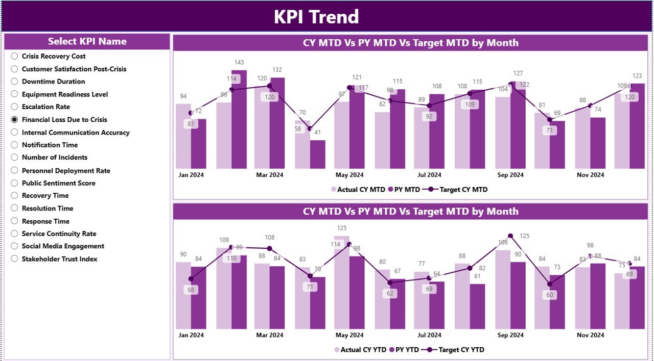
Crisis Response KPI Dashboard in Power BI – KPI Trend Page
2. KPI Trend Page
This page hosts two combo charts side-by-side. The left chart visualizes MTD performance: a clustered column for Current Year Actual and Previous Year Actual, plus a line for Target. The right chart mirrors that for YTD numbers. A KPI Name slicer on the left lets the user step through every metric individually — ideal for chief’s briefings where each KPI gets its own slide.
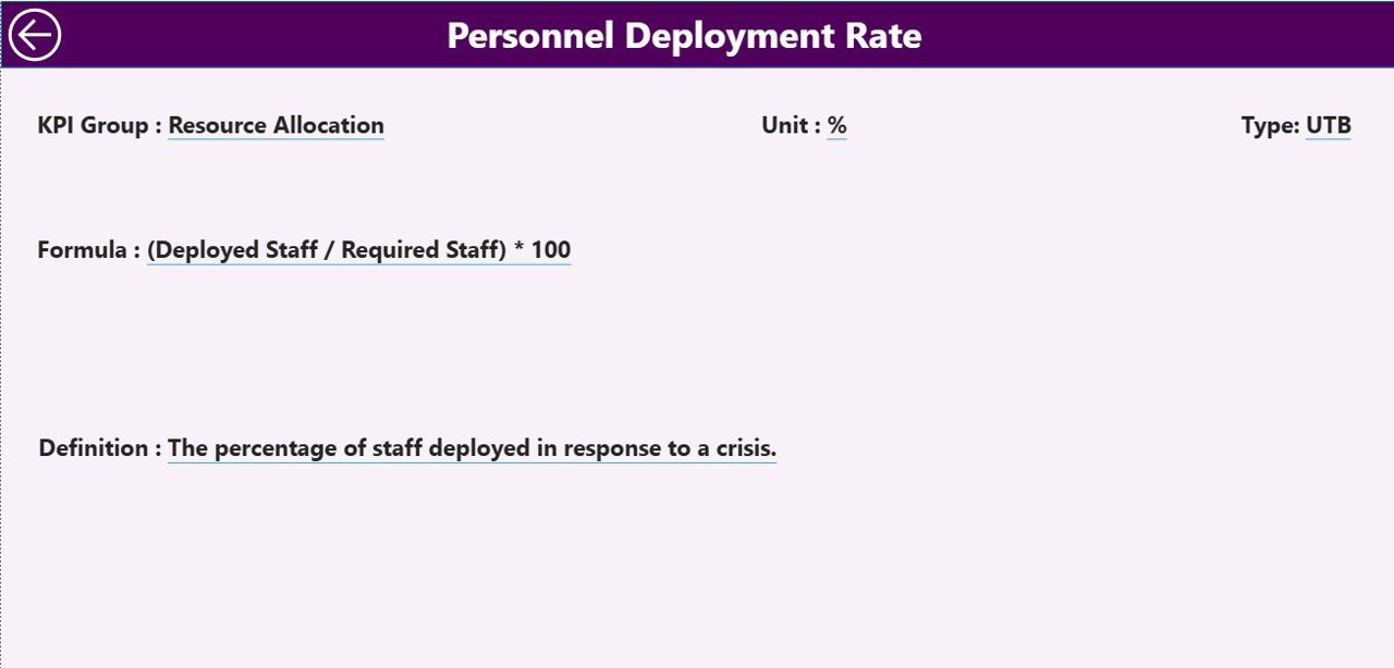
3. KPI Definition Page (Drill-Through, Hidden)
Hidden from the page navigator and accessed only through the Summary table’s right-click drill-through. The page shows the selected KPI’s Number, Group, Name, Unit, Type, Formula, and Definition. A back button at the top-left returns to the Summary. This is the dashboard’s built-in data dictionary — useful when an external auditor asks how a KPI is calculated.
Crisis Response KPI Dashboard in Power BI – Drill-Through KPI Definition Page
Excel Data Source — Three Worksheets
Input_Actual: KPI Name, Month (first date of the month), MTD number, YTD number.
Input_Target: KPI Name, Month (first date of the month), MTD target, YTD target.
KPI Definition: KPI Number, KPI Group, KPI Name, Unit, Formula, Definition, Type (LTB or UTB).
Once the three sheets are populated, the dashboard refresh pulls in everything — cards, table, icons, and charts all update from the same source.
Crisis Response KPI Dashboard vs. Excel Equivalent vs. Resolver/Everbridge — Feature Comparison
| Feature | Crisis Response KPI Dashboard (Power BI) | Excel KPI Scorecard | Resolver / Everbridge / D4H |
|---|---|---|---|
| Cost | $11.99 one-time | $10–15 one-time | $39–199 / user / month |
| Platform | Power BI Desktop (free) | Microsoft Excel | Cloud SaaS, login required |
| Setup time | Under 10 minutes | 10–15 minutes | 2–6 weeks vendor onboarding |
| MTD + YTD on same row | Yes | Yes | Often separate views |
| LTB / UTB status logic | Built-in red/green ▼▲ icons | Manual conditional formatting | Yes |
| Drill-through KPI definitions | Yes — hidden page | Separate KPI sheet | Yes |
| Year-1 cost at 5 users | $11.99 total | $10–15 total | $2,340–$11,940 |
| Vendor lock-in | None — own the .pbix | None | High |
For crisis managers who want SaaS-grade reporting without paying SaaS-grade subscription fees, the Crisis Response KPI Dashboard in Power BI sits in the sweet spot.
Who Should Use This Template
Perfect for:
- Crisis managers and emergency operations leads at organizations with 50–5,000 staff
- Business continuity teams reporting MTD/YTD response KPIs to executive committees
- Public safety departments, fire and rescue, and EMS agencies
- Corporate risk and resilience teams already standardized on Power BI Desktop
- Consultants delivering crisis response benchmarking reports to client boards
Not a fit if:
- You need real-time alerting, two-way SMS, or geofenced notifications — use Everbridge or AlertMedia
- You require SOC 2 Type II + SSO + audit trails — use a SaaS GRC platform
- You’re Mac-only and can’t run Power BI Desktop in a Windows environment
- You need streaming ingestion from CAD systems or ServiceNow — this dashboard is refresh-based
Real-World Use Cases
Maya runs the crisis response program at a 1,200-employee fintech. Each month she fills the Input_Actual sheet with response time, drill completion rate, and tabletop participation, refreshes the .pbix, and exports the Summary page to PDF for her quarterly resilience steering committee — replacing a $99-per-user-per-month Resolver seat with an $11.99 one-time download.
Carlos manages emergency operations at a county fire department. He uses the Crisis Response KPI Dashboard in Power BI to track 14 KPIs across Response, Communication, Recovery, and Training KPI Groups. The MTD ▲ and YTD ▼ icons let his chief see at a glance which KPIs need attention before the monthly all-hands, without reading a 30-page report.
Priya is an internal auditor at a multinational manufacturer. She uses the dashboard’s drill-through KPI Definition page to validate that every reported metric has a documented formula and definition before the ISO 22301 surveillance audit — a control point her external auditors cite favorably.
Advantages of the Crisis Response KPI Dashboard in Power BI
One-time cost replaces recurring SaaS spend. A 5-seat Resolver subscription costs roughly $5,940 in year one. The Crisis Response KPI Dashboard in Power BI is $11.99, period. The savings compound every year afterwards.
Refresh-based architecture. The dashboard updates whenever the underlying Excel file is updated and the .pbix is refreshed. No live API connections, no firewall holes to open, no IT ticket to update credentials when staff change. See the Business Continuity Planning KPI Dashboard in Power BI for the same architecture applied to BCP.
MTD and YTD in one screen. Most scorecard tools force a choice between monthly and year-to-date views. This dashboard puts both on the same row, with separate icons for each, so the trend over time is visible alongside the snapshot.
Opportunities for Improvement
No real-time alerting. The dashboard is a reporting tool, not a notification system. If your operations require pager-style alerts, pair this dashboard with a dedicated alerting platform.
Windows-only Power BI Desktop. Mac users need a Windows VM (Parallels, VMware Fusion, UTM) or Power BI Service in the cloud. The Excel data source itself opens fine on Mac.
Single-source data model. The .pbix points at one Excel file. Teams that pull data from multiple systems (ServiceNow, PagerDuty, ticketing) will need to consolidate into the Excel sheet first or extend the data model.
Best Practices
Fix the KPI Definition sheet first. Before entering any actuals or targets, lock in the KPI Number, Group, Name, Unit, Formula, and Type. The MTD/YTD logic depends on the Type column being correct.
Use the first day of the month consistently. Both Input_Actual and Input_Target need the Month column to use the first date of the month (e.g., 2026-04-01 for April 2026). Inconsistent dates break the join.
Refresh on a schedule. If the dashboard is published to Power BI Service, set up scheduled refresh against the Excel file in OneDrive or SharePoint so the team always sees the latest numbers without manual refresh.
Drill through before publishing. Right-click each KPI and verify the Definition page renders correctly. Missing definitions show up as blanks — better caught in dev than during a board meeting.
Explore Relevant Templates
📌 Emergency Management KPI Dashboard in Power BI — Sister template tracking emergency response, communication, and recovery KPIs in the same 3-page Power BI format.
📌 Business Continuity Planning KPI Dashboard in Power BI — For BCP teams tracking RTO/RPO, plan testing frequency, and recovery exercises.
📌 Crisis Management KPI Scorecard in Excel — The Excel scorecard companion if you prefer cell-based reporting.
📌 Incident Response and Downtime Analysis Dashboard in Google Sheets — Google Sheets alternative for cloud-first teams.
💎 Save 40% — Get all 8 safety templates in the Safety & Compliance Commander Bundle.
Frequently Asked Questions
What KPIs does the Crisis Response KPI Dashboard in Power BI track?
The dashboard tracks any KPIs you define in the Input_Actual, Input_Target, and KPI Definition Excel sheets. Common crisis response KPIs include mean time to acknowledge, mean time to resolve, drill completion rate, tabletop participation rate, recovery time objective, and after-action review closure rate.
How long does setup take?
Setup takes under 10 minutes. Open the .pbix file, point Power BI to the included Excel data source, fill the three sheets (Input_Actual, Input_Target, KPI Definition), click Refresh, and every visual in the Crisis Response KPI Dashboard in Power BI updates automatically.
How does this compare to Resolver or Everbridge?
Resolver and Everbridge are SaaS platforms that cost $39–$199 per user per month. The Crisis Response KPI Dashboard in Power BI is a one-time $11.99 download with no per-user fees, no subscription, and no vendor lock-in. It does not replace SaaS for real-time alerting, but it covers reporting and KPI tracking at a fraction of the cost.
Do I need a Power BI Pro license?
No. The Crisis Response KPI Dashboard in Power BI runs entirely on Power BI Desktop, which Microsoft offers free of charge. A Pro license is only needed if you want to publish the .pbix to the Power BI Service for cloud sharing.
Can I add my own KPIs and KPI Groups?
Yes. Add new rows to the KPI Definition sheet with a unique KPI Number, the desired KPI Group, Name, Unit, Formula, Definition, and Type (LTB or UTB). Add the corresponding monthly numbers in Input_Actual and Input_Target, then refresh.
What is the difference between LTB and UTB KPI types?
LTB (Lower the Better) is for KPIs where a lower number is good — such as Mean Time to Acknowledge. UTB (Upper the Better) is for KPIs where a higher number is good — such as Drill Participation Rate. The dashboard uses this Type field to decide whether ▲ or ▼ should be green or red.
Will the dashboard work on Mac?
Power BI Desktop is Windows-only, so the Crisis Response KPI Dashboard in Power BI requires a Windows machine, a Windows VM (Parallels, VMware Fusion, UTM), or Power BI Service in the cloud. The Excel data source itself opens fine in Excel for Mac.
About the Author
Built by PK — Microsoft Certified Professional with 15+ years of Excel, Google Sheets, and Power BI experience. Founder of NextGenTemplates, reaching 300K+ subscribers across YouTube channels. Every template is hand-built and tested before release.
Conclusion
If you’re running a crisis response, emergency operations, or business continuity program and you’ve been weighing whether a $99-per-user SaaS subscription is really worth it, this is your alternative. The Crisis Response KPI Dashboard in Power BI delivers the same MTD/YTD visibility, the same drill-through definitions, and the same red/green status logic for one-time $11.99 — instant download, lifetime access, no subscription, no per-user fees.
🛒 Click here to Purchase the Crisis Response KPI Dashboard in Power BI
✅ Instant download · One-time payment · No subscription · Lifetime access
🎥 Visit our YouTube channel for step-by-step Power BI tutorials — YouTube.com/@PK-AnExcelExpert
📅 Last updated: April 2026