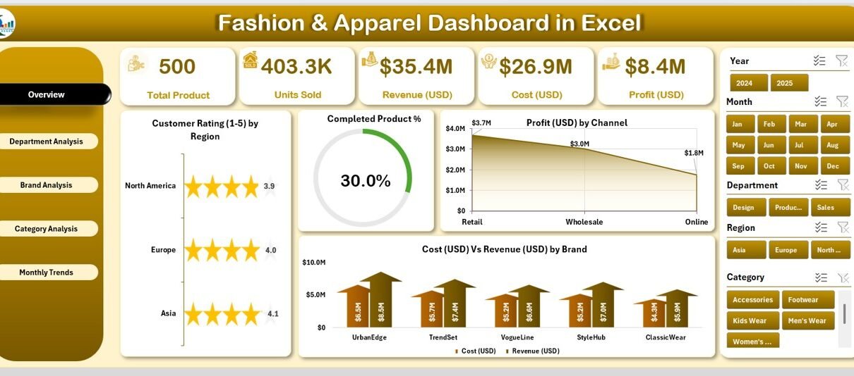
The fashion and apparel industry moves fast. Trends shift every season, customer preferences evolve rapidly, and managing operations across departments, brands, and categories can feel overwhelming. To stay ahead, businesses need a clear and data-driven view of performance. That’s exactly where the Fashion & Apparel Dashboard in Excel comes in.
This ready-to-use Excel-based dashboard helps fashion retailers, designers, and apparel manufacturers monitor sales, profits, costs, and performance ratings — all in one interactive place. Whether you’re running a boutique brand or managing a global clothing line, this dashboard gives you a structured, visual, and easy-to-understand performance snapshot.
In this article, you’ll explore everything about the Fashion & Apparel Dashboard in Excel — from its structure and features to its advantages, best practices, and FAQs.
Click to Purchases Fashion & Apparel Dashboard in Excel
What Is a Fashion & Apparel Dashboard in Excel?
A Fashion & Apparel Dashboard in Excel is a performance-tracking tool designed specifically for businesses in the clothing and fashion industry. It consolidates sales, cost, revenue, profit, and customer feedback data into interactive visuals that make insights easier to interpret.
Instead of flipping through multiple spreadsheets or reports, this dashboard centralizes everything — giving business leaders a real-time view of how their brand, departments, and product categories are performing month after month.
With a single click, users can analyze KPIs (Key Performance Indicators) such as:
-
Profit by brand, category, and department
-
Cost versus revenue comparison
-
Completed product percentage
-
Customer ratings by region and channel
-
Monthly performance trends
Built entirely in Excel, it requires no coding or complex setup. You simply enter your data into the Data Sheet, and the dashboard automatically updates charts and visuals for powerful insights.
Purpose of the Fashion & Apparel Dashboard
The main goal of the Fashion & Apparel Dashboard is to simplify decision-making through data visualization. Fashion companies often manage hundreds of SKUs, multiple sales channels, and numerous collections. Tracking performance manually wastes time and can lead to missed opportunities.
This dashboard:
-
Shows what’s selling well and what’s underperforming
-
Highlights profitable and costly areas
-
Helps assess customer satisfaction through ratings
-
Monitors the overall financial health of your business
-
Enables teams to collaborate with clear data visibility
By integrating all KPIs into one Excel workbook, this dashboard turns data into decisions and insight into action.
Structure of the Fashion & Apparel Dashboard in Excel
The template includes five main analytical pages and two support sheets. Let’s explore each one in detail.
Overview Page — The Command Center
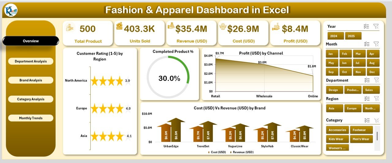
The Overview Page is the primary dashboard where users can see all high-level insights in one glance. It includes:
-
Page Navigator (Left-Side Panel): Quickly switch between dashboard pages without scrolling.
-
Five Key Metric Cards: Displaying the most important KPIs — Total Revenue, Total Cost, Profit Margin, Completed Product %, and Average Customer Rating.
Charts Included:
- Customer Rating (1–5) by Region
- Completed Product %
- Profit (USD) by Channel
- Cost vs Revenue (USD) by Brand
This page acts as a snapshot for executives and managers to get a clear, visual understanding of the company’s performance across key parameters.
Department Analysis — Evaluate Department-Wise Performance
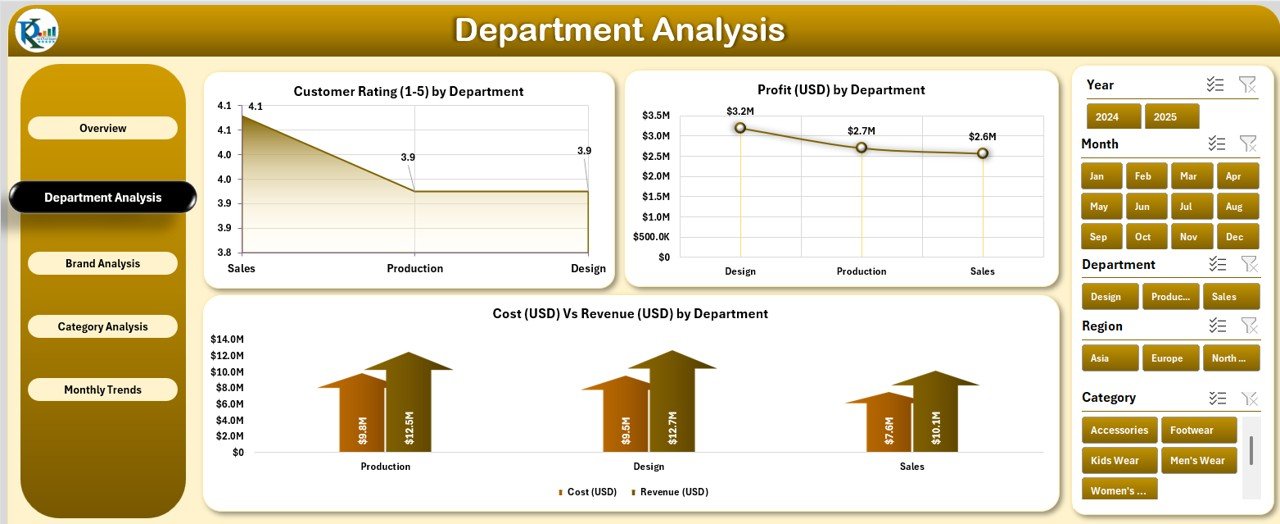
The Department Analysis Page dives deeper into performance across various internal divisions such as Men’s Wear, Women’s Wear, Accessories, or Footwear.
Features include:
-
Customer Rating (1–5) by Department: Understand customer satisfaction by department.
-
Profit (USD) by Department: Identify the most profitable segments.
-
Cost vs Revenue (USD) by Department: Compare spending and income to find efficiency gaps.
This page helps department heads take data-driven actions — improving performance where needed and recognizing top-performing segments.
Click to Purchases Fashion & Apparel Dashboard in Excel
Brand Analysis — Compare Brand Strengths
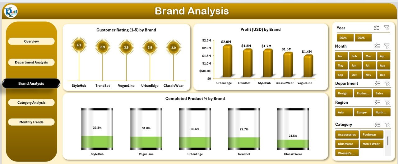
Brand diversity is common in fashion businesses. Whether you own multiple in-house labels or collaborate with partner brands, the Brand Analysis Page provides clarity.
It includes:
-
Customer Rating (1–5) by Brand
-
Profit (USD) by Brand
-
Completed Product % by Brand
With these visuals, managers can identify which brands resonate best with customers, maintain quality, and deliver strong returns.
Category Analysis — Track Product Category Trends
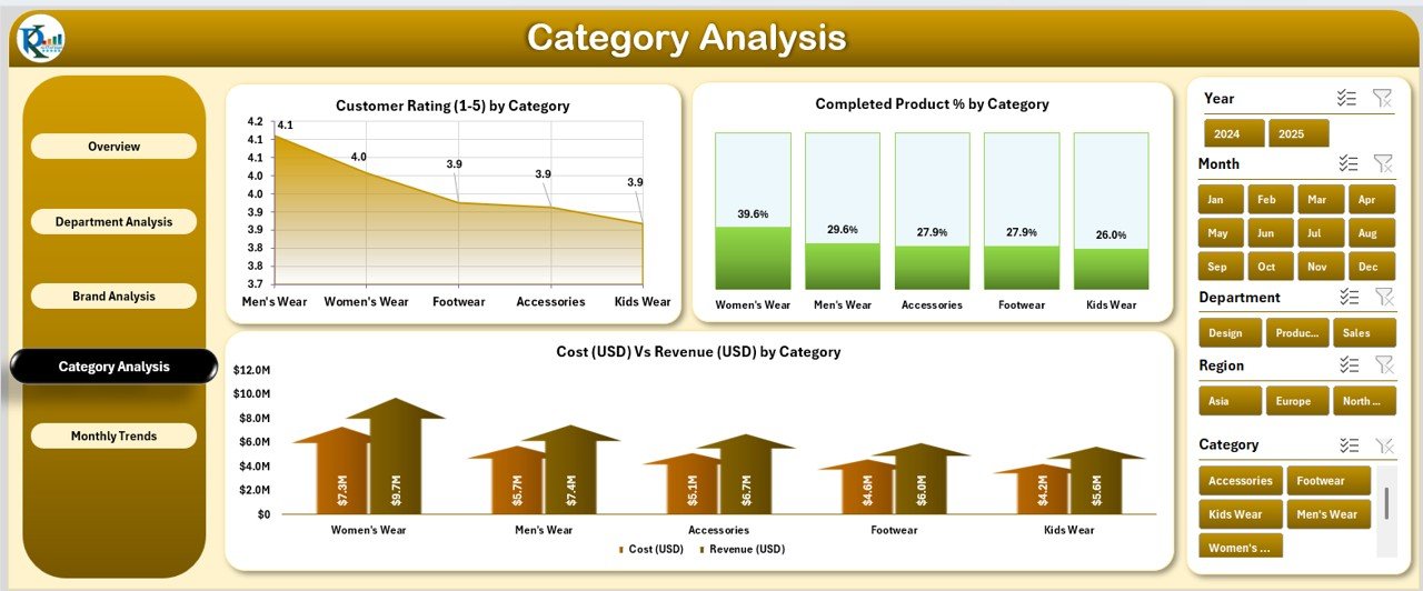
Fashion businesses often deal with multiple categories — clothing, shoes, bags, and accessories. The Category Analysis Page helps analyze which product lines drive the most value.
Charts include:
-
Customer Rating (1–5) by Category
-
Completed Product % by Category
-
Cost vs Revenue (USD) by Category
This page helps you understand customer preferences and allocate resources to the most profitable product groups.
Monthly Trends — Track Growth Over Time
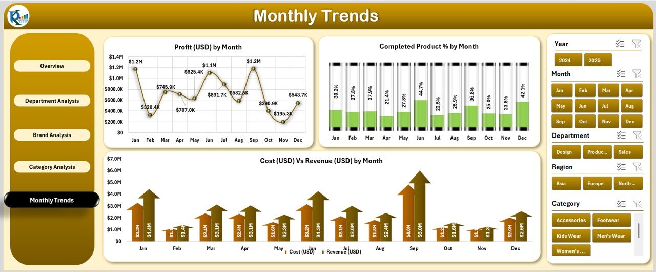
Seasonality plays a big role in fashion sales. The Monthly Trends Page shows how performance shifts over months.
Charts include:
-
Profit (USD) by Month
-
Completed Product % by Month
-
Cost vs Revenue (USD) by Month
This time-series visualization helps identify peak months, forecast future demand, and plan production or promotional activities accordingly.
Support Sheets — The Backbone of the Dashboard
The Support Sheet and Data Sheet are where all data management happens.
-
Data Sheet: You’ll enter your raw data here — including brand names, regions, categories, departments, profit, cost, revenue, and customer ratings. The dashboard automatically pulls data from this sheet.
-
Support Sheet: Stores lists, formulas, and reference information for dropdowns, slicers, and visual controls.
Together, these sheets make the dashboard dynamic and fully automated.
Key Features of the Fashion & Apparel Dashboard in Excel
Here are the highlights that make this Excel template powerful and easy to use:
-
Ready-to-Use Template: No coding or Power BI required. Just open and analyze.
-
Interactive Navigation Pane: Move between pages effortlessly.
-
Dynamic Charts and Slicers: Filter data by brand, category, month, or region with a click.
-
Instant KPI Updates: Refresh visuals instantly after data entry.
-
Customizable Layout: Add or remove charts, rename sections, or modify colors.
-
Visually Appealing Design: Professionally formatted visuals that look modern and business-ready.
This dashboard offers all the power of analytics — right inside Excel.
Why Every Fashion Business Needs This Dashboard
In the competitive fashion market, data-driven decisions make the difference between profit and loss. The Fashion & Apparel Dashboard in Excel acts as your digital control center. Here’s why it’s essential:
-
Centralizes Data: Combines cost, sales, and customer insights in one file.
-
Improves Efficiency: Reduces time spent on manual reporting.
-
Enhances Accuracy: Minimizes data errors through structured input fields.
-
Supports Growth: Provides visibility into trends that drive profitability.
-
Boosts Collaboration: Teams can use shared data for cross-functional planning.
In short, this dashboard helps you work smarter, not harder.
Advantages of the Fashion & Apparel Dashboard in Excel
Here are the top benefits of using this template for your fashion business:
1. Real-Time Visibility
You can instantly see up-to-date performance metrics without waiting for manual reports.
2. Data-Driven Decision Making
Charts and slicers make it easier to spot trends and make informed decisions.
3. Easy Customization
You can tailor the dashboard to your business — add new KPIs, brands, or categories.
4. Affordable Analytics
Unlike expensive BI tools, Excel dashboards require no subscription or coding.
5. Enhanced Productivity
Teams spend less time compiling data and more time improving performance.
6. Visual Storytelling
Color-coded visuals and charts make performance analysis more intuitive and engaging.
Click to Purchases Fashion & Apparel Dashboard in Excel
How to Use the Fashion & Apparel Dashboard Effectively
Using this dashboard is simple. Follow these steps to get started:
-
Enter Data in the Data Sheet: Include all relevant columns such as region, brand, category, cost, revenue, and customer rating.
-
Refresh the Dashboard: Excel formulas and pivot charts will update automatically.
-
Navigate Between Pages: Use the left-side page navigator to switch between overview and detailed views.
-
Filter Data with Slicers: Narrow your focus by selecting specific months, regions, or departments.
-
Analyze Trends: Review the Monthly Trends page to plan future strategies.
Within minutes, you’ll have a full overview of your business performance.
Best Practices for the Fashion & Apparel Dashboard in Excel
To get the best insights, follow these proven best practices:
✅ Keep Data Clean and Consistent: Avoid blank cells and ensure uniform naming conventions for brands and categories.
✅ Update Data Regularly: Refresh your inputs weekly or monthly for accurate tracking.
✅ Use Filters Smartly: Focus on key dimensions that matter most to your business.
✅ Back Up Your File: Store a copy of your dashboard safely to prevent data loss.
✅ Visualize Key KPIs Only: Too many charts can clutter the layout. Stick to essential metrics.
✅ Review Monthly Trends: Use this section for forecasting and planning inventory or marketing campaigns.
✅ Customize for Your Brand: Adjust colors, logo, and labels to match your brand identity.
By following these tips, your Fashion & Apparel Dashboard will become a reliable decision-making companion.
Why Excel Is Still a Great Choice for Dashboards
Many people assume dashboards require complex software like Power BI or Tableau. But Excel remains one of the most powerful and accessible tools for analytics.
Here’s why:
-
It’s widely available and familiar to users.
-
It supports pivot tables, slicers, and conditional formatting.
-
You can easily integrate external data from CSVs or ERP systems.
-
Excel dashboards can be shared or stored securely across teams.
With the right structure, Excel can deliver professional dashboards comparable to enterprise BI tools — at zero extra cost.
How the Dashboard Improves Business Decision-Making
The Fashion & Apparel Dashboard in Excel enables better decision-making in several ways:
-
Performance Monitoring: Quickly identify which brands or departments need improvement.
-
Cost Control: Compare revenue and cost in one place to identify inefficiencies.
-
Customer Insight: Use rating analysis to enhance customer satisfaction.
-
Trend Forecasting: Understand how sales and profit change over time.
-
Strategic Planning: Build yearly goals using accurate monthly data.
When you visualize your KPIs effectively, business decisions become faster, more confident, and more accurate.
Conclusion
The Fashion & Apparel Dashboard in Excel is more than a data tool — it’s a strategic asset for any fashion business. With its five analytical pages, interactive navigation, and clean visual design, this template transforms raw data into meaningful insights. It helps decision-makers track profitability, evaluate customer satisfaction, and manage product performance with precision.
Whether you’re a designer, retailer, or brand manager, adopting this Excel dashboard brings structure, speed, and intelligence to your decision-making process.
With data at your fingertips, you can focus less on manual reporting and more on innovation, creativity, and growth.
Frequently Asked Questions (FAQs)
1. What data do I need to use the Fashion & Apparel Dashboard?
You need basic data such as cost, revenue, profit, department, brand, category, region, and customer rating.
2. Is this dashboard suitable for small businesses?
Yes, it’s ideal for small and medium-sized fashion brands that want an affordable performance tracking solution.
3. Can I add more KPIs or charts?
Absolutely! You can customize the dashboard to include any new KPI or chart relevant to your business.
4. Does it require advanced Excel skills?
No. It’s designed for ease of use. Anyone familiar with Excel can operate it.
5. How often should I update the data?
You can update it weekly or monthly based on your reporting cycle to maintain accurate insights.
6. Can this dashboard track multiple brands?
Yes. It’s built to compare performance across brands, categories, and regions.
7. Is this compatible with Excel 2016 and later versions?
Yes, the dashboard works seamlessly on Excel 2016, 2019, 2021, and Microsoft 365.
8. Can I share this dashboard with my team?
Yes, you can share it through OneDrive, email, or your company’s shared drive for collaboration.
Visit our YouTube channel to learn step-by-step video tutorials
