Managing inventory effectively is a top priority for businesses of all sizes. Whether you’re running a retail store, a warehouse, or an e-commerce business, keeping track of your product stock, vendors, and reorder schedules is essential to avoid stockouts or overstocking. That’s where a Product Inventory Dashboard in Excel comes in handy.
In this detailed article, you’ll learn everything about using a ready-to-use Excel dashboard to monitor, analyze, and control your inventory operations. From features and benefits to best practices and FAQs—we’ve got it all covered!
Click to Purchases Product Inventory Dashboard in Excel
What is a Product Inventory Dashboard in Excel?
A Product Inventory Dashboard in Excel is a dynamic tool that enables you to monitor key inventory metrics like stock levels, product status, reorder requirements, vendor performance, and category-wise trends—all in one file. With Excel’s power of pivot tables, slicers, and charts, you can easily filter, visualize, and analyze your data in real time.
This dashboard is fully automated, interactive, and doesn’t require any special software—just Excel on your desktop.
What’s Inside the Product Inventory Dashboard?
This dashboard template is divided into five main analytical pages, along with a Data Sheet and a Support Sheet. A page navigator on the left helps you switch between sections effortlessly.
Let’s explore each page in detail:
Overview Page – Quick Summary at a Glance
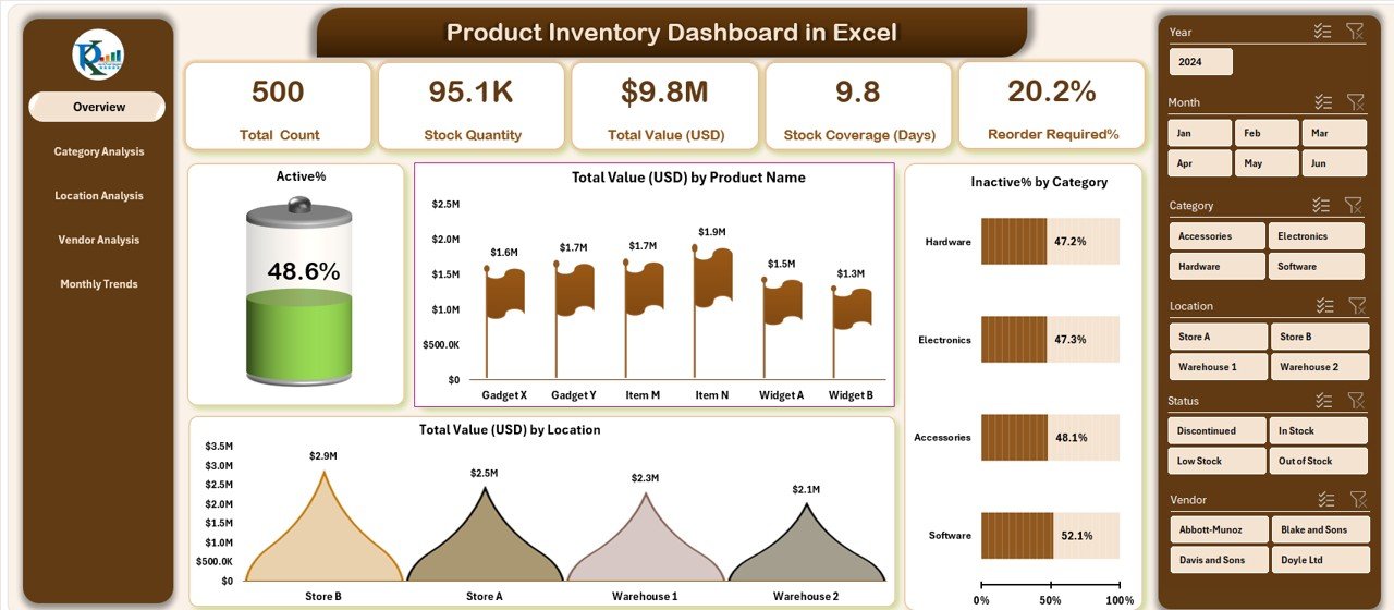
This page provides a high-level summary of the entire inventory system. With right-side slicers and key metric cards, you can get instant answers to questions like:
-
What percentage of products are active?
-
What’s the total inventory value?
-
Which products are inactive?
-
How is inventory distributed across locations?
Cards on this page:
-
🔹 Total Products
-
🔹 Active Products (%)
-
🔹 Inactive Products (%)
-
🔹 Total Inventory Value (USD)
-
🔹 Total Reorder Alerts
Charts:
-
📊 Active % – Doughnut Chart
-
📊 Total Value by Product Name – Column Chart
-
📊 Inactive % by Category – Bar Chart
-
📊 Total Value by Location – Pie Chart
Click to Purchases Product Inventory Dashboard in Excel
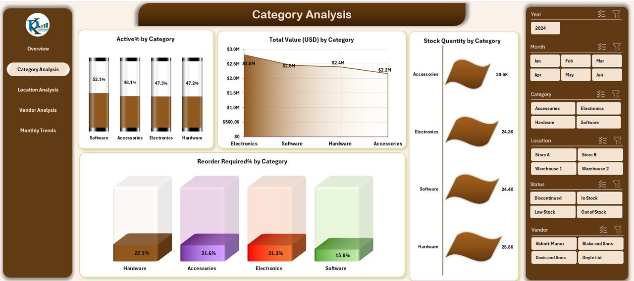
Category Analysis – Deep Dive by Product Type
In this section, you can analyze how each category of product is performing in terms of value, quantity, and reorder alerts.
Charts on this page:
-
📊 Active % by Category – Pie Chart
-
📊 Total Value by Category – Column Chart
-
📊 Stock Quantity by Category – Bar Chart
-
📊 Reorder Required % by Category – Line Chart
With these insights, you can quickly identify underperforming or overstocked categories.
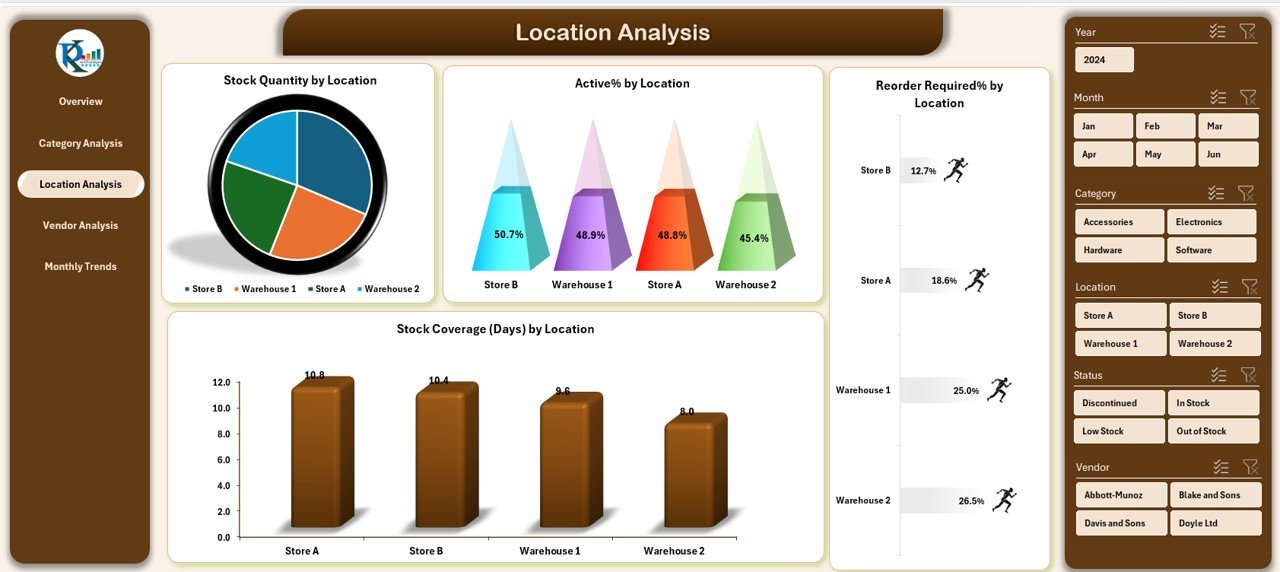
Location Analysis – Warehouse and Outlet View
Inventory distributed across multiple locations can be hard to manage. This page breaks down performance by site.
Charts on this page:
-
📊 Stock Quantity by Location – Column Chart
-
📊 Active Products by Location – Pie Chart
-
📊 Reorder Required % by Location – Line Chart
-
📊 Stock Coverage (in Days) by Location – Area Chart
These metrics are helpful for warehouse planning and store-level replenishment strategies.
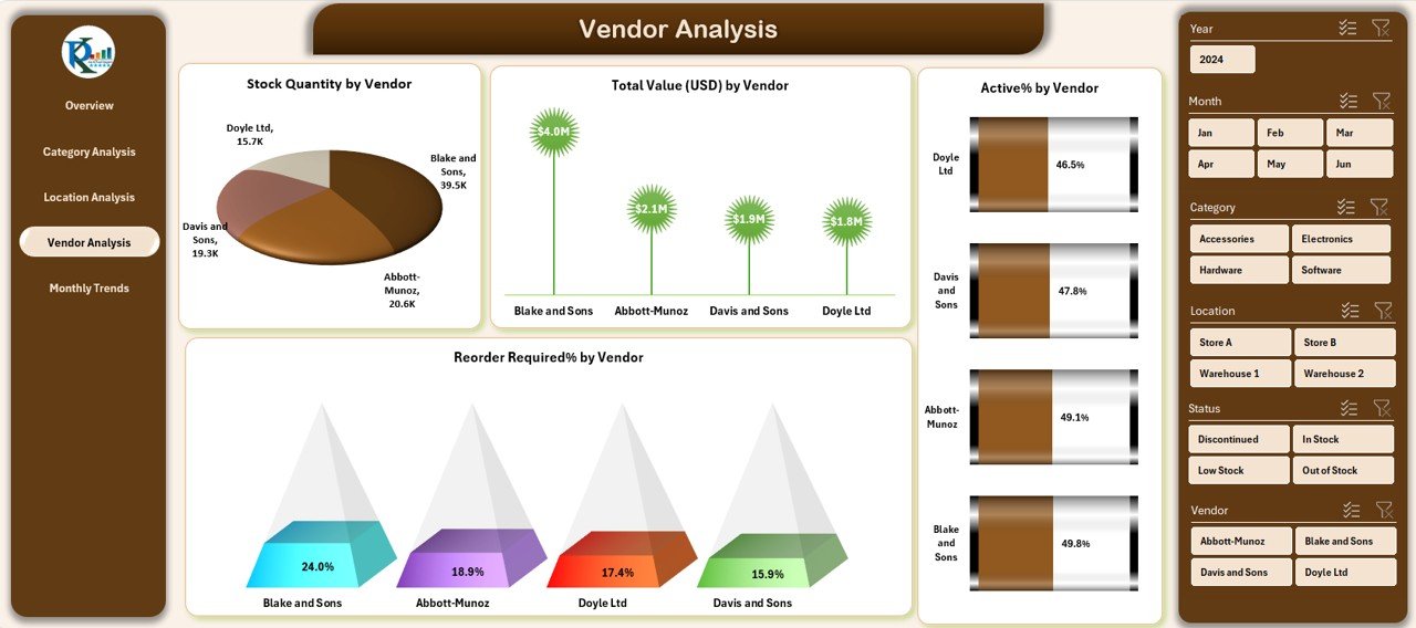
Vendor Analysis – Track Supplier Reliability
This page provides a focused look at vendor-wise performance, allowing procurement teams to identify the most efficient suppliers.
Charts on this page:
-
📊 Stock Quantity by Vendor – Column Chart
-
📊 Active % by Vendor – Doughnut Chart
-
📊 Reorder Required % by Vendor – Line Chart
-
📊 Total Value by Vendor – Column Chart
You can compare vendors based on supply value, stock quality, and frequency of reorder alerts.
Monthly Trends – Stay Ahead with Time-Based Insights
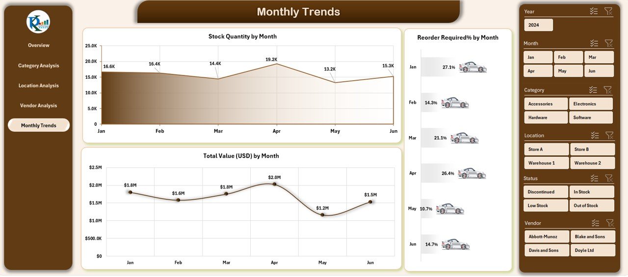
This page allows you to analyze time trends, which are critical for demand forecasting and planning.
Charts on this page:
-
📊 Stock Quantity by Month – Line Chart
-
📊 Reorder Required % by Month – Area Chart
-
📊 Total Inventory Value by Month – Column Chart
Understanding these trends helps avoid overstocking during slow months or understocking during peak demand.
Data Sheet and Support Sheet
-
Data Sheet: This is where you enter or paste your raw inventory records. Each row should include fields like Product Name, Category, Vendor, Quantity, Location, Status, Reorder Level, etc.
-
Support Sheet: This sheet contains master data for dropdown lists (like categories, locations, vendors) and backend calculations used for slicers and visualizations.
Advantages of Using a Product Inventory Dashboard in Excel
Using this dashboard brings many business benefits. Here’s what you gain:
-
🔍 Real-time Insights – Instantly see what’s happening with your inventory.
-
📉 Reduce Stockouts – Get early alerts on reorder requirements.
-
💸 Control Inventory Costs – Monitor product value and vendor performance.
-
📍 Track Multiple Locations – Analyze inventory distribution across branches.
-
🧠 Improve Forecasting – Make better purchase decisions using monthly trends.
-
📈 Visualize Everything – Use Excel pivot charts for interactive storytelling.
Best Practices for the Product Inventory Dashboard in Excel
To get the most out of your dashboard, follow these smart practices:
-
✔ Regularly Update the Data Sheet – Keep your input data fresh and accurate.
-
✔ Define Clear Reorder Levels – Ensure every product has a defined threshold.
-
✔ Classify Products Correctly – Use categories, statuses, and vendors properly.
-
✔ Use Filters and Slicers Efficiently – Slice the data by region, time, or vendor to find hidden trends.
-
✔ Keep It Simple – Avoid overcrowding the data with too many metrics.
-
✔ Backup Regularly – Save versions of your Excel file to avoid accidental data loss.
How Can This Dashboard Help Different Teams?
Different departments benefit from this tool in unique ways:
-
Procurement Teams: Can analyze vendor efficiency and order timing.
-
Warehouse Managers: Can manage storage space and stock movement.
-
Finance Teams: Can track inventory valuation over time.
-
Sales & Marketing: Can identify product gaps or overstock trends.
Key Metrics to Track in Your Inventory Dashboard
Include the following metrics in your dashboard to stay ahead of inventory issues:
-
📦 Stock Quantity
-
🔁 Reorder Required %
-
🧾 Total Inventory Value (USD)
-
🚚 Vendor-wise Stock Supply
-
🟢 Active vs Inactive Products
-
📍 Location-wise Distribution
-
🗓️ Monthly Trend Lines
Each metric tells a different part of your inventory story—don’t ignore them.
Why Use Excel for Inventory Dashboards?
You might wonder—why not use expensive inventory software?
Here’s why Excel is still the go-to solution for many teams:
-
💰 Cost-effective – No subscription fees or licenses.
-
🖥️ User-friendly – Most teams already know how to use Excel.
-
🔧 Customizable – Easily adapt formulas, charts, and layouts.
-
📤 Easy to Share – Send the file over email or save on cloud drives.
-
🔒 Secure – Keep your sensitive data offline if needed.
Excel gives you control, flexibility, and power—all in one place.
When Should You Upgrade to a Dashboard?
Here are signs that it’s time to adopt a Product Inventory Dashboard:
-
🔁 You manage stock across multiple locations.
-
📊 You track 100+ products.
-
⏱️ You spend hours creating manual reports.
-
🧾 You struggle to get real-time inventory value.
-
📉 You face frequent stockouts or overstocking.
If any of these sound familiar, then switching to a smart dashboard is your next move.
Conclusion
The Product Inventory Dashboard in Excel is more than just a spreadsheet—it’s your intelligent assistant for managing inventory operations. It helps you visualize stock movement, forecast reorder needs, evaluate vendor performance, and optimize storage costs.
With five powerful pages, interactive slicers, dynamic charts, and pivot-powered analytics, you gain full visibility and control over your products—all inside Excel.
If you’re looking for an affordable, powerful, and easy-to-use solution for managing inventory, this Excel dashboard is your best bet.
Click to Purchases Product Inventory Dashboard in Excel
Frequently Asked Questions (FAQs)
1. Is this dashboard compatible with all versions of Excel?
No. This dashboard is designed for the desktop version of Excel, ideally Excel 2016 or later. It uses slicers and pivot charts that may not function correctly in Excel Online or older versions.
2. Can I customize the dashboard for my business needs?
Yes! You can easily modify chart types, add new slicers, or change layout formatting. The dashboard is 100% Excel-based, making it highly customizable.
3. How often should I update the data sheet?
Ideally, you should update it daily or weekly, depending on how frequently your inventory changes. Frequent updates ensure your dashboard remains accurate and reliable.
4. What kind of businesses can use this dashboard?
Any business that manages physical products can benefit from this dashboard—retail stores, e-commerce sellers, warehouses, logistics providers, and manufacturers.
5. Is this dashboard linked to a live database or inventory system?
No. This template is not connected to a live database. You manually input or import data into the Data Sheet. However, you can use Power Query or VBA to automate future imports.
6. Can I track reorder levels in this dashboard?
Yes. The dashboard includes a Reorder Required % metric across vendors, categories, and locations. This helps you stay on top of procurement.
7. How do I share this dashboard with my team?
You can save the Excel file and share it via email or upload it to a shared drive like Google Drive, OneDrive, or SharePoint. It works great in collaborative environments.
8. What if I need more than 5 pages of analysis?
You can always add more sheets like “Product Aging,” “Daily Movements,” or “Supplier Ratings.” Excel offers unlimited flexibility to expand.
Visit our YouTube channel to learn step-by-step video tutorials