In today’s competitive business environment, organizations generate massive amounts of data every single day. However, data alone does not create value. Instead, insights drive decisions, and decisions drive performance. Therefore, businesses need a structured, visual, and reliable way to monitor performance continuously.
That is exactly where a Business Intelligence KPI Dashboard in Power BI becomes a game-changing solution.
This detailed article explains everything you need to know about a Business Intelligence KPI Dashboard in Power BI—what it is, why it matters, how it works, its page-wise structure, data setup, advantages, best practices, and frequently asked questions. Moreover, the language remains clear and simple, so anyone can understand and implement it confidently.
Click to Purchases Business Intelligence KPI Dashboard in Power BI
What Is a Business Intelligence KPI Dashboard in Power BI?
A Business Intelligence KPI Dashboard in Power BI is a centralized, interactive reporting tool that helps organizations track key performance indicators (KPIs) in real time or near real time. Instead of reviewing multiple Excel files, static reports, or manual summaries, decision-makers can monitor performance from a single, visual dashboard.
Moreover, this dashboard focuses on Month-to-Date (MTD) and Year-to-Date (YTD) performance, making it ideal for operational and strategic reviews.
This ready-to-use dashboard uses Excel as a data source and Power BI Desktop as the visualization layer. As a result, businesses gain flexibility, accuracy, and speed without complex technical dependencies.
Why Do Businesses Need a Business Intelligence KPI Dashboard?
Every organization tracks performance, but many still rely on manual methods. Unfortunately, manual reporting creates delays, errors, and confusion. Therefore, businesses need a smarter approach.
A Business Intelligence KPI Dashboard in Power BI solves these challenges by:
-
Providing real-time performance visibility
-
Highlighting target achievements and gaps
-
Enabling data-driven decisions
-
Reducing manual reporting efforts
-
Improving accountability across teams
As a result, leadership teams can act faster and with greater confidence.
How Does a Business Intelligence KPI Dashboard in Power BI Work?
This dashboard works on a simple yet powerful concept.
First, you capture KPI data in a structured Excel file. Then, Power BI connects to this file and transforms raw numbers into meaningful visuals. Finally, interactive slicers and charts allow users to analyze performance across months, KPIs, and KPI groups.
Because of this structure, the dashboard remains easy to maintain while still offering advanced insights.
Key Features of Business Intelligence KPI Dashboard in Power BI
Before diving into the page-wise structure, let’s understand the key features that make this dashboard effective.
Centralized KPI Monitoring
The dashboard brings all KPIs into one place. Therefore, users do not waste time switching between files or reports.
MTD and YTD Performance Tracking
The dashboard clearly separates Month-to-Date and Year-to-Date metrics. As a result, users can analyze short-term and long-term performance simultaneously.
Target vs Actual Analysis
The dashboard compares actual performance against targets using percentages and visual indicators. Consequently, performance gaps become instantly visible.
Previous Year Comparison
By comparing current performance with the previous year, businesses can identify trends and seasonal patterns easily.
Interactive Slicers
Users can filter data by Month and KPI Group, which makes analysis faster and more focused.
Page-Wise Structure of Business Intelligence KPI Dashboard in Power BI
This dashboard includes three well-structured pages, each designed for a specific analytical purpose.
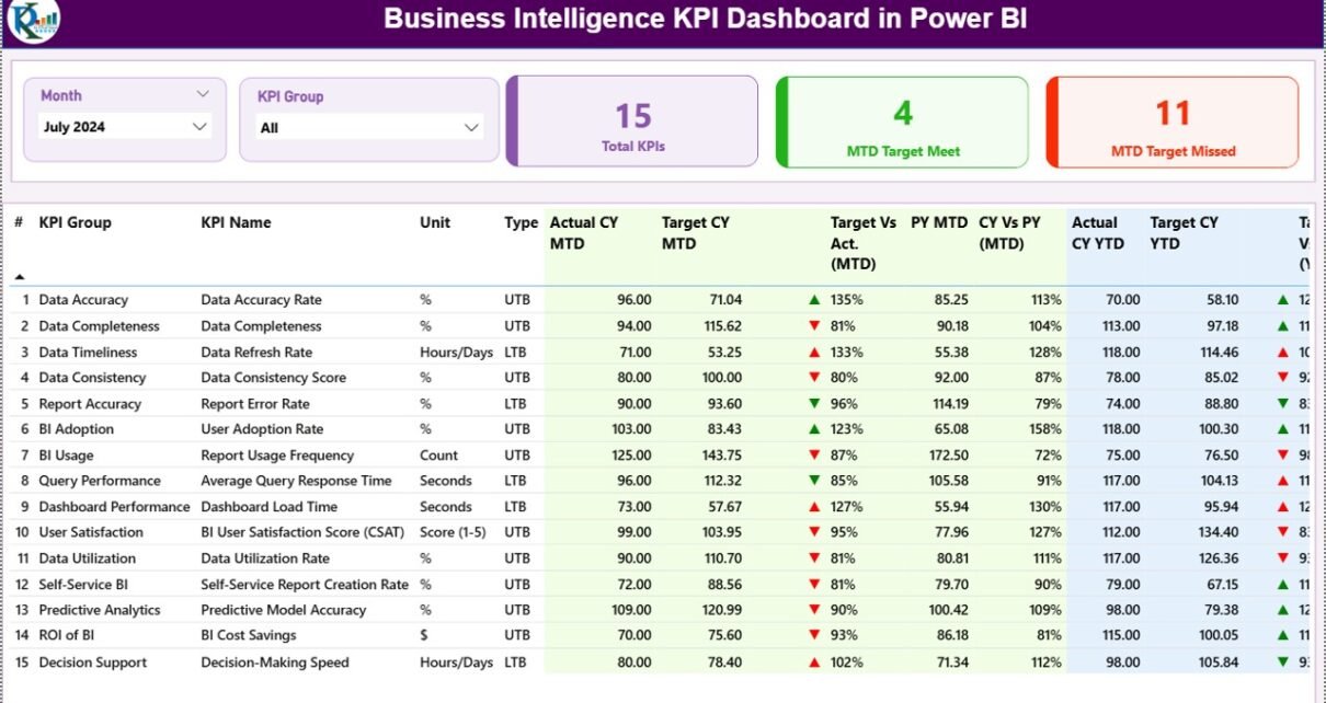
1) Summary Page: Where Performance Comes Together
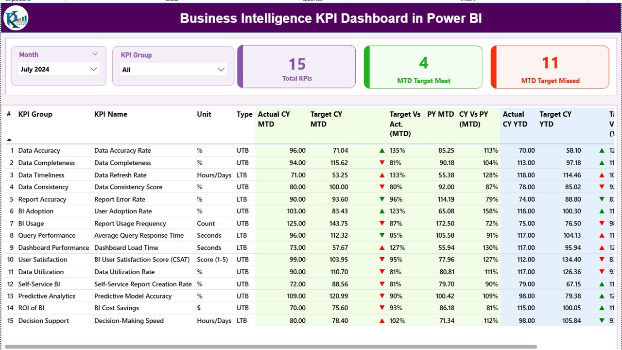
The Summary Page serves as the heart of the dashboard. It provides a complete snapshot of business performance at a glance.
What Do You See on the Summary Page?
Slicers at the Top
At the top of the page, you see:
-
Month Slicer
-
KPI Group Slicer
These slicers allow users to instantly filter the dashboard. Therefore, performance analysis becomes faster and more targeted.
KPI Summary Cards
Below the slicers, the dashboard displays three important cards:
-
Total KPIs Count – Shows how many KPIs you are tracking
-
MTD Target Met Count – Displays how many KPIs achieved their targets
-
MTD Target Missed Count – Highlights how many KPIs missed their targets
As a result, decision-makers understand overall performance within seconds.
Detailed KPI Table Explained
The detailed table forms the core of the Summary Page. Each column delivers a specific insight.
-
KPI Number
Shows the sequence number of each KPI. -
KPI Group
Indicates the category or department to which the KPI belongs. -
KPI Name
Displays the name of the KPI being tracked. -
Unit
Shows the unit of measurement, such as %, Hours, Count, or Amount. -
Type (LTB / UTB)
-
LTB (Lower the Better) for cost, defects, or downtime
-
UTB (Upper the Better) for revenue, productivity, or growth
-
-
Actual CY MTD
Displays the actual performance for the current year Month-to-Date. -
Target CY MTD
Shows the target value for the current year Month-to-Date. -
MTD Icon
Uses green ▲ or red ▼ icons to indicate whether the target is met or missed. -
Target vs Actual (MTD)
Calculates performance using the formula:
Actual MTD / Target MTD -
PY MTD
Displays the Month-to-Date value for the same period last year. -
CY vs PY (MTD)
Compares current performance with last year using:
CY MTD / PY MTD -
Actual CY YTD
Shows current year Year-to-Date actual performance. -
Target CY YTD
Displays Year-to-Date target values. -
YTD Icon
Highlights YTD target achievement with visual indicators. -
Target vs Actual (YTD)
Calculates YTD performance using:
Actual YTD / Target YTD -
PY YTD
Shows previous year YTD values. -
CY vs PY (YTD)
Compares current YTD performance with last year.
Because of this structured layout, users can analyze performance from multiple angles without confusion.
Click to Purchases Business Intelligence KPI Dashboard in Power BI
2) KPI Trend Page: How Is Performance Changing Over Time?
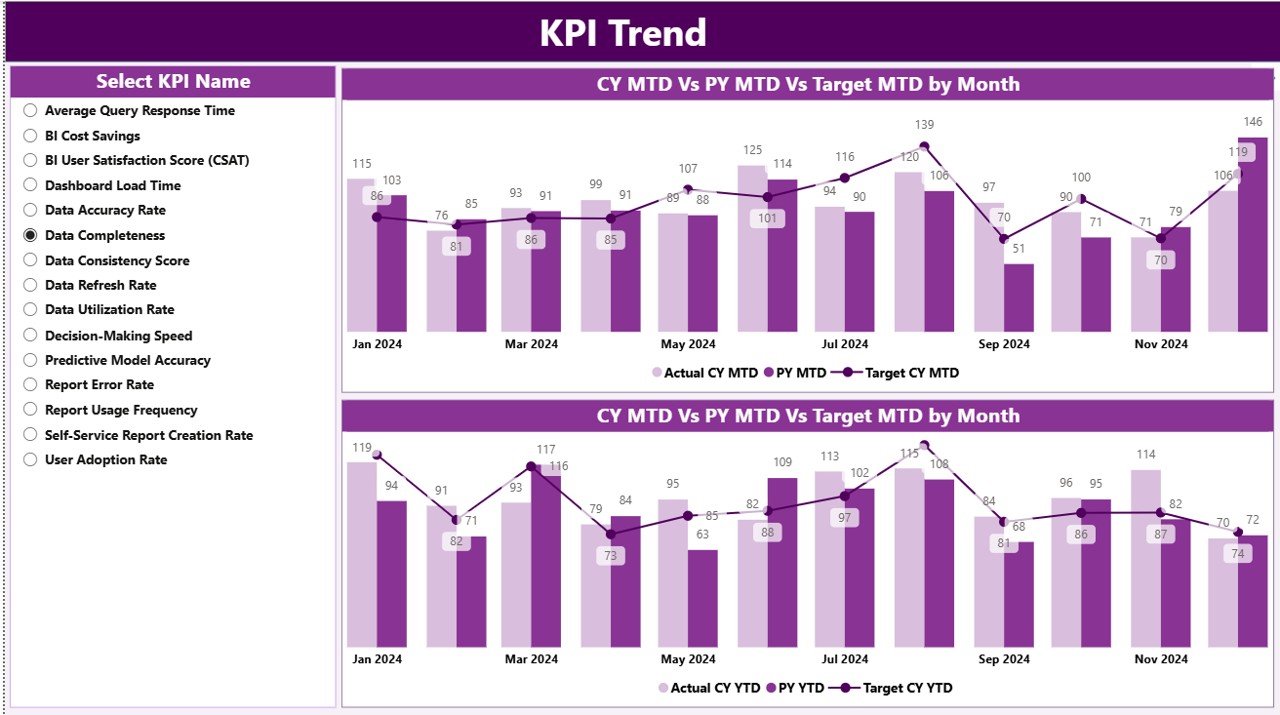
While the Summary Page shows current status, the KPI Trend Page focuses on performance movement.
What Does the KPI Trend Page Show?
This page displays two combo charts:
-
MTD Trend Chart
-
YTD Trend Chart
Each chart compares:
-
Actual Current Year
-
Actual Previous Year
-
Target Values
As a result, users can identify trends, growth patterns, and performance gaps quickly.
KPI Selection Slicer
On the left side, a KPI Name slicer allows users to select any KPI. Once selected, the charts update automatically.
Therefore, this page becomes extremely useful during performance review meetings.
3) KPI Definition Page: Understanding the Metrics Clearly
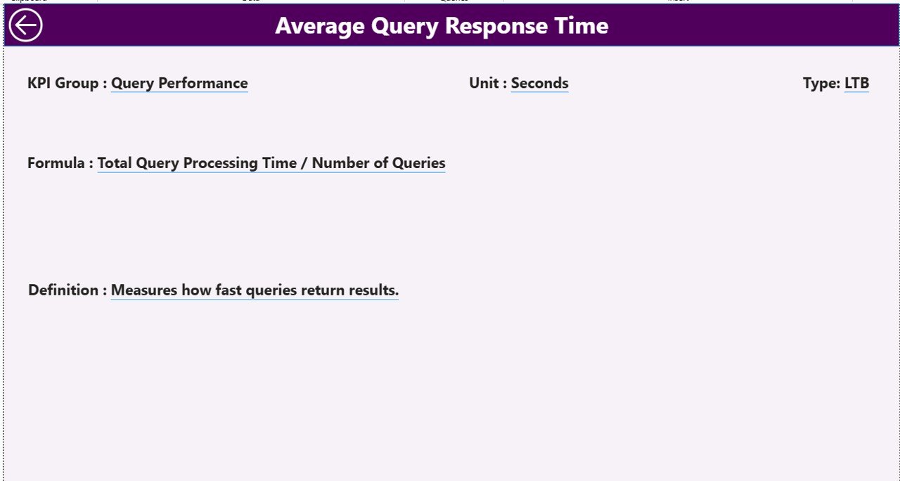
The KPI Definition Page acts as a reference layer.
Why Is This Page Important?
Many dashboards fail because users do not understand KPI logic. This page solves that problem.
It displays:
-
KPI Formula
-
KPI Definition
-
Unit of Measurement
-
KPI Type (LTB or UTB)
This page remains hidden and works as a drill-through page. Users can right-click from the Summary Page to view KPI details.
To return, users simply click the Back button on the top-left corner.
Excel Data Structure Used in the Dashboard
The dashboard uses Excel as its data source, which makes it flexible and easy to maintain.
Excel File Structure Overview
The Excel file contains three worksheets.
1) Input_Actual Sheet
This sheet stores actual performance data.
You need to fill:
-
KPI Name
-
Month (use the first date of the month)
-
MTD Actual Number
-
YTD Actual Number
Because of this design, monthly updates become quick and simple.
2) Input_Target Sheet
This sheet stores target values.
You need to fill:
-
KPI Name
-
Month (use the first date of the month)
-
MTD Target Number
-
YTD Target Number
As a result, Power BI automatically calculates target comparisons.
3) KPI Definition Sheet
This sheet defines each KPI.
You need to fill:
-
KPI Number
-
KPI Group
-
KPI Name
-
Unit
-
Formula
-
Definition
-
Type (LTB or UTB)
Therefore, the dashboard remains consistent and easy to understand.
Advantages of Business Intelligence KPI Dashboard in Power BI
Click to Purchases Business Intelligence KPI Dashboard in Power BI
A Business Intelligence KPI Dashboard in Power BI offers several practical advantages.
Improved Decision-Making
Because data updates automatically, leaders make decisions based on facts, not assumptions.
Time-Saving Reporting
The dashboard eliminates manual report preparation. Therefore, teams save hours every month.
Clear Performance Visibility
Visual indicators instantly show whether targets are met or missed.
Better Accountability
When KPIs remain visible, teams stay focused and accountable.
Scalable and Flexible
You can add new KPIs, groups, or months without redesigning the dashboard.
Best Practices for the Business Intelligence KPI Dashboard in Power BI
To get maximum value, follow these best practices.
Keep KPI Definitions Clear
Always define each KPI properly to avoid confusion.
Use Consistent Units
Ensure consistent units across actual, target, and previous year data.
Update Data Regularly
Update Excel input sheets on a fixed schedule to maintain accuracy.
Limit KPIs Per Dashboard
Track only critical KPIs to avoid information overload.
Validate Data Before Refresh
Always check Excel data before refreshing Power BI.
Who Can Use a Business Intelligence KPI Dashboard in Power BI?
This dashboard suits many roles and industries.
-
Business Leaders
-
Operations Managers
-
Finance Teams
-
Sales and Marketing Teams
-
HR and Admin Departments
-
Strategy and Planning Teams
Because of its flexibility, any organization can adapt it easily.
Conclusion: Why This Dashboard Matters
A Business Intelligence KPI Dashboard in Power BI transforms how organizations monitor and manage performance. Instead of reacting late, teams gain real-time insights. Instead of guessing, leaders act with confidence.
Because it uses Excel for data input and Power BI for visualization, it remains powerful yet simple. Therefore, this dashboard becomes an essential tool for modern, data-driven organizations.
Frequently Asked Questions (FAQs)
What is a Business Intelligence KPI Dashboard in Power BI?
It is an interactive Power BI report that tracks KPIs using MTD, YTD, target, and previous year comparisons.
Do I need advanced Power BI skills to use this dashboard?
No. You only need basic Excel data entry skills.
Can I add more KPIs later?
Yes. You can easily add new KPIs in the Excel file.
Does the dashboard support multiple KPI groups?
Yes. You can create unlimited KPI groups.
How often should I update the Excel file?
You should update it monthly or as frequently as your reporting cycle requires.
Can this dashboard handle large datasets?
Yes. Power BI handles large datasets efficiently.
Visit our YouTube channel to learn step-by-step video tutorials