Running a franchise network efficiently requires more than just intuition—it demands accurate data analysis, timely decision-making, and continuous performance tracking. That’s where the Franchise Management KPI Dashboard in Power BI becomes your game-changing tool.
This ready-to-use dashboard helps franchise owners, business managers, and analysts track key performance indicators (KPIs) across multiple locations, ensuring smooth operations and measurable growth. Built on Microsoft Power BI, this solution transforms raw franchise data into actionable insights, making it easier to evaluate performance, identify trends, and align every branch with business goals.
Click to Purchases Franchise Management KPI Dashboard in Power BI
What Is a Franchise Management KPI Dashboard in Power BI?
A Franchise Management KPI Dashboard in Power BI is a visual performance analysis system that brings together all crucial franchise metrics in one interactive interface. It allows you to monitor franchise efficiency, profitability, and goal achievement across all outlets, departments, and time periods.
By connecting an Excel data source to Power BI, this dashboard automatically updates and refreshes visuals, offering real-time insights into how each franchise location is performing. Whether you manage ten stores or a hundred, this dashboard helps you make informed, data-driven decisions in seconds.
Key Features of the Franchise Management KPI Dashboard
The Franchise Management KPI Dashboard in Power BI includes three interactive pages, each designed for a specific analytical purpose: Summary Page, KPI Trend Page, and KPI Definition Page.
Let’s explore each page in detail:
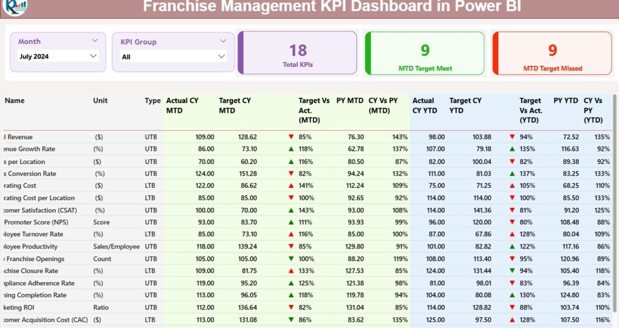
1️⃣ Summary Page — Your Central Performance Hub
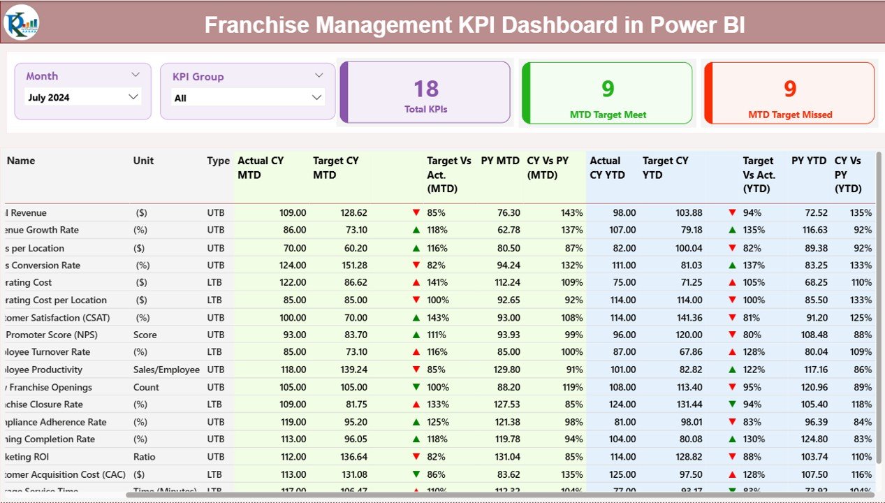
The Summary Page is the heart of the dashboard. It presents a complete snapshot of franchise performance through slicers, cards, and detailed tables.
Key Highlights:
-
Month and KPI Group Slicers: Located at the top, these slicers allow you to filter results by specific months and KPI groups instantly.
-
Performance Cards:
-
Total KPIs Count: Displays the number of KPIs being tracked.
-
MTD Target Met Count: Shows how many KPIs achieved or exceeded the target.
-
MTD Target Missed Count: Indicates the number of KPIs that fell below expectations.
-
Detailed KPI Table Includes:
-
KPI Number: Sequential identifier for each KPI.
-
KPI Group: Category or department of the KPI (e.g., Sales, Customer Service, Operations).
-
KPI Name: Specific name of the performance metric.
-
Unit: Unit of measurement (e.g., %, $, Units).
-
Type: Defines whether it’s UTB (Upper The Better) or LTB (Lower The Better).
-
Actual CY MTD: Actual performance for the current month.
-
Target CY MTD: Expected target for the current month.
-
MTD Icon: Uses up (▲) and down (▼) arrows in green or red to indicate performance status.
-
Target vs Actual (MTD): Shows the achievement ratio (Actual ÷ Target × 100).
-
Previous Year (PY) MTD: Last year’s month-to-date numbers.
-
CY vs PY (MTD): Percentage comparison between current and previous year performance.
-
Actual CY YTD & Target CY YTD: Year-to-date actual and target values.
-
YTD Icon: Similar arrow indicators to show overall YTD performance.
-
Target vs Actual (YTD) and CY vs PY (YTD): Provide YTD comparative analysis.
This page gives managers instant clarity on which KPIs are on track, which ones need attention, and where the trends are improving or declining.
2️⃣ KPI Trend Page — Analyze Monthly and Yearly Trends
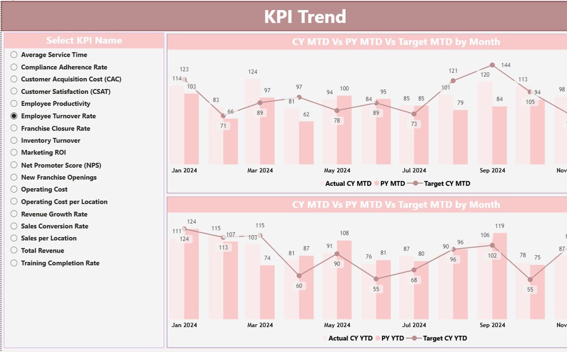
The KPI Trend Page focuses on visual analytics. It uses combo charts to show monthly and yearly performance comparisons for each KPI.
Features Include:
Click to Purchases Franchise Management KPI Dashboard in Power BI
-
KPI Selector Slicer: On the left panel, you can select any KPI name to analyze its trend.
-
Charts Display:
-
Actual Numbers for Current Year vs Previous Year
-
Target Numbers for both MTD and YTD views
-
These visuals help managers see performance evolution over time—spotting growth patterns, forecasting future trends, and identifying areas that consistently underperform.
3️⃣ KPI Definition Page — Understanding Each Metric
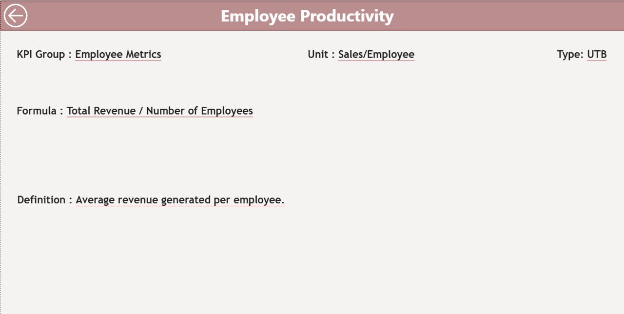
The KPI Definition Page is a hidden drill-through page that provides detailed descriptions of each KPI.
From the Summary Page, users can right-click and drill through to view:
-
KPI Formula
-
KPI Definition
-
Measurement Unit
-
Type (UTB or LTB)
This feature ensures transparency and standardization across all franchise locations.
A simple Back Button at the top-left corner allows users to return to the main page instantly.
Data Source and Structure
The backbone of this dashboard is a structured Excel data source. The connected Excel file contains three key worksheets, ensuring seamless Power BI integration:
1️⃣ Input_Actual Sheet
This sheet stores all actual KPI data, including:
-
KPI Name
-
Month (first date of month)
-
MTD Actual
-
YTD Actual
Each month’s data gets updated here to reflect the real performance metrics.
2️⃣ Input_Target Sheet
This worksheet contains all the target values for each KPI:
-
KPI Name
-
Month (first date of month)
-
MTD Target
-
YTD Target
It defines the performance benchmarks for every location and department.
3️⃣ KPI Definition Sheet
This page includes the KPI master data such as:
-
KPI Number
-
KPI Group
-
KPI Name
-
Unit
-
Formula
-
Definition
-
Type (UTB or LTB)
These three sheets collectively power the dashboard, ensuring accurate and automated updates in Power BI.
Why Every Franchise Needs a KPI Dashboard in Power BI
Managing a franchise network without a central dashboard often leads to inefficiency and guesswork. The Power BI-based Franchise Management Dashboard brings structure, visibility, and clarity to every aspect of operations.
Here’s why every franchise organization should use it:
-
Unified Data View: Combine performance data from multiple branches into a single source of truth.
-
Automated Analytics: Eliminate manual calculations and errors with real-time updates.
-
Decision Speed: Analyze trends and act fast on opportunities or issues.
-
Transparency: Keep every manager and franchise partner aligned with defined KPIs.
-
Customization: Adapt KPI groups, formulas, and visuals to match business needs.
Advantages of the Franchise Management KPI Dashboard in Power BI
1️⃣ Real-Time Performance Monitoring
You can monitor daily, weekly, or monthly KPI progress instantly. With live Excel connections, you always have up-to-date data visualizations.
2️⃣ Improved Decision-Making
Managers can easily identify which outlets perform well and which need support. It transforms complex numbers into actionable visuals that simplify strategy-making.
3️⃣ Enhanced Accountability
Since every franchisee’s performance is tracked and visualized, it promotes responsibility and ownership across the network.
4️⃣ Data Accuracy
The Excel data model ensures data integrity. Every calculation (like MTD vs YTD, or Actual vs Target) happens automatically with zero human error.
5️⃣ Time Savings
Instead of compiling reports manually, users can generate insights in seconds. Power BI automates the reporting process completely.
6️⃣ Better Goal Alignment
With KPI definitions standardized across all branches, every location works toward the same targets and goals.
How to Use the Dashboard Effectively
Using this dashboard requires a clear workflow. Follow these steps for optimal results:
-
Prepare Your Data:
Enter actual and target KPI numbers in the respective Excel sheets. -
Refresh Power BI:
Connect the Excel file and refresh the data to update visuals. -
Explore the Summary Page:
Use slicers to filter data by month or KPI group. -
Analyze Trends:
Switch to the KPI Trend Page to understand performance patterns. -
Drill Into Details:
Right-click on a KPI to open its detailed definition page. -
Make Decisions:
Based on insights, take actions to improve low-performing KPIs or replicate high-performing strategies.
Best Practices for the Franchise Management KPI Dashboard
1️⃣ Maintain Data Consistency
Ensure that every franchise location uses the same KPI naming conventions and units. Inconsistent data entries can lead to incorrect visuals.
2️⃣ Update Monthly
Refresh and update the actual and target sheets every month to maintain real-time accuracy.
3️⃣ Focus on Key Metrics
Avoid overloading the dashboard with unnecessary KPIs. Focus on essential metrics like sales growth, customer satisfaction, and operating cost.
4️⃣ Use Drill-Through Wisely
Leverage the drill-through page for KPI explanations to train new managers and standardize interpretations.
5️⃣ Review Trends Regularly
Schedule weekly or monthly reviews using the KPI Trend Page to identify long-term patterns.
6️⃣ Keep Visualization Simple
Use clear and minimalistic visuals—avoid cluttered charts. The goal is to make performance insights clear, not complicated.
Conclusion
The Franchise Management KPI Dashboard in Power BI empowers franchise leaders to take control of performance management with clarity and precision. It merges automation, visualization, and real-time data into one smart reporting platform.
From summary cards showing high-level insights to trend charts revealing deeper patterns, this dashboard ensures that every franchise decision is backed by accurate and timely data.
In today’s fast-moving business landscape, managing franchises without a data-driven approach can limit growth potential. With this Power BI solution, you can elevate performance, strengthen consistency, and drive success across your entire network.
Frequently Asked Questions (FAQs)
1️⃣ What is a Franchise Management KPI Dashboard?
It’s a Power BI-based tool that tracks and visualizes key performance indicators (KPIs) across all franchise outlets. It helps you measure sales, efficiency, customer satisfaction, and other vital metrics.
2️⃣ Why should I use Power BI for franchise management?
Power BI offers automation, visual analytics, and real-time updates. It eliminates manual reporting, improves decision speed, and provides dynamic insights into every aspect of your franchise performance.
3️⃣ Can I customize KPIs in the dashboard?
Yes, you can easily modify or add KPIs in the Excel data source. Once updated, the dashboard refreshes automatically to display new metrics.
4️⃣ Does it work for multiple franchise locations?
Absolutely! The dashboard is designed to handle multi-location data. You can compare different outlets, regions, or managers using slicers and filters.
5️⃣ What skills are required to use this dashboard?
Basic Power BI knowledge and familiarity with Excel are enough. The dashboard is pre-built, so most of the heavy lifting—formulas, visuals, and automation—is already done.
6️⃣ How often should I update the data?
For best results, update your Excel sheets monthly or weekly depending on business needs. Regular updates keep all visuals accurate and relevant.
7️⃣ Can I export reports from this dashboard?
Yes, you can export visuals, charts, and entire reports from Power BI to PDF, PowerPoint, or Excel for sharing with your team.
8️⃣ Is the dashboard suitable for small franchises?
Yes, even small businesses can benefit from structured performance tracking. The dashboard scales easily as your franchise network grows.
9️⃣ How does it compare to traditional Excel dashboards?
Unlike Excel-only dashboards, Power BI offers real-time interactivity, advanced visualizations, and easier scalability. It connects directly to your data source and updates automatically.
Visit our YouTube channel to learn step-by-step video tutorials
Click to Purchases Franchise Management KPI Dashboard in Power BI