Urban development grows every day, and cities face nonstop pressure to improve roads, transport, water systems, waste handling, and public services. Because of this fast growth, city leaders need a simple and reliable way to monitor the performance of their infrastructure. A Urban Infrastructure KPI Dashboard in Power BI helps them track everything in real time. It offers complete visibility, strong data analysis, and instant decision-making support.
In this article, I explain how this dashboard works, why it delivers great value, and how every worksheet, chart, and KPI contributes to better city management. I also include advantages, best practices, and answers to common questions at the end.
Click to Purchases Urban Infrastructure KPI Dashboard in Power BI
What Is an Urban Infrastructure KPI Dashboard in Power BI?
An Urban Infrastructure KPI Dashboard in Power BI is a ready-to-use management tool that tracks the essential KPIs of city infrastructure systems. It connects with simple Excel data sources, transforms raw numbers into insights, and allows leaders to measure progress month after month.
Since this dashboard runs in Power BI, you enjoy fast visuals, real-time slicers, drill-through features, and attractive analytics. You get clear insights into current performance, monthly trends, year-to-date progress, and comparison with past performance.
This dashboard includes three main pages:
-
Summary Page
-
KPI Trend Page
-
KPI Definition Page (Drill-Through)
Now let us understand each part step by step.
Why Do Cities Need an Urban Infrastructure KPI Dashboard?
Cities handle critical infrastructure networks. Roads, electricity, water supply, waste handling, transport, and public facilities run every minute. Therefore, officials cannot depend on manual reports or inconsistent spreadsheets.
A dashboard solves these issues because:
-
It builds clarity from scattered data
-
It tracks monthly and yearly progress in one place
-
It highlights areas that need improvement immediately
-
It improves accountability across departments
-
It guides faster decisions during emergencies
-
It reduces duplication of reports
With Power BI, every city team can see the same data at the same time. This creates trust and smooth teamwork.
Click to Purchases Urban Infrastructure KPI Dashboard in Power BI
Key Features of the Urban Infrastructure KPI Dashboard in Power BI
This dashboard includes powerful features designed to make analysis simple and quick. Below are the main features with clear explanations.
1. Summary Page – The Main Control Center
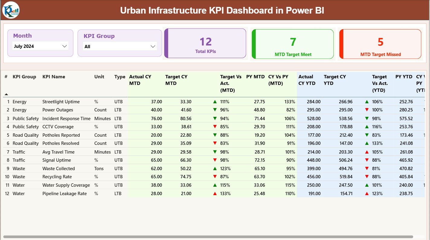
The Summary Page is the heart of the dashboard. It gives a complete snapshot of all KPIs in one place. Because of the clean layout and simple navigation, users understand the data in seconds.
Slicers on Top
On the top area, you get:
-
Month Slicer
-
KPI Group Slicer
These slicers help you filter the dashboard instantly. Choose any month, any group, or any category and watch the dashboard update every chart and table.
KPI Cards
Just below the slicers, you see three powerful KPI cards:
-
Total KPIs Count
-
MTD Target Meet Count
-
MTD Target Missed Count
These cards help you understand performance within one second.
Green ▲ means performance meets or beats the target.
Red ▼ means performance misses the target.
This table gives complete transparency about every KPI.
Click to Purchases Urban Infrastructure KPI Dashboard in Power BI
2. KPI Trend Page – Understand Patterns and Movement
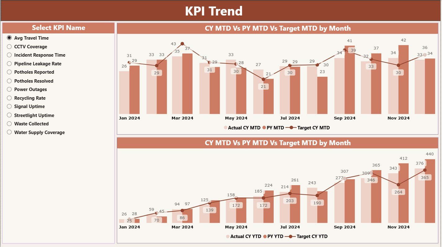
The next page helps you see how your KPIs move month after month. This matters a lot because trends help you correct problems early.
On this page, you get:
-
A slicer on the left to choose the KPI Name
-
Two combo charts that show:
-
Current Year Actual
-
Previous Year Actual
-
Targets
-
For both MTD and YTD
-
This page offers clean comparisons. You learn:
-
Which KPI improves steadily
-
Which KPI drops in certain months
-
Which KPI crosses the target often
-
Which KPI needs immediate attention
Trend analysis helps you plan maintenance, budgets, and resources in a smarter way.
3. KPI Definition Page – Drill Through to Find Details
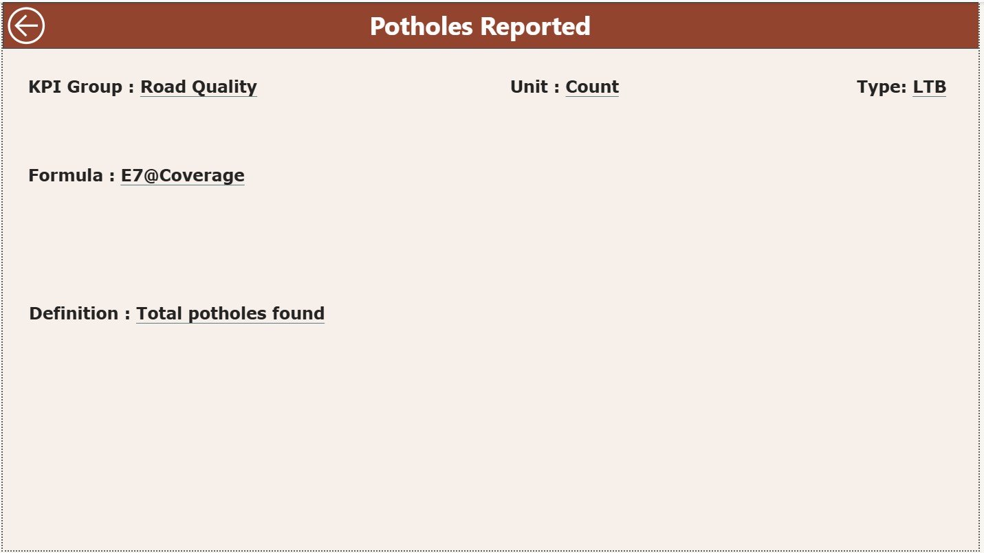
This page is hidden because users reach it only through drill-through action.
From the Summary Page, right-click on any KPI and select Drill Through. You reach the KPI Definition Page, where you see:
-
KPI Number
-
KPI Group
-
KPI Name
-
Unit
-
Formula
-
KPI Definition
-
Type (UTB or LTB)
This page helps users understand what the KPI actually measures. It also creates a great documentation system.
At the top left corner, you see a Back Button. Use it to return to the main dashboard anytime.
Click to Purchases Urban Infrastructure KPI Dashboard in Power BI
Excel Data Source Used for the Dashboard
This dashboard uses an Excel file that includes three worksheets:
1. Input_Actual Sheet
Here you fill:
-
KPI Name
-
Month (use the first date of the month)
-
MTD Actual
-
YTD Actual
This sheet captures the real performance numbers of the city’s infrastructure.
2. Input_Target Sheet
Here you fill:
-
KPI Name
-
Month
-
MTD Target
-
YTD Target
These numbers help the dashboard compare planned performance with actual performance.
3. KPI Definition Sheet
This is the master sheet. Fill:
-
KPI Number
-
KPI Group
-
KPI Name
-
Unit
-
Formula
-
Definition
-
Type (UTB or LTB)
This sheet works as the backbone of the dashboard because it explains every KPI clearly.
Advantages of the Urban Infrastructure KPI Dashboard in Power BI
1. Real-Time Monitoring
You get live numbers every month. This helps teams take action quickly.
2. High Transparency
Everyone can see KPIs, comparisons, and trends in one place.
3. Fast Decision-Making
You make decisions confidently because Power BI updates everything instantly.
4. Supports Long-Term Planning
Trend charts help you plan resources, budgets, expansions, and repairs.
5. Better Team Coordination
Different departments track their KPIs through the same dashboard.
6. Reduces Manual Work
No need to compile large Excel reports every month.
7. KPI Drill-Through for Clarity
Everyone understands the KPI definition and formula directly from the dashboard.
Best Practices for Using an Urban Infrastructure KPI Dashboard in Power BI
1. Keep KPI Names Simple
Use short names. Simple KPIs help users understand the story quickly.
2. Keep Data Updated
Always update the Input_Actual and Input_Target sheets on time.
3. Use Consistent Units
Use the same measurement units for every category.
4. Review Trends Monthly
Check both positive and negative patterns clearly.
5. Remove Irrelevant KPIs
Track only the KPIs that matter to your city.
6. Use Color Codes Wisely
Green for good performance, red for low performance.
7. Take Action Immediately
When a KPI misses the target, take action within the same month.
8. Train Teams to Use the Dashboard
When everyone understands how to read the dashboard, decisions become faster.
Click to Purchases Urban Infrastructure KPI Dashboard in Power BI
How the Dashboard Helps the City Improve Daily Operations
This dashboard creates strong visibility across all departments. Because it tracks MTD, YTD, targets, PY comparison, trends, and KPI definitions, you always know:
-
What goes well
-
Where improvements are needed
-
Which department performs well
-
Where delays exist
-
How resources move
-
How performance changes across months
Urban development becomes structured, measurable, and predictable.
Conclusion
The Urban Infrastructure KPI Dashboard in Power BI brings clear visibility and powerful analytics to city management. It helps leaders track infrastructure KPIs effectively, compare performance with targets, and identify areas that require immediate action. Because the dashboard includes slicers, cards, tables, trends, and drill-through definitions, it becomes a complete analytical tool for every city development department.
With the right input sheets, correct KPIs, and proper usage, this dashboard becomes a must-have tool for modern urban planning.
Click to Purchases Urban Infrastructure KPI Dashboard in Power BI
Frequently Asked Questions (FAQs)
1. What is an Urban Infrastructure KPI Dashboard in Power BI?
It is a ready-to-use dashboard that tracks city infrastructure KPIs, compares targets, shows trends, and supports decision-making.
2. Who should use this dashboard?
Urban planners, municipal engineers, infrastructure teams, administrators, city leaders, and public service managers.
3. What makes this dashboard useful?
It shows MTD and YTD KPIs, target vs actual comparisons, past year trends, and definitions in one place.
4. Can beginners use this dashboard?
Yes. The dashboard uses clean visuals, slicers, and combo charts that beginners understand easily.
5. What data do I need to fill before using the dashboard?
You must fill the KPI Definitions, Actual Data (MTD & YTD), and Target Data.
6. Does the dashboard support drill-through for KPI details?
Yes. You can drill through to the KPI Definition Page to see formulas and KPI meaning.
7. Can I customize the KPIs?
Yes. You can add or remove KPIs in the Excel file and refresh the report.
8. Can this dashboard work for smaller cities?
Yes. It works for both small and large cities because it scales easily.
Click to Purchases Urban Infrastructure KPI Dashboard in Power BI
Visit our YouTube channel to learn step-by-step video tutorials