Public safety teams handle high-pressure situations every day. Police departments, emergency response teams, disaster management authorities, security departments, and public agencies monitor huge volumes of data every hour. They track crime trends, response time, incident resolution, community complaints, patrol performance, safety compliance, and many more indicators. Because of this heavy workload, teams struggle when data sits in multiple spreadsheets or scattered systems. It slows down decision-making and hides the insights that help them act in time.
A Public Safety KPI Dashboard in Power BI solves this challenge. It brings all key metrics into one clean, interactive, and user-friendly dashboard. You can track trends, compare performance, and make informed decisions in seconds. Rather than working with dozens of files, the dashboard presents everything in a single visual environment.
In this detailed article, you will learn what a Public Safety KPI Dashboard is, how each page works, and why every public safety department benefits from it. You will also explore the advantages, best practices, and frequently asked questions. Let’s dive in.
Click to buy Public Safety KPI Dashboard in Power BI
What Is a Public Safety KPI Dashboard in Power BI?
A Public Safety KPI Dashboard in Power BI is a ready-to-use analytics solution that helps safety teams analyze performance indicators across crime monitoring, emergency response, traffic safety, disaster preparedness, community engagement, and operational efficiency. It converts raw numbers into meaningful visuals. The dashboard updates directly from an Excel-based data source, so you refresh insights anytime without creating new reports.
Managers and field leaders use the dashboard to understand:
- Monthly performance
- Year-to-date (YTD) progress
- Trends vs targets
- Trends vs previous years
- Team performance
- Response time metrics
- Incident reduction trends
- Community safety improvements
Because Power BI offers slicers and drill-through features, you navigate between KPI groups, months, and detailed definitions with ease. The dashboard gives you clarity and supports faster decisions during critical moments.
Why Do Public Safety Teams Need a KPI Dashboard?
Public safety operations demand accuracy and quick action. Every second matters during incident response or crime resolution. Without a visual system, teams face several issues:
- Data sits in multiple spreadsheets
- Manual reporting consumes hours
- Key insights remain hidden
- Managers struggle to identify patterns
- Teams cannot compare performance with targets
- Previous year analysis becomes difficult
A Power BI dashboard removes these limitations. It offers a single view of all KPIs and allows teams to act with confidence. Moreover, it encourages a data-driven culture where decisions rely on facts instead of guesswork.
Key Features of the Public Safety KPI Dashboard in Power BI
This dashboard includes three main pages inside the Power BI file. Each page plays a unique role in delivering insights.
Let’s explore each one clearly.
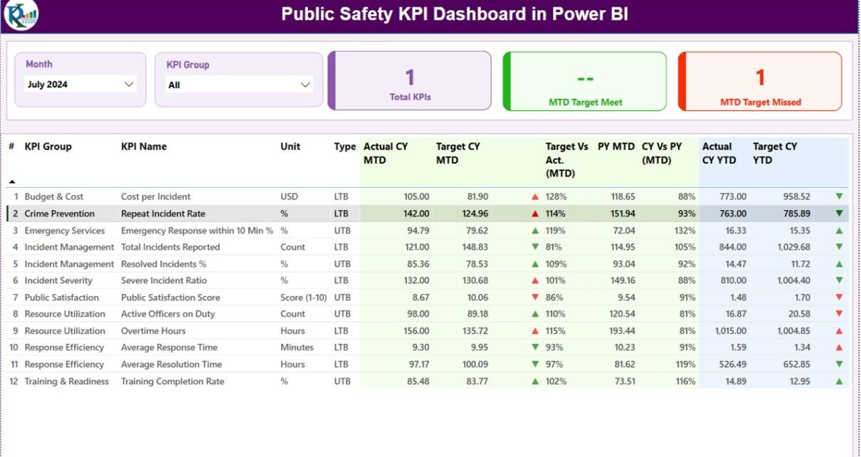
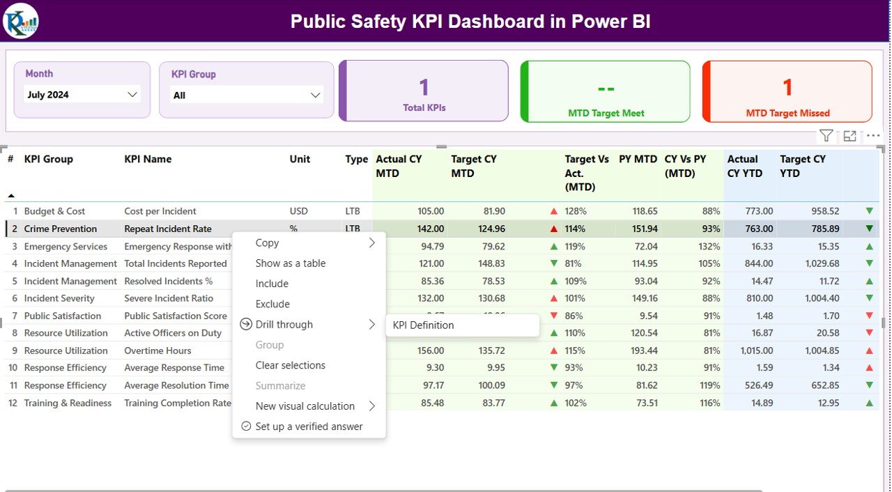
Summary Page – The Main Control Center
The Summary Page gives you the complete picture of public safety performance. It hosts the most important slicers, cards, and detailed tables.
Top Section
The top section includes:
- Month slicer – Select the month you want to analyze
- KPI Group slicer – Filter KPIs based on category such as Crime, Incident Response, Traffic Safety, Community Policing, etc.
These slicers make navigation easy and allow you to compare different periods.
Performance Cards
Below the slicers, the dashboard displays three KPI cards:
- Total KPIs
- MTD Target Met
- MTD Target Missed
These cards offer a quick snapshot of monthly performance. Managers understand whether the team is meeting expectations within seconds.
Detailed KPI Table
This is the heart of the Summary Page. You see a detailed table that displays:
- KPI Number – Unique sequence number
- KPI Group – KPI category
- KPI Name – Name of the indicator
- Unit – Measurement unit (Count, %, Hours, Minutes, etc.)
- Type (LTB / UTB) – Lower The Better or Upper The Better
- Actual CY MTD – Current Year’s Month-to-Date value
- Target CY MTD – Current MTD target
- MTD Icon – Green ▲ or Red ▼ to indicate performance
- Target vs Actual (MTD%) – Actual / Target
- PY MTD – Previous Year MTD
- CY vs PY (MTD%) – Current vs previous year comparison
- Actual CY YTD – Current Year-to-Date actual
- Target CY YTD – Target YTD
- YTD Icon – Green ▲ or Red ▼
- Target vs Actual (YTD%) – Actual / Target for YTD
- PY YTD – Previous Year YTD
- CY vs PY (YTD%) – Year-to-date comparison with last year
This structure enables public safety leaders to evaluate ongoing performance and historical patterns. They see where improvements occur and where immediate actions are necessary.
Click to buy Public Safety KPI Dashboard in Power BI
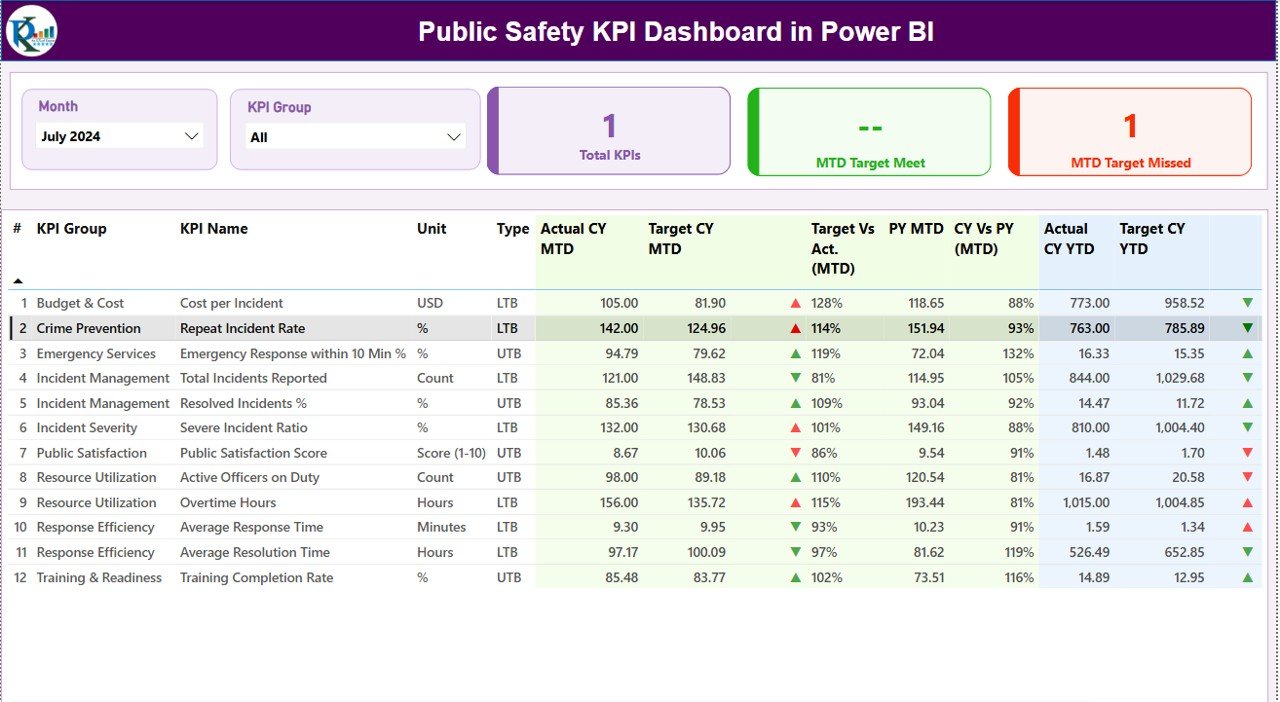
KPI Trend Page – Visual Comparison of Safety Metrics
The KPI Trend Page helps you visualize:
- Monthly trends
- Yearly performance changes
- Actual vs Target
- Current year vs previous year numbers
What You See on This Page
- Two combo charts
- One for MTD comparison
- One for YTD comparison
Each chart shows:
- Current year values
- Previous year values
- Target values
You also get a KPI Name slicer on the left side. You pick any KPI, and the charts update instantly. Safety teams use this page to understand whether crime rates rise or fall, whether response time improves, and how community metrics change over time.
Click to buy Public Safety KPI Dashboard in Power BI
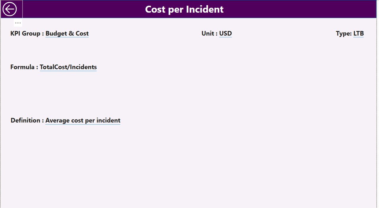
KPI Definition Page – Drill-Through for Deep Insights
The KPI Definition Page works as a hidden drill-through page. It opens when you right-click a KPI in the Summary Page and choose drill-through.
On this page, you see details like:
- KPI Number
- KPI Name
- KPI Group
- Unit of measurement
- Formula used
- KPI Definition
- KPI Type (UTB or LTB)
This page helps you understand the logic behind each KPI. When team members or new employees join, they use this page to learn how the KPI works. This improves clarity and ensures consistent reporting.
A back button on the top-left corner brings you back to the main summary page.
Click to buy Public Safety KPI Dashboard in Power BI
Excel Data Structure Used for the Dashboard
The dashboard uses an Excel file as its data source. You manage three sheets inside the file:
Input_Actual Sheet
Here you fill:
- KPI Name
- Month (use the first day of the month)
- MTD Actual
- YTD Actual
This sheet stores real performance numbers.
Input_Target Sheet
Here you enter:
- KPI Name
- Month
- MTD Target
- YTD Target
This sheet defines your goals and expectations.
KPI Definition Sheet
This sheet contains:
- KPI Number
- KPI Group
- KPI Name
- Unit
- Formula
- Definition
- Type (LTB or UTB)
This is the master reference for the entire dashboard.
Click to buy Public Safety KPI Dashboard in Power BI
What KPIs Can Public Safety Teams Track in This Dashboard?
You can customize the dashboard for many types of public safety indicators, such as:
Crime Monitoring KPIs
- Crime rate
- Arrest rate
- Crime resolution percentage
- Repeat offenses
- Community complaints
Emergency Response KPIs
- Average response time
- Incident handling time
- Number of emergency calls
- Staff readiness
- Dispatch accuracy
Traffic & Road Safety KPIs
- Road accident count
- Accident severity index
- Traffic rule violations
- Patrol coverage
- Vehicle seizure reports
Disaster Management KPIs
- Preparedness score
- Resources available
- Emergency equipment status
- Response time
- Relief distribution accuracy
Community Engagement KPIs
- Public satisfaction scores
- Community events conducted
- Awareness programs
- Complaint resolution rate
Because the dashboard is fully customizable, you can modify KPIs based on any department or safety objective.
Advantages of Public Safety KPI Dashboard in Power BI
Public safety teams receive many benefits from using a Power BI dashboard. Let’s understand why it adds value to safety operations.
- Real-Time Performance Monitoring
The dashboard updates automatically when you refresh your data. You see current performance at any time without building new reports.
- Faster Decision-Making During Critical Situations
When emergency calls rise or crime spikes, teams need fast insights. The dashboard highlights trends quickly so authorities take the right action at the right time.
- Clear Visualization of Trends and Patterns
Charts and icons help you spot areas that need attention. You see patterns in crime rate, emergency response, or safety incidents without complex analysis.
- Comparison With Targets and Previous Years
You evaluate growth by checking:
- Actual vs target
- Current year vs previous year
- MTD and YTD numbers
This gives a full picture of performance.
- Reduces Manual Reporting Work
Teams spend hours preparing reports. The dashboard reduces workload and saves time.
- Improves Transparency Across Departments
Every team member sees the same numbers. This builds trust and improves accountability.
- Easy Customization Based on Safety Operations
You add new KPIs anytime. You also adjust formulas, change KPI categories, or modify visuals without difficulty.
Best Practices for Using a Public Safety KPI Dashboard in Power BI
To get maximum value from the dashboard, follow these best practices:
- Standardize KPI Definitions
Use clear formulas and consistent definitions. This avoids confusion and improves accuracy.
- Update Data Monthly
As public safety operations change quickly, keep data fresh. Update MTD and YTD numbers at the start of every month.
- Use the Drill-Through Page for Training
Share the KPI Definition page with your team. It helps new analysts understand each indicator.
- Compare Current Trends With Previous Years
Use CY vs PY metrics to identify trends. This helps you understand whether operations improve or decline.
- Review Icon Indicators Regularly
The red and green icons offer quick signals. Use them to identify KPIs that need immediate action.
- Build Additional Pages When Needed
Because Power BI is flexible, create more pages such as:
- Crime Heat Map Page
- Emergency Response Analysis Page
- Traffic Violations Dashboard
This expands your reporting capacity.
Conclusion
A Public Safety KPI Dashboard in Power BI transforms the way safety teams handle their data. It organizes all essential information into a single interactive dashboard. You monitor crime trends, analyze incident response metrics, track traffic safety, and compare performance with targets. Because the dashboard uses simple Excel sheets as its data source, every department can adopt it with ease.
When safety teams use this dashboard regularly, they improve response speed, operational efficiency, and community trust. It becomes more than a reporting tool—it becomes a strategic decision-making platform.
Frequently Asked Questions (FAQs)
- Who can use a Public Safety KPI Dashboard?
Police teams, fire departments, emergency response units, traffic control teams, disaster management groups, and community safety agencies can use it.
- Do I need Power BI expertise to use this dashboard?
No. The dashboard is ready to use. You only update the Excel file and refresh the report.
- Can I add more KPIs to the dashboard?
Yes. You can add any number of KPIs by updating the Excel file and extending visuals.
- What file format is used for data input?
The data comes from an Excel file with three worksheets: Actual, Target, and KPI Definition.
- Does the dashboard support drill-through?
Yes. You can drill through any KPI to view formulas and definitions.
- Can I customize the charts?
Yes. Power BI allows full customization of visuals, themes, colors, and layout.
Visit our YouTube channel to learn step-by-step video tutorials
Watch the step-by-step video tutorial:
Click to buy Public Safety KPI Dashboard in Power BI