Running a primary school has never been easy, because every school must track academic performance, student well-being, teacher productivity, attendance, and operational efficiency at the same time. Although schools collect a large amount of data every month, they often struggle to convert it into meaningful insights. However, a Primary Schools KPI Dashboard in Power BI solves this problem with ease. It helps school leaders understand how their school performs today, how it performed last year, and how it must perform in the future.
In this detailed article, I will explain everything about the Primary Schools KPI Dashboard in Power BI, how it works, how each page helps you monitor KPIs, and why every school must start using one. I will also cover its features, benefits, best practices, and commonly asked questions to help you get full clarity.
Click to buy Primary Schools KPI Dashboard in Power BI
What Is a Primary Schools KPI Dashboard in Power BI?
A Primary Schools KPI Dashboard in Power BI is a ready-to-use performance monitoring tool built for school administrators, principals, and academic coordinators. It collects data from an Excel file and converts it into simple visuals, KPI cards, trend charts, and comparison metrics. Because of this, school leaders understand how well students perform, how effective teachers are, how consistent attendance is, and how different school processes function.
This dashboard includes three pages inside Power BI Desktop:
- Summary Page – For overall KPI monitoring
- KPI Trend Page – For month-wise and year-wise comparison
- KPI Definition Page – For understanding the formula and purpose of each KPI
Since the dashboard works on Excel as a data source, schools can update numbers anytime without changing the dashboard structure.
Why Do Primary Schools Need a KPI Dashboard?
Primary schools handle several operational activities daily. Teachers record attendance, coordinators monitor class quality, administrators track staff performance, and principals review academic results. However, raw Excel files do not show the pattern behind the numbers.
A KPI dashboard gives you:
- Real-time visibility
- Month-to-month comparison
- Clear performance status
- Trend analysis
- Target vs Actual results
Because of this, schools take faster and more confident decisions.
How the Primary Schools KPI Dashboard Works
The dashboard uses an Excel file with three worksheets:
- Input_Actual Sheet
You enter:
- KPI Name
- Month (first date of the month)
- MTD (Month-to-Date) actual numbers
- YTD (Year-to-Date) actual numbers
- Input_Target Sheet
You enter:
- KPI Name
- Month (first date of the month)
- MTD target numbers
- YTD target numbers
- KPI Definition Sheet
You fill:
- KPI Number
- KPI Group
- KPI Name
- Unit
- Formula
- Definition
- Type (UTB – Upper the Better / LTB – Lower the Better)
This structured data flows into Power BI and updates the dashboard automatically.
Click to buy Primary Schools KPI Dashboard in Power BI
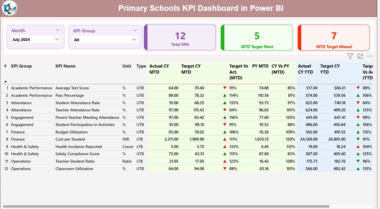
the Summary
The Summary Page is the heart of the dashboard. It gives a complete view of school performance in a single glance.
Key Elements on the Summary Page
Month Slicer
This lets you switch between different months instantly.
KPI Group Slicer
You can view specific groups such as:
- Academic KPIs
- Administrative KPIs
- Attendance KPIs
- Teacher KPIs
- Infrastructure KPIs
- Student Support KPIs
Three Main Cards
These cards appear at the top:
- Total KPI Count
- MTD Target Met Count
- MTD Target Missed Count
These instantly show how well your school performs this month.
Detailed Table on the Summary Page
A large table shows the most important KPI metrics. Each KPI row includes:
- KPI Number
A running sequence number for easy identification.
- KPI Group
Shows the category—for example:
- Student Performance
- Teaching Quality
- Attendance Management
- Operational Efficiency
- KPI Name
A clear name for the KPI like:
- Student Attendance Rate
- Teacher Attendance Rate
- Homework Completion %
- Class Quality Score
- Parent Feedback Score
- Unit
Percentage, count, or score.
- Type (UTB / LTB)
If a KPI is “Upper the Better”, high values indicate good performance.
If a KPI is “Lower the Better”, low values show improvement.
- Actual CY MTD
Current Year Month-to-Date value.
- Target CY MTD
Target value for the ongoing month.
- MTD Icon
A red ▼ or green ▲ icon shows if the KPI meets or misses the target.
- Target vs Actual (MTD %)
Formula:
Actual MTD / Target MTD × 100
- PY MTD
Previous Year’s Month-to-Date number.
- CY vs PY MTD (%)
Formula:
CY MTD / PY MTD × 100
- Actual CY YTD
Current Year Year-to-Date value.
- Target CY YTD
Target value for YTD.
- YTD Icon
Green ▲ for target achieved, red ▼ for target missed.
- Target vs Actual (YTD %)
Formula:
Actual YTD / Target YTD × 100
- PY YTD
Previous Year’s YTD number.
- CY vs PY YTD (%)
Formula:
CY YTD / PY YTD × 100
This table helps any school understand performance instantly.
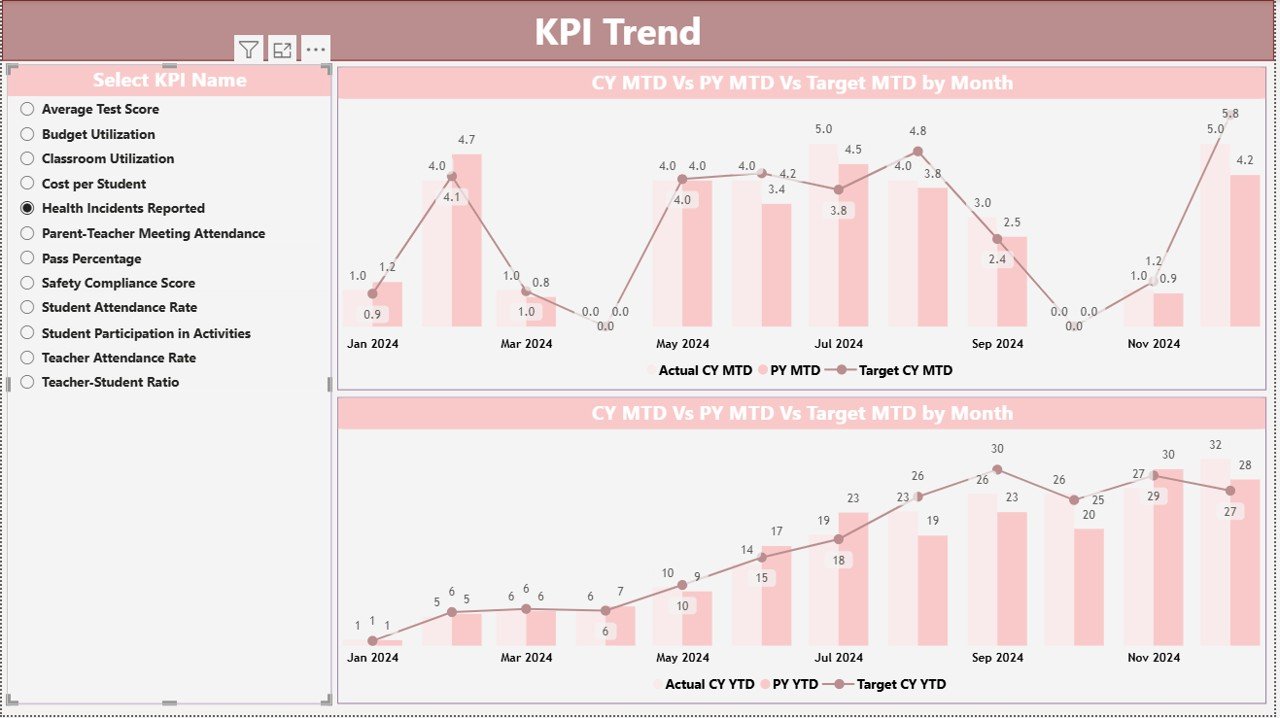
the KPI Trend .
The KPI Trend Page helps schools understand the direction of their performance.
It shows two combo charts:
- MTD Trend Chart
You can compare:
- Current Year Actual
- Previous Year Actual
- Monthly Targets
- YTD Trend Chart
You compare:
- Current Year YTD
- Previous Year YTD
- YTD Targets
A slicer on the left lets you choose any KPI name.
Because of this, principals and coordinators understand:
- Whether performance improves
- Whether targets are realistic
- Whether last year’s performance was better
- Whether the KPI is moving in the right direction
Click to buy Primary Schools KPI Dashboard in Power BI
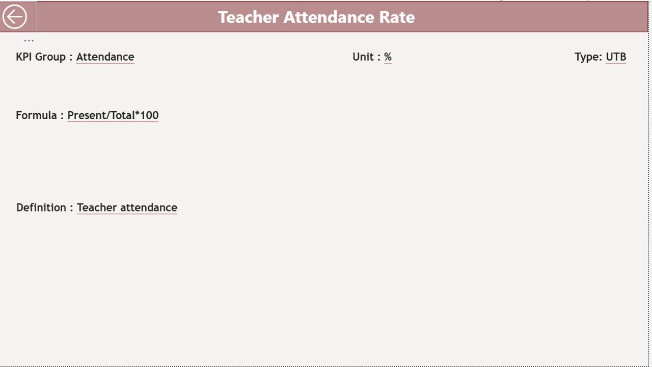
KPI Definition Page: Why It Matters
This page is hidden and accessible only through drill-through actions.
It shows:
- KPI Formula
- KPI Definition
- Measurement unit
- KPI type
- Purpose of KPI
This helps teachers and administrators understand what they measure and why.
A simple back button brings you back to the main page.
Click to buy Primary Schools KPI Dashboard in Power BI
Advantages of a Primary Schools KPI Dashboard in Power BI
Schools benefit the most when they track data in a structured way. Here are the major advantages:
- Better Academic Visibility
Schools see students’ academic strength and improvement areas instantly.
- Improved Teacher Performance Insights
You track teaching quality, attendance, delivery consistency, and class standards.
- Faster Decision-Making
Clear visuals help principals take decisions in seconds.
- Strong Parent Confidence
Schools share transparent performance improvements with parents.
- Helps Meet Annual Educational Goals
Targets and comparisons motivate teams.
- Saves Time and Reduces Manual Effort
Power BI automates reports, charts, and summaries.
- Improves Resource Planning
Schools identify low-performing areas and allocate resources smartly.
Best Practices for Using the Primary Schools KPI Dashboard
To get the best results, schools must follow these practices:
- Update Data Every Month
Regular updates ensure accurate tracking.
- Keep KPI List Clear and Simple
Avoid unnecessary KPIs. Focus on meaningful indicators.
- Use UTB and LTB Carefully
Mark KPIs correctly:
- UTB: Attendance Rate, Parent Feedback Score
- LTB: Absenteeism Rate, Incident Count
- Monitor MTD and YTD Separately
A KPI may perform well in MTD but poorly in YTD. Always check both.
- Review Trends Frequently
The trend page highlights early warning signs.
- Share Insights with Teachers
Teachers improve performance when they see actual numbers.
- Use Drill-Through Smartly
KPI definitions help your team understand the meaning of each KPI.
Conclusion
A Primary Schools KPI Dashboard in Power BI brings clarity, accuracy, and speed to school performance monitoring. It eliminates manual reports and converts raw Excel data into meaningful insights. When schools track academic KPIs, teacher KPIs, attendance KPIs, and administrative KPIs regularly, they deliver better education and improve student outcomes.
With clear visuals, trend comparison, icons for status, and structured KPI definitions, this dashboard becomes an essential tool for every school.
Frequently Asked Questions (FAQ)
- What is a KPI in primary schools?
A KPI is a measurable indicator that shows how well the school performs in key areas like academics, attendance, teaching quality, and operations.
- Can school staff use this dashboard without technical skills?
Yes. Power BI dashboards are easy to use, and you only update numbers in Excel.
- How often should administrators update the dashboard?
Schools must update it monthly to get accurate MTD and YTD insights.
- Can we add more KPIs to this dashboard?
Yes. Schools can add new KPIs in the KPI Definition sheet.
- Does the dashboard support year-on-year comparison?
Yes. It compares the Current Year vs Previous Year for both MTD and YTD.
- How does the KPI Trend Page help?
It shows performance direction and helps schools detect improvement or decline.
- What data source does the dashboard use?
It uses an Excel file with three sheets: Actual, Target, and KPI Definition.
Visit our YouTube channel to learn step-by-step video tutorials
Watch the step-by-step video tutorial:
Click to buy Primary Schools KPI Dashboard in Power BI