Artificial Intelligence continues to transform how teams work, innovate, and solve problems. Yet, many organizations still struggle to monitor AI performance because the data stays scattered across reports, logs, tools, and manual spreadsheets. As a result, leaders miss early warning signs, cannot compare AI models, and lose time in slow reporting cycles.
An Artificial Intelligence (AI) Dashboard in Excel solves these issues. It gives a clear, real-time view of your AI operations without requiring complex tools. Because Excel already exists in every workplace, teams can track performance metrics, model behavior, efficiency trends, and regional insights with ease.
In this detailed guide, you will learn what this dashboard is, how it works, what pages it includes, and why it has become essential for organizations using AI. You will also explore its advantages, best practices, and frequently asked questions so you gain complete clarity.
Click to buy Artificial Intelligence (AI) Dashboard in Excel
What Is an Artificial Intelligence (AI) Dashboard in Excel?
An Artificial Intelligence Dashboard in Excel is a ready-to-use reporting system that helps teams track AI-related performance, efficiency, accuracy, and cost metrics. The dashboard pulls data from an Excel sheet and transforms it into interactive visuals that update instantly. Because of this, users can view KPIs across departments, regions, and AI models without writing a single formula.
This dashboard monitors metrics such as:
- Total tasks processed
- Average latency
- Average throughput
- Cost per task
- User satisfaction
- Success rate
- Failure trends
- Published content percentage
Since the dashboard includes structured sheets like Overview, Department Analysis, AI Model Analysis, Region Analysis, and Monthly Trends, teams gain a complete picture of how well their AI systems perform.
Why Do Organizations Need an AI Dashboard?
AI systems run thousands of automated actions every day. Without a clear dashboard, teams often face:
- Fragmented data
- Slow reporting
- Difficulty comparing AI models
- No visibility on costs
- Missed accuracy or latency issues
- Poor understanding of user satisfaction
An AI Dashboard organizes all of this into one structured workspace. It ensures continuous visibility so teams make faster, smarter decisions.
Transitioning to a dashboard ensures better governance, higher efficiency, and improved accountability across all AI workflows.
Key Features of the Artificial Intelligence (AI) Dashboard in Excel
This ready-to-use dashboard includes multiple sheet tabs that help you analyze AI performance from every angle.
Below is a detailed look at each page.
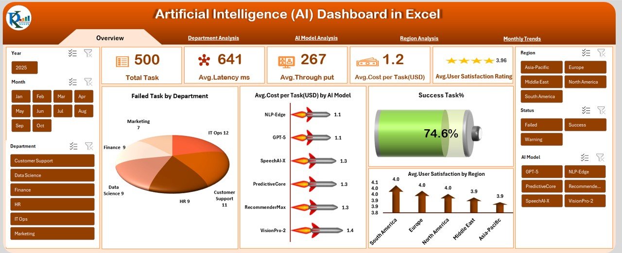
Overview Sheet Tab
The Overview page works as the main performance summary. It gives a quick view of the most important KPIs so users understand how their AI systems perform at a glance.
KPIs displayed on the Overview page:
- Total Task – Shows the count of tasks processed by all models.
- Avg. Latency (ms) – Measures how fast the AI responds.
- Avg. Throughput – Tracks the number of tasks processed per second.
- Avg. Cost per Task (USD) – Helps monitor operational efficiency.
- Published Content % – Shows how much AI output reached production.
- Failed Task by Department – Displays which departments face more task failures.
- Avg. Cost per Task (USD) by AI Model – Compares operational costs between models.
- Success Task % – Shows how many tasks completed successfully.
- Avg. User Satisfaction by Region – Highlights user experience across regions.
This page brings all essential KPIs into one visual summary. Because of this central view, teams save time and improve decision-making.
Click to buy Artificial Intelligence (AI) Dashboard in Excel
Department Analysis Sheet Tab
The Department Analysis page helps teams understand how each department uses AI and how well the systems perform in those areas.
Metrics shown in Department Analysis:
- Avg. Throughput by Department
- Avg. Error Rate % by Department
- Avg. Latency (ms) by Department
These metrics help managers identify:
- Slow-performing areas
- High-error departments
- Departments that utilize AI more efficiently
This sheet also supports collaboration because it promotes clarity between teams.

Click to buy Artificial Intelligence (AI) Dashboard in Excel
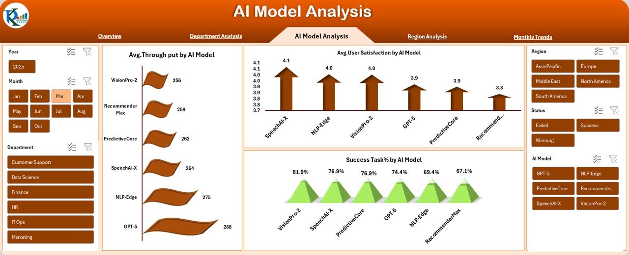
AI Model Analysis Sheet Tab
Different AI models behave differently. Some models run faster, some produce more accurate results, while others cost more to operate. Because of this, a model-wise analysis becomes essential.
Metrics shown on AI Model Analysis:
- Avg. Throughput by AI Model
- Avg. User Satisfaction by AI Model
- Success Task % by AI Model
These insights help teams answer questions like:
- Which model offers the best performance?
- Which model gives the highest success rate?
- Which model satisfies users the most?
- Which model needs more optimization?
As a result, leaders can improve model selection and allocate resources wisely.
Click to buy Artificial Intelligence (AI) Dashboard in Excel
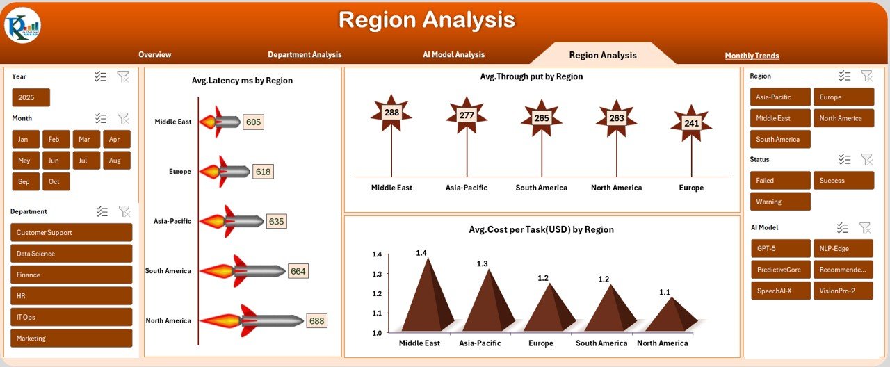
Region Analysis Sheet Tab
AI performance varies across regions because of network speed, hardware differences, user behavior, and operational environments. The Region Analysis page helps monitor these regional variations.
Metrics displayed in Region Analysis:
- Avg. Latency (ms) by Region
- Avg. Throughput by Region
- Avg. Cost per Task (USD) by Region
This view helps organizations:
- Improve infrastructure
- Optimize cost distribution
- Enhance region-specific reliability
- Understand user behavior across locations
Better decisions happen when region-wise performance becomes clear.
Click to buy Artificial Intelligence (AI) Dashboard in Excel
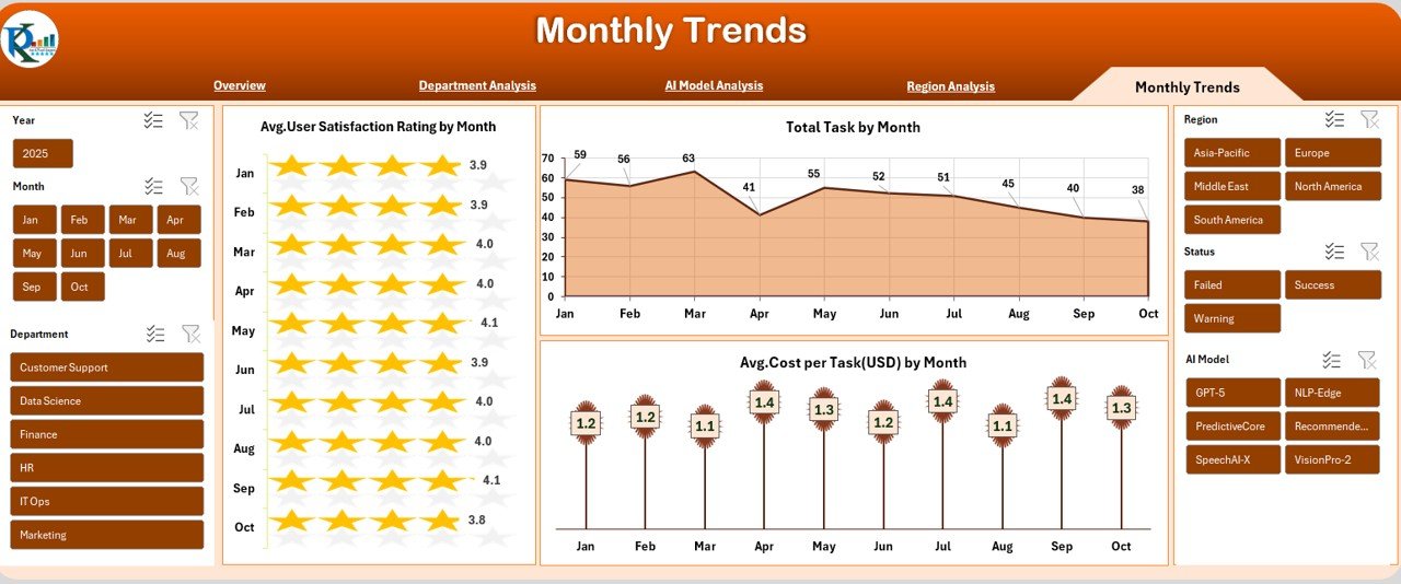
Monthly Trends Sheet Tab
Trends help teams understand whether performance improves or declines over time. The Monthly Trends page displays key metrics month by month.
Monthly visualizations include:
- Avg. User Satisfaction Rating by Month
- Total Task by Month
- Avg. Cost per Task (USD) by Month
Trend analysis helps teams:
- Predict issues early
- Track seasonal changes
- Understand usage growth
- Evaluate cost movement
- Improve long-term decision-making
This page ensures you always stay ahead of performance shifts.
Click to buy Artificial Intelligence (AI) Dashboard in Excel
How Does an AI Dashboard Improve Workflow?
An Excel-based AI dashboard simplifies performance tracking in many ways. When teams use the dashboard consistently, they experience:
- Faster reporting
- Clear visibility of KPIs
- Better decision-making
- Increased operational efficiency
- Lower manual work
- Improved collaboration
- Higher accountability
- More accurate forecasting
Since everything stays in one place, teams avoid confusion, reduce errors, and gain confidence in their data.
Advantages of the Artificial Intelligence (AI) Dashboard in Excel
Organizations prefer this dashboard because it delivers strong value. Below are the biggest advantages.
- Easy to Use for Everyone
Because the dashboard works in Excel, everyone—from analysts to managers—can use it comfortably. No advanced training is required.
- Real-Time Insights for Better Decisions
The dashboard updates instantly when users refresh data. This ensures decisions happen faster.
- Complete Visibility Across Models and Regions
The structured pages let teams compare performance for:
- Departments
- Regions
- AI models
- Monthly performance
This improves strategic clarity.
- Cost Tracking Helps Optimize Resources
Since the dashboard shows cost per task and cost by region/model, teams can:
- Identify costly operations
- Reduce unnecessary spending
- Improve system efficiency
This supports better budget planning.
- Strong Performance Monitoring
Metrics like latency, throughput, satisfaction, and error rates help teams understand performance deeply.
- Helps Detect Issues Early
Trend charts and department-wise views allow teams to spot:
- Declining performance
- Rising error rates
- Slow departments
- High-cost regions
Early detection helps prevent bigger issues.
- Improves Transparency and Accountability
Clear tracking across teams builds trust and promotes responsible operations.
Best Practices for Using the AI Dashboard in Excel
To get the best results from this dashboard, teams should follow these best practices.
- Update Data Regularly
Frequent data refresh ensures accuracy and real-time decision-making.
- Keep Data Clean and Consistent
Use structured tables and avoid merged cells. This helps formulas run smoothly.
- Review Monthly Trends
Trend pages show long-term changes. Teams should review them every month to track improvements.
- Compare Departments and Regions
This comparison helps find strengths and weaknesses across the organization.
- Monitor AI Models Closely
Model-wise insights help teams choose the best model for each use case.
- Focus on High-Impact KPIs
Total tasks, success rate, latency, and cost per task offer the biggest insights. Make sure to check them first.
- Use Conditional Formatting
Highlighting helps teams notice issues faster, especially when numbers change.
Train Teams to Read the Dashboard
A simple introduction ensures everyone understands:
What each KPI means
- How to refresh data
- How to compare metrics
This promotes smoother adoption.
Conclusion
An Artificial Intelligence (AI) Dashboard in Excel gives organizations a simple yet powerful way to track AI performance. It brings together key metrics such as latency, throughput, cost, satisfaction, and success rates. Because of its structured pages—Overview, Department Analysis, AI Model Analysis, Region Analysis, and Monthly Trends—teams gain a complete 360-degree view of their AI operations.
This dashboard helps detect issues early, improve efficiency, and make informed decisions. With clean data, regular updates, and consistent monitoring, organizations can unlock the true value of their AI systems.
The future belongs to teams that use data wisely, and this dashboard provides the clarity they need.
Frequently Asked Questions (FAQs)
What is an AI Dashboard in Excel?
An AI Dashboard in Excel is a structured reporting tool that tracks key AI performance metrics through visual charts and tables.
Who can use this AI Dashboard?
Teams such as data analysts, developers, managers, operations teams, and AI engineers can use it. Anyone comfortable with Excel can use it easily.
Does the dashboard require coding?
No, the dashboard works without coding. Users only need basic Excel knowledge.
What types of metrics does it track?
It tracks latency, throughput, cost per task, error rate, user satisfaction, success rate, and department or region performance.
Can I customize the dashboard?
Yes, you can add charts, change formulas, update themes, and modify KPI definitions based on your needs.
How often should I update data?
Teams should update the data weekly or monthly, depending on task volume and reporting frequency.
Why use Excel instead of a BI tool?
Excel is accessible, easy to use, cost-effective, and suitable for teams who do not need advanced BI complexity.
Visit our YouTube channel to learn step-by-step video tutorials
Watch the step-by-step video tutorial:
Click to buy Artificial Intelligence (AI) Dashboard in Excel