In today’s competitive marketing and sales environment, organizations cannot afford to guess how much it costs to acquire a new customer. Every lead, campaign, and conversion comes with a cost — and understanding that cost accurately can make the difference between profit and loss.
That’s where the Cost Per Acquisition (CPA) KPI Dashboard in Power BI plays a crucial role. This interactive dashboard provides real-time insights into marketing efficiency, campaign performance, and acquisition costs — all visualized in an easy-to-understand format.
Let’s explore what this dashboard is, how it works, its key features, advantages, best practices, and how businesses can use it to make data-driven marketing decisions.
Click to buy Cost Per Acquisition KPI Dashboard in Power BI
What Is a Cost Per Acquisition KPI Dashboard in Power BI?
A Cost Per Acquisition (CPA) KPI Dashboard is a performance measurement tool designed to help organizations analyze how much they spend to acquire each customer.
When built in Power BI, the dashboard becomes an interactive and dynamic platform that connects data from various sources (like Excel, CRM systems, or marketing tools) and turns it into meaningful insights.
The dashboard helps decision-makers track monthly trends, year-to-date (YTD) performance, and compare results with previous years. With features like conditional formatting, drill-through capability, and trend visualization, users can instantly identify whether acquisition efforts are within target or exceeding cost expectations.
Why Is Cost Per Acquisition Important?
Cost Per Acquisition (CPA) is one of the most critical KPIs in marketing and sales performance analysis. It measures how efficiently your business converts spending into new customers.
Key Reasons Why CPA Matters
- Profitability Insight: It helps measure if marketing campaigns generate profit or drain the budget.
- Marketing Optimization: It shows which channels or campaigns bring the best ROI.
- Budget Allocation: It helps marketers distribute funds to the most cost-effective campaigns.
- Performance Tracking: It tracks whether acquisition costs are improving or increasing over time.
- Cross-Department Collaboration: Finance, marketing, and sales teams can align their goals around a unified KPI.
By visualizing CPA in a Power BI dashboard, businesses can see both the big picture and detailed metrics in one place.
Key Features of the Cost Per Acquisition KPI Dashboard in Power BI
The Cost Per Acquisition KPI Dashboard in Power BI is designed with precision and usability in mind. It is divided into three major pages, each serving a unique analytical purpose.
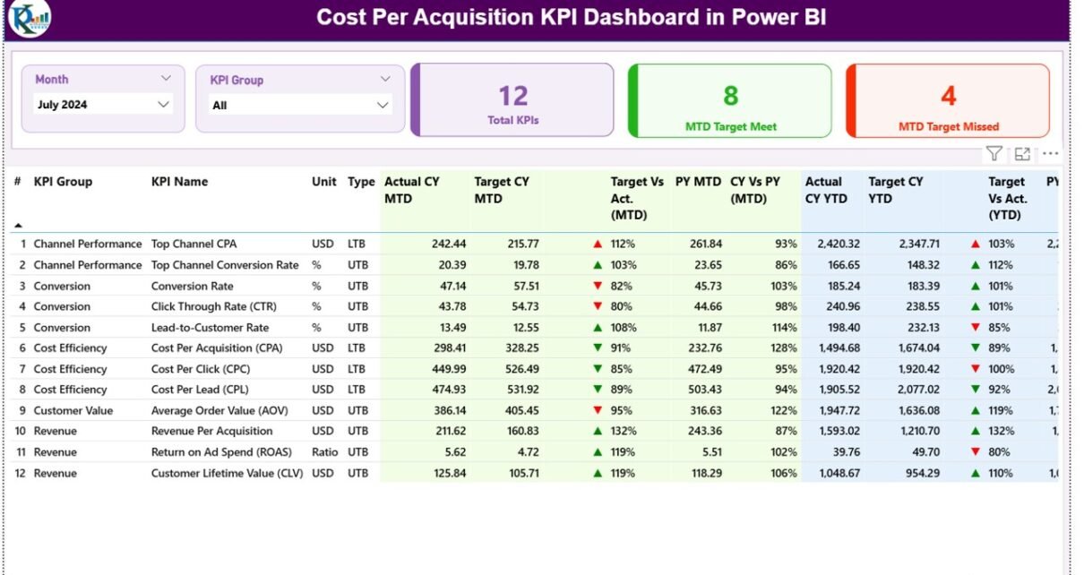
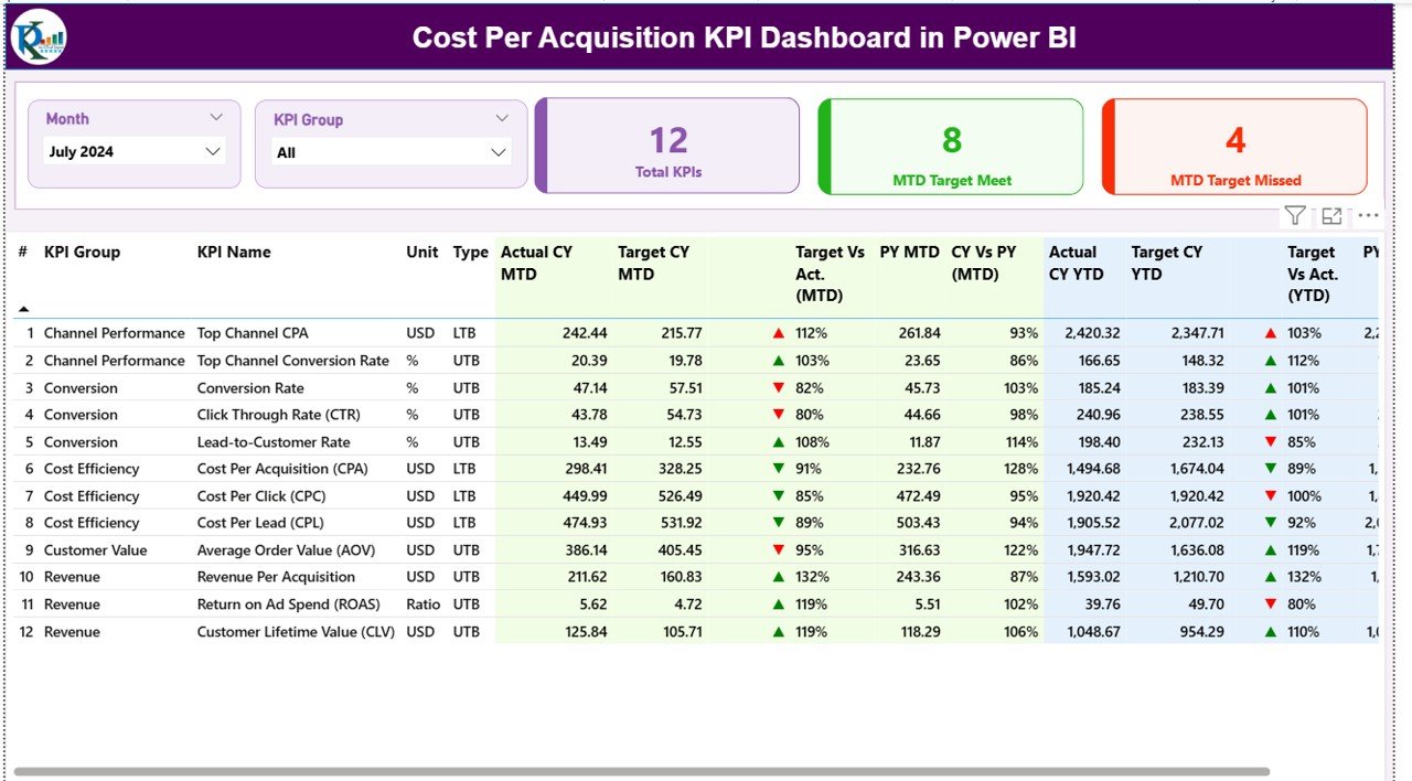
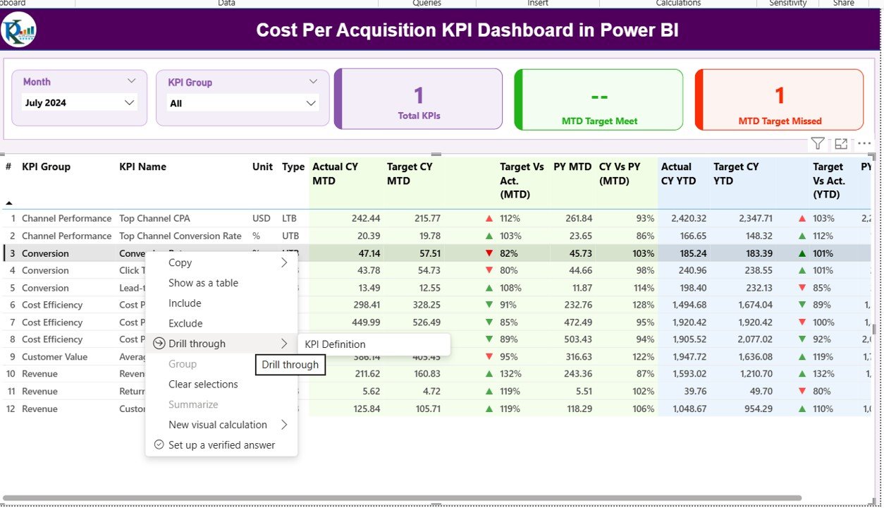
Summary Page
The Summary Page serves as the main control center of the dashboard.
Top Section
- Month and KPI Group Slicers: Users can filter data by month or by specific KPI category.
- Key Metrics Cards:
- Total KPI Count: Displays the total number of KPIs being tracked.
- MTD Target Met Count: Shows how many KPIs met their target for the current month.
- MTD Target Missed Count: Displays the number of KPIs that failed to meet the target.
Click to buy Cost Per Acquisition KPI Dashboard in Power BI
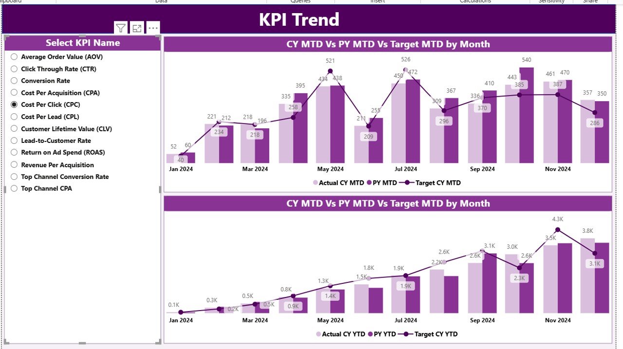
KPI Trend Page
The KPI Trend Page helps visualize how acquisition costs and related KPIs evolve over time.
- Two Combo Charts:
- MTD Chart: Compares current month’s actual, target, and previous year’s values.
- YTD Chart: Displays cumulative trends across the year.
- KPI Selector (Slicer): Users can select any KPI from the dropdown to view specific trends.
This visualization makes it easier to identify seasonal patterns, marketing cycle effects, or improvements in cost management.
Click to buy Cost Per Acquisition KPI Dashboard in Power BI
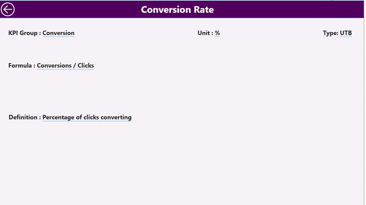
KPI Definition Page
The KPI Definition Page is a hidden drill-through page designed for deeper insights.
When a user clicks on any KPI from the summary table, Power BI drills through to this page, displaying:
- KPI Formula
- KPI Definition
- Calculation Logic
This ensures that users understand what each metric means and how it is calculated.
A Back Button on the top-left corner allows users to return to the main dashboard effortlessly.
Data Structure: The Backbone of the Dashboard
The dashboard is powered by an Excel data source that contains three key worksheets:
-
Input_Actual:
- Captures the actual monthly and YTD data for each KPI.
- Columns include: KPI Name, Month, MTD Value, YTD Value.
-
Input_Target:
- Stores target data for MTD and YTD values.
- Helps compare planned vs actual performance.
- KPI Definition:
- Contains details like KPI Number, Group, Name, Unit, Formula, Definition, and Type (UTB/LTB).
- This data populates the drill-through section for reference.
- This structure ensures data integrity and allows for seamless updates without altering the Power BI dashboard’s core design.
Click to buy Cost Per Acquisition KPI Dashboard in Power BI
How Does the Dashboard Work?
The Cost Per Acquisition KPI Dashboard in Power BI functions using dynamic data modeling and DAX (Data Analysis Expressions).
When you select a month or KPI group, Power BI filters and recalculates all metrics on the page — including MTD vs YTD comparisons, target achievements, and prior year data.
Conditional formatting with color-coded icons (▲ green for success, ▼ red for failure) instantly shows whether your acquisition costs are improving or not.
This visual storytelling approach eliminates the need for long reports and helps executives make faster decisions.
Advantages of the Cost Per Acquisition KPI Dashboard in Power BI
The dashboard provides several measurable benefits to organizations.
- Real-Time Decision-Making
Power BI’s dynamic visuals allow marketers and executives to monitor CPA trends and make timely adjustments.
- Centralized Performance View
All acquisition KPIs are consolidated into one unified dashboard. This helps teams track performance across departments and campaigns without switching tools.
- Visual Clarity
Color-coded indicators and combo charts simplify performance tracking. Even non-technical users can quickly grasp complex data.
- Accurate Comparisons
By comparing MTD, YTD, and previous year values, the dashboard shows long-term trends and short-term performance deviations.
- Improved Accountability
Teams can see which KPIs meet or miss targets, enabling better accountability across marketing and sales functions.
- Scalability
The structure can easily expand with new KPIs or business units. You just add new data in Excel, and Power BI updates automatically.
Applications of the Dashboard
The Cost Per Acquisition KPI Dashboard is versatile and applicable across multiple business functions.
- Marketing Teams: Track paid campaigns, ad spend, and lead costs.
- Sales Teams: Analyze cost per conversion or closed deal.
- Finance Teams: Validate marketing ROI and spending efficiency.
- Executives: Monitor overall acquisition performance and budget utilization.
This adaptability makes it valuable for startups, enterprises, and agencies alike.
How to Use the Dashboard Effectively
Follow these steps to get the best out of your Cost Per Acquisition KPI Dashboard:
- Update Data Regularly: Keep Excel sheets current with latest actuals and targets.
- Use Slicers Strategically: Analyze trends by month, department, or KPI group.
- Drill Down for Insights: Use drill-through pages to understand KPI definitions and root causes.
- Monitor Both MTD and YTD: MTD shows short-term progress, while YTD indicates cumulative performance.
- Compare Year-over-Year (YoY): Identify growth or decline patterns.
Best Practices for the Cost Per Acquisition KPI Dashboard in Power BI
To ensure accuracy and actionable insights, follow these best practices:
- Maintain Clean Data
Remove duplicates, missing values, and inconsistent formats in Excel before refreshing Power BI.
- Define Clear KPIs
Ensure that each KPI has a defined formula, unit, and performance type (UTB or LTB). This avoids confusion among users.
- Automate Data Refresh
Use Power BI’s scheduled refresh to update data automatically from Excel or other sources.
- Use Consistent Visual Standards
Maintain consistent colors — green for positive trends, red for negative — across all visuals.
- Optimize DAX Measures
Simplify your DAX calculations to avoid performance delays when filtering or switching between months.
- Secure Access
Implement Power BI’s row-level security if the dashboard includes sensitive financial data.
- Communicate Findings
Encourage managers to review CPA trends in weekly or monthly review meetings to make timely adjustments.
Advantages of Using Power BI for Cost Per Acquisition Analysis
Using Power BI for CPA analytics brings a host of benefits:
- Interactive Dashboards: Real-time filtering and visualization.
- Data Integration: Connects to Excel, CRM, Google Ads, or databases easily.
- Visual Variety: Offers bar, line, combo, and KPI cards for clarity.
- Cloud Accessibility: Share dashboards across teams via Power BI Service.
- Data Security: Controlled access and version management.
- Improved Marketing ROI: Identifies which campaigns reduce acquisition costs over time.
How This Dashboard Helps Optimize Marketing Spend
The dashboard isn’t just about reporting — it’s about optimization.
By identifying KPIs where acquisition costs exceed targets, teams can:
- Reallocate budgets to better-performing channels.
- Improve conversion funnel efficiency.
- Analyze campaign-level ROI.
- Identify seasonal cost spikes.
This proactive approach leads to higher conversion rates, lower acquisition costs, and better marketing ROI.
Challenges Solved by the Dashboard
Without a unified dashboard, businesses face multiple challenges:
- Disconnected marketing and financial data.
- Manual tracking leading to errors.
- Delays in identifying overspending.
- Lack of transparency across departments.
The Cost Per Acquisition KPI Dashboard in Power BI eliminates these issues by consolidating all metrics in one automated, visual, and intelligent system.
Conclusion
The Cost Per Acquisition KPI Dashboard in Power BI empowers businesses to monitor, analyze, and optimize their acquisition costs effectively.
It combines data visualization, automation, and analytics to deliver a single source of truth for marketing performance. From tracking daily campaigns to evaluating yearly cost efficiency, this dashboard enables faster, smarter, and more profitable decision-making.
If your goal is to reduce acquisition costs and maximize return on investment, this Power BI dashboard is your ultimate analytics companion.
Frequently Asked Questions (FAQs)
- What is the purpose of a Cost Per Acquisition KPI Dashboard?
It helps businesses measure how much they spend to acquire a customer and visualize performance against targets, budgets, and previous year data.
- Can I connect data sources other than Excel?
Yes. Power BI allows integration with multiple data sources like Google Ads, Salesforce, or SQL databases.
- How often should I update the dashboard?
Ideally, refresh the data monthly or weekly depending on campaign activity to maintain accuracy.
- What do the green and red arrows mean?
Green (▲) indicates KPI targets are achieved or performing well, while red (▼) indicates performance below target.
- Can this dashboard be customized for other KPIs?
Absolutely! You can add or modify KPI groups, formulas, or visuals based on your business needs.
- What is the difference between MTD and YTD?
- MTD (Month-to-Date): Tracks performance for the current month.
- YTD (Year-to-Date): Measures cumulative performance since the start of the year.
- Who can benefit from this dashboard?
Marketing managers, analysts, finance teams, and executives — anyone responsible for managing acquisition costs or marketing ROI.
- How can Power BI improve decision-making?
By converting raw data into interactive visuals, Power BI enables instant insights and faster, data-driven decisions.
Visit our YouTube channel to learn step-by-step video tutorials
Watch the step-by-step video tutorial:
Click to buy Cost Per Acquisition KPI Dashboard in Power BI