in today’s uncertain world, emergencies can strike at any time — from natural disasters and health crises to industrial accidents and infrastructure failures. To protect lives, minimize damage, and restore normalcy quickly, organizations must manage emergencies effectively.
That’s where an Emergency Management KPI Dashboard in Excel becomes a game-changer. This ready-to-use tool allows teams to track, analyze, and improve their emergency preparedness and response through clear, data-driven insights.
Whether you’re managing a hospital, government department, corporate office, or disaster-relief agency, this Excel dashboard gives you a single platform to monitor all critical metrics in real time.
Click to buy Emergency Management KPI Dashboard in Excel
What Is an Emergency Management KPI Dashboard in Excel?
An Emergency Management KPI Dashboard is an interactive Excel-based tool designed to measure the performance of emergency response operations. It consolidates key performance indicators (KPIs) such as response time, resource utilization, communication efficiency, incident resolution rate, and more into a single, easy-to-navigate interface.
Instead of juggling multiple spreadsheets or manual reports, this dashboard automates analysis and visualization — helping decision-makers act quickly based on accurate data.
In short, it transforms scattered emergency data into actionable intelligence, empowering teams to enhance safety, efficiency, and accountability.
Structure and Key Features of the Dashboard
This Emergency Management KPI Dashboard consists of seven well-structured worksheets, each serving a distinct purpose for data entry, visualization, and trend analysis.
Summary Page
The Summary Page acts as the index of the dashboard.
It provides navigation buttons that link to all other pages, allowing users to jump directly to specific sections — such as the main dashboard, trend charts, or KPI definitions — with a single click.
This page ensures the dashboard remains user-friendly and organized, even for those unfamiliar with Excel dashboards.

Click to buy Emergency Management KPI Dashboard in Excel
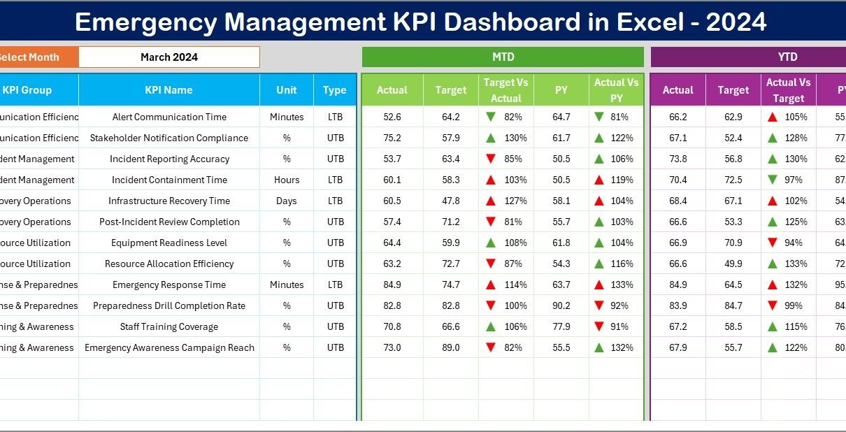
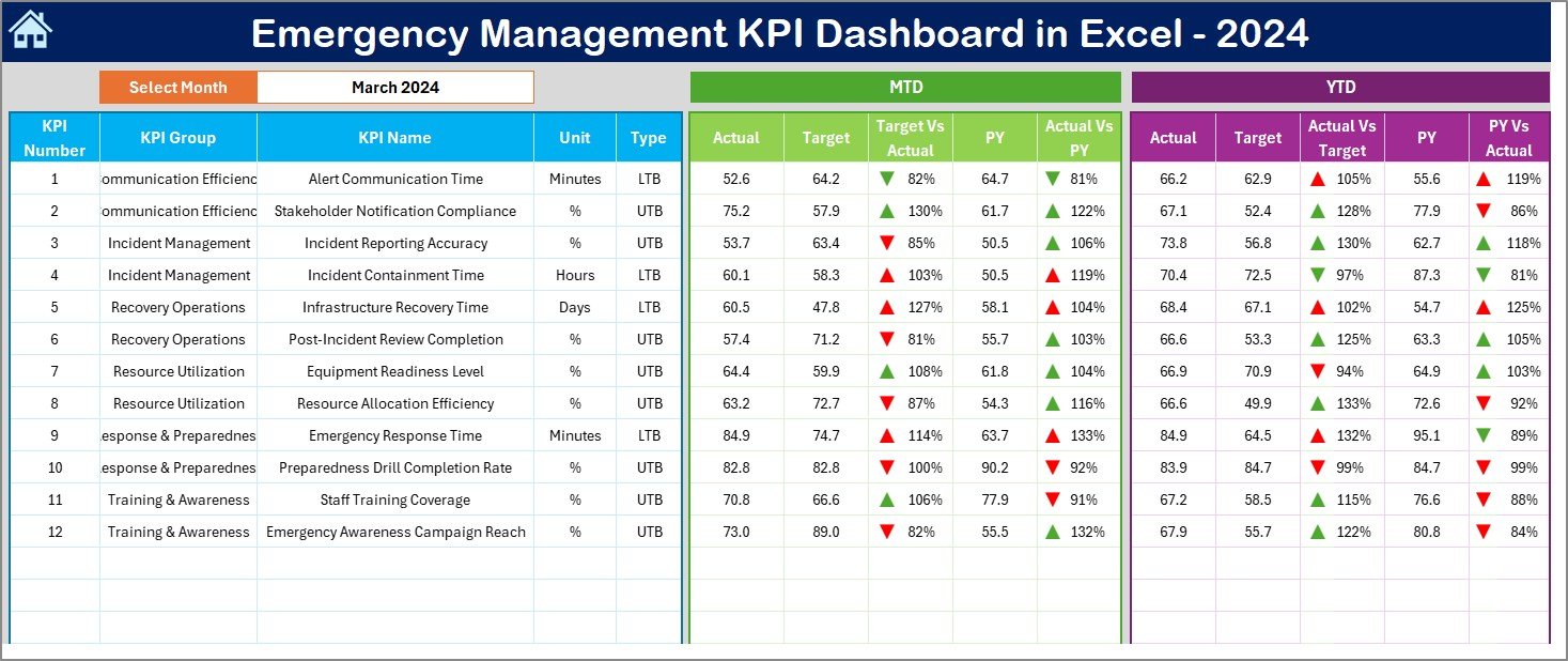
Dashboard Sheet Tab
The Dashboard Sheet is the core of the system — your command center for monitoring all KPIs.
Here’s what it includes:
- A Month selector (cell D3) where users can choose the desired month to refresh all calculations automatically.
- Clear tables showing:
- MTD (Month-to-Date) Actual vs. Target vs. Previous Year (PY)
- YTD (Year-to-Date) Actual vs. Target vs. Previous Year
- Conditional formatting that highlights performance trends using up/down arrows, allowing you to quickly identify KPIs that are improving or lagging behind.
This sheet turns complex data into visually intuitive insights, making performance evaluation fast and efficient.
Click to buy Emergency Management KPI Dashboard in Excel
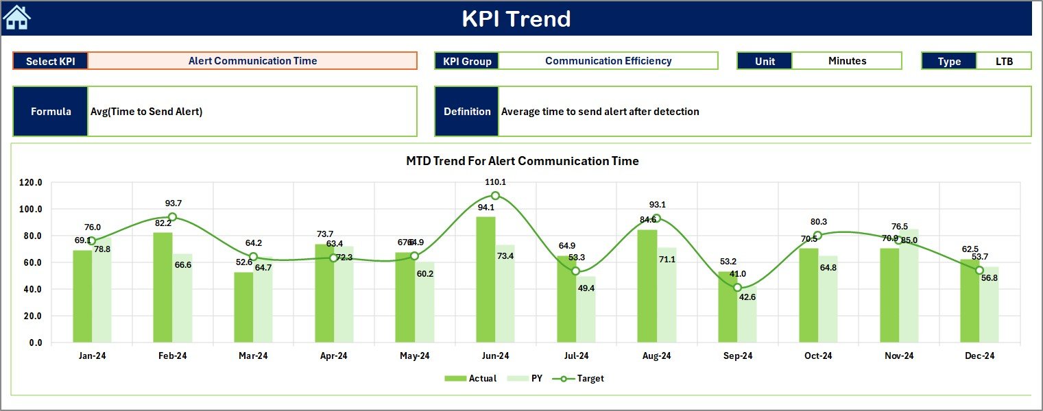
Trend Sheet Tab
The Trend Sheet helps users study the performance pattern of a particular KPI over time.
- Select the KPI Name from the dropdown menu in cell C3.
- Automatically display:
- KPI Group
- Unit of Measurement
- KPI Type (LTB or UTB) — Lower the Better / Upper the Better
- KPI Formula
- KPI Definition
- View trend charts for both MTD and YTD data showing Actual vs. Target vs. Previous Year performance.
This sheet provides the clarity needed to identify trends, detect performance gaps, and plan corrective actions.
Click to buy Emergency Management KPI Dashboard in Excel
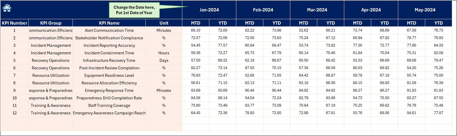
Actual Numbers Input Sheet
This sheet allows you to input actual performance data for both MTD and YTD figures.
- Set the starting month in cell E1.
- Enter actual results for each KPI per month.
It ensures that your data entry is systematic and consistent, forming the backbone of accurate performance tracking.
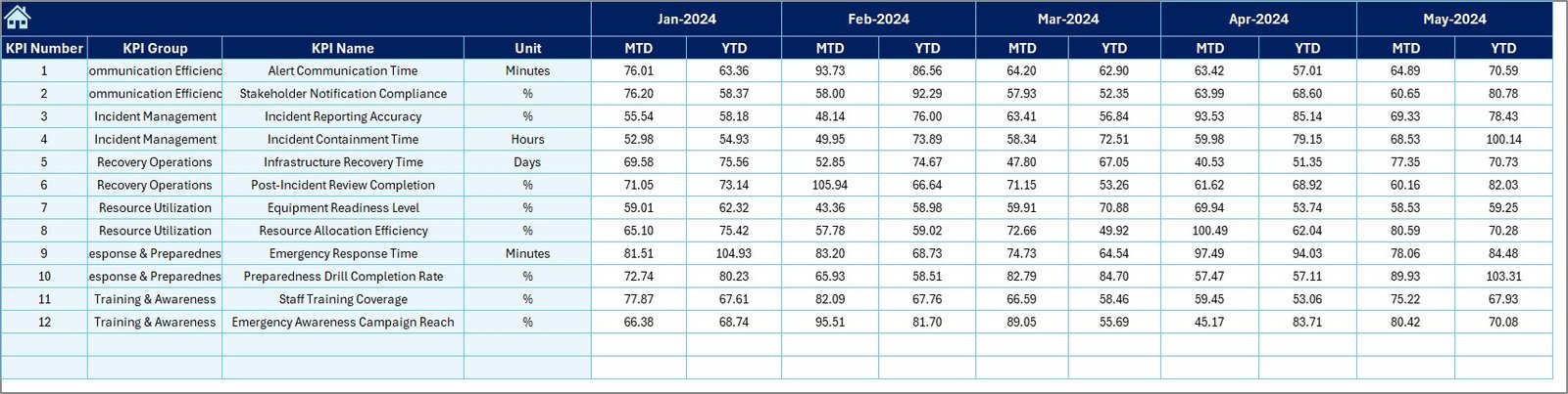
Target Sheet Tab
In the Target Sheet, users input monthly and yearly target values for each KPI.
Defining realistic, measurable targets helps your team:
- Maintain accountability
- Track progress efficiently
- Align operational efforts with organizational objectives
This proactive planning component ensures every emergency metric has a defined goal to achieve.
Click to buy Emergency Management KPI Dashboard in Excel
Previous Year Numbers Sheet
Historical data is vital for performance benchmarking.
In this tab, you can enter the Previous Year’s data for the same KPIs and time periods.
By comparing the current year with the previous year, the dashboard highlights improvement rates, declines, and trends, allowing management to make data-backed decisions.

Click to buy Emergency Management KPI Dashboard in Excel
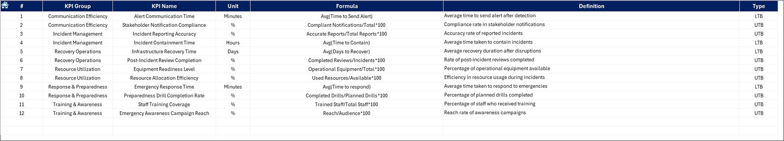
KPI Definition Sheet
The KPI Definition Sheet serves as a reference document.
It contains:
- KPI Names
- KPI Groups
- Units of Measurement
- Formulas
- Clear KPI Definitions
This ensures everyone in the organization understands the meaning and purpose of each indicator, promoting data literacy and consistent interpretation.
Why Emergency Management Needs a KPI Dashboard
Emergency management is not just about response — it’s about preparedness, coordination, and learning.
A KPI Dashboard allows teams to:
- Evaluate how quickly they react to emergencies
- Track resource allocation (vehicles, personnel, funds)
- Assess communication efficiency among departments
- Measure recovery time and cost effectiveness
- Analyze historical trends for better future planning
With real-time visibility into performance, managers can focus their efforts where improvement is needed most.
Advantages of the Emergency Management KPI Dashboard in Excel
Centralized Data Control
All emergency-related performance data stays in one place. This eliminates the need for multiple spreadsheets, reducing the risk of duplication or human error.
Real-Time Decision Support
The dashboard updates instantly when you change inputs. This helps management make real-time, data-driven decisions during crises.
Easy Customization
Built in Excel, the tool is fully customizable. You can add KPIs, modify formulas, or integrate external data sources based on your organization’s unique needs.
Trend Visibility
The Trend Sheet allows you to identify performance fluctuations and predict future challenges before they escalate.
Enhanced Accountability
By comparing Actual vs. Target vs. Previous Year, teams gain a transparent view of their performance, fostering accountability and continuous improvement.
⃣Cost-Effective and Scalable
Unlike complex software systems, this Excel dashboard requires no additional licensing or IT setup. It’s ideal for small to medium-sized organizations that want powerful analytics at low cost.
Easy Integration with Other Systems
You can connect this Excel dashboard with external data sources like:
- Incident reporting systems
- Resource management platforms
- Financial tracking sheets
This makes it a comprehensive management tool rather than just a reporting spreadsheet.
Best Practices for Using the Emergency Management KPI Dashboard in Excel
Keep KPIs SMART
All metrics should be Specific, Measurable, Achievable, Relevant, and Time-Bound to ensure accurate tracking.
Standardize Data Entry
Establish clear rules for data collection and entry to maintain accuracy and comparability across months or teams.
Automate Calculations
Use Excel formulas like IF, AVERAGEIFS, and SUMIFS to automate repetitive calculations and minimize manual effort.
Visualize Trends
Utilize Excel charts — such as line, bar, and combo charts — to present trends in an easy-to-understand format.
Validate Data Monthly
Check for inconsistencies or missing values each month to prevent incorrect insights.
Train Your Team
Ensure everyone who uses the dashboard understands the metrics, structure, and data entry protocols.
Protect Data Integrity
Use Excel’s sheet protection and cell locking features to safeguard sensitive data and formulas.
Conclusion
The Emergency Management KPI Dashboard in Excel is more than a reporting tool — it’s a strategic management system.
By consolidating data, tracking key metrics, and visualizing trends, it empowers decision-makers to act swiftly and effectively during crises.
Its simplicity, flexibility, and analytical strength make it a must-have for any organization aiming to improve readiness, response, and recovery.
In a world where every second counts, this Excel dashboard helps ensure those seconds make a difference.
Frequently Asked Questions (FAQs)
What is the main purpose of an Emergency Management KPI Dashboard?
It helps organizations monitor key emergency metrics such as response time, recovery duration, and resource utilization — ensuring data-driven decision-making during crises.
Can this dashboard be used by non-technical staff?
Yes. The dashboard is built in Excel with easy-to-use dropdowns, buttons, and automated formulas — no advanced Excel knowledge required.
How often should the data be updated?
Ideally, update it monthly for MTD and YTD values. During active crises, you can update it weekly for more frequent insights.
What are some common KPIs for emergency management?
Key metrics include Response Time, Incident Resolution Rate, Training Completion Rate, Equipment Availability, and Cost per Incident.
Can I customize the dashboard for my organization?
Absolutely. You can add KPIs, modify targets, or change visuals according to your internal reporting needs.
Why choose Excel over other BI tools?
Excel is cost-effective, widely available, and doesn’t require specialized training — making it perfect for small and medium organizations.
How can this dashboard improve real-time decision-making?
By comparing actual, target, and previous year values, leaders can instantly see where performance lags and take immediate corrective actions.
Is data security ensured?
Yes. You can lock sheets, hide formulas, and restrict editing rights to maintain data integrity and confidentiality.
Visit our YouTube channel to learn step-by-step video tutorials
Watch the step-by-step video tutorial:
Click to buy Emergency Management KPI Dashboard in Excel