In the modern era, arts and culture organizations need data-driven insights to make informed decisions. From managing event budgets to analyzing ticket sales and visitor satisfaction, every piece of information contributes to success. However, collecting and understanding this data manually can be time-consuming and error-prone.
That’s where the Arts & Culture Dashboard in Excel becomes a game-changer.
This ready-to-use Excel template helps cultural institutions, event organizers, museums, and art councils analyze performance metrics quickly and visually. With this dashboard, you can track everything from event attendance and regional performance to sponsorships and costs — all in one interactive file.
Click to buy Arts & Culture Dashboard in Excel
What Is an Arts & Culture Dashboard in Excel?
An Arts & Culture Dashboard in Excel is a data visualization and management tool designed for organizations that manage cultural programs, events, and exhibitions. It consolidates multiple data points — such as event budgets, ticket sales, sponsorships, and artist participation — into one organized system.
Instead of manually tracking performance, users can view metrics in real time through interactive charts, summary cards, and dynamic visuals. It transforms raw data into clear insights, helping decision-makers evaluate what’s working and what needs improvement.
This dashboard is ideal for:
- Art galleries and museums
- Cultural foundations and non-profits
- Performing arts centers
- Festival and event organizers
- Municipal or government arts departments
With Excel’s flexibility and automation, even non-technical users can manage large datasets easily while keeping reports visually appealing and easy to understand.
Key Features of the Arts & Culture Dashboard in Excel
The Arts & Culture Dashboard comes with multiple sheets and sections — each serving a unique analytical purpose.
Let’s explore the main components and their functions.
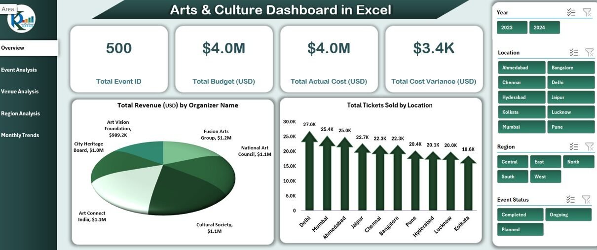
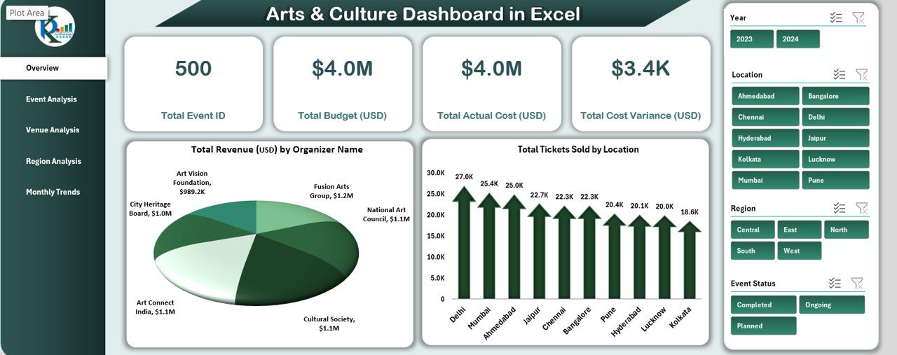
Overview Sheet Tab
The Overview Sheet serves as the control center of the dashboard. It displays high-level KPIs (Key Performance Indicators) that summarize your organization’s performance at a glance.
KPI Cards
The top section includes dynamic cards showing:
- Total Event ID – Count of all events tracked in the system.
- Total Budget (USD) – The cumulative budget allocated for all cultural programs and events.
- Total Actual Cost (USD) – The amount actually spent, reflecting cost efficiency.
- Total Cost Variance (USD) – The difference between the planned and actual cost.
- Organizer Name – Highlights the event organizer associated with the data.
Financial and Sales Highlights
- Total Revenue (USD) by Organizer Name – Displays revenue distribution by organizer, identifying top performers.
- Total Tickets Sold by Location – Shows which locations attract the most audiences.
- Total Tickets Sold by Event Status – Compares active, completed, and canceled events.
This sheet provides a quick snapshot for executives and helps identify trends across multiple parameters in seconds.
Click to buy Arts & Culture Dashboard in Excel
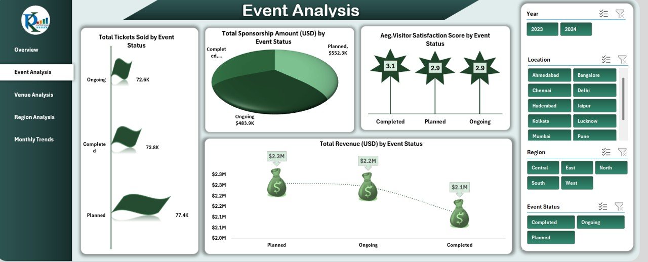
Event Analysis Sheet Tab
The Event Analysis page dives deeper into performance metrics at the event level.
Detailed Event Metrics
- Total Sponsorship Amount (USD) by Event Status – Tracks sponsorship inflows and their alignment with event categories.
- Total Tickets Sold by Event Status – Reveals ticket demand based on event phase (upcoming, ongoing, or completed).
- Average Visitor Satisfaction Score by Event Status – Measures audience engagement and satisfaction.
- Total Revenue (USD) by Event Status – Evaluates financial success of each event type.
This sheet helps management teams identify which events deliver the best ROI, attract the highest audiences, or require further improvement.
Click to buy Arts & Culture Dashboard in Excel
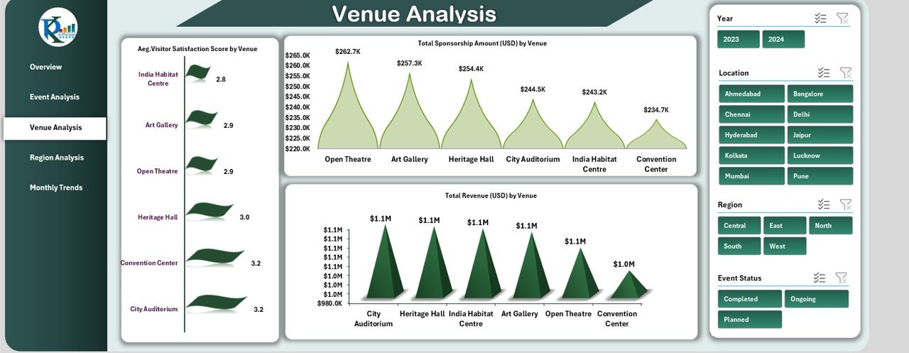
Venue Analysis Sheet Tab
The Venue Analysis section focuses on how different venues perform in terms of attendance, sponsorships, and satisfaction levels.
Venue Performance Highlights
- Average Visitor Satisfaction Score by Venue – Highlights the most engaging venues.
- Total Sponsorship Amount (USD) by Venue – Displays the amount of sponsorship secured for each venue.
- Total Revenue (USD) by Venue – Evaluates income generated from different locations.
This analysis assists in selecting optimal venues for future cultural events and supports cost optimization strategies.
Click to buy Arts & Culture Dashboard in Excel
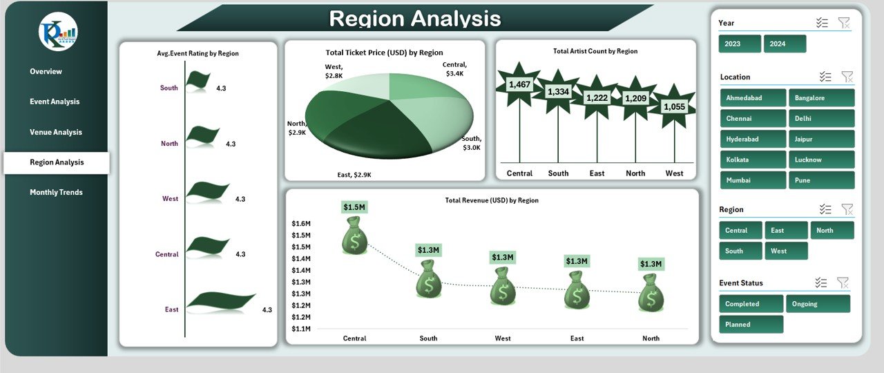
Region Analysis Sheet Tab
The Region Analysis tab helps organizations understand the geographical performance of their cultural initiatives.
Regional Insights
- Average Event Rating by Region – Reveals audience feedback and satisfaction by region.
- Total Ticket Price (USD) by Region – Shows how ticket pricing strategies differ geographically.
- Total Revenue (USD) by Region – Analyzes regional profitability.
- Total Artist Count by Region – Displays how many artists participated from each region.
This sheet is essential for identifying high-performing regions and potential areas for outreach or marketing expansion.
Click to buy Arts & Culture Dashboard in Excel
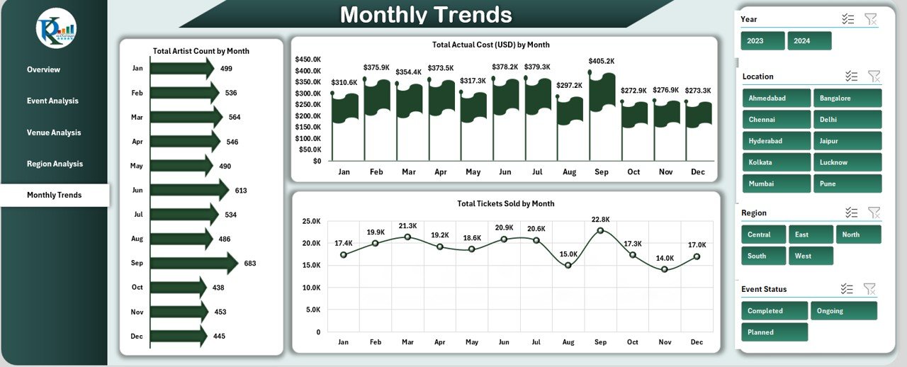
Monthly Trends Sheet Tab
The Monthly Trends tab provides a time-based view of the organization’s activities and financials.
Time-Series Metrics
- Total Artist Count by Month – Shows trends in artist participation across months.
- Total Actual Cost (USD) by Month – Displays monthly spending patterns.
- Total Tickets Sold by Month – Tracks seasonal or monthly demand changes.
With these visuals, decision-makers can detect trends, anticipate demand, and plan future events accordingly.
Click to buy Arts & Culture Dashboard in Excel
Advantages of the Arts & Culture Dashboard in Excel
The benefits of using this dashboard extend far beyond basic data visualization. Here’s why organizations across the world rely on Excel dashboards for cultural management:
- Centralized Information
All data — from financial details to visitor satisfaction — is stored in one file. This eliminates data silos and ensures everyone works with the same information.
- Enhanced Decision-Making
With interactive visuals and real-time metrics, you can make quick, evidence-based decisions. Excel charts and slicers make comparisons simple and intuitive.
- Customizable Design
Since the dashboard is built in Excel, you can easily modify colors, charts, and data sources to match your organization’s branding.
- Cost-Effective Solution
Unlike expensive business intelligence tools, this Excel dashboard provides similar insights at zero subscription cost.
- Improved Accountability
By comparing budget vs. actual costs, the dashboard promotes financial transparency across departments.
- Data-Driven Performance Evaluation
With KPI tracking, you can monitor artist participation, visitor engagement, and event success metrics continuously.
- Easy to Use and Share
Excel’s simplicity allows you to share reports instantly via email or cloud storage, making collaboration smooth.
Opportunities for Improvement
While this dashboard is powerful, continuous enhancement ensures long-term efficiency. Consider these improvements:
- Integrate live data connections: Link Excel to external sources (Google Sheets, databases, or event registration systems) for real-time updates.
- Add Power Query automation: Automate data refreshes without manual entry.
- Include more visual types: Add gauges, trendlines, and heat maps for advanced storytelling.
- Embed audience feedback forms: Collect data directly from participants for better satisfaction tracking.
- Use Power BI integration: For larger datasets, combining this dashboard with Power BI unlocks deeper insights.
Best Practices for Using the Arts & Culture Dashboard in Excel
To get the most from your dashboard, follow these proven practices:
- Keep Data Clean and Consistent
Ensure all data entries (e.g., ticket prices, event names, and organizers) follow a consistent format. Consistency prevents calculation errors and makes pivot tables more reliable.
- Update Regularly
Refresh your data weekly or after every event to keep reports accurate and actionable.
- Define Clear KPIs
Establish measurable performance indicators such as Revenue per Event, Visitor Satisfaction Score, and Cost Variance %. This helps you focus on what truly matters.
- Use Conditional Formatting
Highlight top-performing events in green and under-performing ones in red to visualize trends instantly.
- Backup and Version Control
Save versions of your dashboard after each major update. This practice prevents data loss and helps compare past performance.
- Train Your Team
Provide short training sessions for staff members to help them interpret charts, modify slicers, and use filters effectively.
- Protect Key Formulas
- Lock or hide formula cells to prevent accidental edits, ensuring calculation integrity.
- Link to Strategic Goals
- Align your KPIs with organizational objectives — whether it’s boosting community participation, improving financial efficiency, or enhancing artist collaboration.
Conclusion
The Arts & Culture Dashboard in Excel is more than a reporting tool — it’s a strategic asset that empowers cultural organizations to make informed, data-driven decisions. By consolidating information across events, venues, and regions, it transforms scattered data into actionable insights.
Whether you’re managing a single art exhibition or an international cultural festival, this dashboard offers the clarity, structure, and flexibility you need to succeed.
It’s easy to use, cost-effective, and visually engaging — making Excel not just a spreadsheet tool but a complete cultural intelligence platform.
Frequently Asked Questions (FAQs)
What is the purpose of an Arts & Culture Dashboard in Excel?
It helps organizations track event performance, financial health, and audience engagement metrics in a single visual report.
Can I customize the dashboard for my organization?
Yes, you can easily edit KPI names, add new visuals, and change colors to align with your branding.
Does it require Excel macros or VBA?
The base version works without macros, but advanced automation (like dynamic filtering) can use VBA for enhanced functionality.
How often should I update the data?
Ideally after every event or at least once a week to ensure reports remain up to date.
Can small non-profits use this dashboard?
Absolutely. It’s perfect for non-profits with limited budgets who still want professional-level analytics.
Is this dashboard compatible with Power BI?
Yes. You can easily connect it to Power BI to create more advanced interactive visuals.
Can this dashboard handle large datasets?
Excel can handle thousands of rows efficiently. For very large datasets, Power Query or Power Pivot can improve performance.
Visit our YouTube channel to learn step-by-step video tutorials
Watch the step-by-step video tutorial:
Click to buy Arts & Culture Dashboard in Excel