In today’s creative economy, arts and culture organizations need data-driven insights just as much as businesses do. Tracking performance, funding impact, community engagement, and visitor satisfaction is essential for growth and sustainability. That’s where the Arts & Culture KPI Dashboard in Excel steps in — a powerful, easy-to-use, and ready-to-implement solution that turns raw data into clear visual insights.
This article explores what this dashboard is, how it works, and why every arts organization should use it. You’ll learn its structure, key features, benefits, best practices, and answers to the most common questions.
Click to buy Arts & Culture KPI Dashboard in Excel
What Is an Arts & Culture KPI Dashboard in Excel?
An Arts & Culture KPI Dashboard in Excel is a data visualization tool that helps organizations in the arts, heritage, and cultural sectors track their key performance indicators (KPIs). It provides a centralized view of goals, achievements, and progress across multiple areas like exhibitions, ticket sales, audience engagement, social reach, and community programs.
Built entirely in Microsoft Excel, this dashboard allows museum managers, art curators, cultural organizations, and performing-arts institutions to make informed decisions without needing complex business-intelligence software.
With dynamic drop-downs, automated charts, and interactive visuals, the dashboard transforms performance tracking into an intuitive experience.
Structure of the Arts & Culture KPI Dashboard
The Arts & Culture KPI Dashboard in Excel includes seven interactive sheets, each with a unique function that supports holistic data management and visualization.
Summary Page
The Summary Page acts as the index or home page. It provides six navigation buttons that help users jump to specific worksheets instantly. This design improves workflow efficiency, making it easy to explore different analytical views.

Click to buy Arts & Culture KPI Dashboard in Excel
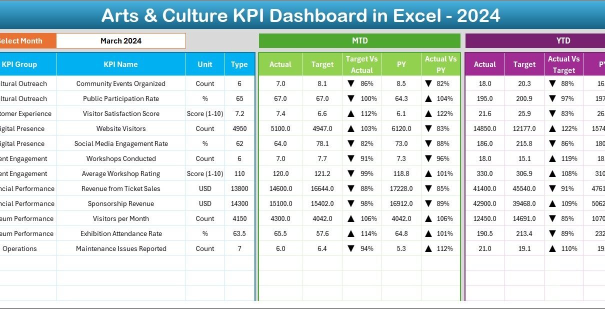
Dashboard Sheet Tab
This is the main dashboard sheet and the centerpiece of the entire workbook.
Key highlights:
- Select any Month using the drop-down in cell D3.
- Instantly update all visual and numerical data for that month.
- View MTD (Month-to-Date) and YTD (Year-to-Date) metrics.
- Compare Actual vs Target and Previous Year vs Actual using visual up/down arrows and color-coded formatting.
- Instantly see how each KPI is performing — whether targets are being met, exceeded, or missed.
This dynamic interactivity makes it easy to spot strengths and identify areas that require improvement.

Trend Sheet Tab
The Trend Sheet provides an in-depth look at performance over time.
Here’s what makes it valuable:
- Choose any KPI name from a drop-down menu (cell C3).
- Automatically view KPI Group, Unit, Type (Lower or Upper the Better), Formula, and Definition.
- Analyze MTD and YTD trends using visually appealing line or column charts for Actual, Target, and Previous Year values.
This sheet helps stakeholders monitor progress patterns and evaluate the success of strategic initiatives.

Click to buy Arts & Culture KPI Dashboard in Excel
Actual Numbers Input Sheet
This sheet is designed for data entry.
You can enter monthly Actual values for both MTD and YTD metrics.
To begin the year’s data entry:
- Set the first month in cell E1.
- Input Actuals for each KPI for the chosen period.
This sheet ensures data consistency and serves as the foundation for all dashboard calculations.

Click to buy Arts & Culture KPI Dashboard in Excel
Target Sheet Tab
The Target Sheet lets you define performance expectations.
For every KPI, you can enter monthly targets for both MTD and YTD.
By aligning these with Actual data, you instantly measure performance gaps and achievements.

Click to buy Arts & Culture KPI Dashboard in Excel
Previous Year Numbers Sheet
This sheet allows you to maintain a reference point by storing last year’s data for comparison.
When you compare Current vs Previous Year, you can easily see growth, decline, or stability across your performance areas.

KPI Definition Sheet Tab
This is one of the most important parts of the dashboard.
You can list each KPI’s:
- Name
- Group
- Unit of Measurement
- Formula
- Definition
- Type (Lower the Better or Upper the Better)
This section ensures transparency, helping every user understand what each KPI means and how it’s calculated.

Click to buy Arts & Culture KPI Dashboard in Excel
Why Arts and Culture Organizations Need KPI Dashboards
Arts and culture institutions often manage diverse activities — from exhibitions and performances to educational workshops and digital outreach. Tracking all these manually is time-consuming and error-prone.
With an Excel-based KPI dashboard:
- You consolidate all data in one file.
- You monitor real-time performance without switching tools.
- You analyze outcomes visually using graphs and color codes.
- You improve decision-making with clear, measurable insights.
In short, this dashboard turns creativity into measurable performance.
How Does the Arts & Culture KPI Dashboard Work?
The dashboard works by integrating Actual, Target, and Previous Year data across different sheets.
Once you input or update your monthly values:
- Excel formulas calculate MTD and YTD summaries.
- Conditional formatting highlights performance trends.
- Pivot-friendly tables feed dynamic charts for visual analysis.
Because it’s built in Excel, you can easily customize it — add more KPIs, adjust thresholds, or change color themes. The logic is simple yet powerful, making it ideal for non-technical users too.
Advantages of Using the Arts & Culture KPI Dashboard in Excel
The benefits of this dashboard go far beyond tracking numbers. Let’s look at the top advantages:
Centralized Performance Management
All KPIs across departments — marketing, finance, audience engagement, and education — are captured in one place. No more juggling between different spreadsheets.
Real-Time Insights
Instantly view performance updates with drop-down-driven interactivity. You don’t need complex tools; Excel automatically refreshes all visuals.
Simplified Decision-Making
Charts, traffic lights, and trend arrows help you make quick data-driven decisions without deep analytics skills.
Easy to Customize
The dashboard is fully editable. You can add new KPIs, modify charts, or rename KPI groups to suit your institution’s goals.
Budget and Funding Transparency
By tracking financial KPIs, you ensure accountability for every project and demonstrate impact to donors and sponsors.
Encourages Team Collaboration
When everyone can see performance results in one sheet, teamwork improves. Teams align on goals and focus on shared outcomes.
Enhances Strategic Planning
Trend data and YTD analysis help leaders refine event calendars, audience strategies, and grant proposals more effectively.
Opportunities for Improvement
Even though the dashboard is powerful, there are always ways to improve it further. Consider these enhancements:
- Add automated data imports using Power Query or VBA.
- Integrate attendance scanners or ticketing systems for real-time updates.
- Use Power BI visualization extensions for deeper insights.
- Include a KPI weightage system to rank performance areas.
- Create a print-ready summary report for board meetings.
These additions can elevate the Excel dashboard into an even more robust management tool.
Best Practices for Using the Arts & Culture KPI Dashboard
To get the most out of this dashboard, follow these best practices:
Keep Data Updated Monthly
Regular updates ensure your charts and insights reflect current performance. Assign responsibility to a team member for monthly data entry.
Define Clear KPI Ownership
Each KPI should have an owner — such as the Marketing Head for social metrics or the Finance Manager for budget KPIs. Ownership increases accountability.
Use Consistent Units and Definitions
Maintain uniform KPI definitions in the KPI Definition Sheet. It helps everyone interpret data the same way.
Review Trends, Not Just Numbers
Don’t focus only on MTD data. Compare YTD performance and year-on-year growth to see bigger patterns.
Use Conditional Formatting Wisely
Green, yellow, and red indicators instantly show whether performance is good, average, or poor. Keep the color logic consistent.
Back Up Data Regularly
As Excel files grow with time, backup copies prevent data loss. Use version control for monthly updates.
Customize Visuals for Stakeholders
Different teams may want different visuals — finance teams prefer numbers, while curators may prefer charts. Adjust as per audience.
Conclusion
The Arts & Culture KPI Dashboard in Excel is more than just a reporting tool — it’s a digital compass that guides creative organizations toward growth, engagement, and sustainability. By consolidating data, simplifying analysis, and visualizing trends, it empowers cultural leaders to make better, faster, and smarter decisions.
Whether you run a museum, art center, or community foundation, this Excel dashboard helps you transform numbers into narratives — stories of progress, purpose, and positive impact.
Frequently Asked Questions (FAQs)
- What is the purpose of the Arts & Culture KPI Dashboard?
It helps organizations monitor, analyze, and improve performance across visitor engagement, finances, and outreach programs using easy-to-read visual reports.
- Can I customize the KPIs in this dashboard?
Yes, you can add or edit KPIs in the KPI Definition Sheet. The dashboard updates automatically once you link them correctly.
- Does it require advanced Excel knowledge?
Not at all. The dashboard is designed for non-technical users. You only need basic Excel skills like data entry and drop-down selection.
- How often should I update the data?
It’s best to update it monthly to maintain accuracy and see timely performance trends.
- Can this dashboard handle multiple years of data?
Yes, you can extend the sheets with new columns for each year and easily compare year-on-year growth.
- Is the dashboard suitable for small organizations?
Absolutely. Whether you’re a small art gallery or a large cultural foundation, the template scales according to your data size.
- How does it improve reporting to donors or boards?
You can generate quick visuals showing progress against goals, making donor reports and board presentations far more impactful.
Visit our YouTube channel to learn step-by-step video tutorials
Watch the step-by-step video tutorial:
Click to buy Arts & Culture KPI Dashboard in Excel