The dairy industry depends on efficiency, quality control, and cost management. However, managing multiple plants, product categories, suppliers, and shifts at the same time creates complexity. If you rely on manual reports, you lose visibility. Moreover, you react late to operational issues.
So, how can dairy processing companies gain real-time insight into production, cost, yield, and quality?
The answer is clear.
You need a Dairy Products Processing Plant Dashboard in Power BI.
This advanced Power BI dashboard transforms raw plant data into powerful visual insights. Furthermore, it allows management teams to monitor revenue, production cost, machine downtime, yield percentage, quality scores, and resource usage from one interactive platform.
What Is a Dairy Products Processing Plant Dashboard in Power BI?
A Dairy Products Processing Plant Dashboard in Power BI is an interactive business intelligence solution designed for dairy manufacturing companies.
It helps management teams:
- Track total revenue and production cost
- Monitor average quality score
- Analyze yield percentage
- Measure machine downtime
- Compare plant performance
- Evaluate product category efficiency
- Monitor supplier contribution
Because Power BI supports dynamic slicers and drill-down capabilities, users can filter data by:
- Year
- Month Name
- Plant Location
- Product Category
- Shift
- Supplier Name
Therefore, decision-makers gain real-time operational clarity.
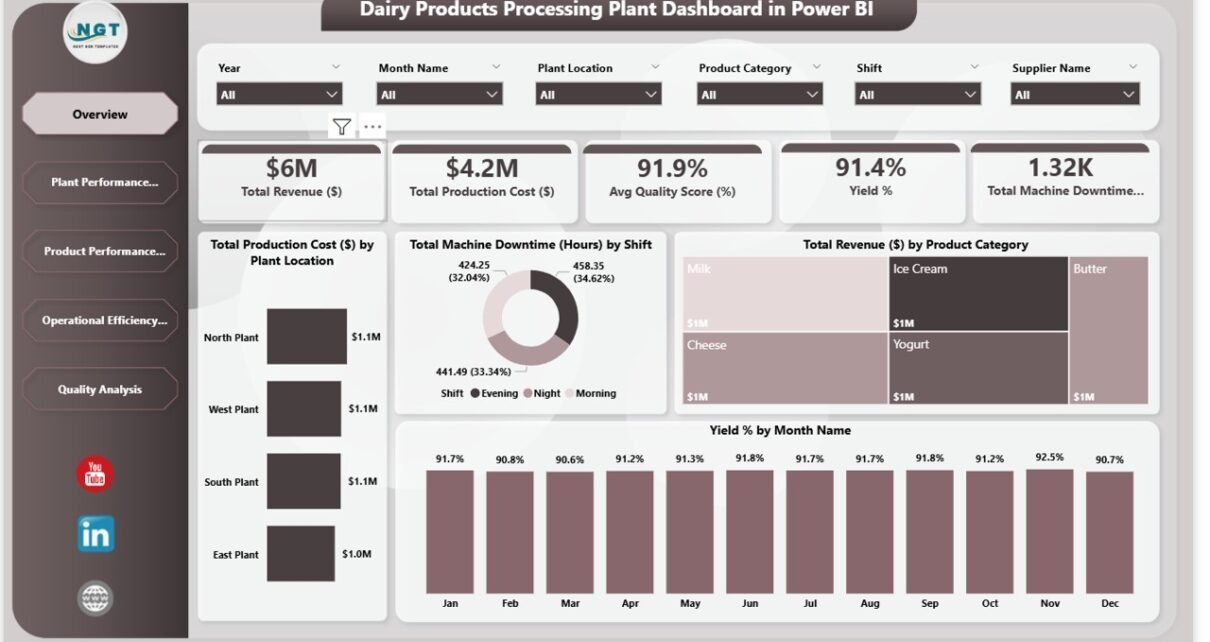
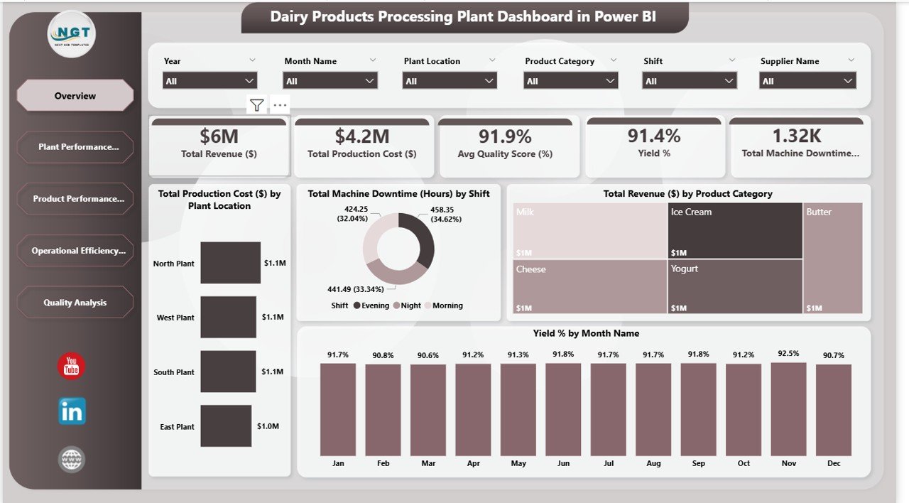
Overview Page – How Can You Monitor Entire Plant Performance Instantly?
Click to Buy Dairy Products Processing Plant Dashboard in Power BI
The Overview page serves as the executive summary. It displays high-level KPIs and visual insights.
Key KPI Cards
- Total Revenue – $6M
- Total Production Cost – $4.2M
- Average Quality Score – 91.9%
- Yield % – 91.4%
- Total Machine Downtime – 1.32K Hours
These KPIs give instant clarity about financial health and operational efficiency.
Key Visuals
- Total Production Cost by Plant Location
- Total Machine Downtime by Shift
- Total Revenue by Product Category
- Yield % by Month Name
For example:
- If revenue drops while production cost remains high, you can investigate cost control.
- If downtime increases during evening shifts, you can schedule maintenance proactively.
Therefore, the Overview page supports strategic decisions quickly.
Click to Buy Dairy Products Processing Plant Dashboard in Power BI
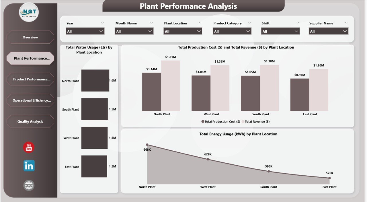
Plant Performance Analysis – Which Plant Performs Best?
The Plant Performance Analysis page compares plant-level performance across locations such as:
- North Plant
- South Plant
- West Plant
- East Plant
Key Visuals
- Total Water Usage (Liters) by Plant
- Total Production Cost vs Total Revenue by Plant
- Total Energy Usage (KWh) by Plant
From the dashboard insights:
- North Plant shows strong revenue performance
- Energy usage differs significantly by plant
- Water consumption varies across locations
Because utilities directly impact production cost, this analysis helps optimize plant operations.
If one plant consumes more energy without higher output, management can review machinery efficiency. Thus, the dashboard supports cost optimization.
Click to Buy Dairy Products Processing Plant Dashboard in Power BI
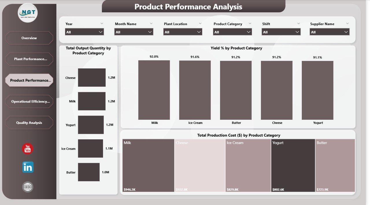
Product Performance Analysis – Which Dairy Products Drive Profitability?
The Product Performance Analysis page focuses on product categories such as:
- Milk
- Cheese
- Yogurt
- Ice Cream
- Butter
Key Visuals
- Total Output Quantity by Product Category
- Yield % by Product Category
- Total Production Cost by Product Category
This page helps identify:
- High-yield products
- High-cost product categories
- Output performance comparison
For example:
- Milk and Cheese show strong output levels.
- Butter shows lower production cost compared to Milk.
Because product-level insights drive profitability, this page helps adjust production strategy.
If a product shows high cost and low yield, management can review processing methods immediately.
Click to Buy Dairy Products Processing Plant Dashboard in Power BI
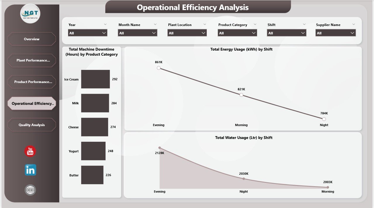
Operational Efficiency Analysis – Are Your Shifts and Machines Optimized?
Operational efficiency plays a crucial role in dairy manufacturing.
This page monitors:
- Total Machine Downtime by Product Category
- Total Energy Usage by Shift
- Total Water Usage by Shift
From the dashboard:
- Evening shift shows higher energy usage
- Ice Cream production shows higher downtime
- Water usage differs across shifts
Because downtime reduces output capacity, this analysis helps improve maintenance planning.
If downtime increases for a specific product, the operations team can inspect equipment immediately.
Therefore, this page strengthens operational control and resource management.
Click to Buy Dairy Products Processing Plant Dashboard in Power BI
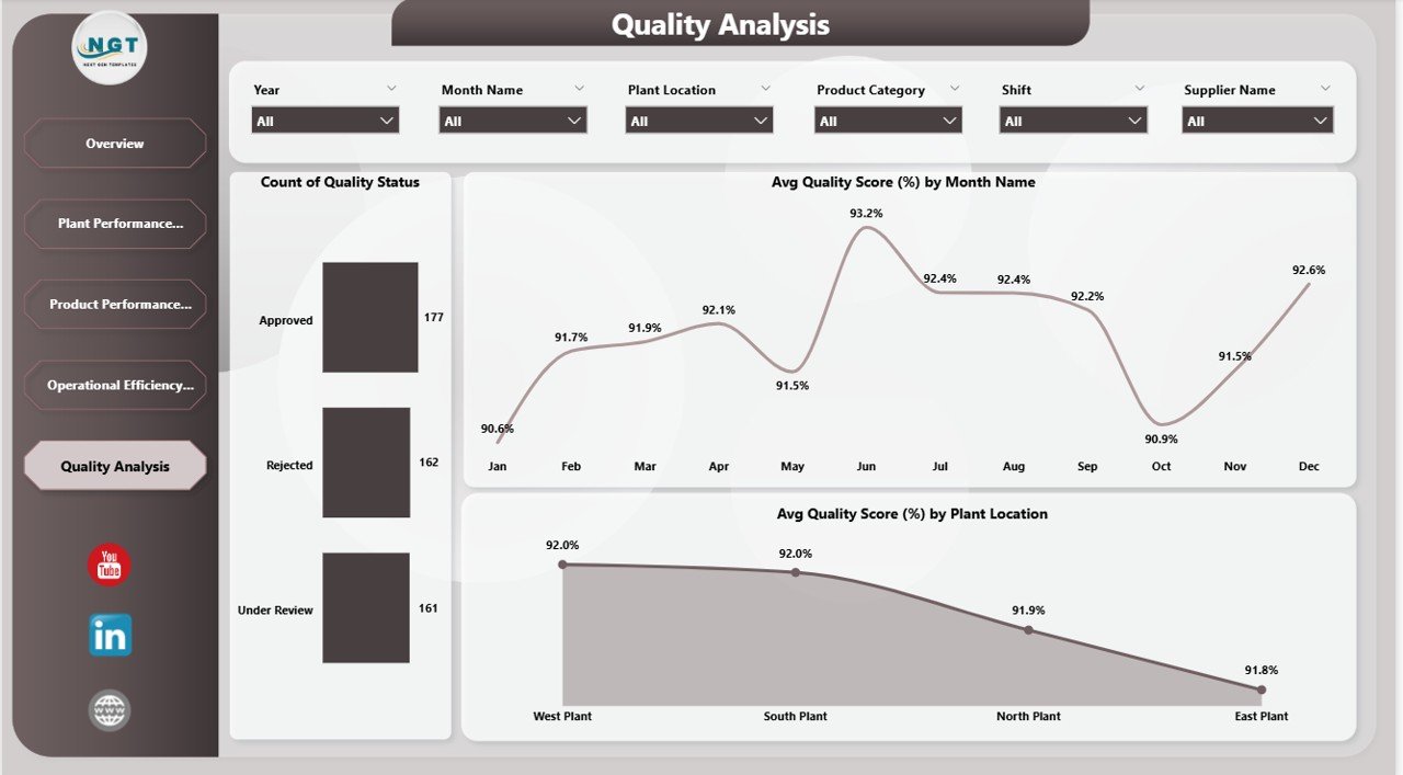
Quality Analysis – How Do You Maintain Dairy Quality Standards?
Quality management protects brand reputation. Therefore, continuous monitoring becomes essential.
The Quality Analysis page includes:
- Count of Quality Status (Approved, Rejected, Under Review)
- Average Quality Score by Month
- Average Quality Score by Plant Location
From the dashboard insights:
- Most products remain approved
- Quality score fluctuates between 90%–93% monthly
- West Plant shows strong quality performance
If rejection rates increase, quality teams can act quickly. Therefore, this page ensures compliance and product safety.
Click to Buy Dairy Products Processing Plant Dashboard in Power BI
Advantages of Dairy Products Processing Plant Dashboard in Power BI
Real-Time Insights
You access live performance data instantly.
Improved Resource Management
You monitor water and energy consumption clearly.
Data-Driven Decision Making
You analyze revenue and cost performance easily.
Plant-Level Comparison
You compare operational efficiency across locations.
Product Optimization
You identify profitable and cost-heavy products.
Quality Monitoring
You track quality performance consistently.
Interactive Filtering
You filter by plant, shift, supplier, and product category.
Therefore, this dashboard improves transparency and operational excellence.
Best Practices for Implementing the Dashboard
Click to Buy Dairy Products Processing Plant Dashboard in Power BI
To maximize benefits, follow these best practices:
Maintain Clean Data
Ensure accurate data entry and validation.
Refresh Data Regularly
Schedule automatic refresh in Power BI Service.
Monitor Downtime Weekly
Identify equipment issues early.
Track Yield Closely
Yield percentage directly impacts profit.
Analyze Utility Trends
Review water and energy usage monthly.
Focus on Quality Deviations
Investigate any quality score drop immediately.
When you follow these practices, you enhance operational efficiency continuously.
Conclusion
Click to Buy Dairy Products Processing Plant Dashboard in Power BI
The Dairy Products Processing Plant Dashboard in Power BI provides a complete business intelligence solution for dairy manufacturing companies.
With five structured analytical pages—Overview, Plant Performance, Product Performance, Operational Efficiency, and Quality Analysis—you gain full control over financial, operational, and quality metrics.
Moreover, interactive slicers and dynamic visuals allow deeper insights instantly. Therefore, management teams can reduce cost, improve yield, optimize resources, and maintain product quality effectively.
If you want to transform your dairy plant operations into a data-driven system, this Power BI dashboard becomes an essential management tool.
Frequently Asked Questions (FAQs)
Click to Buy Dairy Products Processing Plant Dashboard in Power BI
1. What is a Dairy Products Processing Plant Dashboard in Power BI?
It is an interactive Power BI report that tracks plant performance, revenue, cost, yield, downtime, and quality metrics.
2. Can I filter data by plant location and shift?
Yes, you can filter by plant location, shift, supplier, product category, month, and year.
3. Does the dashboard track energy and water usage?
Yes, it monitors both energy (KWh) and water usage (Liters).
4. How many analysis pages are included?
The dashboard includes five main analytical pages.
5. Can this dashboard support multiple plants?
Yes, it supports multiple plant locations with comparative analysis.
6. Why is yield percentage important?
Yield percentage measures production efficiency and impacts profitability directly.
7. Is this dashboard suitable for small dairy companies?
Yes, both small and large dairy companies can use it effectively.
Visit our YouTube channel to learn step-by-step video tutorials
Watch the step-by-step video tutorial:
Click to Buy Dairy Products Processing Plant Dashboard in Power BI