In today’s globalized world, international development projects play a critical role in driving social, economic, and environmental progress. Governments, NGOs, and donor agencies invest millions of dollars in initiatives aimed at poverty reduction, education, healthcare, gender equality, and sustainability. However, monitoring these initiatives effectively requires accurate data, actionable insights, and transparent performance tracking.
That’s where the International Development KPI Dashboard in Excel comes in.
This ready-to-use, data-driven Excel template enables organizations to monitor key performance indicators (KPIs), analyze performance trends, and make data-informed decisions — all in one interactive dashboard.
In this detailed article, you’ll learn everything about the International Development KPI Dashboard in Excel — including its structure, key features, advantages, best practices, and frequently asked questions.
Click to buy International Development KPI Dashboard in Excel
What Is an International Development KPI Dashboard in Excel?
An International Development KPI Dashboard in Excel is an analytical tool that helps project managers, monitoring & evaluation (M&E) teams, and decision-makers track and measure performance across multiple development programs.
It consolidates data from various sources — such as donor reports, regional offices, and project submissions — into a single, visually appealing Excel dashboard.
With this dashboard, you can:
- Track Month-to-Date (MTD) and Year-to-Date (YTD) progress
- Compare Actual vs Target vs Previous Year (PY) values
- Identify underperforming KPIs using visual indicators (up/down arrows)
- Drill down into specific KPI trends for deeper insights
- Improve accountability and data-driven decision making
This tool is ideal for organizations involved in international cooperation, humanitarian aid, or sustainable development projects.
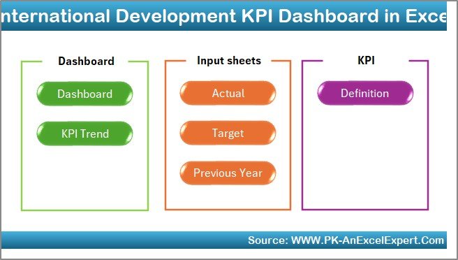
Structure of the International Development KPI Dashboard
The dashboard is designed with seven well-structured worksheets, each serving a distinct purpose. Let’s explore each one in detail:
Home Sheet
The Home sheet serves as the navigation hub of the dashboard.
It features six clickable buttons that instantly take you to the respective sheets.
Click to buy International Development KPI Dashboard in Excel
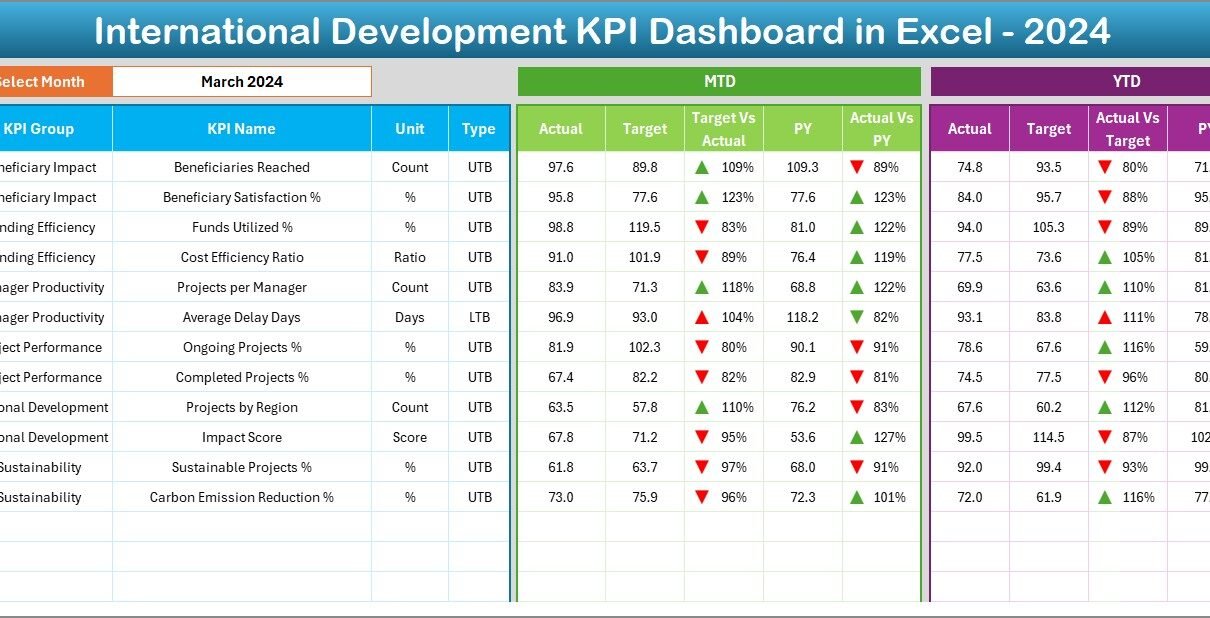
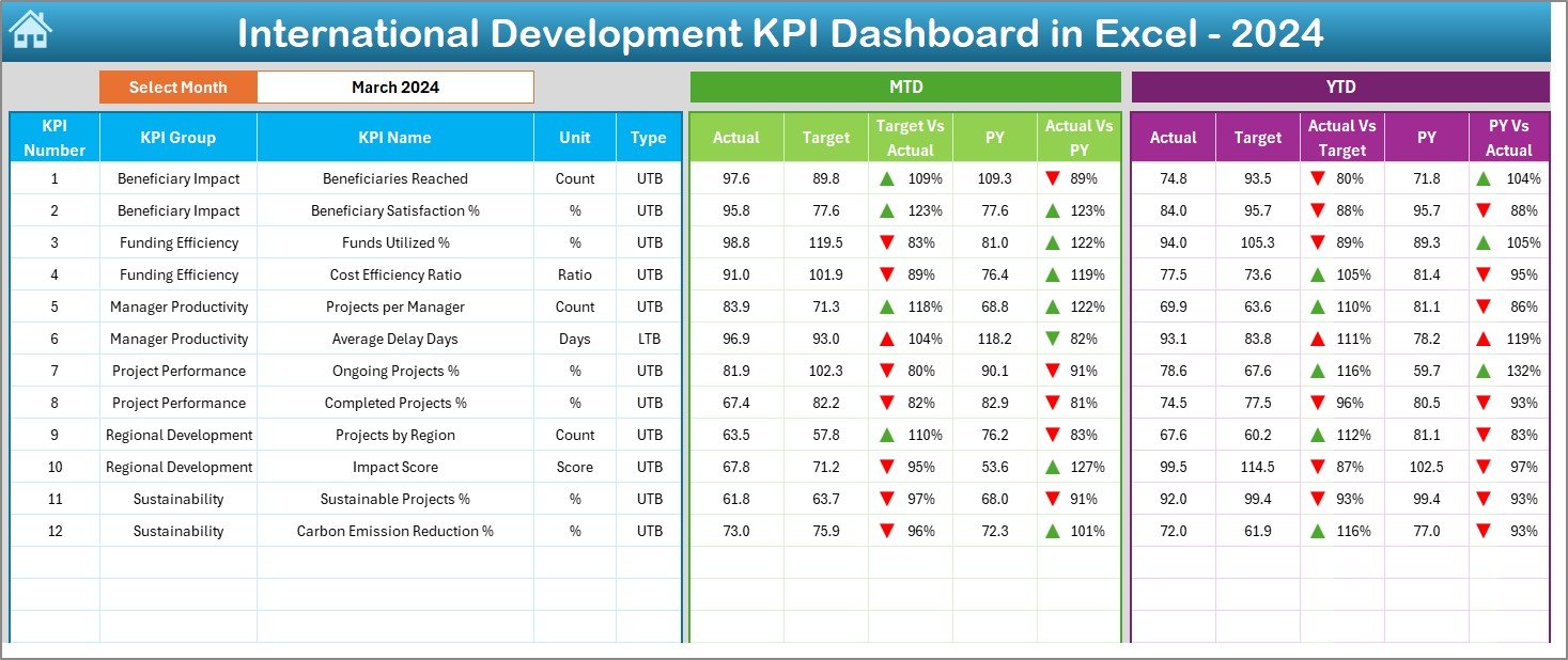
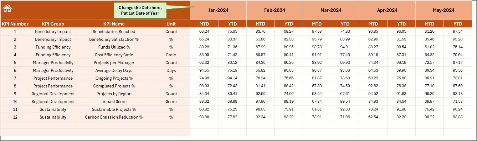
Dashboard Sheet Tab
This is the main visualization sheet, where users can see a summarized view of all KPIs.
At the top, you’ll find a Month Selector (Cell D3).
Selecting any month dynamically updates all performance numbers across the dashboard.
Here’s what you’ll find on this sheet:
- MTD Section (Month-to-Date)
Displays Actual, Target, and Previous Year data, along with Target vs Actual and PY vs Actual comparisons.
Conditional formatting uses arrows to visually show whether performance has improved or declined. - YTD Section (Year-to-Date)
Shows cumulative performance over the year with the same visual logic as the MTD section.
You can instantly see if the project is on track for annual goals.
Click to buy International Development KPI Dashboard in Excel
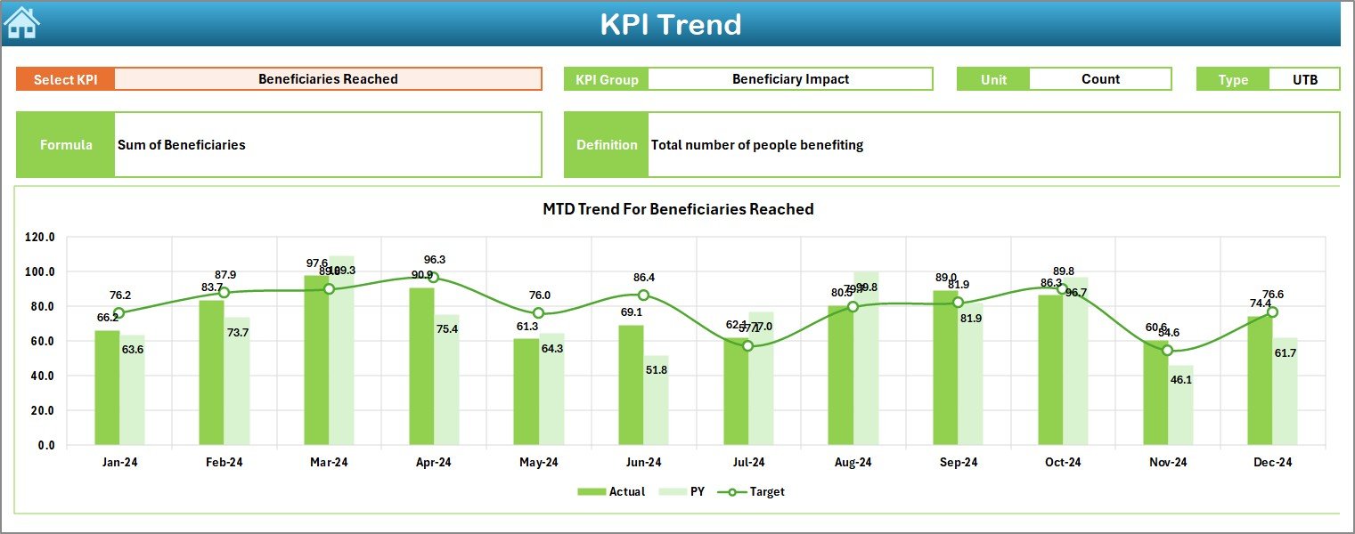
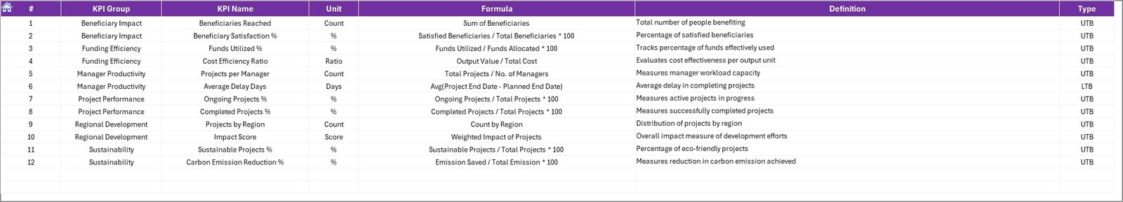
KPI Trend Sheet Tab
The KPI Trend Sheet focuses on individual KPI analysis.
Users can choose any KPI from a dropdown list (Cell C3) to explore its details and historical performance.
Displayed information includes:
- KPI Group (Category or Domain)
- Unit of Measurement
- Type of KPI — Upper the Better (UTB) or Lower the Better (LTB)
- Formula used to calculate the KPI
- Definition for clarity and transparency
Additionally, it includes MTD and YTD trend charts for Actual, Target, and Previous Year data, making it easier to identify performance patterns.
Click to buy International Development KPI Dashboard in Excel
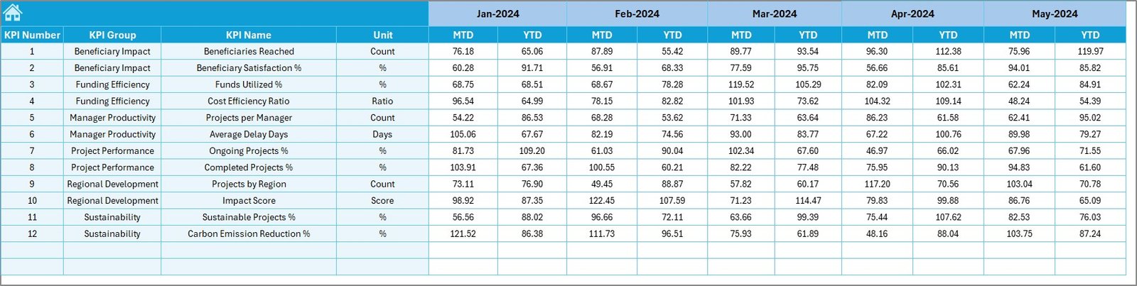
Actual Numbers Input Sheet
This sheet is where the monthly actual data is entered.
You can select the month from Cell E1, which defines the data period.
Here, the user records:
- MTD (Month-to-Date) Actuals
- YTD (Year-to-Date) Actuals
Click to buy International Development KPI Dashboard in Excel
Target Sheet Tab
Targets form the foundation of performance measurement.
In the Target Sheet, users input the monthly and yearly targets for each KPI.
This enables performance comparison against planned objectives.
For example:
- If the KPI is “Number of Beneficiaries Reached,” the target might be 10,000 for the month.
- If the actual value is 9,500, the dashboard will show a downward red arrow, signaling a minor gap.
Click to buy International Development KPI Dashboard in Excel
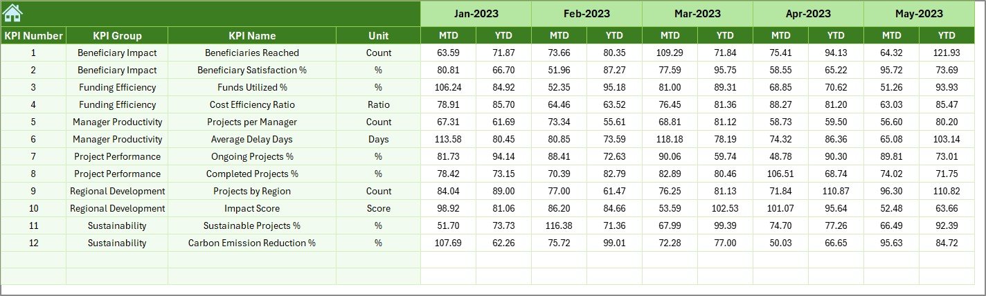
Previous Year Number Sheet Tab
This sheet maintains historical data from the previous year for benchmarking purposes.
It mirrors the structure of the Actual Numbers and Target sheets.
By comparing this data, you can evaluate growth trends, year-over-year improvements, and sustainability of outcomes.
KPI Definition Sheet Tab
Transparency in KPI interpretation is crucial for development reporting.
The KPI Definition Sheet lists all metrics along with:
- KPI Name
- KPI Group (e.g., Education, Health, Livelihood, etc.)
- Unit of Measurement
- Formula Used
- Short Definition
Click to buy International Development KPI Dashboard in Excel
📘 This acts as a “reference library” for anyone using or auditing the dashboard.
Key Features of the Dashboard
Here’s a summary of the standout features that make this dashboard unique and powerful:
Interactive Month Selector: View data for any month with just one click.
Conditional Formatting: Up/down arrows automatically display performance trends.
Auto-Updating Charts: All charts and metrics update based on user selection.
MTD and YTD Analysis: Quickly analyze both monthly and yearly performance.
Structured Data Entry: Clearly separated input sheets for Actual, Target, and Previous Year data.
Professional Layout: Clean, intuitive, and visually appealing design.
No Coding Required: 100% Excel-based — no VBA or add-ins necessary.
KPI Reference Table: Comprehensive KPI definitions for consistent understanding.
Why International Development Organizations Need KPI Dashboards
Monitoring large-scale development projects across multiple countries and regions can be overwhelming.
An Excel-based KPI dashboard bridges the gap between complex data and practical decision making.
It enables teams to:
- Improve transparency with donors and partners
- Identify underperforming projects early
- Compare regional performance
- Track beneficiary impact metrics
- Ensure timely reporting and compliance
📊 For NGOs, UN agencies, and international aid organizations, such dashboards are essential tools for accountability and success measurement.
Advantages of the International Development KPI Dashboard in Excel
Let’s explore the key advantages in detail:
- Centralized Performance Tracking
You can track all project KPIs — from education to healthcare — in one place.
This saves time and eliminates data silos.
- Visual Data Insights
Color-coded visuals and dynamic charts make the data easy to interpret.
Even non-technical stakeholders can instantly see where attention is needed.
- Improved Accountability
Transparent metrics help hold teams and partners accountable for results.
You can easily share dashboard summaries during donor reviews.
- Data-Driven Decisions
The ability to compare Actual vs Target vs Previous Year ensures decisions are based on evidence, not assumptions.
- Flexibility and Customization
Since it’s built in Excel, you can easily add new KPIs, modify formulas, or integrate with other data sources.
- No Software Dependency
You don’t need any external software or subscription.
Everything runs within Microsoft Excel, making it cost-effective and portable.
How to Use the International Development KPI Dashboard
Follow these simple steps to get started:
- Open the Home Sheet.
Use the navigation buttons to explore different sections. - Enter Actual Data.
Go to the “Actual Numbers Input” sheet and fill in MTD and YTD figures. - Set Targets.
In the “Target Sheet,” input performance goals for each KPI. - Enter Previous Year Data.
Add past values for accurate comparisons. - Define KPIs.
Update or review KPI definitions in the “KPI Definition Sheet.” - Analyze Results.
Visit the “Dashboard” tab to visualize overall performance, trends, and gaps. - Drill Down by KPI.
Use the “KPI Trend Sheet” for individual KPI tracking and trend analysis.
🧠 Insights You Can Gain from the Dashboard
The dashboard allows you to discover answers to important questions such as:
- Which regions or projects are meeting their KPIs?
- Which KPIs are showing declining trends compared to last year?
- Are targets realistic or need adjustment?
- What is the overall success rate of ongoing programs?
- How can limited resources be better allocated?
📊 Having these insights empowers leaders to act quickly and effectively.
Best Practices for the International Development KPI Dashboard
To get the most from your dashboard, follow these best practices:
Define Clear and Measurable KPIs
Ensure every KPI is linked to your organization’s strategic goals.
Avoid vague or overlapping metrics.
Maintain Data Accuracy
Always validate your input data before analysis.
Inaccurate data leads to misleading conclusions.
Regularly Update the Dashboard
Set a fixed schedule (e.g., monthly) for data entry and review.
Consistency keeps reports reliable.
Use Visual Cues Wisely
Apply color codes and arrows only where they add meaning.
Avoid visual clutter.
Keep KPI Definitions Updated
Whenever you modify formulas or measurement methods, update the KPI Definition Sheet to maintain transparency.
Back Up Your Data
Maintain backup copies of your dashboard to prevent accidental data loss.
Train Your Team
Ensure all users understand how to enter data correctly and interpret the dashboard outputs.
Conclusion
The International Development KPI Dashboard in Excel is more than just a reporting tool — it’s a strategic decision-support system.
It empowers organizations to monitor progress, enhance accountability, and ensure every dollar and effort contributes to sustainable outcomes.
By simplifying performance tracking, this dashboard helps international development professionals visualize impact, optimize resources, and achieve long-term goals efficiently.
Whether you’re managing education programs in Africa, health initiatives in Asia, or environmental projects worldwide — this Excel dashboard gives you the clarity and confidence to lead with data.
Frequently Asked Questions (FAQs)
- What types of organizations can use this dashboard?
Any organization involved in international or community development — including NGOs, donor agencies, government programs, and UN bodies — can use it.
- Do I need advanced Excel skills to use this dashboard?
Not at all. The dashboard is beginner-friendly and includes dropdowns and automatic updates.
- Can I customize the KPIs?
Yes. You can add or remove KPIs easily by updating the KPI Definition and related sheets.
- Does the dashboard work in Google Sheets?
It’s primarily designed for Excel, but it can also be adapted to Google Sheets with minimal adjustments.
- How often should I update the data?
Ideally, update the dashboard monthly to ensure your reports stay accurate and relevant.
- Can I share the dashboard with my team?
Yes. You can share the Excel file via email, shared drive, or OneDrive for collaborative analysis.
- What makes this dashboard better than other tools?
Unlike complex software systems, this Excel dashboard is cost-effective, easy to maintain, and fully transparent — making it perfect for development organizations with limited technical resources.
Visit our YouTube channel to learn step-by-step video tutorials
Watch the step-by-step video tutorial:
Click to buy International Development KPI Dashboard in Excel