Employee onboarding plays a crucial role in shaping the experience of new hires. A well-structured onboarding process helps employees feel welcomed, informed, and prepared to succeed in their new roles. However, measuring the effectiveness of onboarding can be challenging without the right tools.
That’s where the Onboarding Effectiveness KPI Dashboard in Excel comes in — a comprehensive and data-driven solution designed to track, measure, and optimize every aspect of your onboarding program. This dashboard gives HR leaders, training managers, and business executives a clear picture of how efficiently new employees are being integrated into the organization.
In this article, you’ll learn everything about the dashboard — its structure, key features, benefits, and best practices — so you can make onboarding a measurable and strategic success factor in your organization.
Click to buy Onboarding Effectiveness KPI Dashboard in Excel
What Is the Onboarding Effectiveness KPI Dashboard in Excel?
The Onboarding Effectiveness KPI Dashboard in Excel is a ready-to-use analytics tool designed to monitor the performance and outcomes of the onboarding process. It helps HR professionals visualize and analyze key performance indicators (KPIs) related to employee integration, training completion, satisfaction, and retention.
Built entirely in Microsoft Excel, this dashboard is both powerful and easy to use. It consolidates all onboarding metrics into one interactive interface with dynamic charts, progress indicators, and performance comparisons. Whether you are onboarding 10 employees or 1,000, this dashboard gives you real-time visibility into your HR onboarding success.
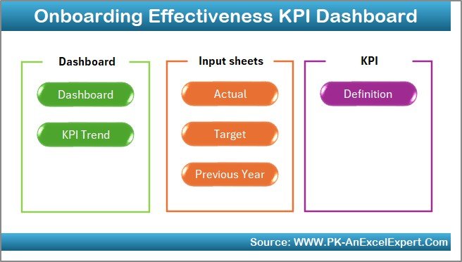
Structure of the Dashboard
This dashboard consists of seven interconnected worksheets, each serving a specific purpose. Together, they create a seamless workflow that simplifies data input, tracking, and reporting.
Home Sheet – The Command Center
The Home sheet serves as the dashboard’s main navigation panel. It includes six buttons that link to the other worksheet tabs — allowing you to move instantly between data entry, visualization, and trend analysis sections.
This structure ensures quick access and saves time when managing monthly reports or presenting onboarding results to management.
Click to buy Onboarding Effectiveness KPI Dashboard in Excel
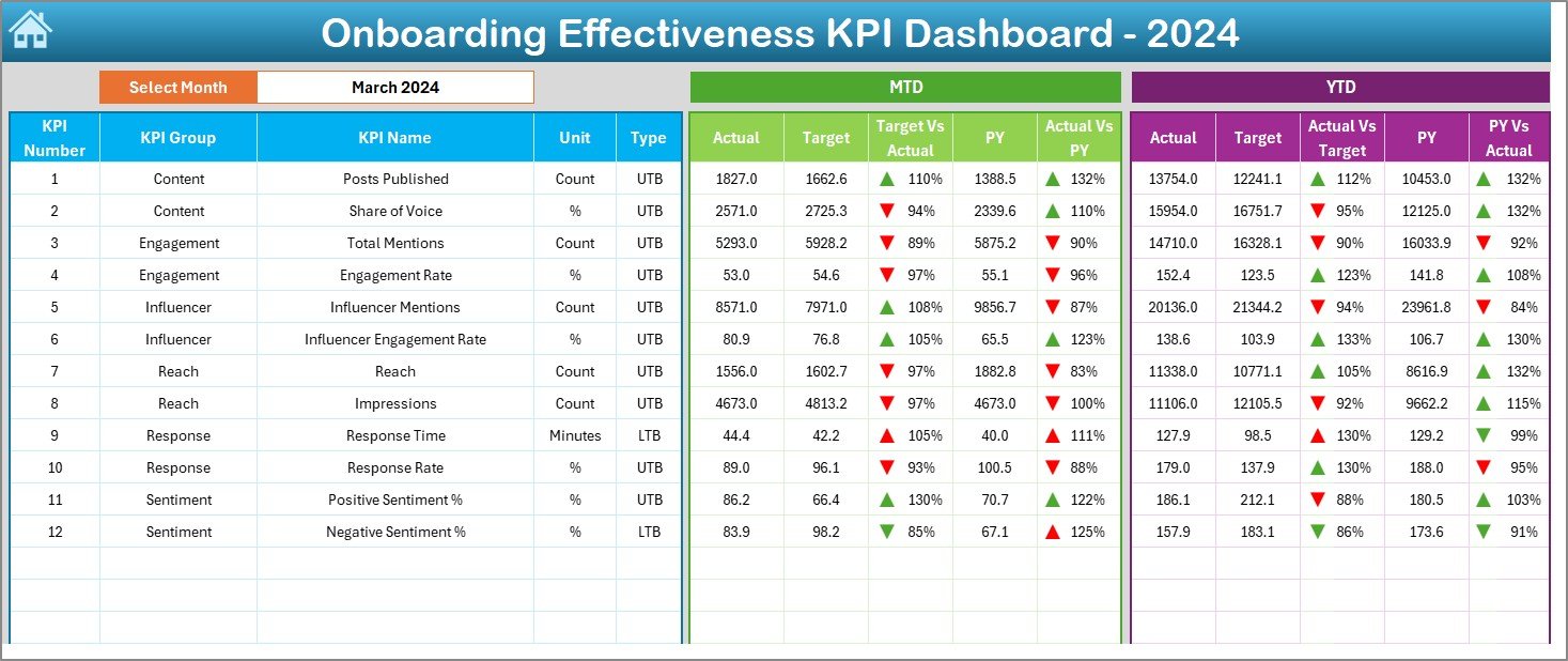
Dashboard Sheet – Visual Performance Overview
The Dashboard sheet is the core visualization tab. It provides a real-time snapshot of all onboarding KPIs through interactive charts, summary cards, and conditional formatting.
- The Month Selector (cell D3) lets you choose any month from a dropdown list. Once selected, all metrics automatically update.
- Key metrics include both MTD (Month-to-Date) and YTD (Year-to-Date) values.
- Each KPI compares Actual, Target, and Previous Year (PY) data side-by-side.
- Color-coded arrows show whether performance has improved or declined versus targets and historical data.
This design makes it easy to identify trends, performance gaps, and areas needing improvement in the onboarding process.
Click to buy Onboarding Effectiveness KPI Dashboard in Excel
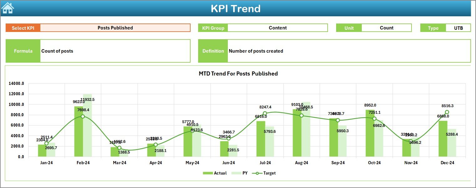
KPI Trend Sheet – Deep Dive into Each KPI
The KPI Trend Sheet provides an in-depth view of individual KPI performance over time. You can select a KPI name using the dropdown menu (cell C3), and the dashboard instantly updates with trend charts and definitions.
Here’s what it displays:
- KPI Group and Unit: Categorizes each metric logically.
- KPI Type: Indicates if “Lower the Better (LTB)” or “Upper the Better (UTB).”
- Formula and Definition: Offers clarity on how each KPI is calculated.
- Trend Charts: Compare MTD, YTD, Target, and Previous Year data visually.
This page helps HR analysts and business leaders identify patterns in onboarding performance and measure improvement across months or years.
Click to buy Onboarding Effectiveness KPI Dashboard in Excel
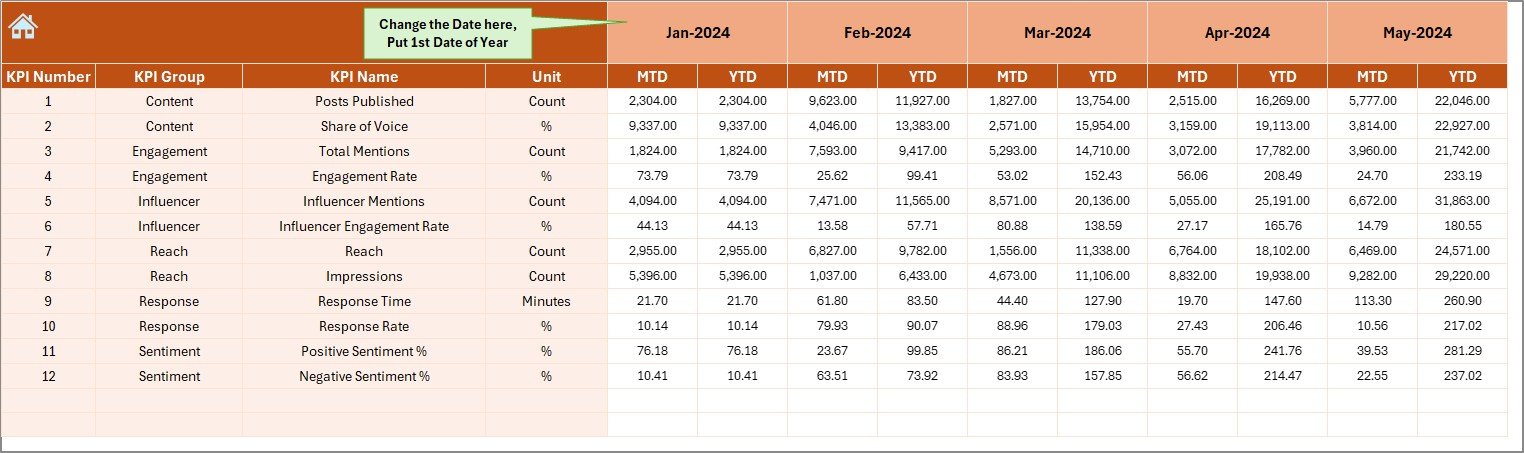
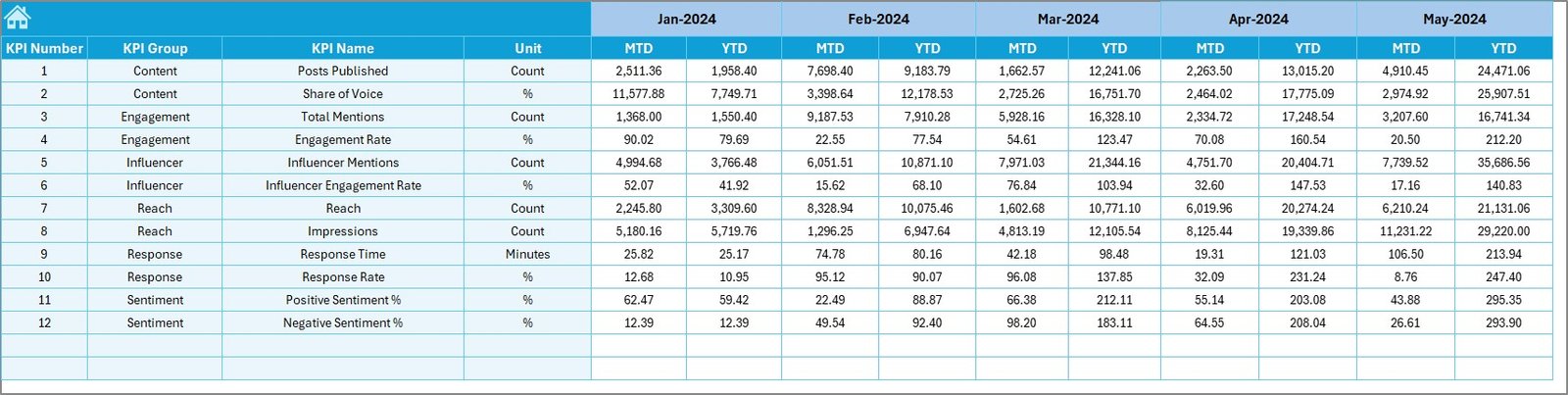
Actual Numbers Input Sheet – Data Entry Made Easy
The Actual Numbers Input sheet is where you record real-world onboarding data. It supports both MTD and YTD inputs for every KPI and month.
You can control which month starts the reporting year by changing the value in cell E1. Once configured, the entire dashboard aligns accordingly. This makes the system flexible for organizations that follow fiscal years different from the calendar year.
Target Sheet – Setting Goals
Every performance dashboard needs benchmarks. The Target Sheet lets you define target values for each KPI on a monthly basis.
By comparing actual onboarding results against these targets, HR leaders can evaluate whether the process is meeting expectations and identify areas that need improvement — such as reducing the time-to-productivity or increasing training completion rates.
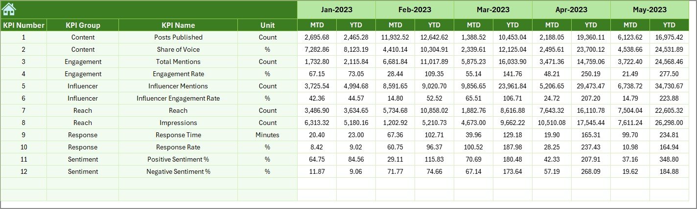
Previous Year Number Sheet – Historical Benchmarking
The Previous Year Sheet stores data from the prior year, enabling accurate year-over-year comparisons.
By analyzing how onboarding KPIs have changed over time, the dashboard helps organizations determine whether new HR strategies, onboarding content, or technology improvements have produced measurable gains.
KPI Definition Sheet – Reference Hub
This sheet provides a centralized record of all KPIs used in the dashboard, including:
- KPI Name
- KPI Group
- Unit
- Formula
- Definition
It’s a vital documentation hub that ensures everyone — from HR specialists to senior management — understands what each KPI represents and how it’s calculated.
Key KPIs Tracked in the Dashboard
While the dashboard is customizable, here are some of the most common KPIs it can track to measure onboarding effectiveness:
- New Hire Retention Rate (%) – Measures how many employees stay beyond the first 90 days.
- Training Completion Rate (%) – Tracks the percentage of new hires completing required training.
- Time-to-Productivity (Days) – Measures how quickly new employees reach full performance levels.
- New Hire Satisfaction Score (%) – Captures feedback from post-onboarding surveys.
- Manager Satisfaction Score (%) – Evaluates how satisfied managers are with the readiness of new hires.
- Cost per Onboarded Employee (USD) – Calculates onboarding expenses per new hire.
- Onboarding Task Completion % – Tracks administrative tasks completed by HR and new hires.
- First-Year Turnover % – Measures how many employees leave within the first year.
- Average Training Hours per New Hire – Tracks the amount of time spent in onboarding programs.
Why Use an Onboarding KPI Dashboard?
- Centralized Insights
All onboarding data — from performance scores to cost metrics — is captured in one Excel file. This eliminates manual reporting and ensures everyone uses the same source of truth.
- Time Savings
Automated updates and dynamic charts reduce reporting time dramatically. HR teams can focus more on improving onboarding experiences instead of preparing reports.
- Data-Driven Decision Making
By visualizing key trends, HR leaders can make informed decisions backed by real data rather than assumptions.
- Continuous Improvement
Comparing actual performance against targets and historical data helps identify improvement areas, leading to more efficient and effective onboarding processes.
Advantages of the Onboarding Effectiveness KPI Dashboard in Excel
Let’s explore the major advantages of using this dashboard in your HR workflow:
1. Real-Time Performance Visibility
Get instant insight into how well new employees are adapting and performing. This helps HR teams take timely action to address issues before they escalate.
2. Improved Employee Experience
By tracking metrics like satisfaction and training completion, HR managers can ensure every new hire has a smooth transition into the organization.
3. Cost Optimization
Monitor onboarding costs closely to allocate resources more effectively. This can significantly reduce unnecessary expenses while improving results.
4. Better Accountability
Each KPI is linked to specific ownership — HR teams, managers, or trainers — creating transparency and accountability.
5. Historical Benchmarking
With year-over-year analysis, organizations can measure progress and demonstrate the impact of strategic onboarding initiatives.
6. Customizable and Scalable
Because it’s built in Excel, you can modify KPIs, visuals, and structure to fit your organization’s unique needs without coding knowledge.
How to Use the Dashboard Effectively
Here’s a step-by-step guide to get started with the Onboarding Effectiveness KPI Dashboard in Excel:
- Set Up Your Year:
Enter the first month of your reporting year in the Actual Numbers Input Sheet (cell E1). - Input Data:
Fill in the MTD and YTD actuals for each KPI based on your onboarding records. - Enter Targets:
Open the Target Sheet and define expected KPI values for each month. - Add Historical Data:
Copy data from the previous year into the Previous Year Sheet for performance comparison. - Review KPI Definitions:
Make sure all KPI formulas and definitions in the KPI Definition Sheet match your company’s standards. - Analyze the Dashboard:
Use the Dashboard and KPI Trend sheets to review insights and identify areas for improvement.
Best Practices for Using the Onboarding KPI Dashboard
To get the most from your dashboard, follow these proven best practices:
- Standardize Data Entry: Ensure that every HR member uses consistent data formats and definitions.
- Update Monthly: Refresh actual data regularly to maintain accurate reporting.
- Align KPIs with Business Goals: Track only metrics that tie directly to your onboarding and retention strategy.
- Visualize Progress: Use conditional formatting and charts to make trends easily understandable.
- Use Filters and Slicers Wisely: Keep filters simple for faster analysis and cleaner visuals.
- Conduct Quarterly Reviews: Evaluate trends and discuss improvement strategies in HR meetings.
Opportunities for Improvement
Even though this dashboard is powerful, here are some ideas to enhance it further:
- Integrate with HR Software: Link Excel to HR databases or Microsoft Power BI for live data updates.
- Add Automation Macros: Use VBA to generate monthly reports automatically.
- Include Predictive Analytics: Forecast onboarding success rates using historical trends.
- Add Employee Feedback Sections: Incorporate survey summaries for better qualitative analysis.
- Implement Conditional Alerts: Trigger warnings for low satisfaction or high turnover rates.
Conclusion
The Onboarding Effectiveness KPI Dashboard in Excel is more than just a reporting tool — it’s a performance management system for your onboarding process.
By transforming raw data into meaningful insights, it empowers HR teams to enhance efficiency, improve employee satisfaction, and optimize costs. Its simplicity, flexibility, and visual appeal make it an essential tool for modern HR management.
Whether you are a small business onboarding five employees or a large enterprise managing hundreds, this Excel-based dashboard helps you turn onboarding into a measurable, data-driven success story.
Frequently Asked Questions (FAQs)
- What is an Onboarding Effectiveness KPI Dashboard?
It’s a visual Excel-based tool that tracks and measures the success of new employee onboarding programs using KPIs like retention rate, satisfaction, and time-to-productivity.
- Who should use this dashboard?
HR managers, recruiters, training coordinators, and business leaders who want to analyze and improve onboarding outcomes.
- Can I customize the KPIs in this dashboard?
Yes! All KPIs, targets, and formulas are fully editable. You can easily tailor them to match your organization’s unique onboarding goals.
- Do I need Excel expertise to use it?
Not at all. The dashboard uses simple dropdowns and charts — no complex formulas or coding required.
- How often should I update the data?
It’s best to update the MTD and YTD actuals monthly for consistent, accurate insights.
- Can this dashboard integrate with other HR systems?
Yes. You can link it with tools like Power BI, HRIS, or Google Sheets for automated data refreshes and broader analytics.
- What KPIs are most useful for measuring onboarding success?
Some essential ones include training completion rate, time-to-productivity, new hire satisfaction, and first-year retention.
- Is this dashboard suitable for remote onboarding?
Absolutely. It can track metrics from both in-office and virtual onboarding programs, ensuring consistent analysis.
- How does the dashboard help improve onboarding programs?
By providing clear visibility into what’s working and what’s not, it helps HR teams refine training methods, improve communication, and increase retention.
- Where can I get this dashboard?
You can download the Onboarding Effectiveness KPI Dashboard in Excel from professional Excel template providers such as NextGenTemplates.com.
Visit our YouTube channel to learn step-by-step video tutorials
Watch the step-by-step video tutorial:
Click to buy Onboarding Effectiveness KPI Dashboard in Excel
