In today’s fast-paced business world, teamwork defines success. Organizations that foster collaboration achieve higher productivity, better innovation, and stronger employee satisfaction. However, without a clear way to measure collaboration effectiveness, even the best teams struggle to sustain consistent performance.
That’s where the Team Collaboration KPI Dashboard in Power BI comes in. This powerful tool provides data-driven insights into how well your teams communicate, coordinate, and deliver results. It transforms raw data into interactive visuals—helping leaders track performance, identify gaps, and improve collaboration strategies across departments.
Built in Microsoft Power BI and powered by Excel data, this dashboard is a ready-to-use, intuitive solution designed for managers, HR professionals, and project leaders who want to strengthen teamwork and achieve measurable results.
Click to buy Team Collaboration KPI Dashboard in Power BI
What Is a Team Collaboration KPI Dashboard in Power BI?
A Team Collaboration KPI Dashboard is an interactive reporting system that tracks, measures, and visualizes performance indicators related to collaboration.
Instead of relying on assumptions or manual reports, this dashboard provides a clear, visual picture of team performance using KPIs such as:
- Team engagement rate
- Task completion ratio
- Communication effectiveness
- Project delivery accuracy
- Cross-departmental collaboration index
By consolidating this information, it helps decision-makers identify bottlenecks, optimize workflows, and promote a culture of transparent, data-backed teamwork.
⚙️ Key Features of the Team Collaboration KPI Dashboard in Power BI
The dashboard includes three main pages inside the Power BI file and uses Excel sheets as its backend data source. Let’s explore each in detail.
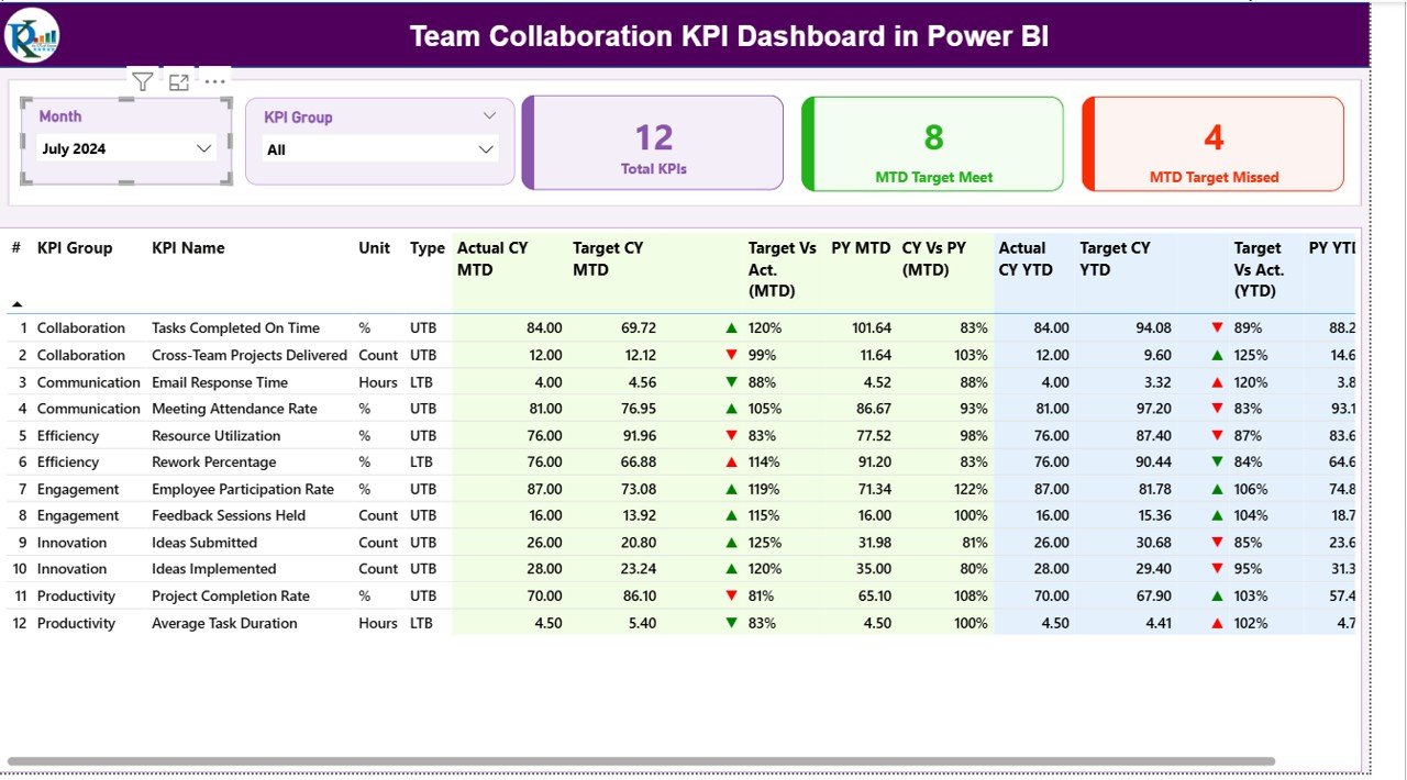
Summary Page – The Command Center of Collaboration
The Summary Page acts as the main control panel. It offers an overall view of KPI performance with visual indicators and slicers that let users filter by month or KPI group.
Key Elements:
Slicers for Dynamic Filtering:
Choose a specific month or KPI group to view targeted performance data instantly.
- Performance Cards:
- Total KPIs Count – Displays how many KPIs are being tracked.
- MTD Target Met Count – Shows how many KPIs met their month-to-date goals.
- MTD Target Missed Count – Shows KPIs that fell short of expectations.
- Detailed KPI Table:
Each row provides essential metrics such as KPI number, group, unit, and performance indicators like: - Actual CY MTD: Current Year’s Month-to-Date Actual Value
- Target CY MTD: Target Value for the same period
- MTD Icon: Red ▼ or green ▲ icon to indicate performance status
- Target vs Actual (MTD): Ratio of actual vs target for MTD values
- Previous Year (PY) MTD: Comparison metric from the same month last year
- CY vs PY (MTD): Growth percentage vs last year’s MTD
- Actual CY YTD & Target CY YTD: Year-to-Date actual and target comparisons
- YTD Icon: Visual status of performance
- Target vs Actual (YTD): Ratio of actual vs target YTD
- CY vs PY (YTD): Growth comparison vs last year’s YTD numbers
- These visual and numeric indicators help managers quickly assess whether collaboration KPIs are on track or need improvement.
Click to buy Team Collaboration KPI Dashboard in Power BI
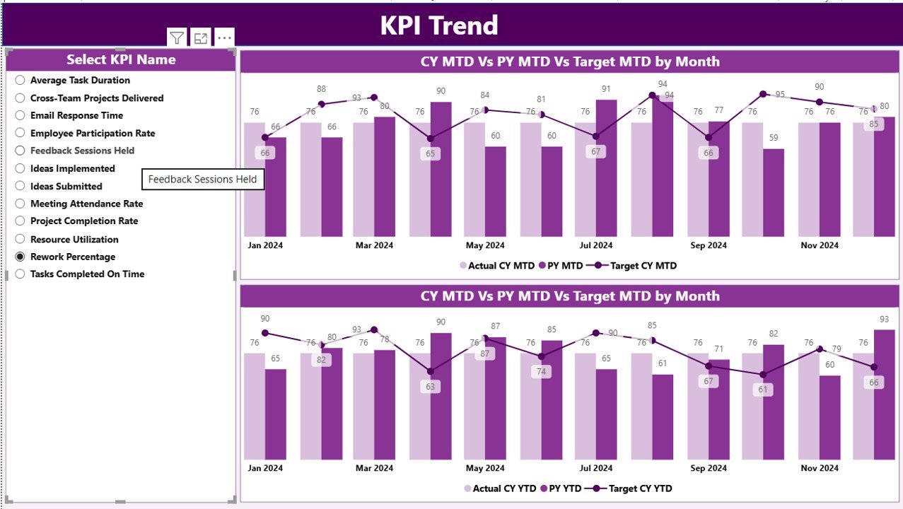
KPI Trend Page – Visualizing Progress Over Time
This page focuses on trends and comparisons. It includes two combo charts that display Actual, Target, and Previous Year data for both MTD and YTD.
Key Features:
- A slicer on the left lets users pick a specific KPI to analyze.
- Combo charts combine bars (for targets) and lines (for actual performance) to highlight differences over time.
- Trend visualization helps identify whether performance is improving, stagnating, or declining.
This page is particularly valuable for HR and project leads who want to monitor progress and forecast future performance patterns.
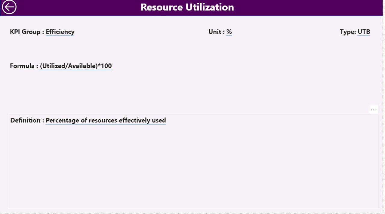
KPI Definition Page – The Behind-the-Scenes Logic
This hidden drill-through page provides detailed definitions for each KPI. From the summary page, users can right-click and drill through to see:
- KPI Formula
- KPI Definition
- KPI Type (UTB – Upper the Better or LTB – Lower the Better)
A back button on the top-left allows users to return easily to the main page.
This feature ensures transparency and helps users understand how each KPI is calculated, reducing confusion and promoting consistent performance interpretation.
Excel Data Structure Behind the Dashboard
The dashboard’s flexibility lies in its structured Excel data source. It includes three key sheets:
Input_Actual Sheet
Here, users fill in:
- KPI Name
- Month (first date of each month)
- MTD Value
- YTD Value
This sheet captures actual performance data for each KPI.
Input_Target Sheet
This sheet records the target numbers for each KPI, with the same structure as the actuals. Maintaining identical columns ensures smooth Power BI data mapping.
KPI Definition Sheet
Here, users define each KPI, including:
- KPI Number
- KPI Group
- KPI Name
- Unit
- Formula
- Definition
- Type (LTB/UTB)
Together, these three sheets serve as the foundation of the Power BI dashboard, allowing automatic refresh and seamless updates whenever new data is entered.
Advantages of the Team Collaboration KPI Dashboard in Power BI
- Enhanced Visibility and Accountability
- Managers can monitor real-time collaboration performance, ensuring every department remains aligned with company goals.
- Improved Decision-Making
- The dashboard translates raw numbers into actionable visuals. Trends and comparisons help leaders make informed, timely decisions.
- Time Efficiency
- Instead of manually compiling reports, Power BI automates data aggregation and visualization—saving countless hours every month.
- Promotes Transparency
- Team members can clearly see where their efforts stand compared to set targets. This transparency encourages ownership and continuous improvement.
- Supports Continuous Improvement
- By comparing MTD and YTD results with previous year data, organizations can identify performance gaps and adopt strategies to enhance teamwork efficiency.
- Scalable and Customizable
- Since the data source is Excel, users can easily add or modify KPIs, adjust definitions, or connect to different departments without rebuilding the entire dashboard.
🧠 How to Use the Dashboard Effectively
To gain maximum value, follow these steps:
- Prepare the Excel Files:
Fill in the Actual, Target, and Definition sheets with clean, accurate data. - Load Data into Power BI:
Connect your Excel file as a data source and ensure relationships between sheets are defined properly. - Refresh Regularly:
Update your Excel sheets monthly or weekly. Refresh Power BI to pull in the latest numbers. - Use Slicers Wisely:
Filter by Month or KPI Group to zoom into specific areas that need attention. - Drill Through for Details:
Use the KPI Definition page to clarify calculation logic when interpreting performance results. - Share Insights:
Publish the dashboard to Power BI Service and share interactive reports with teams and stakeholders.
Best Practices for the Team Collaboration KPI Dashboard in Power BI
- Define SMART KPIs
- Ensure every KPI is Specific, Measurable, Achievable, Relevant, and Time-bound. Clear definitions reduce ambiguity.
- Maintain Data Accuracy
- Regularly validate data in Excel. Inaccurate data leads to misleading visuals and poor decisions.
- Limit the Number of KPIs per View
- Displaying around 10 KPIs per page keeps the dashboard focused and readable.
- Use Consistent Units and Formats
- Standardize units (e.g., %, Hours, Count) across all KPIs to make comparisons intuitive.
- Color-Code Performance
- Use green for achievements, red for underperformance, and neutral colors for ongoing metrics to simplify visual interpretation.
- Leverage Drill-Throughs and Tooltips
- Provide definitions or explanations via tooltips or drill-through pages to keep visuals clean yet informative.
- Automate Refresh Schedules
- Set Power BI’s automatic refresh to ensure your dashboard always reflects the latest data without manual intervention.
Who Can Benefit from This Dashboard?
The Team Collaboration KPI Dashboard in Power BI is versatile and beneficial for many professionals:
- HR Managers: Track employee engagement, collaboration hours, and participation rates.
- Project Managers: Evaluate team performance across multiple projects.
- Department Heads: Identify which teams consistently meet targets and which need support.
- Executives: Monitor organizational collaboration at a high level to align with strategic objectives.
- Data Analysts: Use historical and comparative data to find patterns and insights for future planning.
Real-World Applications
- Corporate Teams: Monitor inter-departmental communication efficiency.
- Remote Work Environments: Track collaboration success across virtual teams.
- Project-Based Firms: Compare team delivery timelines versus planned schedules.
- Innovation Hubs: Measure idea contribution rates and teamwork effectiveness.
Conclusion
In the modern workplace, collaboration is more than just teamwork—it’s the driving force behind innovation and growth. The Team Collaboration KPI Dashboard in Power BI helps organizations transform collaboration data into actionable insights.
By tracking, analyzing, and visualizing collaboration KPIs, businesses can strengthen communication, boost productivity, and ensure every team moves toward common goals. With Power BI’s interactive visuals and Excel integration, this dashboard makes performance management not only simple but also effective.
Whether you’re leading a small team or managing a large enterprise, this tool offers the clarity you need to inspire, evaluate, and elevate your team’s collaborative success.
Frequently Asked Questions (FAQs)
- What is the main purpose of the Team Collaboration KPI Dashboard in Power BI?
The main purpose is to track and visualize key performance indicators related to team collaboration—helping managers assess communication, engagement, and performance.
- How is the data managed in this dashboard?
The dashboard connects to an Excel data source containing three sheets: Actuals, Targets, and KPI Definitions. Updates to Excel automatically reflect in Power BI after refresh.
- Can I add more KPIs to the dashboard?
Yes. Simply add new KPI entries in the Excel sheets, and Power BI will update visuals accordingly once you refresh the dataset.
- Is this dashboard suitable for non-technical users?
Absolutely. It’s built with user-friendly visuals, dropdown filters, and drill-through options, making it ideal for HR and management professionals.
- How often should I update the data?
Most organizations refresh the data monthly or weekly, depending on reporting frequency and KPI requirements.
- Can this dashboard track multiple departments?
Yes. With KPI groups and slicers, you can monitor multiple departments or teams separately and compare their performance.
- Is customization possible?
Definitely. You can modify visuals, colors, or formulas to align with your organization’s reporting standards.
Visit our YouTube channel to learn step-by-step video tutorials
Watch the step-by-step video tutorial:
Click to buy Team Collaboration KPI Dashboard in Power BI