The textiles and apparel manufacturing industry operates in a fast-moving, cost-sensitive, and highly competitive environment. Every day, manufacturers track production volumes, unit costs, selling prices, regional demand, and monthly trends. However, when teams manage this data across multiple spreadsheets, reports quickly become slow, confusing, and error-prone.
Therefore, a Textiles & Apparel Manufacturing Dashboard in Power BI becomes a powerful solution. It transforms raw manufacturing data into interactive visuals, KPI cards, and drill-down analysis. Moreover, it helps management understand performance instantly and act faster.
In this in-depth article, you will learn what a Textiles & Apparel Manufacturing Dashboard in Power BI is, why it matters, how it works, its structure, key pages, advantages, best practices, and frequently asked questions. Additionally, this guide explains how a 5-page Power BI dashboard supports smarter operational and financial decisions.
Click to Purchases Textiles & Apparel Manufacturing Dashboard in Power BI
What Is a Textiles & Apparel Manufacturing Dashboard in Power BI?
A Textiles & Apparel Manufacturing Dashboard in Power BI is an interactive business intelligence tool that consolidates production, cost, pricing, and sales data into a single visual platform. Instead of manually reviewing rows of data, decision-makers see trends, comparisons, and KPIs in real time.
Moreover, Power BI allows users to apply slicers, filters, and drill-downs. As a result, managers analyze data by plant, product type, product category, region, and month without rewriting reports.
Why Do Textile and Apparel Manufacturers Need a Dashboard?
Textile and apparel businesses face constant pressure to control costs while maintaining quality and speed. Therefore, leaders must answer questions quickly, such as:
-
Which plant produces at the lowest cost per unit?
-
Which product category generates the highest production cost?
-
How does selling price vary by region?
-
Which months show rising or falling unit costs?
A Power BI dashboard answers these questions instantly and visually.
How Does a Textiles & Apparel Manufacturing Dashboard in Power BI Work?
A typical dashboard workflow follows a clear and structured process:
-
Data Collection
Manufacturers capture production, cost, pricing, and sales data in Excel or databases. -
Data Modeling in Power BI
Power BI cleans, transforms, and relates data tables for accurate analysis. -
KPI and Measure Creation
Metrics such as cost per unit, production cost, and selling price get calculated using DAX. -
Dashboard Visualization
Charts, cards, and slicers display insights across multiple analytical pages. -
Decision-Making
Managers use insights to reduce cost, optimize pricing, and improve profitability.
Because of this flow, Power BI becomes a central decision-support system.
What Is the Structure of the Textiles & Apparel Manufacturing Dashboard in Power BI?
This dashboard contains 5 well-designed analytical pages, each focusing on a specific business perspective. Let’s explore each page in detail.
1. Overview Page: How Do You Track Overall Performance at a Glance?
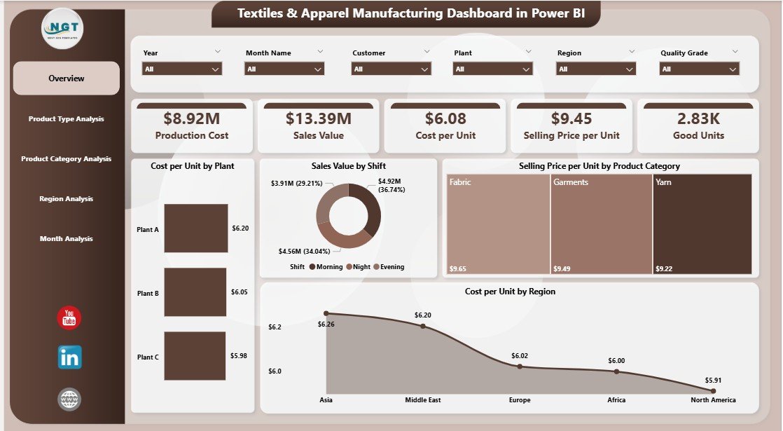
The Overview Page serves as the entry point for the entire dashboard. It provides a high-level summary of manufacturing and sales performance.
Key Features of the Overview Page
-
Slicers (Filters)
Users filter data by dimensions such as plant, product category, region, or time period. -
KPI Cards and Charts
-
Cost per Unit by Plant – Compares manufacturing efficiency across plants.
-
Sales Value by Shift – Highlights revenue contribution by production shift.
-
Selling Price per Unit by Product Category – Shows pricing trends across categories.
-
Cost per Unit by Region – Reveals regional cost differences.
-
Why Is the Overview Page Important?
Because it delivers instant clarity. Instead of opening multiple reports, decision-makers see performance in seconds and identify areas that need attention.
2. Product Type Analysis: Which Product Types Drive Cost and Efficiency?
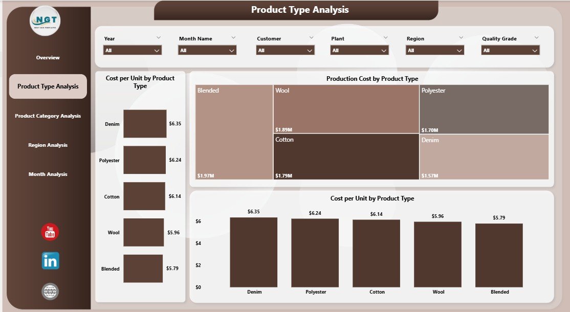
The Product Type Analysis Page focuses on understanding cost behavior across different product types, such as yarn, fabric, garments, or accessories.
Key Visuals on the Product Type Analysis Page
-
Cost per Unit by Product Type
-
Production Cost by Product Type
-
Cost per Unit Trend by Product Type
Business Value of This Page
This page helps manufacturers:
-
Identify high-cost product types.
-
Compare profitability between product lines.
-
Optimize production planning and resource allocation.
As a result, businesses improve margins while maintaining quality.
3. Product Category Analysis: How Do Categories Impact Cost Performance?
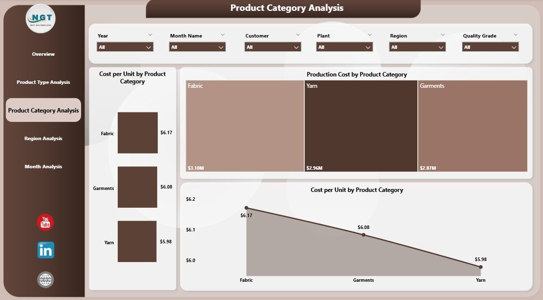
The Product Category Analysis Page breaks down performance by categories such as cotton, polyester, blended fabrics, casual wear, or formal wear.
Key Charts Included
-
Cost per Unit by Product Category
-
Production Cost by Product Category
-
Cost per Unit Trend by Product Category
Why Product Category Analysis Matters
Because category-level insights help teams:
-
Control material and labor costs.
-
Adjust pricing strategies.
-
Identify categories that need process improvement.
Therefore, category analysis directly supports profitability optimization.
Click to Purchases Textiles & Apparel Manufacturing Dashboard in Power BI
4. Region Analysis: How Does Performance Vary Across Regions?
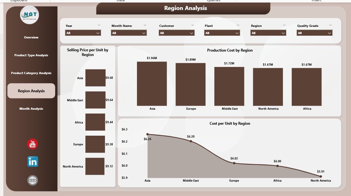
The Region Analysis Page focuses on geographical performance, which is critical for global or multi-location manufacturers.
Charts on the Region Analysis Page
-
Selling Price per Unit by Region
-
Production Cost by Region
-
Cost per Unit by Region
Key Insights from Regional Analysis
Using this page, businesses can:
-
Compare regional cost structures.
-
Identify high-margin markets.
-
Adjust supply chain and logistics strategies.
As a result, manufacturers make informed expansion and pricing decisions.
5. Month Analysis: How Do Costs and Prices Change Over Time?
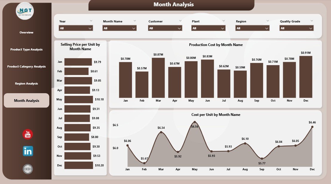
The Month Analysis Page tracks trends over time, enabling better forecasting and planning.
Charts Included
-
Selling Price per Unit by Month
-
Production Cost by Month
-
Cost per Unit by Month
Why Monthly Analysis Is Essential
Because trends reveal:
-
Seasonal cost fluctuations.
-
Demand cycles.
-
Opportunities for cost optimization.
Therefore, monthly insights support accurate budgeting and forecasting.
Advantages of a Textiles & Apparel Manufacturing Dashboard in Power BI
Why Should Manufacturers Use This Dashboard?
A Power BI dashboard delivers multiple business advantages:
-
📊 Centralized Reporting
All key metrics appear in one interactive platform. -
⚡ Faster Decision-Making
Visual insights replace manual analysis. -
💰 Improved Cost Control
Managers identify cost leaks quickly. -
🌍 Multi-Dimensional Analysis
Analyze by plant, product, category, region, and month. -
🔄 Real-Time Updates
Data refreshes keep insights current.
Because of these benefits, manufacturers gain a competitive edge.
Who Can Benefit from This Dashboard?
This dashboard supports multiple stakeholders:
-
Plant Managers – Track efficiency and cost per unit.
-
Operations Teams – Optimize production planning.
-
Finance Managers – Monitor cost and profitability.
-
Sales Teams – Analyze pricing trends by region.
-
Executives – Make strategic, data-driven decisions.
Best Practices for the Textiles & Apparel Manufacturing Dashboard in Power BI
Click to Purchases Textiles & Apparel Manufacturing Dashboard in Power BI
How Can You Maximize Dashboard Value?
Follow these best practices to achieve better results:
-
✅ Maintain Clean Data Sources
Ensure consistent product, category, and region naming. -
✅ Use Standard KPIs
Keep definitions consistent across plants and teams. -
✅ Design with Simplicity
Avoid overcrowding visuals. -
✅ Leverage Slicers Wisely
Use intuitive filters for faster analysis. -
✅ Review Monthly Trends Regularly
Spot issues early and take corrective action.
By following these practices, teams improve adoption and trust.
How Does Power BI Improve Textile Manufacturing Decision-Making?
Power BI converts data into stories. Instead of asking “what happened,” teams ask “why it happened” and “what to do next.” Moreover, interactive dashboards encourage collaboration across departments.
Because insights appear visually, non-technical users also understand performance quickly.
What Makes This Dashboard Better Than Traditional Excel Reports?
While Excel remains useful, Power BI offers clear advantages:
-
Interactive visuals instead of static charts
-
Faster filtering and drill-downs
-
Better performance with large datasets
-
Centralized sharing and access control
Therefore, Power BI suits growing manufacturing operations.
How Can You Customize This Dashboard for Your Business?
Customization options include:
-
Adding new KPIs
-
Creating plant-specific views
-
Integrating inventory or quality metrics
-
Automating data refresh schedules
As a result, the dashboard evolves with your business needs.
Conclusion: Why Is a Textiles & Apparel Manufacturing Dashboard in Power BI a Smart Investment?
A Textiles & Apparel Manufacturing Dashboard in Power BI transforms complex production and cost data into clear, actionable insights. It helps manufacturers reduce costs, optimize pricing, and improve operational efficiency.
Moreover, with five dedicated analytical pages—Overview, Product Type, Product Category, Region, and Month Analysis—this dashboard delivers a complete performance picture. Therefore, it supports smarter, faster, and more confident decisions across the organization.
Frequently Asked Questions (FAQs)
What data is required for a Textiles & Apparel Manufacturing Dashboard in Power BI?
You need production cost, selling price, product details, region data, and time-based records.
Can small textile manufacturers use this dashboard?
Yes. Small and mid-sized manufacturers benefit significantly from centralized insights.
Does this dashboard support real-time data updates?
Yes. Power BI supports scheduled and real-time data refresh.
Can this dashboard replace manual reports?
Absolutely. It reduces manual reporting effort and improves accuracy.
Is Power BI suitable for multi-plant manufacturing operations?
Yes. Power BI handles large datasets and multi-location analysis efficiently.
Visit our YouTube channel to learn step-by-step video tutorials