International development teams deal with complex projects, strict timelines, donor expectations, and multi-country operations. They track financial progress, monitor program efficiency, measure impact, and evaluate field performance every month. Because these activities move fast, teams need reliable tools to stay informed. A International Development KPI Dashboard in Power BI solves this challenge. It brings every KPI into one dashboard, helps you measure performance in real time, and supports better decisions across global programs.
This guide explains everything about this dashboard—its structure, worksheets, advantages, best practices, FAQs, and more. You will also learn how the dashboard works inside Power BI and how teams can use it to improve performance at every level.
Click to buy International Development KPI Dashboard in Power BI
What Is an International Development KPI Dashboard in Power BI?
An International Development KPI Dashboard in Power BI is a ready-to-use reporting solution that tracks key performance indicators across development programs, donor projects, aid operations, community programs, budgeting activities, and field performance. It converts raw numbers from Excel into clean visuals that update in just one click.
International development teams use this dashboard to monitor:
- Program efficiency
- Fund utilization
- Community outreach
- Compliance performance
- Project timelines
- Monitoring & evaluation (M&E) metrics
- Donor performance indicators
- Country-wise progress
The dashboard gives you MTD, YTD, targets, previous year numbers, and trends in a single place. As a result, project managers, program directors, field officers, and donor reporting teams can work faster and make informed decisions.
Why Do International Development Teams Need a KPI Dashboard?
Teams in this sector manage massive data sets. Every project generates numbers related to finance, staffing, community impact, activity timelines, partner performance, and risk areas. When teams use scattered spreadsheets or manual reports, they lose clarity. They struggle to track progress across locations. They also spend too much time merging data every month.
A Power BI dashboard solves these issues because:
- It brings all KPIs into one clean layout.
- It reduces human errors.
- It updates automatically.
- It highlights what works and what needs attention.
- It helps managers compare locations and programs instantly.
With this tool, your teams can focus on impact instead of data preparation.
Key Features of the International Development KPI Dashboard in Power BI
This dashboard includes 3 powerful pages, each designed for deep analysis. Every page captures MTD, YTD, target comparison, previous year comparison, and KPI definitions.
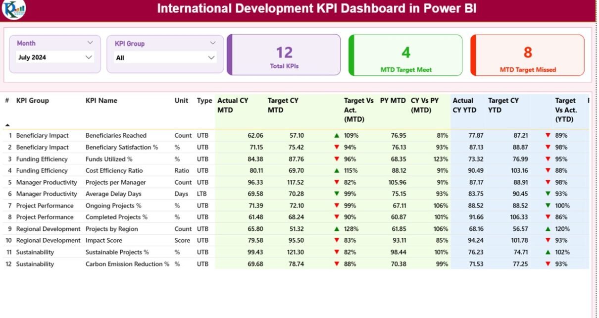
Summary Page – The Main Control Center
The Summary Page acts as the heart of the dashboard. You get slicers, cards, detailed KPI tables, and performance icons that help you understand monthly progress in seconds.
Key Features of the Summary Page
Month Slicer and KPI Group Slicer
These slicers sit on the top. They help users choose the reporting period and KPI category. Once you select a month, all numbers update across the entire dashboard.
Performance Cards
You get three cards on the top:
- Total KPIs Count
- MTD Target Met Count
- MTD Target Missed Count
These cards show how your KPIs perform at a glance.
Detailed KPI Table
The detailed table contains everything you need for analysis:
- KPI Number – The unique sequence number.
- KPI Group – The category or cluster.
- KPI Name – The specific metric you track.
- Unit – The measurement unit.
- Type – LTB (Lower the Better) or UTB (Upper the Better).
- Actual CY MTD – The current month’s actual value.
- Target CY MTD – The target value for the current month.
- MTD Icon – Arrow icons show performance (▲ = good, ▼ = poor).
- Target vs Actual (MTD) – Percentage using Actual/Target.
- PY MTD – The previous year’s month number.
- CY vs PY (MTD) – Comparison between current and previous year.
- Actual CY YTD – Current year cumulative value.
- Target CY YTD – Cumulative target value.
- YTD Icon – Arrow icons showing performance trend.
- Target vs Actual (YTD) – Percentage using Actual/Target.
- PY YTD – Previous year’s cumulative value.
- CY vs PY (YTD) – Comparison between current and previous year cumulative performance.
Every field helps users evaluate whether development programs move in the right direction.

Click to buy International Development KPI Dashboard in Power BI
KPI Trend Page – Deep Insights for Decision Making
The KPI Trend Page helps you understand long-term movement. It displays two combo charts—one for MTD and one for YTD.
What You See on This Page
- Actual CY numbers
- Actual PY numbers
- Target numbers
- A KPI name slicer on the left
This page supports long-term planning, donor reporting, and performance tracking at a deeper level.

Click to buy International Development KPI Dashboard in Power BI
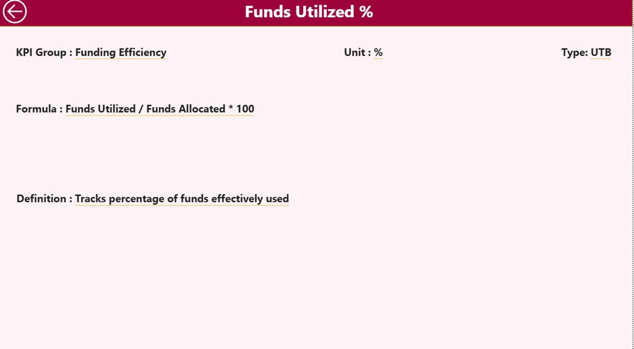
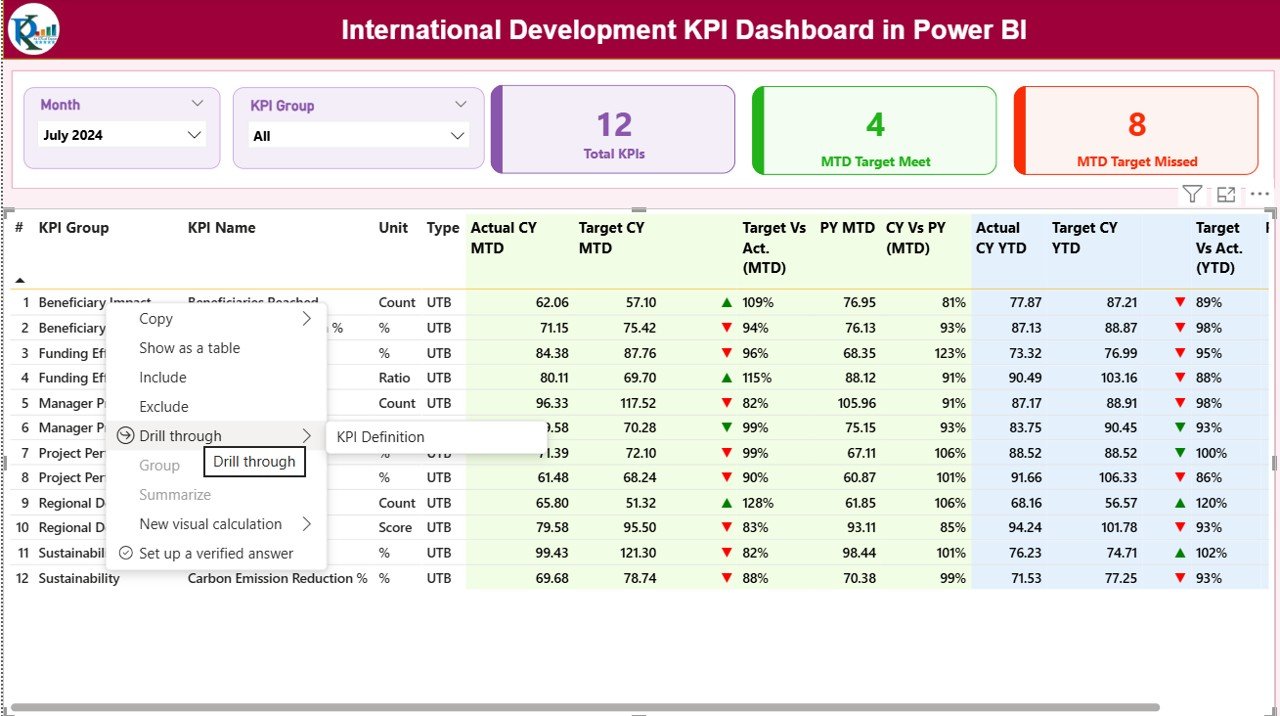
KPI Definition Page – Full Clarity for Every KPI
The KPI Definition Page is a hidden drill-through page. You can open it by right-clicking any KPI on the Summary Page.
This page shows:
- KPI Number
- KPI Group
- KPI Name
- Unit
- Formula
- KPI Definition
- KPI Type (UTB or LTB)
This page helps you maintain clarity, accuracy, and transparency across all KPIs. Anyone can understand the meaning, structure, and purpose of each metric.
To return to the main page, just click the Back button on the top-left corner.
Click to buy International Development KPI Dashboard in Power BI
How the Excel Data Structure Supports This Dashboard
The dashboard uses an Excel file as the data source. You simply fill numbers in three worksheets, and Power BI does the rest.
- Input_Actual Sheet
Enter:
- KPI Name
- Month (use the first date of the month)
- MTD Actual
- YTD Actual
This sheet stores real-time performance numbers.
- Input_Target Sheet
Enter:
- KPI Name
- Month (first date of the month)
- MTD Target
- YTD Target
This sheet stores performance expectations.
- KPI Definition Sheet
Enter:
- KPI Number
- KPI Group
- KPI Name
- Unit
- Formula
- Definition
- Type (UTB or LTB)
This sheet keeps your dashboard structured and clear.
Click to buy International Development KPI Dashboard in Power BI
Why Power BI Works Best for International Development KPIs
Power BI is widely used in global development organizations because it simplifies reporting and brings clarity to complex data structures.
You get several advantages:
- Real-time insights
- Strong visuals
- Easy data refresh
- Centralized data management
- Smooth comparison across years
- Drill-through options
- Multi-country performance analysis
Because development programs run across regions, Power BI provides the flexibility needed to track progress anywhere.
Advantages of Using an International Development KPI Dashboard in Power BI
This dashboard offers several benefits that help global teams streamline reporting and decision-making.
- Faster Decision Making
- You see everything in one place, so you act fast.
- Clear Comparison Across Programs
- You compare MTD, YTD, targets, and PY values instantly.
- Less Manual Work
- You do not waste time merging spreadsheets or building charts every month.
- Better Transparency
- Everyone understands the formulas and definitions.
- Strong Donor Reporting
- Donors get clear visuals, accurate performance updates, and consistent formats.
- Better Impact Measurement
You measure output, outcomes, and long-term impact with ease.
- Organized KPI Structure
The KPI Definition page ensures clarity for every stakeholder.
- More Accountability
Icons, percentages, and comparison metrics highlight problem areas instantly.
- Easy Monitoring of Country Offices
Multi-country operations become easier to track with slicers and trend charts.
How International Development Teams Use This Dashboard
This dashboard helps teams across the development sector work more effectively. Here’s how different roles use it:
Program Managers
They track progress, identify risks early, and prepare monthly reports quickly.
M&E (Monitoring & Evaluation) Analysts
They analyze long-term trends, compare KPIs, and evaluate impact.
Donor Relations Teams
They prepare transparent performance reports for donor reviews.
Country Directors
They track multiple locations and make strategic decisions faster.
Field Officers
They review their local KPIs and improve field execution.
Finance Teams
They monitor fund utilization ratios, cost efficiency, and budget targets.
Every team benefits from real-time insights and easy access to program KPIs.
Best Practices for Using the International Development KPI Dashboard in Power BI
To get maximum value from this dashboard, follow these best practices.
- Keep KPI Definitions Clear
Use simple formulas and definitions so every team understands the metrics.
- Update Excel Files Monthly
Keep your actual and target sheets updated to get accurate results.
- Use Consistent Naming Conventions
Name KPIs, groups, and units consistently to avoid confusion during analysis.
- Monitor Trends, Not Just Numbers
Use the trend page to understand long-term movement.
- Compare Current and Previous Year
Always evaluate CY vs PY trends to identify growth or decline.
- Use the KPI Type (UTB/LTB) Correctly
Ensure your KPI type is accurate—wrong types lead to wrong insights.
- Train Your Team
Help your teams understand slicers, drill-through features, and comparison indicators.
- Keep Visuals Clean
Do not overload Power BI pages with too many visuals. This dashboard follows best design practices.
- Evaluate MTD and YTD Separately
MTD gives current month performance, while YTD shows long-term movement.
- Review Performance Icons Carefully
Green arrows show progress, while red arrows highlight issues. Use them during reviews.
Conclusion
The International Development KPI Dashboard in Power BI brings clarity, speed, and accuracy to global development projects. It combines all KPIs into one dashboard, supports real-time decisions, and reduces manual reporting tasks. With slicers, trend charts, drill-through pages, and Excel-based inputs, it becomes easy for teams to track monthly and yearly progress. Whether you run NGO programs, donor-funded development projects, multi-country operations, community outreach initiatives, or impact-driven campaigns, this dashboard helps you stay informed and take the right actions at the right time.
By using the best practices shared above, your team can make strong, data-backed decisions and improve outcomes across every development program.
Frequently Asked Questions (FAQs)
- What is an International Development KPI Dashboard in Power BI?
It is a ready-to-use dashboard that tracks KPIs for development programs, donor projects, community impact, budgeting, and global operations. It converts raw Excel data into real-time visuals.
- Who should use this dashboard?
Program managers, donor teams, finance teams, field officers, M&E analysts, and country directors use this dashboard for monthly and yearly performance evaluation.
- What KPIs can I track?
You can track operational, financial, impact-based, compliance, partner, and outreach KPIs. You can also add custom KPIs.
- How do I update the dashboard?
Just update the Excel files (Actual, Target, and KPI Definition). When you refresh Power BI, the dashboard updates automatically.
- Does the dashboard support multi-country reporting?
Yes. You can use slicers, filters, and trend charts to compare performance across multiple locations.
- Can I add new KPIs later?
Yes. Add the new KPI to the Excel sheets and refresh Power BI. The dashboard adjusts automatically.
- Do I need advanced Power BI skills to use this?
No. The dashboard is simple, clean, and intuitive. Anyone can use it after basic instructions.
- Can I customize the visuals?
Yes. You can modify charts, slicers, layouts, colors, and formats according to your reporting needs.
Visit our YouTube channel to learn step-by-step video tutorials
Watch the step-by-step video tutorial:
Click to buy International Development KPI Dashboard in Power BI