Arts and culture organizations shape communities, preserve heritage, and create unique experiences for audiences. Yet, they also work in a fast-moving environment where funding changes, visitor expectations grow, and event performance varies from month to month. Because of this, cultural leaders need clear insights into engagement, revenue, participation, and operational performance.
An Arts & Culture KPI Dashboard in Power BI solves this challenge. It brings all key performance indicators into one place, so teams can track progress, compare results, analyze trends, and make better decisions. This dashboard turns raw numbers into meaningful visuals that help museums, galleries, theaters, cultural centers, event organizers, and performing arts groups work smarter.
In this detailed guide, you will learn everything about this dashboard—how it works, what each page includes, why organizations use it, and how to apply best practices for maximum impact.
Click to buy Arts & Culture KPI Dashboard in Power BI
What Is an Arts & Culture KPI Dashboard in Power BI?
An Arts & Culture KPI Dashboard in Power BI is a ready-to-use reporting tool that centralizes all important cultural performance metrics. It tracks visitor engagement, event results, audience satisfaction, funding outcomes, and operational KPIs in one place. You can use this dashboard to gain a clear, visual, and real-time understanding of how your arts and culture programs perform.
Because Power BI supports automation and interactive visuals, the dashboard updates instantly when new data is added to the Excel source file. As a result, leaders and teams stay informed and make smarter decisions without manual reporting.
Why Do Arts & Culture Organizations Need KPI Dashboards?
Arts organizations work with many variables—visitor counts, ticket sales, educational programs, donations, sponsorships, and more. Keeping track of these numbers manually leads to mistakes and delays. Therefore, a Power BI dashboard becomes a crucial tool.
Here are a few reasons:
- It provides a single source of truth.
- It shows instant performance insights.
- It compares current performance with past results.
- It highlights KPIs that need attention.
- It improves planning for events, exhibitions, and cultural programs.
Because the dashboard uses interactive slicers and charts, decision-making becomes smoother and more accurate.
Key Features of the Arts & Culture KPI Dashboard in Power BI
This dashboard comes with three well-structured pages in the Power BI file. Each page plays a unique role in helping users understand performance from different angles.
Let’s break them down in detail.
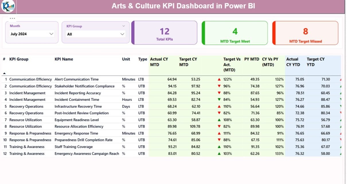
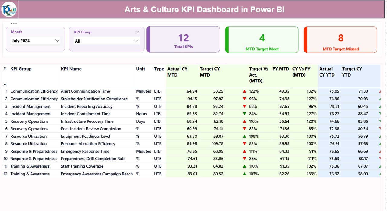
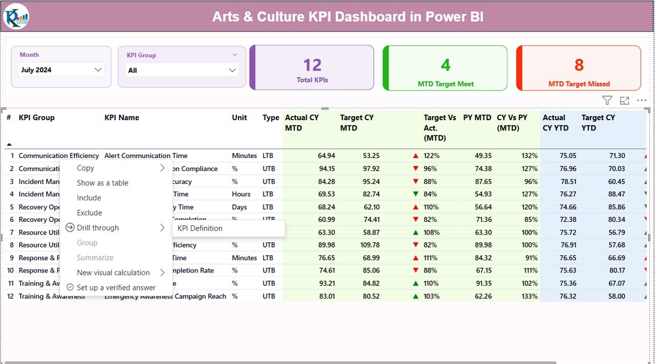
Summary Page: The Central Performance View
The Summary Page acts as the home screen of the dashboard. It gives a clear view of overall performance, monthly progress, and KPI categories. Because it shows KPIs in a simplified and structured layout, users get immediate insights.
Top-Level Slicers
The page includes two slicers:
- Month
- KPI Group
Users can filter the entire page instantly to analyze performance for any specific period or KPI category.
Overview KPI Cards
Three important performance cards appear at the top:
- Total KPIs Count
- MTD (Month-to-Date) Target Met Count
- MTD Target Missed Count
These cards help you quickly understand how your arts and culture programs perform during the selected month.
Detailed KPI Table
The main table is the heart of the Summary Page. It includes:
- KPI Number – A unique identifier for each KPI
- KPI Group – Category such as Audience Engagement, Funding, Creative Programs, etc.
- KPI Name – Title of the KPI
- Unit – Measurement type (percentage, count, revenue, etc.)
- Type – LTB (Lower the Better) or UTB (Upper the Better)
- Actual CY MTD – Current Year Month-to-Date actual value
- Target CY MTD – MTD target for Current Year
- MTD Icon – Green ▲ for meeting targets and red ▼ for missing targets
- Target vs Actual (MTD) – Percent comparison of Actual vs Target
- PY MTD – Last year’s MTD performance
- CY vs PY (MTD) – Comparison between current and previous year
- Actual CY YTD – Year-to-Date actual performance
- Target CY YTD – Year-to-Date target
- YTD Icon – Visual indicator for YTD performance
- Target vs Actual (YTD)
- PY YTD – Previous Year YTD
- CY vs PY (YTD) – Year-to-date comparison with last year
Because the table includes icons, percentages, and multiple comparisons, users quickly understand performance without complex analysis.
Click to buy Arts & Culture KPI Dashboard in Power BI
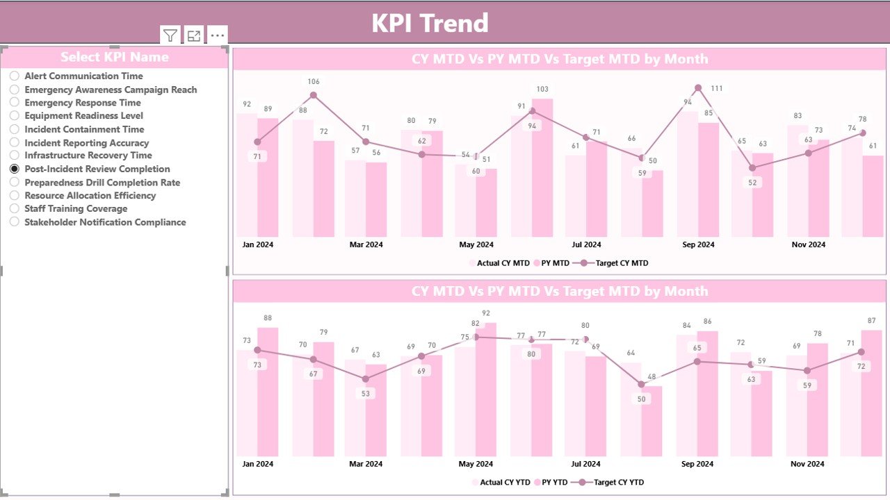
KPI Trend Page: Visualizing Month-Wise and Year-Wise Trends
Trends play a major role in arts and cultural planning. Therefore, the KPI Trend Page helps users analyze performance over time.
This page includes:
Two Combo Charts
- MTD Trend Chart
- YTD Trend Chart
Each chart shows:
- Current Year Actuals
- Previous Year Actuals
- Targets
This visual comparison helps leaders understand how programs evolve month over month and year over year.
KPI Selection Slicer
A slicer on the left side allows you to choose a KPI. When you select a KPI, both charts update instantly. Therefore, you get a focused performance trend for any specific KPI.
This helps management teams review performance patterns for:
- Audience Visits
- Ticket Sales
- Workshop Attendance
- Sponsorship Revenue
- Artistic Program Deliveries
and many more depending on your cultural initiatives.
Click to buy Arts & Culture KPI Dashboard in Power BI
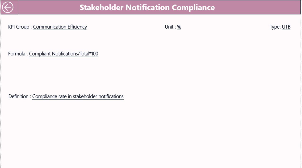
KPI Definition Page: Understanding KPI Logic and Formulas
The KPI Definition Page adds clarity for teams who want to understand how each KPI is calculated. This page is hidden in the dashboard because it works as a drill-through page.
When you right-click a KPI in the Summary Page, you can drill through to this page. It displays:
- KPI Number
- KPI Group
- KPI Name
- Unit
- Formula
- Definition
- Type (LTB or UTB)
Because every KPI has a clear definition, there is no confusion in reporting or performance evaluation.
To return to the main Summary Page, just click the Back button on the top left corner.
Click to buy Arts & Culture KPI Dashboard in Power BI
Excel Data Source Structure for the Dashboard
The dashboard works on a simple Excel-based data entry system. It includes three worksheets.
- Input_Actual Sheet
You need to fill in:
- KPI Name
- Month (first date of the month)
- MTD values
- YTD values
- Input_Target Sheet
You need to enter:
- KPI Name
- Month
- MTD target values
- YTD target values
- KPI Definition Sheet
This sheet includes:
- KPI Number
- KPI Group
- KPI Name
- Unit
- Formula
- KPI Definition
- Type (LTB or UTB)
Because the dashboard uses simple data entry sheets, anyone can update the data without technical knowledge.
What KPIs Can You Track in an Arts & Culture Dashboard?
Arts and culture organizations work with a wide range of KPIs. Here are some examples:
Audience & Engagement KPIs
- Total Visitors
- Event Attendance
- Workshop Participation
- Repeat Visitor Rate
- Online Engagement Rate
Financial KPIs
- Ticket Revenue
- Program Revenue
- Sponsorship Income
- Donation Growth
- Cost per Event
Operational KPIs
- Exhibit Completion Rate
- Staff Hours
- Volunteer Participation
- Resource Utilization
- Program Scheduling Accuracy
Impact KPIs
- Community Outreach Count
- Educational Program Reach
- Artist Participation
- Cultural Impact Index
Because the dashboard is fully customizable, you can add or remove KPIs based on your organization’s goals.
Advantages of an Arts & Culture KPI Dashboard in Power BI
An arts and culture dashboard provides many powerful advantages. Let’s explore the most important ones.
- Clear Performance Visibility
Leaders see all KPIs in one place. This clarity helps them make informed decisions quickly.
- Better Program Planning
You understand what works, what needs improvement, and how events perform across months.
- Data-Driven Financial Management
The dashboard shows the gap between actual revenue and target revenue. This helps organizations manage budgets and funding more effectively.
- Improved Audience Understanding
With trends and comparisons, you understand how audiences behave, how many return, and which programs they prefer.
- Easy Reporting for Boards and Funders
Boards, sponsors, and government agencies want clear progress reports. A dashboard provides easy, visual, and reliable performance updates.
- Year-on-Year Improvement Tracking
You can compare performance with previous years to understand growth and challenges.
- Complete Transparency for Teams
Because the dashboard shows KPI definitions and formulas, teams stay aligned and consistent.
How to Use This Dashboard Effectively
To get the best results from the Arts & Culture KPI Dashboard, follow these steps:
- Update data regularly
- Review the Summary Page each month
- Analyze trends before making decisions
- Review KPI definitions to understand each metric
- Use slicers to filter KPIs by category
- Compare current performance with previous year results
Because the dashboard is interactive, you gain insights quickly and take better action.
Best Practices for the Arts & Culture KPI Dashboard in Power BI
To maximize dashboard accuracy and usefulness, follow these best practices:
- Keep Data Clean
Always enter correct values in the Excel sheets. Clean data ensures reliable performance insights.
- Standardize KPI Names
Use consistent naming for all KPIs. It prevents confusion during analysis.
- Review KPI Definitions Often
Make sure every team member understands the meaning of each KPI.
- Update Data on Time
Frequent updates help maintain accurate trends.
- Use Visual Indicators
The green and red icons help teams evaluate performance quickly.
- Compare MTD and YTD Values Carefully
Both values provide different insights. Use them together to understand short-term and long-term performance.
- Track Both Financial and Engagement KPIs
Balanced reporting improves cultural program planning.
Conclusion
Arts and culture organizations need strong, clear, and consistent insights to manage creative programs, engage communities, and achieve financial stability. The Arts & Culture KPI Dashboard in Power BI helps them monitor all key metrics in one place. Because it provides real-time trends, visual indicators, and detailed comparisons, leaders make faster and smarter decisions.
This dashboard also simplifies reporting, boosts transparency, and improves performance analysis across programs. When you combine clean data, well-defined KPIs, and the power of Power BI, your arts and culture initiatives grow stronger and more successful.
Frequently Asked Questions (FAQs)
- What is the Arts & Culture KPI Dashboard in Power BI?
It is a ready-to-use dashboard that tracks key performance indicators for arts and culture organizations. It helps analyze attendance, revenue, engagement, and operational performance.
- Who can use this dashboard?
Museums, theaters, cultural centers, art galleries, event organizers, and performing arts groups can use it.
- Does the dashboard require technical skills?
No. You only need to update an Excel file. Power BI updates the dashboard automatically.
- What KPIs can I track?
You can track visitor counts, ticket revenue, event participation, sponsorship income, cultural outreach, staff metrics, and many more.
- Can I add custom KPIs?
Yes. The dashboard is fully customizable. You can add or modify KPIs in the Excel source file.
- Does the dashboard show year-on-year comparisons?
Yes. It offers MTD and YTD comparisons for both current and previous years.
- How many pages does the dashboard include?
It includes three pages: Summary Page, KPI Trend Page, and KPI Definition Page.
- Is this dashboard helpful for reporting to funders or boards?
Yes. It provides clear visuals and performance insights useful for meetings, funding applications, and progress reports.
Visit our YouTube channel to learn step-by-step video tutorials
Watch the step-by-step video tutorial:
Click to buy Arts & Culture KPI Dashboard in Power BI