Running a college or university involves hundreds of activities every month. Academic performance, student admissions, staff efficiency, research output, attendance, operational costs, and administrative quality all demand constant attention. Because of this, education leaders look for simple and clear performance tools that help them track what is working and what needs improvement. A Colleges & Universities KPI Dashboard in Power BI solves this challenge in the most effective way.
This dashboard gives management teams a real-time view of academic and operational KPIs. It shows current performance, trend movement, target achievement, and month-wise comparison in an easy and interactive layout. Since it connects with a structured Excel file, the dashboard updates instantly whenever new data comes in. As a result, administrators make faster decisions with complete confidence.
In this detailed guide, you will learn everything about the Colleges & Universities KPI Dashboard in Power BI, including how it works, what each page shows, and why every educational institute needs it. You will also see its advantages, best practices, and frequently asked questions to help you use this tool with clarity.
Click to buy Colleges & Universities KPI Dashboard in Power BI
What Is a Colleges & Universities KPI Dashboard in Power BI?
A Colleges & Universities KPI Dashboard in Power BI is a ready-to-use performance monitoring system designed for higher education institutions. It collects actual and target data from an Excel file and converts it into interactive visuals, KPI cards, trend charts, and comparison metrics. With this tool, academic leaders track results for every department, every course, and every operational area.
Because the dashboard follows KPIs like enrollment, attendance, research publications, faculty performance, student satisfaction, financial operations, and infrastructure efficiency, it becomes a complete performance monitoring solution.
The dashboard includes:
- A Summary Page for quick updates
- A KPI Trend Page for time-based analysis
- A KPI Definition Page for detailed understanding
This structure ensures that users understand both the current performance and the reason behind the performance.
Why Do Colleges and Universities Need a Power BI KPI Dashboard?
Higher education institutions manage complex systems. Students, faculties, programs, departments, and administrative teams create large amounts of data every day. Without a dashboard, this data spreads across Excel sheets, emails, manual reports, and handwritten notes. This leads to delays, errors, and unclear decision-making.
A KPI dashboard brings all performance data into one place. Education leaders gain a clearer view of:
- Academic progress
- Student development
- Faculty efficiency
- Research output
- Attendance trends
- Budget and resource utilization
- Department-wise results
With this real-time visibility, colleges run with more discipline and alignment.
Key Features of the Colleges & Universities KPI Dashboard in Power BI
The dashboard comes with three powerful pages that capture all performance metrics.
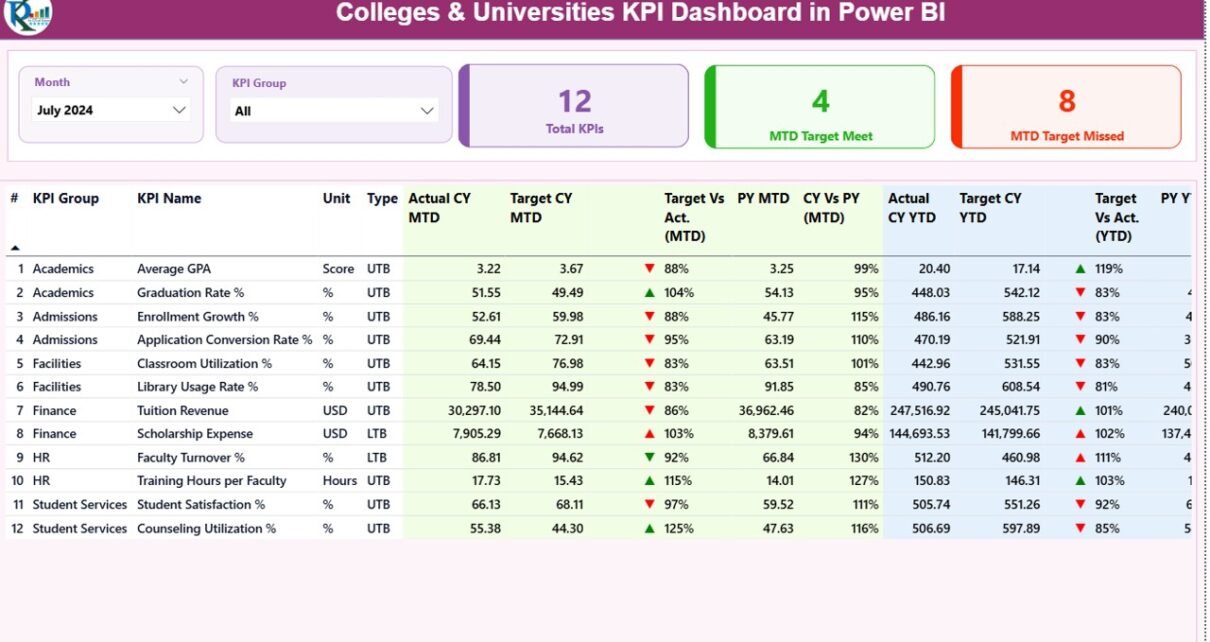
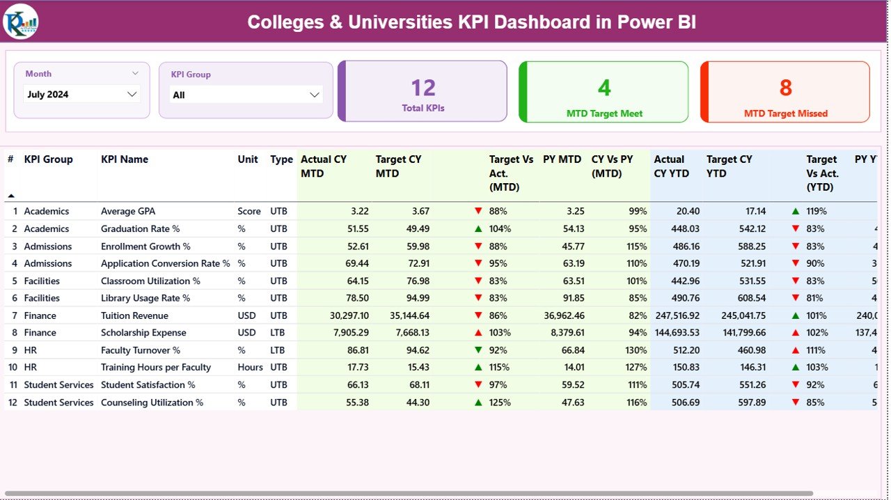
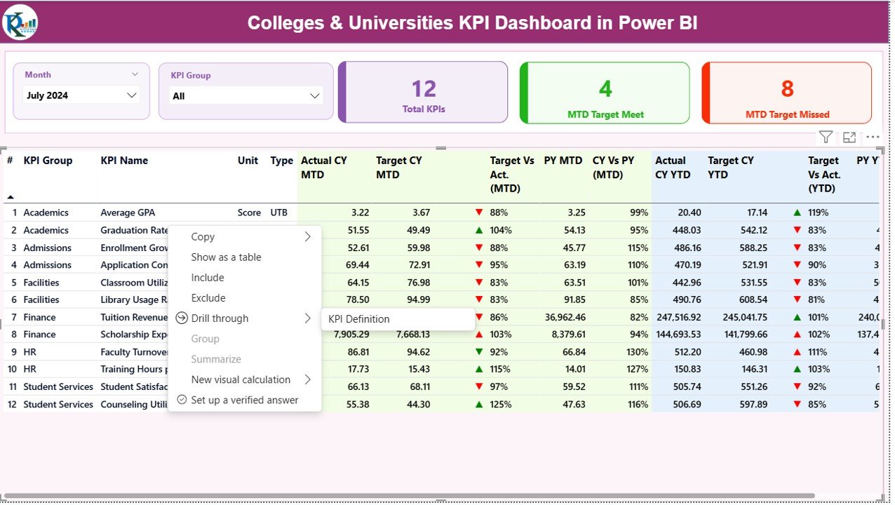
Summary Page – The Heart of the Dashboard
The Summary Page gives a complete snapshot of current academic and operational performance. It includes slicers, KPI cards, and detailed tables that help users see performance at a glance.
Slicers on Top:
- Month Slicer to switch monthly performance
- KPI Group Slicer to filter by academic or administrative category
These slicers make navigation simple and quick.
KPI Cards on the Top Section:
- Total KPIs Count
- MTD Target Meet Count
- MTD Target Missed Count
These cards help leaders see how performance looks immediately.
Current Month (MTD) Metrics:
- Actual CY MTD – current year MTD actual
- Target CY MTD – current year MTD target
- MTD Icon – red/green arrow showing KPI status
- Target vs Actual (MTD %) – performance percentage
- PY MTD – previous year MTD
- CY vs PY (MTD %) – year-on-year comparison
Current Year (YTD) Metrics:
- Actual CY YTD – current year YTD actual
- Target CY YTD – current year YTD target
- YTD Icon – red/green arrow for status
- Target vs Actual (YTD %) – YTD achievement
- PY YTD – previous year YTD
- CY vs PY (YTD %) – year-to-year comparison
Because the table displays MTD, YTD, and previous year performance together, users understand exactly where the college stands.
Click to buy Colleges & Universities KPI Dashboard in Power BI
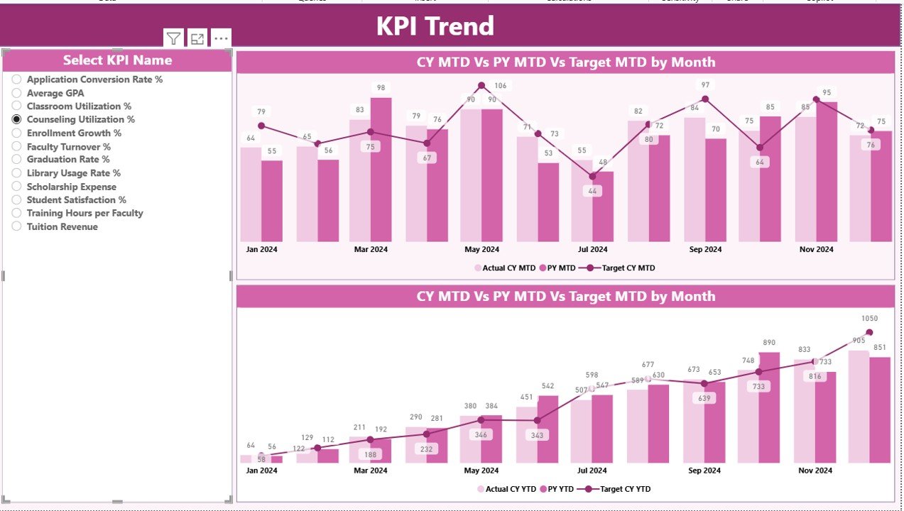
KPI Trend Page – Track Movement Across Time
The KPI Trend Page gives deeper insights into MTD and YTD trends.
What This Page Shows:
- Two combo charts
- One for MTD actual vs target vs last year
- One for YTD actual vs target vs last year
- A slicer to pick any KPI name for trend analysis
Trends help colleges visualize academic progress, research improvement, faculty efficiency, and operational stability over time.
Click to buy Colleges & Universities KPI Dashboard in Power BI
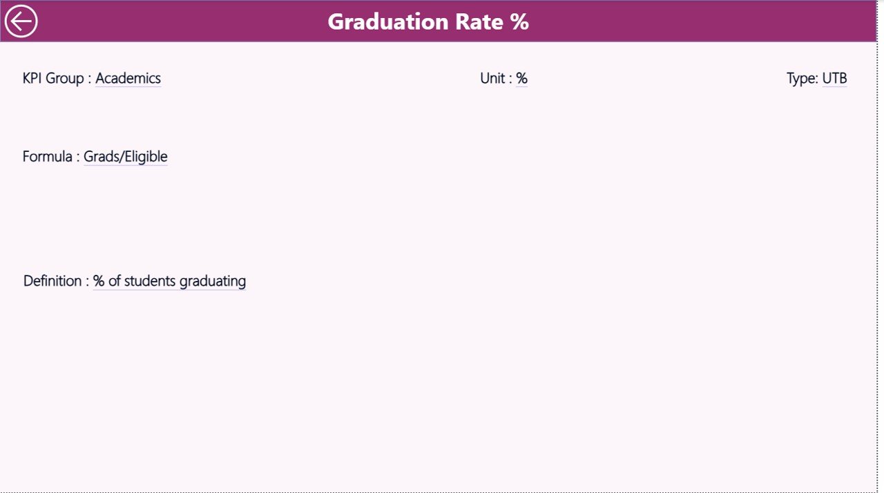
KPI Definition Page – Complete Clarity on KPIs
This is a drill-through page and remains hidden by default. Users reach it by right-clicking any KPI on the Summary Page.
This Page Displays:
- KPI Number
- KPI Group
- KPI Name
- Unit
- Formula
- KPI Definition
- Type (LTB or UTB)
This page helps teams understand why a KPI exists and how it should be measured.
Click to buy Colleges & Universities KPI Dashboard in Power BI
How the Excel Backend Works
The Power BI dashboard connects with a simple and clean Excel file. It uses three sheets:
Input_Actual Sheet
- Fill these values:
- KPI Name
- Month (first date of the month)
- MTD actual
- YTD actual
- Input_Target Sheet
- Fill these values:
- KPI Name
- Month
- MTD target
- YTD target
- KPI Definition Sheet
- Fill:
- KPI Number
- KPI Group
- KPI Name
- Unit
- Formula
- Definition
- Type (UTB or LTB)
Whenever this Excel file updates, the Power BI dashboard updates as well.
Click to buy Colleges & Universities KPI Dashboard in Power BI
Advantages of Colleges & Universities KPI Dashboard in Power BI
Using this dashboard brings several benefits for both academic and administrative teams.
- Real-Time Visibility
The dashboard shows live updates across all departments.
- Better Academic Planning
Leaders track academic KPIs like attendance, results, enrollment, and research.
- Faster Decision-Making
Clear visuals help leaders act faster.
- Improved Student Outcomes
Tracking student-related KPIs improves performance and satisfaction.
- Transparent Reporting
Everyone sees the same data, reducing confusion.
- Easy Trend Monitoring
MTD and YTD trends support planning and forecasting.
- Accurate Year-on-Year Comparison
The dashboard shows comparisons between current and previous years.
- Easy to Update
Since it connects to Excel, updating data takes only a few seconds.
- Suitable for All Departments
Academics, HR, Finance, Administration, Research, and Operations benefit from it.
Best Practices for Using the Colleges & Universities KPI Dashboard
Follow these tips to improve the quality of insights:
- Use Standard KPI Definitions
Ensure every department follows the same KPI definition.
- Keep Data Structured
Clean and organized Excel sheets deliver accurate visuals.
- Update Data Timely
Record actual and target numbers at the end of every month.
- Review Red Icons First
Red arrows show problem areas that need immediate action.
- Compare with Previous Year
Review PY data to understand improvements.
- Use Trend Charts Frequently
The trend page helps you predict future performance.
- Add KPIs Only When Needed
Avoid tracking too many KPIs; track only meaningful ones.
- Train Key Users
Ensure academic teams know how to read charts and slicers.
Conclusion
A Colleges & Universities KPI Dashboard in Power BI brings clarity, discipline, and speed to academic management. It helps leaders monitor performance at every level—student, faculty, department, and institution. Since it uses simple Excel sheets as a data source, any college can use this tool without technical difficulty. When the dashboard shows trends, comparisons, and performance indicators in one place, leaders make better decisions for teaching quality, student growth, and institutional excellence.
This dashboard becomes a must-have tool for every modern educational institution that wants to grow with accuracy and insight.
Frequently Asked Questions (FAQs)
- How does a Colleges & Universities KPI Dashboard help institutions?
It helps institutions track academic, administrative, and financial KPIs in real-time, improving decision-making.
- Do I need technical skills to use this dashboard?
No. You only need to update numbers in Excel. Power BI updates automatically.
- What KPIs can colleges track?
KPIs like attendance, enrollment, research publications, faculty workload, exam results, departmental performance, and financial metrics.
- Can I add more KPIs later?
Yes. You can expand the KPI Definition sheet and refresh the dashboard.
- What makes this dashboard better than manual reports?
Manual reports take time and create errors. This dashboard updates instantly and shows insights clearly.
Visit our YouTube channel to learn step-by-step video tutorials
Watch the step-by-step video tutorial:

